What do you think about this photo?Do you have questions or curiosities about this image? Do you want to ask something to the author, give him suggestions for improvement, or congratulate for a photo that you really like?
You can do it by joining JuzaPhoto, it is easy and free!
There is more: by registering you can create your personal page, publish photos, receive comments and you can use all the features of JuzaPhoto. With more than 242000 members, there is space for everyone, from the beginner to the professional.
| sent on September 30, 2013 (11:44) | This comment has been automatically translated (show/hide original)
congratulations, very beautiful complimenti, molto bella |
| sent on October 29, 2013 (11:48) | This comment has been automatically translated (show/hide original)
Thanks James
Greetings Grazie Giacomo
Saluti |
| sent on January 10, 2014 (9:53) | This comment has been automatically translated (show/hide original)
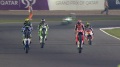
Very nice pan, but I'd cut at an angle so as to remove the space above the word pirelli and I straightened out the photo ... anyway complimentoni for shooting. Really well done :) Molto bello il panning peró avrei tagliato in obliquo in modo da levare lo spazio sopra la scritta pirelli e avrei raddrizzato la foto...comunque complimentoni per lo scatto .davvero ben riuscito :) |
| sent on January 11, 2014 (15:11) | This comment has been automatically translated (show/hide original)
Thanks Christian for the comment!
I'll try to edit the photo as you indicated
Thanks again Grazie Christian per il commento!!!!
Proverò a modificare la foto come da te indicato
Grazie ancora |
| sent on May 07, 2014 (11:50) | This comment has been automatically translated (show/hide original)
Hello 8848, nick very curious!
First of all, this shot really appreciate the creaminess and the cleanliness of the background: the hazel, gray and yellow ensure good legibility of the subject and an appropriate sense of depth.
Personally, I like the diagonal cut, an output from the "classical schemes." Moreover, in this case, the written enhances more the trajectory of the car without becoming an element of disorder (by virtue of the excellent blur, which is lacking in other shots).
Only reason why I do not put "I like" is the front of the car. Clearly it is not your fault but the angle of recovery. I know that F1 is soooo hard to photograph and shoot a few points, but I encourage you to try again because cthe shots are where the sharpness of the car was complete and total (see photo of Kimi).
Good shots! Ciao 8848, nick molto curioso!!
Anzitutto di questo scatto apprezzo molto la cremosità e la pulizia dello sfondo: il nocciola, il grigio ed il giallo garantiscono una buona leggibilità al soggetto ed un adeguato senso di profondità.
Personalmente mi piace il taglio diagonale, un'uscita dagli "schemi classici". Inoltre, in questo caso, la scritta valorizza maggiormente la traiettoria della monoposto senza divenire un elemento di disturbo (in virtù dell'ottima sfuocatura, cosa che manca negli altri scatti).
Unico motivo per cui non metto "mi piace" è il muso dell'auto. Chiaramente non è colpa tua ma dell'angolo di ripresa. So benissimo che fotografare la F1 è moooolto difficile ed i punti di ripresa pochissimi, però ti invito a riprovare poiché ci sono scatti dove la nitidezza della vettura era completa e totale (vedi foto di Kimi).
Buoni scatti!! |
|
Publish your advertisement on JuzaPhoto (info) |


 JuzaPhoto contains affiliate links from Amazon and Ebay and JuzaPhoto earn a commission in case of purchase through affiliate links.


 16.3 MEGAPIXEL
 Resize to fit window