What do you think about this photo?Do you have questions or curiosities about this image? Do you want to ask something to the author, give him suggestions for improvement, or congratulate for a photo that you really like?
You can do it by joining JuzaPhoto, it is easy and free!
There is more: by registering you can create your personal page, publish photos, receive comments and you can use all the features of JuzaPhoto. With more than 242000 members, there is space for everyone, from the beginner to the professional.
| sent on July 24, 2021 (18:30) | This comment has been automatically translated (show/hide original)
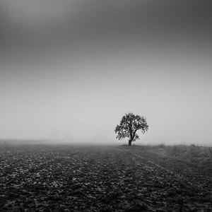
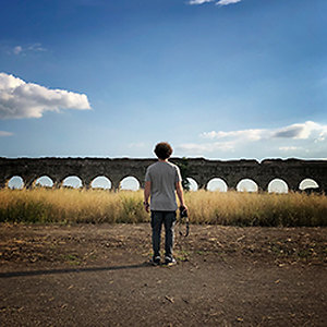
I would say much better so , Riccardo , my humble opinion ; moreover, the b / w I find better outlines the horizon line and give greater (and better) emphasis to the buildings: excellent choice!
Leonardo Direi decisamente meglio così , Riccardo , mio modesto parere ; oltretutto , il b/n trovo delinei meglio la linea d'orizzonte e dia maggiore (e migliore) risalto alle costruzioni : ottima scelta !
Leonardo |
| sent on July 24, 2021 (18:34) | This comment has been automatically translated (show/hide original)
Thank you very much Leonardo, I worked on it a bit but I must admit that taking into account the starting image the final result satisfied me.
Then no one will file as usual, but that's another story and anyway now I'm used :-D Grazie mille Leonardo, ci ho lavorato un po' ma devo ammettere che tenendo conto dell'immagine di partenza il risultato finale mi ha soddisfatto.
Poi non se la filerà nessuno come al solito, ma questa è un altra storia e comunque oramai ci sono abituato  |
| sent on July 25, 2021 (18:31) | This comment has been automatically translated (show/hide original)
Definitely better, it has more character, out of the norm ...... unreal.... in b/w everything becomes unreal....... by its nature it represents the unreal. Only observation, that sign in the foreground that recalls reality, I would eliminate it so as not to ruin that enchanted and unreal atmosphere ..... my humble opinion.
Hello Francis Decisamente meglio, ha più carattere, fuori dalla norma......irreale....in b/n tutto diventa irreale.......per sua natura rappresenta l'irreale. Unica osservazione, quel cartello in primo piano che richiama la realtà, io lo eliminerei per non rovinare quell'atmosfera incantata e irreale.....mio modesto parere.
Ciao Francesco |
| sent on July 26, 2021 (8:38) | This comment has been automatically translated (show/hide original)
Thank you very much Francis your appreciation, I am very pleased.
As for the sign to me as pure aesthetics and positioning likes, but seen under the "unreal" optics that you have well described and that I had not taken into account, in fact out of tune. Then the same note was also moved by Leonardo, so I can only take note of your observation.
Grazie mille Francesco il tuo apprezzamento, mi fa molto piacere.
Per quanto riguarda il cartello a me come estetica pura e posizionamento piace, ma visto sotto l'ottica "irreale" che hai ben descritto e che io non avevo preso in considerazione, in effetti stona. Poi lo stesso appunto mi è stato mosso anche da Leonardo, quindi non posso che prendere atto della vostra osservazione.
|
| sent on July 28, 2021 (17:41) | This comment has been automatically translated (show/hide original)
Fantastic black and white, in all honesty I envy you a little. I agree with Leonardo's comment regarding the comparison with the color version. Congratulations, image with considerable depth of field and communicative power. Fantastico bianco e nero, in tutta onestà te lo invidio un po'. Concordo col commento di Leonardo per quanto riguarda il confronto con la versione a colori. Complimenti, immagine con notevole profondità di campo e potere comunicativo. |
| sent on July 28, 2021 (22:13) | This comment has been automatically translated (show/hide original)
Thank you for the beautiful words Giammarco, I'm glad you appreciated it. Ti ringrazio per le belle parole Giammarco, mi fa piacere che tu la abbia apprezzata. |
| sent on July 29, 2021 (10:25) | This comment has been automatically translated (show/hide original)
Hello Riccardo ! I fully agree with the opinions read above, if it had been taken in another moment of light it would have been a must color , but given the conditions it is much more beautiful as well.
The field of black and white is also beautiful because sometimes it comes to the rescue to save some unconvincing photos making them very interesting (by this I do not mean that the BeN is a loophole, I would not be misunderstood). That sign.... yes, it disturbs a bit but it is in a nice position and in my opinion in the composition we are fine .
Hello
Guide Ciao Riccardo ! Sono pienamente d'accordo con le opinioni lette sopra, se fosse stata scattata in un altro momento di luce sarebbe stato d'obbligo il colore , ma viste le condizioni è molto piu bella così.
Il campo del bianco e nero è bello anche perché a volte viene in soccorso per salvare alcune foto poco convincenti rendendole molto interessanti ( con questo non voglio dire che il BeN sia una scappatoia, non vorrei essere frainteso ) . Quel cartello.... si , disturba un po' ma è in una bella posizione e secondo me nella composizione ci sta bene .
Ciao
Guido |
| sent on July 29, 2021 (18:45) | This comment has been automatically translated (show/hide original)
I also sometimes make an instrumental use of the b / w if the color version does not fully convince me, as in this case for that matter.
I'm glad you're on my side for the sign :-D
Thanks for the compliments and for your intervention Guido. Anche io alcune volte faccio un uso strumentale del b/n se la versione a colori non mi convince a pieno, come in questo caso del resto.
Sono contento che tu sia dalla mia parte per il cartello
Grazie per i complimenti e per il tuo intervento Guido. |
| sent on July 30, 2021 (18:08) | This comment has been automatically translated (show/hide original)
Beautiful image. The choice of the B / W. Applause is right.
A salute
Carlo Splendida immagine. Azzeccata la scelta del B/N. Applausi.
Un saluto
Carlo |
| sent on July 30, 2021 (18:14) | This comment has been automatically translated (show/hide original)
Thank you Carlo, very kind. Ti ringrazio Carlo, molto gentile. |
| sent on August 08, 2021 (17:00) | This comment has been automatically translated (show/hide original)
A beautiful bw!
Compliments Un bellissimo bw!
Complimenti |
| sent on August 08, 2021 (17:40) | This comment has been automatically translated (show/hide original)
Thank you very much Diodato, I am pleased that it is to your liking. Grazie mille Diodato, mi fa piacere che sia di tuo gradimento. |
|

Publish your advertisement on JuzaPhoto (info) |


 JuzaPhoto contains affiliate links from Amazon and Ebay and JuzaPhoto earn a commission in case of purchase through affiliate links.


 3.8 MEGAPIXEL
 Resize to fit window