What do you think about this photo?Do you have questions or curiosities about this image? Do you want to ask something to the author, give him suggestions for improvement, or congratulate for a photo that you really like?
You can do it by joining JuzaPhoto, it is easy and free!
There is more: by registering you can create your personal page, publish photos, receive comments and you can use all the features of JuzaPhoto. With more than 242000 members, there is space for everyone, from the beginner to the professional.
| sent on June 05, 2017 (12:09) | This comment has been automatically translated (show/hide original)
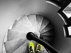
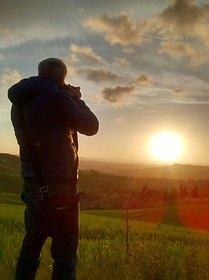
The idea for me is good, less the composition.
I would have opted for a different position or looking from outside to inside or from inside out, this to focus more attention on the subject. For example, the floor of the floor i find it irrelevant to the snap shot.
Nice dark light game on your face, maybe you could even risk something more in the blacks. L'idea per me è buona, meno la composizione.
Avrei optato per una posizione diversa o guardando da fuori a dentro o da dentro a fuori, questo per concentrare più attenzione sul soggetto. Ad esempio la parte del pavimento fuori la trovo ininfluente alla resa dello scatto.
Bello il gioco scuro chiaro sul volto, forse potevi rischiare anche qualcosa di più nei neri. |
| sent on June 05, 2017 (12:23) | This comment has been automatically translated (show/hide original)
I do not regret maybe I would have lowered a more pelican opening slightly more shadows, but in the context I find it a valid photo even considering the difficulty in immortalizing the moment ;-) A me non dispiace forse mi sarei abbassato un pelino di più aprendo leggermente di più le ombre, ma nel contesto la trovo una foto valida anche considerando la difficoltà nell'immortalare il momento |
| sent on June 05, 2017 (13:02) | This comment has been automatically translated (show/hide original)
Since my appreciation for your shots is always unconditional, I also find that composition is a bit of the weakness of this photo, but it is very successful.
On the technical plane nothing to say: well-exposed and equally well-developed, I adore balancing lights / shadows, with the first perfect and never burned and the second deep but not too close. The light on the figure appears ideal, allowing you to read the contour without distinguishing the features too much. A great street in this regard.
Coming to the content, composition, precisely; I did not resist and I propose you a cutout: www.dropbox.com/s/66shb07hb3i2nqf/colonnato.jpg?dl=0
Motivated by a very personal appreciation of the balance between lights and shadows and the sacrifice of what is not functional.
NatureSo I'm not you and so it's an absolutely subjective opinion. Premesso che il mio apprezzamento per i tuoi scatti è sempre incondizionato, trovo anch'io che la composizione sia un pò il punto debole di questa foto, peraltro molto riuscita.
Sul piano tecnico niente da dire: ottimamente esposta e altrettanto ben sviluppata, adoro il bilanciamento luci/ombre, con le prime perfette e mai bruciate e le seconde profonde ma non troppo chiuse. La luce sulla figura appare ideale, permettendo di leggerne il contorno senza distinguere troppo i lineamenti. Un'ottima street in questo senso.
Venendo al contenuto, la composizione, appunto; non ho resistito e ti propongo un ritaglio: www.dropbox.com/s/66shb07hb3i2nqf/colonnato.jpg?dl=0
Motivato da una personalissima valutazione circa l'equilibrio tra luci e ombre e il sacrificare ciò che non è funzionale.
Naturalmente io non sono te e quindi è un parere assolutamente soggettivo. |
| sent on June 05, 2017 (13:31) | This comment has been automatically translated (show/hide original)
In my opinion it is a very good photo as it is, the only thing I would check is the slope to dx ...
compliments!
Ciauuuzz Mario secondo me è una buonissima foto così com'è, l'unica cosa che controllerei è la pendenza a dx...
complimenti!
ciauuuzz Mario |
user72446 | sent on June 05, 2017 (13:40) | This comment has been automatically translated (show/hide original)
I really like the shape of the man and the rays of light, maybe the shadows a little too close.
Cmq a very nice photo! Nice game of light! Mi piace molto la sagoma dell'uomo e i raggi di luce, forse le ombre un poco troppo chiuse.
Cmq una foto molto bella! bel gioco di luce! |
| sent on June 05, 2017 (14:03) | This comment has been automatically translated (show/hide original)
@RiccardoMelzi For me a vertical cut is his death @RiccardoMelzi Per me un taglio verticale è la morte sua |
| sent on June 05, 2017 (17:18) | This comment has been automatically translated (show/hide original)
Good photo David, the idea of ??playing with contrasts is winning as well as harnessing the lights and shades of the arcade. I saw that a different cut was proposed and in part I agree, I find too much to the right of the frame that is not interesting in the same way, I would not have said it before but a cut, if the machine allows it, I would have worked to make the scene more central and evenly interesting. But they are just a little bit of a very good photo for themselves Buona foto Davide, l'idea di giocare coi contrasti è vincente così come sfruttare le luci e le ombre del porticato. Ho visto che è stato proposto un taglio diverso ed in parte sono concorde, trovo ci sia troppa parte a destra del fotogramma che non è interessante in egual modo, non l'avrei detto prima ma un taglio, se la macchina lo permette, l'avrei operato per rendere la scena più centrale ed uniformemente interessante. Ma sono solo piccoli accorgimenti per una foto di per se molto molto molto valida |
| sent on June 05, 2017 (18:00) | This comment has been automatically translated (show/hide original)
Since it's been a long time since I do not see you ...
You are ;-) Nice shot and conversion.
Just inclined to dx ;-) Dato che è da molto tempo che non ti rivedo...
Ci sei Bello scatto e conversione.
Appena inclinata a dx |
| sent on June 05, 2017 (18:44) | This comment has been automatically translated (show/hide original)
TECHNIQUES a really interesting black and white that enhances the light-shadow effect from the colonnade. As a composition I would have seen the most decentralized figure to the right, but you would have to cut off much of the bow designing the doors. And you'd probably hit the shot would be worse.
CONTENT The colonnade with the shadows leading to the doors in the background is really beautiful. Misty lindo walking through breaks the scene giving a great deal of interest to the shot. PS do not tell him I called him master, so I disagree. TECNICA un bianco e nero veramente interessante che esalta l'effetto luci-ombre dal colonnato. Come composizione avrei visto la figura più decentrata verso destra, però avresti dovuto tagliare buona parte dell'arco che disegnano le porte. E probabilmete lo scatto sarebbe risultato peggiore.
CONTENUTO Il colonnato con le ombre che guidano verso le porte sullo sfondo è veramente bello. Masto lindo che passeggia spezza la scena dando molto interesse allo scatto. P.S. non dirgli che l'ho chiamato mastro lindo dunque mi disfa. |
| sent on June 05, 2017 (20:57) | This comment has been automatically translated (show/hide original)
Time permitting Saturday morning I would like to repeat the shutter by changing the composition and the shooting point following your suggestions 8-) 8-) cool:
Thanks a lot for the precious tips !!!
David Tempo permettendo sabato mattina vorrei ripetere lo scatto modificando la composizione e il punto di ripresa seguendo i vostri suggerimenti  :cool: :cool:
Grazie mille per i preziosi consigli!!!
Davide
p.s
Hai ragione Rinaldo non sono presente, cerco di partecipare al gruppo dei commenti costruttivi e seguo le foto nelle gallerie di street photography e le più popolari delle 24h, purtroppo la mia partecipazione è a singhiozzo a seconda dei miei impegni lavorativi.
|
| sent on June 05, 2017 (22:28) | This comment has been automatically translated (show/hide original)
I find it a clean street with a good b ^ n, If then we want more quado Ricardo for the cut Io trovo che sia uno street pulito con un buon b^n,Se poi vogliamo di più quoto Ricardo per il taglio |
user81257 | sent on June 05, 2017 (22:42) | This comment has been automatically translated (show/hide original)
You already know how I think, but the picture is top.
The light makes an incredible depth, the BN is handled very well and the windows behind give an interesting contextualization.
I do not find any defects, I really like that. Già sai come la penso, ma la foto è top.
La luce rende una profondità incredibile, il BN è gestito benissimo e le finestre dietro danno una contestualizzazione interessante.
Non trovo difetti, a me piace molto cosi. |
user81826 | sent on June 06, 2017 (0:11) | This comment has been automatically translated (show/hide original)
Well, I find this much more successful than the other because here the force is given not by the post pushed but by the colonnade that impresses its presence on the shadows.
The position you have captured, almost perfectly in the light of the person, is really great, while the composition is good for me but at the same time it does not leave me with a feeling of balance.
Even here I do not see any connection between person and environment but I do not consider it a real defect because I do not think it was what you wanted to show. Bè, questa la trovo molto più riuscita dell'altra perché qui la forza viene data non dalla post spinta ma dal colonnato che imprime la sua presenza sulle ombre.
Davvero ottima la posizione che hai catturato, quasi perfettamente in luce, della persona, mentre la composizione è per me buona ma al contempo non mi lascia con una sensazione di equilibrio.
Anche qua non vedo legami tra persona ed ambiente ma non lo ritengo un difetto vero e proprio perché non credo fosse quello che volevi mostrare. |
| sent on June 06, 2017 (8:21) | This comment has been automatically translated (show/hide original)
A very interesting light and the well maintained BN
regards
Ezio una luce decisamente interessante ed il BN ben gestito
saluti
Ezio |
| sent on June 06, 2017 (11:18) | This comment has been automatically translated (show/hide original)
Beautiful! Continue the "search" of contrasts and cuts that, I must say, do well to you.
I find the handling of black and white contrasts as well as the light on the guy falls. However, I agree with who suggests cutting right and bottom, even to focus more attention on the human presence. Bella! Continua la "ricerca" di contrasti e tagli netti che, devo dire, ti riesce bene.
Trovo ottima la gestione dei contrasti del bianco e nero e come cade la luce sul tizio. Concordo però con chi ti suggerisce di tagliare a destra e sotto, anche per concentrare di più l'attenzione sulla presenza umana. |
| sent on June 06, 2017 (16:30) | This comment has been automatically translated (show/hide original)
I like black and white contrast with the shadows produced by the colonnade. I find the right side a bit dark and maybe even I would have eliminated it because it does not add much. mi piace il bianco e nero contrasto con le ombre prodotte dal colonnato. Trovo un po buia la parte destra e forse addirittura l'avrei proprio eliminata perché non aggiunge molto. |
| sent on June 06, 2017 (17:49) | This comment has been automatically translated (show/hide original)
Very nice. Even that cut out m looks very good. Compliments :-) Molto bella. Anche quella ritagliata m sembra molto valida. Complimenti |
| sent on June 06, 2017 (20:30) | This comment has been automatically translated (show/hide original)
For me it is beautiful in everything. Even the idea. Compliments. bye, see you soon Per me è bella in tutto. Anche l'idea . Complimenti. Ciao a presto |
| sent on June 06, 2017 (21:24) | This comment has been automatically translated (show/hide original)
Quoto Mauro, a warm greeting Francesco 8-) :-P Quoto Mauro appieno, un caro saluto Francesco |
| sent on June 08, 2017 (9:50) | This comment has been automatically translated (show/hide original)
Technique: For me the best composition, the more than excellent toner I would raise just the white ones but the taste of things!
Content: A centurion reminds me of not knowing why but I like to die! Tecnica : per me composizione ottima , viraggio più che eccellente avrei alzato appena i bianchi ma questione di gusti!
Contenuto : A me fa venire in mente un centurione non so perchè ma mi piace da morire ! |
|

Publish your advertisement on JuzaPhoto (info) |


 JuzaPhoto contains affiliate links from Amazon and Ebay and JuzaPhoto earn a commission in case of purchase through affiliate links.


 9.5 MEGAPIXEL
 Resize to fit window