What do you think about this photo?Do you have questions or curiosities about this image? Do you want to ask something to the author, give him suggestions for improvement, or congratulate for a photo that you really like?
You can do it by joining JuzaPhoto, it is easy and free!
There is more: by registering you can create your personal page, publish photos, receive comments and you can use all the features of JuzaPhoto. With more than 242000 members, there is space for everyone, from the beginner to the professional.
| sent on February 27, 2017 (20:21) | This comment has been automatically translated (show/hide original)
Kudos to the steady hand (or stabilizer)!
The photo is difficult to make black and white, for the reflection and everything. Especially because I have the impression that the base are soft and washed-out colors.
Also because of this the result is a little confused, nothing you can not fix with a little stunts in PP.
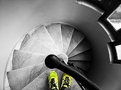
The composition is interesting, despite the slight decentralization and cutting some of the "bars". Evidently in order to frame at least one of the frescoes caged you had to move.
Complimenti per la mano ferma (o per lo stabilizzatore)!
La foto è difficile da rendere in bianco e nero, per i riflessi e tutto. In particolare perché ho l'impressione che la base di partenza siano colori tenui e slavati.
Anche a causa di questo il risultato è un poco confuso, niente che non si possa mettere a posto con un poco di acrobazie in PP.
La composizione è interessante, nonostante il leggero decentramento e taglio di alcune delle "sbarre". Evidentemente per poter inquadrare almeno uno degli affreschi ingabbiato hai dovuto spostarti.
|
| sent on February 27, 2017 (21:23) | This comment has been automatically translated (show/hide original)
0.6 sec free hand ??? Well ... the compo I'm not crazy. But ... I find it confusing. There is a point of interest that t take his eyes. Ok play on geometry and symmetry ... but I miss sth. The b / n is everything and done well I would say. Larger sure nn is micromossa? Hello. Nico 0.6 sec a mano libera??? Mah... la compo non mi fa impazzire. Anzi... la trovo confusa. Non c è un punto di interesse che t prende lo sguardo. Ok giocare sulla geometria e simmetria... ma mi manca qlc. Il b/n c è tutto e fatto bene direi. Ingrandita sicuro nn sia micromossa? Ciao. Nico |
| sent on February 27, 2017 (21:31) | This comment has been automatically translated (show/hide original)
I do not know .... I do not know the deciphering
The b / n for me is good but the rest does not convince me at all
The look I is not captured by anything I think for me a bit 'of confusion
Hello Massimiliano Non so....non la so decifrare
Il b/n per me è buono ma il resto non mi convince affatto
Lo sguardo non mi viene catturato da niente credo per me un po' di confusione
Ciao Massimiliano |
| sent on February 27, 2017 (21:32) | This comment has been automatically translated (show/hide original)
Thanks @Tonysuper and @Nico for passage. Enlarging a slight shake-you see, but I had no basis on which to support.
Thanks also to @Massimiliano Grazie @Tonysuper e @Nico per il passaggio. Ingrandendo un leggero micromosso si vede, ma non avevo nessuna base su cui fare appoggio.
Grazie anche a @Massimiliano |
| sent on February 27, 2017 (21:43) | This comment has been automatically translated (show/hide original)
Shooting at 0.6 seconds freehand and the slight shake-I would say, however good, there would not have succeeded! :-D
The points that capture the attention of my eye were the bottom image, and the whole figure on the right. Then I try the whole figure on the left and see it cut, and I block them, I do not find symmetry and the title and the picture lose the initial force. Maybe it would have been impossible but those two figures were at least shown both whole. A greeting Lo scatto a 0.6 secondi a mano libera e il leggero micromosso mi farebbero dire comunque bravo, io non ci sarei riuscito!
I punti che catturano l'attenzione del mio sguardo sono stati la statua in basso e la figura intera sulla destra. Poi cerco la figura intera sulla sinistra e la vedo tagliata e li mi blocco, non trovo simmetria e il titolo e la foto perdono la forza iniziale. Magari sarebbe stato impossibile ma quelle due figure andavano quanto meno mostrate entrambe intere. Un saluto |
| sent on February 27, 2017 (22:08) | This comment has been automatically translated (show/hide original)
I was not crazy it for composing it from a technical point of view. And if the subject is the underlying statue because of the crushed perspective it is not readable. Hail Non mi fa impazzire ne per la composizione ne dal punto di vista tecnico. E se il soggetto è la statua sottostante per via della prospettiva schiacciate non è leggibile. Ti saluto |
| sent on February 27, 2017 (22:52) | This comment has been automatically translated (show/hide original)
Symmetries are the location as well the Juventus I find it good.
However for me it is a little too full, missing a stronger point of interest that catches the eye ;-)
Le simmetrie ci sono la location pure il bianconero lo trovo buono.
Tuttavia per me è un po troppo piena, manca un punto di interesse più forte che catturi l'occhio
|
| sent on February 28, 2017 (6:01) | This comment has been automatically translated (show/hide original)
Excellent symmetry and framing, the bn find it gray, maybe it's not even the kind of photos from bn, also Anyway I would understand if the intent was the geometry, or bring out what is within you, here is my opinion in bn, makes the composition more confusing ;-) Ottime simmetria ed inquadratura, il bn lo trovo grigio, magari non è nemmeno il tipo di foto da bn, inoltre Comunque vorrei capire se l intento era la geometria oppure far risaltare ciò che vi sta dentro, ecco secondo me in bn, rende la composizione più confusionaria |
user39791 | sent on February 28, 2017 (8:14) | This comment has been automatically translated (show/hide original)
The perspective is interesting as the play of lines, too bad for one of the top two figures cut in half. La prospettiva è interessante come il gioco di linee, peccato per una delle due figure in alto tagliata a metà. |
| sent on February 28, 2017 (19:21) | This comment has been automatically translated (show/hide original)
Hello Ronky! On the black and white each one seems to have an idea, I see that you're forming it a your own, I would not judge it negatively, perhaps it is the structure that does not lend itself to interpretation? Technically I did not know how and by what extent take it, I think you had objectively difficult to photograph and my applause for your steady hand is required. In short, you've got yourself a pretty tough nuts to crack, simple mica photograph this place :-) Ciao Ronky! Sul bianco e nero ognuno pare avere una sua idea, vedo che tu ne stai formando una per conto tuo, non mi sento di giudicarla negativamente, forse è la struttura che non si presta all'interpretazione? Tecnicamente non avrei saputo come e da che punto riprenderla, mi pare tu abbia avuto oggettivamente difficoltà nel fotografare ed il mio plauso per la tua mano ferma è obbligatorio. Insomma, ti sei preso una bella gatta da pelare, mica semplice fotografare in questo posto  |
| sent on February 28, 2017 (20:02) | This comment has been automatically translated (show/hide original)
I agree with what was said by Nico, the PDR and BW are concerned, unfortunately I can not find a point of interest, something that characterizes shooting.
David Mi trovo d'accordo con quanto detto da Nico, il PDR e il BW sono interessati, purtroppo non riesco a trovare un punto d'interesse, qualcosa che caratterizzi lo scatto.
Davide |
| sent on February 28, 2017 (20:29) | This comment has been automatically translated (show/hide original)
Thank you all for the transition and for opinions. They are the first developments in bn and I think I understand that a picture chromatically "flat" does not lend itself to this type of construction. The initial miointento was to try and fit the two heads of the frescoes in the tips of the triangles, but there was no way. Grazie a tutti per il passaggio e per i pareri. Sono i primi sviluppi in bn e penso di aver capito che un'immagine cromaticamente "piatta" mal si presta a questo tipo di realizzazione. Il miointento iniziale era quello di far stare le due teste degli affreschi nelle punte dei triangoli, ma non c'è stato verso. |
| sent on February 28, 2017 (23:34) | This comment has been automatically translated (show/hide original)
The specific shot I like, instead development and light are far too dishes, I would try a post a little 'more' aggressive .... L inquadratura particolare mi piace, invece sviluppo e luce sono decisamente troppo piatti, proverei una post un po' piu' aggressiva.... |
| sent on March 01, 2017 (15:04) | This comment has been automatically translated (show/hide original)
The metal structure very disturbing, and the look is not captured by a specified entity.
The b / n is OK but a bit 'flat. Congratulations on your hand steady. La struttura metallica disturba molto, e lo sguardo non viene catturato da un soggetto specifico.
Il b/n è discreto, ma un po' piatto. Complimenti per la mano ferma. |
| sent on March 01, 2017 (21:45) | This comment has been automatically translated (show/hide original)
Thanks @Andrea and @Alexmi
Grazie @Andrea e @Alexmi
|
|

Publish your advertisement on JuzaPhoto (info) |


 JuzaPhoto contains affiliate links from Amazon and Ebay and JuzaPhoto earn a commission in case of purchase through affiliate links.


 21.6 MEGAPIXEL
 Resize to fit window