What do you think about this photo?Do you have questions or curiosities about this image? Do you want to ask something to the author, give him suggestions for improvement, or congratulate for a photo that you really like?
You can do it by joining JuzaPhoto, it is easy and free!
There is more: by registering you can create your personal page, publish photos, receive comments and you can use all the features of JuzaPhoto. With more than 242000 members, there is space for everyone, from the beginner to the professional.
| sent on May 23, 2017 (13:49) | This comment has been automatically translated (show/hide original)
I remember a photo I proposed a few months ago, for which I was criticized for the looks in the room.
Here is just this beautiful one.
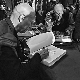
The picture is beautiful, the subject is interesting and bizarre at the right point (who knows why it is barefoot).
I would get a vertical with him alone, "cleaning it" from all the elements of disturbance, in a more decisive b / n.
This is my proposal: www.dropbox.com/s/b0q4qwdi7ffbhsu/fisarmonica.jpg?dl=0 Ricordo una mia foto proposta qualche mese addietro, per la quale venni criticato per gli sguardi in camera.
Qui è proprio questo il bello.
La foto è bella, il soggetto è interessante e bizzarro al punto giusto (chissà perché è scalzo).
Ne ricaverei una verticale con lui solo, "pulendola" da tutti gli elementi di disturbo, in un b/n più deciso.
Questa la mia proposta: www.dropbox.com/s/b0q4qwdi7ffbhsu/fisarmonica.jpg?dl=0 |
| sent on May 23, 2017 (14:10) | This comment has been automatically translated (show/hide original)
Thanks to Riccardo the lack of "cleaning" was my choice to not make the photo the classic instant with the subject looking into the room. It's barefoot because it's part of the character that impersonates the musician .... Grazie Riccardo la mancanza di "pulizia" è stata una mia scelta proprio per non rendere la foto la classica istantanea con il soggetto che guarda in camera. È scalzo perché fa parte del personaggio che impersonifica il musicista.... |
| sent on May 23, 2017 (15:21) | This comment has been automatically translated (show/hide original)
Very nice indeed I would also trim the photo but leave the bw as it is. Molto bella effettivamente anche io ritaglierei la foto ma lascerei il bw così come è. |
user90373 | sent on May 23, 2017 (16:17) | This comment has been automatically translated (show/hide original)
A cut above, on the separate level, and one on the left, to eliminate the "half girl" I would see them right. For the rest it seems the shot made to a friend during the staging of a show. :-) Un taglietto sopra, a livello separè, e uno a sx, per eliminare la "mezza ragazza" ce li vedrei proprio. Per il resto sembra lo scatto fatto ad un'amico durante le prove per la messa in scena di uno spettacolo.  |
| sent on May 23, 2017 (17:57) | This comment has been automatically translated (show/hide original)
Thanks Absolute for the passage Grazie Omsitore per il passaggio |
user117231 | sent on May 23, 2017 (20:54) | This comment has been automatically translated (show/hide original)
Why leave a half-cut biped on the edge? ;-) Perchè lasciare sul bordo un bipede tagliato a metà ?  |
| sent on May 23, 2017 (21:11) | This comment has been automatically translated (show/hide original)
The look catches at the right point but is the contour that in my opinion does not work ... it took a longer focal length and a nice close-up, the perfect bianconero as it is ;-) Lo sguardo cattura al punto giusto ma è il contorno che secondo me non funziona...ci voleva una focale più lunga ed un bel primo piano, il bianconero perfetto così com'è |
| sent on May 23, 2017 (21:13) | This comment has been automatically translated (show/hide original)
I saw the cut by you maybe because I'm looking at it on my cellphone does not tell me anything. If I zoom in and take the superfluous zoom on the subject becomes very interesting and I really like it very much. Then try even to see it with vertical cut and zoom on the subject. Let me know Vista con il taglio da te proposto forse perché la sto visionando sul cellulare non mi dice nulla. Se ingrandisco e tolgo il superfluo zoomando sul soggetto diventa molto interessante e addirittura mi piace molto. Quindi prova magari a vederla anche tu con taglio verticale e zoom sul soggetto. Fammi sapere |
| sent on May 23, 2017 (21:18) | This comment has been automatically translated (show/hide original)
The picture is very beautiful, both for subject and for bw output. I would cut the girl on the left that creates disorder and I would add some grain to make it more "dirty". La foto è molto bella, sia per il soggetto che per il viraggio in bw. Avrei tagliato la ragazza a sinistra che crea disturbo e avrei aggiunto un po' di grana per renderla più "sporca". |
user72446 | sent on May 24, 2017 (8:51) | This comment has been automatically translated (show/hide original)
I like the picture, I would delete the person on the right, nice picture cmq Mi piace la foto, avrei eliminato la persona sulla destra, cmq bella foto |
| sent on May 24, 2017 (12:03) | This comment has been automatically translated (show/hide original)
It is a nice moment and black and white is beautiful too. In my opinion, two words describing why barefoot would be helpful to better understand the context.
As for the composition I agree to cut off the girl on the left, while the other elements frame. E' un bel momento colto ed è bello anche il bianco e nero, secondo me due parole in descrizione sul perché fosse scalzo sarebbero di aiuto per capire meglio il contesto.
Per quanto riguarda la composizione concordo sul tagliare via la ragazza sulla sinistra, mentre gli altri elementi fanno da cornice. |
| sent on May 24, 2017 (20:18) | This comment has been automatically translated (show/hide original)
I like the b / n but it does not convince me all that's around the protagonist. Maybe a cut can help ... but I'm not sure. Unfortunately, even the background is not the best but here the blame is not yours ... let's say, however, the photo is ruining you a bit. Mi piace il b/n ma non mi convince tutto quello che c'è intorno al protagonista. Forse un taglio può aiutare...ma non sono sicuro. Purtroppo anche lo sfondo non è dei migliori ma qui la colpa non è tua...diciamo che però ti rovina un po' la foto. |
| sent on May 24, 2017 (22:10) | This comment has been automatically translated (show/hide original)
There seems to be too much stuff.
I see it well with square cut, to include in the right corner the lectern and the faded chest.
Black and white looks so good in my opinion. Mi sembra ci sia davvero troppa roba.
La vedo bene con taglio quadrato, ad includere nell'angolo destro il leggio e la cassa sfocati.
Il bianco e nero va benissimo così secondo me. |
| sent on May 25, 2017 (13:26) | This comment has been automatically translated (show/hide original)
Thanks to all of us for valuable tips. I cut the half figure on the left and up a bit, completely clearing the scene would mean completely decontesturing the photo. Here is the result:
www.juzaphoto.com/galleria.php?l=it&t=2352024 Grazie a tutti per i vs preziosi suggerimenti. Ho tagliato la mezza figura sulla sx e un po' in alto, ripulire completamente la scena vorrebbe dire decontestualizzare completamente la foto. Ecco il risultato:
www.juzaphoto.com/galleria.php?l=it&t=2352024 |
| sent on May 25, 2017 (21:45) | This comment has been automatically translated (show/hide original)
Bravo Riccardo a great shot, nice b / n
The "superfluous" I like, makes the picture much more interesting in my opinion
Hi Massimiliano Bravo Riccardo un ottimo scatto, bello il b/n
Il "superfluo" a me piace, rende a mio parere la foto molto più interessante
Ciao Massimiliano |
| sent on May 25, 2017 (21:53) | This comment has been translated
Thanks Massimiliano |
| sent on May 26, 2017 (11:32) | This comment has been automatically translated (show/hide original)
Hi Riccardo, I basically agree with your Melzi name :-) a cut would have benefited, especially the right one ... for black and white there is no match, but I like them now, or at least I'm pushing in That direction. I notice a certain "smoothing" in the body as the cause of an aggressive denoise .... possible? regards
Ciao Riccardo, concordo sostanzialmente col tuo omonimo Melzi un taglio avrebbe giovato, soprattutto la prte destra...per il bianco e nero manca un filino di contrasto, ma io ora le gradisco più contrastate, o almeno io mi sto spingendo in quella direzione. Noto una certa "levigatura" nel corpo, come causa di un denoise aggressivo.... possibile? saluti
|
| sent on May 26, 2017 (23:32) | This comment has been automatically translated (show/hide original)
The new version is certainly preferable but I do not consider it a good shot because of the many elements of disturbance .... Sicuramente preferibile la versione rifatta ma comunque non lo ritengo uno scatto buono a causa dei molti elementi di disturbo presenti.... |
| sent on May 27, 2017 (10:31) | This comment has been automatically translated (show/hide original)
Hi Adriidra thank you for the comment, what is the reason for the denoise used to reduce the grain. Ciao Adriidra grazie per il commento, quai ragione sul denoise utilizzato per ridurre la grana. |
| sent on May 27, 2017 (10:31) | This comment has been translated
Thanks Andrea |
|

Publish your advertisement on JuzaPhoto (info) |


 JuzaPhoto contains affiliate links from Amazon and Ebay and JuzaPhoto earn a commission in case of purchase through affiliate links.


 13.6 MEGAPIXEL
 Resize to fit window