What do you think about this photo?Do you have questions or curiosities about this image? Do you want to ask something to the author, give him suggestions for improvement, or congratulate for a photo that you really like?
You can do it by joining JuzaPhoto, it is easy and free!
There is more: by registering you can create your personal page, publish photos, receive comments and you can use all the features of JuzaPhoto. With more than 242000 members, there is space for everyone, from the beginner to the professional.
| sent on July 08, 2016 (18:47) | This comment has been automatically translated (show/hide original)
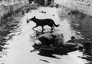
Bella, the converging lines capture and lead the eye and b / n is very well done. I would have preferred that the neon fall exactly perpendicular, symmetry benefited from it. But these are details. Beautiful. Bella, le linee convergenti catturano e guidano lo sguardo e il b/n è molto ben realizzato. Avrei preferito che il neon cadesse esattamente perpendicolare, la simmetria se ne sarebbe giovata. Ma sono dettagli. Bella. |
| sent on July 08, 2016 (19:07) | This comment has been translated
Thanks Riccardo ! |
| sent on July 08, 2016 (20:46) | This comment has been automatically translated (show/hide original)
technically well crafted photography, black white on the road excellent, overall good image.
I would rather slow tempos to give dynamism, but are subjective opinions. Fotografia tecnicamente ben realizzata,bianco nero sulla strada ottima,nel complesso buona immagine.
Avrei preferito tempi lenti per dare dinamicità,ma sono pareri soggettivi. |
| sent on July 08, 2016 (21:04) | This comment has been automatically translated (show/hide original)
I share the thought of filter ... with slow times he might have been a plus, but the compo and the b / n management are really good ... I really like the geometry Condivido il pensiero di filtro...con tempi lenti avrebbe avuto forse una marcia in piu, ma la compo e la gestione del b/n sono veramente ottimi...mi piace veramente molto la geometria |
| sent on July 08, 2016 (21:48) | This comment has been automatically translated (show/hide original)
nice pezzo.Marco bel pezzo.Marco |
| sent on July 08, 2016 (22:05) | This comment has been automatically translated (show/hide original)
well crafted pictures, I agree with Filter concerning times longer ;-) Foto ben realizzata, concordo con Filtro riguardo i tempi lunghi  |
user33434 | sent on July 08, 2016 (22:19) | This comment has been automatically translated (show/hide original)
Beautiful perspective and symmetry breaking in the right places, I agree with the long time but it depends on what you're telling. I do not find satisfying black and white for that which I interpret as a tonal range in my view too narrow, gray ranging from the average up to pure white, deep black is the only indication that, however, I think in this case has function alienating, resulting in the end as a factor that weighs down the scene. As a whole however, I like Bella prospettiva e simmetria che si rompe nei punti giusti, concordo con il tempo lungo ma dipende da cosa stai raccontando. Non trovo appagante il bianco e nero per quella che interpreto come una gamma tonale a mio avviso troppo stretta, i grigi vanno da quello medio fino al bianco puro, l'unico nero profondo è quello dell'indicazione che però credo in questo caso abbia funzione straniante, risultando alla fine come elemento che appesantisce la scena. Nel suo complesso comunque mi piace |
| sent on July 08, 2016 (23:25) | This comment has been automatically translated (show/hide original)
Wow, so many good comments, many good ideas ... Interesting the speech of a long time, to give dynamism, I've just crossed my mind. head.
I took almost unprepared as I was to get myself on the same scale and have sought above all the symmetries and depth that I immediately jumped to the eye.
Thank you all! Wow, tanti bei commenti, tante buone idee... Interessante il discorso dei tempi lunghi, per dare dinamicità, non mi è proprio passato per la testa. testa.
Ho scattato quasi impreparato mentre stavo per salire anch'io sulla stessa scala ed ho cercato soprattutto le simmetrie e la profondità che mi sono subito balzate all'occhio.
Grazie a tutti! |
| sent on July 08, 2016 (23:30) | This comment has been automatically translated (show/hide original)
Definitely a great shot. As already suggested a long time with people moves would give more dynamism to the scene. I am not convinced of the entire board at the top right which is quite cumbersome and out of tune with the tunnel geometries. Sicuramente un ottimo scatto. Come già suggerito un tempo lungo con persone mosse avrebbe dato maggiore dinamismo alla scena. Non mi convince del tutto il tabellone in alto a destra che è abbastanza ingombrante e stona con le geometrie del tunnel. |
| sent on July 09, 2016 (0:50) | This comment has been automatically translated (show/hide original)
I would have avoided the sign at the top right, I understood all the stairs (you'd probably be able to avoid the board) and I would have used a longer time.
Just b / n, the real difficulty would be in color, but with semi-neon lights would be more fascinating? Slightly move and "plasticky". Avrei evitato il cartello in alto a destra, avrei compreso tutte le scale (probabilmente saresti riuscito ad evitare il tabellone) ed avrei utilizzato un tempo più lungo.
Giusto il b/n, la vera difficoltà sarebbe stata a colori, ma con le luci semi-neon sarebbe stata più affascinante? Lievemente mossa e "plasticosa". |
| sent on July 09, 2016 (8:47) | This comment has been automatically translated (show/hide original)
Hello picture itself tells me just ... if I look at the technique seems to me the sign performed excellently as I said it could not be ruled out? Or understand it all ?? Ciao la foto di per se mi dice poco...se guardo alla tecnica mi sembra ottimamente eseguita il cartello come gia detto non poteva essere escluso?oppure comprenderlo tutto?? |
| sent on July 09, 2016 (9:35) | This comment has been automatically translated (show/hide original)
development at Juventus I find it very good.
I love the choice of focal and I also like that you have stopped the subjects with a short time.
I do not like the composition, the lower part is symmetrical, balanced, interesting, dynamic, three-dimensional.
The upper part is annoying as well as unnecessary.
as suggested I would have taken a step forward by removing the frame luminaire and luminous sign.
doing so would have sacrificed the lines to the left and right margins, but you would have gotten a composition in my cleaner and interesting view. lo sviluppo in bianconero lo trovo ottimo.
mi piace molto la scelta della focale e mi piace anche che tu abbia fermato i soggetti con un tempo breve.
non mi piace la composizione.
la parte bassa è simmetrica, bilanciata, interessante, dinamica, tridimensionale.
la parte alta è fastidiosa oltre che inutile.
come suggerito avrei fatto un passo avanti togliendo dall'inquadratura corpo illuminante e cartello luminoso.
così facendo avresti sacrificato le linee ai margini sinistro e destro ma avresti ottenuto una composizione a mio avviso più pulita e interessante. |
| sent on July 09, 2016 (10:53) | This comment has been automatically translated (show/hide original)
In my opinion difficult to imagine a more narrow composition to prevent and neon sign, he would consequently suffered the concrete arch that with signs of reinforcing plates give a sense of depth. Of course, in my personal opinion. Difficile a mio parere immaginare una composizione più stretta per evitare cartello e neon,ne avrebbe conseguentemente patito l'arcata di cemento che con i segni delle tavole d'armatura danno un senso di profondità. Ovviamente a mio personale parere. |
| sent on July 09, 2016 (11:18) | This comment has been automatically translated (show/hide original)
Conversion in excellent and technically well-made black and white.
As previously stated by Daniele I too would have eliminated the frame the luminaire and the luminous sign. Conversione in bianco e nero ottima e tecnicamente ben realizzata.
Come detto in precedenza da Daniele anch'io avrei eliminato dall'inquadratura il corpo illuminante e il cartello luminoso. |
| sent on July 09, 2016 (12:12) | This comment has been automatically translated (show/hide original)
Closing the iris, I think you'd have a greater depth of field. The ISO too high ever leave me puzzled, but it is an idea of ??my own! I agree with Mauro on the gray scale that I tried to dynamize. In shooting complex it is pleasant and the sign in the upper right places him directly in Vienna! Chiudendo di più il diaframma, penso che avresti avuto una maggiore profondità di campo. Gli iso troppo alti mi lasciano sempre perplessa, ma è un'idea tutta mia! Concordo con Mauro sulla scala di grigi che avrei cercato di dinamicizzare. Nel complesso lo scatto è gradevole ed il cartello in alto a destra lo colloca direttamente a Vienna! |
user81257 | sent on July 09, 2016 (12:14) | This comment has been automatically translated (show/hide original)
Without reading the other comments:
I like a casino management of black and white, very good, contrasty and bright as it should.
A shot like that I would see it perfectly symmetrical, here's something that does not make me do this symmetry, perhaps the light beam at the top and I think his being unbalanced.
You entered in the shot the sign: There is also, I would have ruled, I framed nearest the stairs, but that's okay, makes it particularly.
So yes, I like it. Senza leggere gli altri commenti:
mi piace un casino la gestione del bianco e nero, molto bravo, contrastata e luminosa come dovrebbe.
Uno scatto del genere lo vedrei perfettamente simmetrico, qui c'è qualche cosa che non mi fa vedere questa simmetria, forse il fascio di luce in alto che penso proprio essere sbilanciato.
Hai inserito nello scatto il cartello: ci sta anche, io l'avrei escluso, avrei inquadrato da più vicino le scale, ma anche così va bene, lo rende particolare.
Quindi si, mi piace. |
| sent on July 10, 2016 (12:53) | This comment has been automatically translated (show/hide original)
This I like, hello Andrea. Questa mi piace, ciao Andrea. |
| sent on July 10, 2016 (13:30) | This comment has been automatically translated (show/hide original)
Beautiful composition, a show
sharpness fantastic
Compliments
Fonzie Bella composizione, uno spettacolo
Nitidezza fantastica
Complimenti
Fonzie |
| sent on July 10, 2016 (14:52) | This comment has been automatically translated (show/hide original)
Nice I like it; compo, gestone lines BN a representation of life ... "which is made to those who go down stairs and people going up"
enry Bella mi piace; compo, linee gestone del BN una rappresentazione della vita ..." che è fatta a scale chi scende e chi sale "
Enry |
| sent on July 12, 2016 (17:38) | This comment has been automatically translated (show/hide original)
thank you all for the nice comments and constructive criticism are always welcome !!! grazie a tutti per i bei commenti e per le critiche costruttive che sono sempre benvenute !!! |
|

Publish your advertisement on JuzaPhoto (info) |


 JuzaPhoto contains affiliate links from Amazon and Ebay and JuzaPhoto earn a commission in case of purchase through affiliate links.


 15.7 MEGAPIXEL
 Resize to fit window