What do you think about this photo?Do you have questions or curiosities about this image? Do you want to ask something to the author, give him suggestions for improvement, or congratulate for a photo that you really like?
You can do it by joining JuzaPhoto, it is easy and free!
There is more: by registering you can create your personal page, publish photos, receive comments and you can use all the features of JuzaPhoto. With more than 242000 members, there is space for everyone, from the beginner to the professional.
user81257 | sent on May 05, 2016 (9:40) | This comment has been automatically translated (show/hide original)
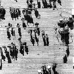
Oh yes, very confusing :-D
The vertical cut is good for us, the composition is good.
But they do not convince the lights and shadows. In the sense, the sky is probably burned. In a BN release it is also there, but if we find just below a fully black area, then I will create a contrast sometimes too incisive.
Many signs are dark, almost not to read the ideograms present.
I would have played better with the lights and shadows, closing the first and opening the second.
MC. Eh si, molto confusionaria 
Il taglio verticale ci sta bene, la composizione è buona.
Però non mi convincono le luci e le ombre. Nel senso, il cielo probabilmente è bruciato. In uno scatto BN ci sta anche, ma se subito sotto troviamo una zona completamente nera, allora mi si crea un contrasto a volte troppo incisivo.
Molte insegne sono scure, quasi da non far leggere gli ideogrammi presenti.
Avrei giocato meglio con le luci e le ombre, chiudendo le prime e aprendo le secondo.
MC. |
| sent on May 05, 2016 (14:24) | This comment has been automatically translated (show/hide original)
Hello Walter, I think it is a great b & n, the confusion is the point readable forteeeee between the lights and shadows, the vertical cut like, congratulations 8-)
Claudio C Ciao Walter , lo ritengo un ottimo b&n , la confusione è il punto forteeeee leggibile tra le luci e le ombre , il taglio verticale mi piace , complimenti 
Claudio C |
| sent on May 06, 2016 (1:00) | This comment has been automatically translated (show/hide original)
It makes good 'idea of ??chaos, resulting in rejection or attraction. A cross section d 'Orient. Rende bene il' idea del caos, con il conseguente rigetto o attrazione. Uno spaccato d' oriente. |
| sent on May 06, 2016 (11:34) | This comment has been automatically translated (show/hide original)
Thank you all first.
Lights and shadows are determined and marked given the strong backlight, close the lights on the BN seems to me a shame, let's leave them white and burnt, inconsistent with the blacks, this I always say. The blacks you're not wrong, open and lighten avreebbe made more readable signs. Regarding the cross-section of the East Thank Wladimiro to which I say that is not very good shooting to make the atmosphere of the place.
A greeting,
Walter
Grazie a tutti innanzitutto.
Luci e ombre sono deciso e marcati dato il forte controluce, chiudere le luci sul BN mi sembra un peccato, lasciamole bianche e bruciate, contrasteranno con i neri, questo mi dico sempre. Sui neri non hai torto, aprire e schiarire avreebbe reso più leggibili le insegne. Riguardo lo spaccato d'oriente ringrazio Wladimiro al quale dico che non è molto buono lo scatto per rendere l'atmosfera del posto.
Un saluto,
Walter
|
| sent on May 06, 2016 (11:51) | This comment has been automatically translated (show/hide original)
Beautiful pictures as mentioned above blacks perhaps excessive, especially on the left, are likely to make the picture difficult to read. Nevertheless it gives an idea of ??the confusion of these metropolises.
hello 8-) Bella foto come detto sopra i neri forse eccessivi, specialmente a sinistra, rischiano di rendere difficile la lettura della foto. Comunque rende l'idea della confusione di queste metropoli.
ciao |
| sent on May 06, 2016 (14:19) | This comment has been automatically translated (show/hide original)
Thanks Matthew.
A greeting,
Walter Grazie Matteo.
Un saluto,
Walter |
| sent on May 09, 2016 (14:49) | This comment has been automatically translated (show/hide original)
the composition according to me it is fine, I like the content of the picture and how it was framed.
what I do not like is the black and white. the contrast so marked, but especially so many details in a part of the frame throughout underexposed makes you never want to look after 2 seconds, losing totally intresse.
I think you could get a lot more with a more careful management of shades. la composizione secondo me va benissimo così, mi piace il contenuto della foto e come è stato inquadrato.
quello che non mi piace è il bianconero. il contrasto così marcato, ma soprattutto così tanti dettagli in una parte del fotogramma tutta sottoesposta ti fa passare la voglia di guardarla dopo 2 secondi, perdendo totalmente intresse.
secondo me potevi ottenere molto di più con una più curata gestione delle tonalità. |
| sent on May 09, 2016 (21:29) | This comment has been automatically translated (show/hide original)
Thanks again Daniel,
What do you mean by accurate tonal management? There was not much to play in my opinion, the contrast and the harsh light were part of reality.
If you feel like you around the raw and make me a concrete example, so to understand.
A greeting,
Walter Grazie ancora Daniele,
Cosa intendi per accurata gestione delle tonalità ? Non c'era molto da giocare a mio avviso, il contrasto e la luce dura erano parte della realtà.
Se ti va ti giro il raw e mi fai un esempio concreto, così per capire.
Un saluto,
Walter |
| sent on May 10, 2016 (8:10) | This comment has been automatically translated (show/hide original)
Certainly, he runs well. Certamente, gira pure. |
| sent on May 10, 2016 (22:00) | This comment has been automatically translated (show/hide original)
Give me an email and I'll get right in MP.
Hello,
Walter Dammi una email in MP e faccio subito.
Ciao,
Walter |
|

Publish your advertisement on JuzaPhoto (info) |


 JuzaPhoto contains affiliate links from Amazon and Ebay and JuzaPhoto earn a commission in case of purchase through affiliate links.


 10.9 MEGAPIXEL
 Resize to fit window