What do you think about this photo?Do you have questions or curiosities about this image? Do you want to ask something to the author, give him suggestions for improvement, or congratulate for a photo that you really like?
You can do it by joining JuzaPhoto, it is easy and free!
There is more: by registering you can create your personal page, publish photos, receive comments and you can use all the features of JuzaPhoto. With more than 242000 members, there is space for everyone, from the beginner to the professional.
user16612 | sent on May 11, 2015 (15:28) | This comment has been automatically translated (show/hide original)
Ok, these I've seen. Look, I think in this series should not be two things:
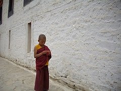
1 the resume point: it would be more interesting (according to me, eh? ;-)) If you were turned down. At eye boy he is sitting, so to speak. The arches would give a greater sense of majesty and frame-scene.
2 It would be interesting to see the histogram. When you work in b / n would be good if it were no peaks and the largest possible both to the right and towards the left. In other words it is a photo that lacks contrast, too many details are lost in too much light or too much shade. And it is a bit 'washed out.
How do you proceed to tack exactly b / w? Ok, queste le ho già viste. Guarda, secondo me in questa serie non vanno due cose:
1 il punto di ripresa: sarebbe stato più interessante (sempre secondo me, eh?  ) se ti fossi abbassato. All'altezza degli occhi del ragazzo seduto, per intenderci. Gli archi avrebbero dato un maggior senso di maestosità e di incorniciamento della scena. ) se ti fossi abbassato. All'altezza degli occhi del ragazzo seduto, per intenderci. Gli archi avrebbero dato un maggior senso di maestosità e di incorniciamento della scena.
2 Sarebbe interessante vedere l'istogramma. Quando lavori in b/n sarebbe bene che fosse senza picchi e il più esteso possibile sia verso destra sia verso sinistra. In altre parole è una foto che manca di contrasto, troppi dettagli si perdono nella troppa luce o nella troppa ombra. Ed è un po' slavata.
Come procedi esattamente per virare in b/n? |
| sent on May 11, 2015 (15:53) | This comment has been automatically translated (show/hide original)
Do not use a process in postproduction. Use the settings from the camera; excluding however the automatic. Then I try to post to vary contrast, brightness etc. etc. Non uso un processo in postproduzione. Uso direttamente le impostazioni della macchina fotografica; escludendo comunque l'automatico. Poi cerco in post di variare contrasti, luminosità etc. etc. |
user16612 | sent on May 11, 2015 (16:00) | This comment has been automatically translated (show/hide original)
Then I suggest you do not delegate to the machine. Take pure color, but raw. From there you can get much more beautiful monochrome images. But much, eh? ;-) Allora ti suggerisco di non delegare alla macchina. Scatta pure a colori, ma in formato raw. Da lì puoi ottenere immagini monocromatiche molto più belle. Ma molto, eh? |
user16612 | sent on May 11, 2015 (16:28) | This comment has been automatically translated (show/hide original)
Begins, do not be afraid. You'll see that the results will be better. Comincia, non aver paura. Vedrai che i risultati saranno migliori. |
|

Publish your advertisement on JuzaPhoto (info) |


 JuzaPhoto contains affiliate links from Amazon and Ebay and JuzaPhoto earn a commission in case of purchase through affiliate links.


 16.1 MEGAPIXEL
 Resize to fit window