What do you think about this photo?Do you have questions or curiosities about this image? Do you want to ask something to the author, give him suggestions for improvement, or congratulate for a photo that you really like?
You can do it by joining JuzaPhoto, it is easy and free!
There is more: by registering you can create your personal page, publish photos, receive comments and you can use all the features of JuzaPhoto. With more than 253000 members, there is space for everyone, from the beginner to the professional.
| sent on November 29, 2014 (0:00) | This comment has been automatically translated (show/hide original)
I like the composition of this, a little '"Fountain Style". Above the regularity of the trees with their reflection and below, in perfect symmetry, the gem of the wing of a gate (I hope they are; to see them so it seems) that razor sharp, for as I see it, are also the main subject. I find defects? Well ... If I could venture to say that I find little color, but it is also true that if the sky is gray flat and uniform graying everything else, is not that we can do much ... Everything this is to say that I like.
Mirko Di questa mi piace la composizione, un po' "Fontana Style". Sopra la regolarità degli alberi con il loro riflesso e sotto, in perfetta simmetria, la chicca dei battenti di un cancello (spero lo siano; a vederli così si direbbe) nitidissimi che, per come la vedo io, sono poi il soggetto principale. Ci trovo dei difetti? Mah... Se proprio devo potrei azzardare a dire che ci trovo poco colore, però è anche vero che se il cielo è di un grigio piatto e uniforme ingrigisce anche tutto il resto, non è che ci si possa fare molto... Tutto questo per dire che mi piace.
Mirko |
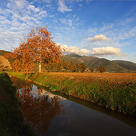
user46920 | sent on November 29, 2014 (1:30) | This comment has been automatically translated (show/hide original)
This, as the fifth gallery, contrast and saturation have a "weak", but I guess a possible improvement is in the frame or in anyway possible cuts during post. I would see better that way (sorry, do you place your photos to make first):
s28.postimg.org/6b43480p9/1110940.jpg
The version in B / N in my opinion does not make it, because the subject is too gray in the image (the water) Questa, come la quinta della galleria, hanno un contrasto ed una saturazione "debole", ma un possibile miglioramento mi immagino stia nell'inquadratura o comunque nel tagli possibili durante la post. Io la vedrei meglio così (scusa, ti posto la foto per far prima):
s28.postimg.org/6b43480p9/1110940.jpg
La versione in B/N secondo me non rende, perché nell'immagine il soggetto è troppo grigio (l'acqua) |
| sent on November 29, 2014 (12:15) | This comment has been automatically translated (show/hide original)
And 'the gate of the house in the first photo, taken by itself, too bad that its doors are open in the opposite direction, but I preferred not to go to correct this problem ... there was still more than a meter of water!
Yet I countered compared to RAW ... how if I countered.
Your version for my taste is too red.
E' proprio il cancello della casa nella prima foto, colto da solo, peccato che i battenti siano aperti in senso opposto, ma ho preferito non andare a correggere questo problema ... c'era ancora più di un metro d'acqua!
Eppure l'ho contrastata rispetto al RAW ... eccome se l'ho contrastata.
La tua versione per i miei gusti è troppo rossa.
|
user46920 | sent on November 30, 2014 (1:26) | This comment has been automatically translated (show/hide original)
Red ??? ... Maybe yellow-blue !!! ... But red, not me he had never told anyone:-D
... Jokes aside, you have a valid and calibrated monitor ???
the picture as you see it, improve it or not ???
Everyone has his eye, even for the proportions etc, but I tried to use my to "enhance" the situation that takes the picture.
In my opinion, it could be a subject on which you should focus. I saw your other shots (few) that seem a bit 'lacking in the "layout" of the compositions (just my point of view and I hope it will be useful;-))
Rossa ??? ... forse giallo-blu !!! ... ma rossa, non me l'aveva mai detto nessuno 
...scherzi a parte, tu hai un monitor valido e calibrato ???
l'inquadratura come la vedi, migliora la cosa o no ???
Ognuno ha il suo occhio, anche per le proporzioni ecc, però ho cercato di usare il mio per "valorizzare" la situazione che riprende l'immagine.
Secondo me, potrebbe essere un tema su cui dovresti concentrarti. Ho visto altri tuoi scatti (pochi) che mi sembrano un po' carenti nella "impaginazione" delle composizioni (è solo il mio punto di vista e spero possa essere utile  ) )
|
| sent on November 30, 2014 (14:53) | This comment has been automatically translated (show/hide original)
@ The occhiodelcigno
Red treetops, yellow on the gate.
The colors of water and gate are your best, to trees, the tops do not convince me.
The shot, perhaps, I have to think again, I'm undecided.
@L'occhiodelcigno
Rossa sulle cime degli alberi, gialla sul cancello.
I colori di acqua e cancello sono migliori i tuoi, per gli alberi le cime non mi convincono.
L'inquadratura, forse si, ci devo pensare ancora, sono indeciso.
|
user46920 | sent on November 30, 2014 (15:22) | This comment has been automatically translated (show/hide original)
Alvar, not those photos to pieces !!! ... I change the WB and saturated throughout the image without layers or masks: if the color of the gate, which reflects the light of the sun, and the water may be fine because they remember the light of the original picture, it say that even the trees were just as you have them photographed, maybe you do not remember;-)
... And then, it is only a starting point to have another point of view;-)
Come to the game of //www.juzaphoto.com/topic2.php? l = en & t = 1111116 & show = last # 4801425] post !!! :-D Alvar, non coloro a pezzi le foto !!! ... modifico il WB e saturo tutta l'immagine senza livelli o maschere: se il colore del cancello, in cui si riflette la luce del sole, e quello dell'acqua, possono andare bene perché ricordano la luce della foto originale, vuol dire che anche gli alberi erano così come li hai fotografati, magari non ricordi
... e poi, è solo uno spunto per avere un'altro punto di vista
vieni a fare il gioco della postproduzione !!! |
| sent on August 17, 2016 (14:51) | This comment has been automatically translated (show/hide original)
Beautiful and congratulations for the report! Bella e complimenti per il report! |
| sent on September 01, 2016 (11:30) | This comment has been automatically translated (show/hide original)
both versions are absolutely pleasant entrambe le versioni sono assolutamente gradevoli |
| sent on September 01, 2016 (12:30) | This comment has been automatically translated (show/hide original)
Congratulations beautiful atmosphere and great composition
Hello Complimenti bella atmosfera e ottima composizione
Ciao |
| sent on January 05, 2022 (23:02) | This comment has been translated
Beautiful! |
| sent on January 05, 2022 (23:32) | This comment has been automatically translated (show/hide original)
Thank you.
We've been busy with it since the full one.
Seven abundant years. Grazie.
Ne è passato di tempo da quella piena.
Sette anni abbondanti. |
| sent on September 11, 2023 (22:20) | This comment has been automatically translated (show/hide original)
Of a mysterious essentiality. Di una essenzialità misteriosa. |
| sent on September 11, 2023 (22:52) | This comment has been automatically translated (show/hide original)
Less is more ... I come from the drawing, where you start from a blank sheet, and "put" ONLY what you want, and I must say that I find reality limiting, with all its complications, all the "things" that get in the way and prevent me from having only "subject and background lost in nothingness". Less is more ... vengo dal disegno, dove inizi da un foglio bianco, e "ci metti" SOLO quello che vuoi, e devo dire che trovo limitante la realtà, con tutte le sue complicazioni, tutte le "cose" che si mettono in mezzo e mi impediscono di avere solo "soggetto e sfondo perso nel nulla". |
| sent on September 11, 2023 (22:57) | This comment has been automatically translated (show/hide original)
In fact, I noticed a kind of photos that you don't see every day. Very special and original. A warm greeting. Infatti ho notato un genere di foto che non capita di vedere tutti i giorni. Molto particolari e originali. Un caro saluto. |
|

Publish your advertisement on JuzaPhoto (info) |


 JuzaPhoto contains affiliate links from Amazon and Ebay and JuzaPhoto earn a commission in case of purchase through affiliate links.


 18.5 MEGAPIXEL
 Resize to fit window