What do you think about this photo?
Do you have questions or curiosities about this image? Do you want to ask something to the author, give him suggestions for improvement, or congratulate for a
photo that you really like?
You can do it by joining JuzaPhoto, it is easy and free!
There is more: by registering you can create your personal page, publish photos, receive comments and you can use all the features of JuzaPhoto.
With more than 260000members, there is space for everyone, from the beginner to the professional.
|
|
sent on 05 Luglio 2023 (18:18) | This comment has been automatically translated (show/hide original)
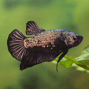
It amazes me that on 66 visits there is not even a comment, perhaps the usual strange dynamics from the forum, the photo is very nice and deserves a thorough comment.
In my opinion there is only one flaw: the light triangle at the top left. You could try, obviously it is just a suggestion, a square cut with the lines of the darkest part, the one where the bell scheme is drawn, which start from the lower corners of the square and the central head or, another alternative, place the head of the child on the anointed lower left of the golden section; I would darken the line of the girl's hair.
They are the ways in which I would see it, it is not said that you like them too but it could also be.
Hello Mi stupisce che su 66 visite non ci sia neanche un commento, forse le solite strane dinamiche da forum, la foto è molto bella e merita un commento anche approfondito.
A mio avviso c'è un solo difetto: il triangolo chiaro in alto a sinistra. Potresti provare, ovviamente è solo un consiglio, un taglio quadrato con le linee della parte più scura, quella dove è disegnato lo schema della campana, che partono dagli angoli in basso del quadrato e la testa centrale o, altra alternativa, posizionare la testa della bambina sul unto in basso a sinistra della sezione aurea; scurirei la riga dei capelli della bambina.
Sono i modi in cui io la vedrei, non è detto che piacciano anche a te ma potrebbe anche essere.
Ciao |
|
|
sent on 06 Luglio 2023 (8:06) | This comment has been automatically translated (show/hide original)
Great job, congratulations Ottimo lavoro, complimenti |
|
|
sent on 06 Luglio 2023 (19:09) | This comment has been automatically translated (show/hide original)
I agree with what is advised by "Mr. Mario", the white triangle is all too evident and takes the scene too much.
The subject and the shooting point I really like also for how you developed black and white
Congratulations
Hello
Fabrizio Condivido quanto consigliato dal "Signor Mario", il triangolo bianco è fin troppo evidente e si prende troppo la scena.
Il soggetto e il punto di ripresa mi piacciono molto anche per come hai sviluppato il bianco e nero
Complimenti
Ciao
Fabrizio |
|
|
sent on 09 Luglio 2023 (11:30) | This comment has been automatically translated (show/hide original)
In reality, the initial format was square just as Mario suggested.
Before publishing the photo, however, I preferred to restore the "original" cut that of the shot, to avoid always proposing the 1: 1 version.
I realize that that triangle (actually portion of white wall) diverts the focus from the central scene but let's say that this was an "experiment" useful to understand external opinions.
Thank you for this debate and points of reflection. In realtà il formato iniziale era quadrato proprio come suggeriva anche Mario.
Prima di pubblicare la foto però ho preferito ripristinare il taglio "originale" quello dello scatto, per evitare di proporre sempre la versione 1:1.
Mi rendo conto che quel triangolo (in realtà porzione di parete bianca) distoglie il focus dalla scena centrale ma diciamo che questo è stato un "esperimento" utile a capire anche pareri esterni.
Vi ringrazio per questo dibattito e punti di riflessione. |
|
|
sent on 09 Luglio 2023 (12:54) | This comment has been automatically translated (show/hide original)
It's always nice to have answers like yours and not beaten, offended or looking for justifications. Thank you è sempre bello avere risposte come la tua e non piccate, offese o di ricerca di giustificazioni. Grazie |
|
|
sent on 13 Luglio 2023 (17:33) | This comment has been automatically translated (show/hide original)
Thanks to you for the discussion Grazie a te per lo spunto di dibattito |
|
|
sent on 08 Settembre 2025 (11:59) | This comment has been automatically translated (show/hide original)
wonderful Lapo! meravigliosa Lapo! |
|

Publish your advertisement on JuzaPhoto (info) |


 JuzaPhoto contains affiliate links from Amazon and Ebay and JuzaPhoto earn a commission in case of purchase through affiliate links.


 Resize to fit window
 24.0 MEGAPIXEL