What do you think about this photo?Do you have questions or curiosities about this image? Do you want to ask something to the author, give him suggestions for improvement, or congratulate for a photo that you really like?
You can do it by joining JuzaPhoto, it is easy and free!
There is more: by registering you can create your personal page, publish photos, receive comments and you can use all the features of JuzaPhoto. With more than 253000 members, there is space for everyone, from the beginner to the professional.
| sent on June 22, 2025 (12:34) | This comment has been automatically translated (show/hide original)
A beautiful blade of light to highlight a sculpted body I really like congratulations Una bellissima lama di luce a risaltare un corpo scolpito mi piace molto complimenti |
| sent on June 22, 2025 (12:35) | This comment has been automatically translated (show/hide original)
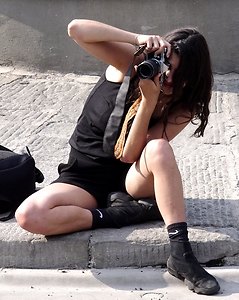
This shot in my opinion does not have enough room forward.
This can also be seen horizontally.
I understand that you wanted to keep the diagonal, but black attracts the eye like light.
Your admirers are content (so to speak) with content, but if you want to progress, you're in the middle of the crossroads.
Between light and pose and shots, you either fill or leave space.
Very good. Questo scatto secondo me non ha abbastanza spazio in avanti.
Lo si evince anche in orizzontale.
Capisco che hai voluto mantenere la diagonale, ma il nero attira lo sguardo come la luce.
I tuoi ammiratori si accontentano ( per modo di dire) dei contenuti, ma se vuoi progredire, sei nel mezzo al crocevia.
Tra la luce e posa e le inquadrature, o riempi o lasci spazio.
Molto brava. |
| sent on June 22, 2025 (12:56) | This comment has been automatically translated (show/hide original)
profiles of light that draw silhouettes - bravissima
Giordano profili di luce che disegnano silhouette- bravissima
Giordano |
| sent on June 22, 2025 (13:22) | This comment has been automatically translated (show/hide original)
Always beautiful.
A well-made black and white. Sempre bellissima.
Un bianco e nero ben realizzato. |
| sent on June 22, 2025 (13:40) | This comment has been automatically translated (show/hide original)
A top nose Un naso top |
| sent on June 22, 2025 (13:57) | This comment has been automatically translated (show/hide original)
I agree with Juan Luca, and perhaps I would have given a little light on the back part to give a shape to the whole body.
It's just a matter of personal
taste Concordo con Juan luca , è forse avrei dato un poco di luce sulla parte della schiena per dare una sagoma a tutto il corpo .
Solo questione di gusti personali
|
| sent on June 22, 2025 (14:43) | This comment has been automatically translated (show/hide original)
I like it too much as it is..... :-| a me invece piace fin troppo così com'è..... |
| sent on June 22, 2025 (15:31) | This comment has been automatically translated (show/hide original)
I suppose that the subject was photographed in a supine position on a sofa or other similar and this would be the reason why the back could not be illuminated, then the photo was shot. I agree in the criticism about the excessive imbalance between shadow and light Suppongo che il soggetto sia stato fotografato in posizione supina su un divano o altro simile e questo sarebbe il motivo per cui non si e' potuta illuminare la schiena, successivamente la foto e' stata girata. Concordo nella critica circa lo squilibrio eccessivo fra ombra e luce |
| sent on June 22, 2025 (17:49) | This comment has been automatically translated (show/hide original)
Fortunately, inspiration, imagination, taste and a sense of beauty cannot be stolen. Nice image and I agree with those who say that there is too much black "behind" but you can easily remedy it by repeating the shot by moving the subject (or rather by varying the PDR). Per fortuna l'estro, la fantasia, il gusto e il senso del bello non si possono rubare. Bella immagine e concordo con chi dice che c'è troppo nero "dietro" ma si può rimediare facilmente ripetendo lo scatto spostando il soggetto (o meglio variando il PDR). |
| sent on June 23, 2025 (1:43) | This comment has been automatically translated (show/hide original)
But exactly who determined that too much black behind is wrong?
a figure that comes out of the shadows that almost tries to hold her.
For me it's perfect like this ma esattamente chi ha stabilito che troppo nero dietro è sbagliato?
una figura che esce dall'ombra che quasi prova a trattenerla.
per me è perfetta così |
| sent on June 24, 2025 (15:31) | This comment has been automatically translated (show/hide original)
I am among those who settle 8-)
Io sono tra quelli che si accontantano
|
| sent on June 24, 2025 (17:28) | This comment has been automatically translated (show/hide original)
I agree with Juan Luca's analysis, for me the photo is unbalanced concordo con l'analisi di Juan Luca, per me la foto è sbilanciata |
| sent on June 25, 2025 (21:13) | This comment has been automatically translated (show/hide original)
“ I agree with Juan Luca's analysis, for me the photo is unbalanced „
I don't question your analysis, but I like the photo for this too. A little more space on the right would certainly have been better, also to have a better proportion of the visual rectangle. It could easily be done in
post-Sara, for this type of shots, surely Norman Tacchi's gallery will be able to give you some interesting ideas. " concordo con l'analisi di Juan Luca, per me la foto è sbilanciata"
non metto in discussione la tua analisi, ma a me la foto piace anche per questo. Un pò di spazio in più a destra sarebbe stato sicuramente meglio, anche per avere una proporzione migliore del rettangolo visivo. Si potrebbe tranquillamente fare in post-
Sara per questo tipo di scatti sicuramente la galleria di Norman Tacchi potrà darti degli spunti interessanti. |
| sent on June 25, 2025 (22:03) | This comment has been automatically translated (show/hide original)
As I write, I know that I should not underline some things, but evidently they escape most people.
First of all, what you see is not Sara, but images that she creates by taking self-portraits.
So here, we discuss her as a photographer and not her doughnuts and curves.
Is that clear?
He has undoubted skills and this is evident from the quality and if you have ever tried to take self-portraits, you would understand it even better.
If she had wanted to be a model, I think she has the skills and the same, some comments would be as useful as a sock with a hole in it.
But let's come to the analysis, space is indispensable, it is a container such as and so important of matter.
point Mentre scrivo, so che non dovrei sottolineare alcune cose, ma evidentemente sfuggono ai più.
Anzitutto quello che vedete non è Sara, ma delle immagini che lei crea facendo autoscatti.
Quindi qui, discutiamo di lei come fotografa e non dei suoi bomboloni e curve.
È chiaro?
Ha indubbie capacità e lo si evince dalla qualità e se avete mai provato a farvi autoritratti, lo capireste ancora meglio.
Se, avesse voluto fare la modella, credo che ne abbia le possibilità e lo stesso, alcuni commenti, sarebbero utili quanto un calzino bucato.
Ma veniamo alla analisi, lo spazio è indispensabile, è un contenitore quale e tanto importante della materia.
Punto |
| sent on June 26, 2025 (9:13) | This comment has been automatically translated (show/hide original)
“ But let's come to the analysis, space is indispensable, it is a container such as and so important of matter.
Punto „
no, it's only and only your opinion, PUNTO " Mentre scrivo, so che non dovrei sottolineare alcune cose, ma evidentemente sfuggono ai più.
Anzitutto quello che vedete non è Sara, ma delle immagini che lei crea facendo autoscatti.
Quindi qui, discutiamo di lei come fotografa e non dei suoi bomboloni e curve.
È chiaro?"
si commenta la foto: il fatto che sara sia contemporaneamente modella e fotografa è ininfluente, a che pro questa inutile precisazione?
" Ma veniamo alla analisi, lo spazio è indispensabile, è un contenitore quale e tanto importante della materia.
Punto"
vero, ma considerare un errore il fatto che lo spazio sia dietro e non avanti rimane solo ed unicamerne la tua opinione, PUNTO |
| sent on June 26, 2025 (9:41) | This comment has been automatically translated (show/hide original)
Alebri78.
You are the litmus test of my fears revealed.
But, I will use the simile to explain myself.
There are several self-portraits on Juza, and many nude shots, have you ever read comments on the photographer's lips? On her breasts?
Step 2.
Let's say that you have read 200 books and I have read 2000 and we are calmly evaluating a work in which we recognize the author's skills and can provide tools for improvement and analysis.
Can I consider valid and indisputable what the 2000 titles have in common as a general qualitative rule?
Or do we have to enter into a long-winded identification with our egos and your cognitive humility wins in this case?
Alebri78.
Sei la cartina tornasole dei miei timori palesati.
Ma, userò la similitudine per spiegarmi.
Ci sono diversi autoritratti su Juza, e moltissimi scatti di nudi, hai mai letto commenti sulle labbra del fotografo? Sui suoi seni?
Punto 2.
Diciamo che tu abbia letto 200 libri e io 2000 e stiamo valutando in serenità una opera in cui riconosciamo all'autore delle capacità e possiamo fornire degli strumenti di miglioramento ed analisi.
Posso ritenere valido ed incontestabile quello che i 2000 titoli hanno in comune come regola generale qualitativa?
O dobbiamo entrare in una prolissa identificazione con i nostri ego e vince la tua umiltà conoscitiva nella fattispecie?
|
| sent on June 26, 2025 (10:07) | This comment has been automatically translated (show/hide original)
“ true, but considering it a mistake that the space is behind and not in front remains only and only your opinion, PERIOD „
sorry but that the photo is unbalanced and works little for this and it is evident, it is not a matter of taste, but it is just the basis
But let's talk seriously a self-timer of this type is not trivial because being able to bring out the shot well lit and well composed is not It's immediate, you just have to try to understand it immediately, but in the end they are quite classic shots and seen and reviewed, certainly not mind-blowing works, but also minimal and the composition in works of this type is essential to have an effective job.
Here she was good at detecting a significant part of the body, in some cases I only saw small profiles or blades of light that in the end say nothing, but you can't help but consider the whole shot " vero, ma considerare un errore il fatto che lo spazio sia dietro e non avanti rimane solo ed unicamerne la tua opinione, PUNTO"
scusa ma che la foto è sbilanciata e funziona poco per questo ed è evidente, non è una questione di gusto, ma è proprio la base
Ma parliamo seriamente, un autoscatto di questo tipo non è banale perchè riuscire a far uscire lo scatto ben illuminato e ben composto non è immediato, basta provarci per capirlo subito, ma alla fine sono scatti abbastanza classici e visti e rivisti, non di certo lavori strabilianti, ma anche minimali e la composizione in lavori di questo tipo è fondamentale per avere un lavoro efficace.
Qui lei è stata brava a rilevare una parte di corpo significativa, in certi casi ho visto solo piccoli profili o lame di luce che alla fine non dicono nulla,qui lei è stata brava a illuminare una porzione che rende la foto molto gradevole anche esteticamente, ma non si può non considerare l'insieme dello scatto |
| sent on June 26, 2025 (10:18) | This comment has been automatically translated (show/hide original)
Good morning everyone, I follow with interest... :-) Buongiorno a tutti,seguo con interesse... |
| sent on June 26, 2025 (10:26) | This comment has been automatically translated (show/hide original)
I try to explain myself even more in detail, the position of the body and the line of the breasts tend to bring the gaze out of the frame of the shot.
I'll take another example that I saw by pure chance:
https://www.juzaphoto.com/galleria.php?t=4614811&l=it
Here too I have the subject at the edge of the frame, but the curves and the lighting have a different effect, they tend to keep the observer's gaze inside the frame
I hope I was clearer Provo a spiegarmi ancora più nel dettaglio, la posizione del corpo e la linea dei seni tendono un poì a portare lo sguardo fuori dal frame dello scatto.
Prendo un altro esempio che per puro caso ho visto:
www.juzaphoto.com/galleria.php?t=4614811&l=it
Anche qui ho il soggetto al limite del frame, ma le curve e l'illuminazione fanno un effetto differente, tendono a mantenere lo sguardo dell'osservatore all'interno
Spero di essere stato più chiaro |
| sent on June 26, 2025 (10:53) | This comment has been automatically translated (show/hide original)
" Anche qui ho il soggetto al limite del frame, ma le curve e l'illuminazione fanno un effetto differente, tendono a mantenere lo sguardo dell'osservatore all'interno"
Matteo sono perfettamente d'accordo, non a caso avevo indicato la galleria di Norman come riferimento.
" discutiamo di lei come fotografa e non dei suoi bomboloni" Luca i tuoi commenti sono a dir poco scortesi e offensivi, sia verso il tuo interlocutore, sia verso l'autore. Seppur condivisibile il concetto lo si può esporre ( come fatto da Matteo ) in modo pacato e cordiale. E' veramente spiacevole interloquire con persone che si pongono così, a mò di Marchese Del Grillo. Poi mi domando, se gli altri non ci capiscono nulla, perchè perdi tempo?
Dovevo dirlo  non ne farò nascere una polemica non ne farò nascere una polemica . .
Sara, sicuramente ascolta Matteo che ha dei buoni consigli da dare. A me i tuoi scatti, molti non tutti, piacciono al netto di qualche errore evidenziato. Se ne vedono di terribili su questo sito, sicuramente i tuoi si fanno notare, al di là della tua bellezza. |
|

Publish your advertisement on JuzaPhoto (info) |


 JuzaPhoto contains affiliate links from Amazon and Ebay and JuzaPhoto earn a commission in case of purchase through affiliate links.


 15.5 MEGAPIXEL
 Resize to fit window