What do you think about this photo?Do you have questions or curiosities about this image? Do you want to ask something to the author, give him suggestions for improvement, or congratulate for a photo that you really like?
You can do it by joining JuzaPhoto, it is easy and free!
There is more: by registering you can create your personal page, publish photos, receive comments and you can use all the features of JuzaPhoto. With more than 242000 members, there is space for everyone, from the beginner to the professional.
user33434 | sent on August 09, 2016 (12:30) | This comment has been automatically translated (show/hide original)
I like the composition and the pdc is in my view correct because you have a little 'of lines that converge on the subject. Even the installation is well managed with a nice curve that is mentioned, but I would have liked to see her full-length to complete it. No objection on desaturation but the patches of sweat are what I think is a bit 'too obvious in my opinion. Overall I find it a nice shooting Mi piace la composizione e la pdc è a mio avviso corretta visto che hai un po' di linee che convergono sul soggetto. Anche la posa è ben riuscita con una bella curva che è accennata ma mi sarebbe piaciuto vederla a figura intera per completarla. Nulla da obbiettare sulla desaturazione ma le chiazze di quello che credo sia sudore sono un po' troppo evidenti a mio avviso. Nel complesso lo trovo un bello scatto |
| sent on August 09, 2016 (13:27) | This comment has been automatically translated (show/hide original)
mauro hello and thanks for the comment. The bridge was narrow and 24mm I was with did not have room to take it back full length. I would have to completely change compo (which I did) but the result did not convince me. What spots are you referring to? ciao mauro e grazie per il commento. Il ponte era stretto ero con 24mm e non avevo spazio indietro per prenderla figura intera. avrei dovuto cambiare completamente compo (cosa che ho fatto) ma il risultato non mi convinceva. A quali macchie ti riferisci? |
| sent on August 09, 2016 (13:34) | This comment has been automatically translated (show/hide original)
It is the black lace culottes is not a sweat stain ... oops ... I looked at it well È la culottes di pizzo nero non è una macchia di sudore...ops...si l'ho guardata bene |
| sent on August 09, 2016 (13:40) | This comment has been automatically translated (show/hide original)
Truly remarkable. Bravo! Veramente notevole. Bravo! |
| sent on August 09, 2016 (13:52) | This comment has been translated
Beautiful! |
user33434 | sent on August 09, 2016 (14:57) | This comment has been automatically translated (show/hide original)
On the right buttock. I point out that, however, I'm looking at the phone which greatly exacerbates the contrasts. Maybe it's a shadow ... Sul gluteo destro. Faccio presente che però sto osservando al cellulare che esaspera enormemente i contrasti. Magari è un ombra... |
| sent on August 09, 2016 (15:05) | This comment has been automatically translated (show/hide original)
That is the redness of a probable date with hand spanking to "rapacious paw" (ugly pig) Quello è il rossore di una probabile sculacciata data con mano a "zampa di rapace" (brutto porco) |
user33434 | sent on August 09, 2016 (15:09) | This comment has been automatically translated (show/hide original)
Ah ok, if you would explain it all :-D. But the old rule that the models do not touch even with a rapacious paw where we put it? Ah ok, nel caso si spiegherebbe il tutto . Ma la vecchia regola che le modelle non si toccano neanche con una zampa di rapace dove la mettiamo? . Ma la vecchia regola che le modelle non si toccano neanche con una zampa di rapace dove la mettiamo? |
| sent on August 09, 2016 (15:10) | This comment has been automatically translated (show/hide original)
shhhh .... do you want to spread the voice ??? shhhh....vuoi che si sparga la voce??? |
| sent on August 09, 2016 (15:49) | This comment has been automatically translated (show/hide original)
Madonna ... not even a secret can not be kept in here ...: - / Madonna... neanche un segreto non si può tenere qua dentro...  |
| sent on August 09, 2016 (17:15) | This comment has been automatically translated (show/hide original)
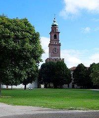
I like the composition, but not particularly appreciate the desaturation applied.
The highlights are almost burned, and affecting the texture of the wood fence, which I think with a different PP could have stand out very well, making it even more impressive on the first floor.
In the background I cloned the light poles and the black dot in the center of the sky, that just does not fit: D
Mi piace la composizione, ma non apprezzo particolarmente la desaturazione applicata.
Le alte luci risultano quasi bruciate, e inficiano la texture del legno della staccionata, che secondo me con una PP differente sarebbero potute risaltare molto bene, rendendo ancora più d'impatto il primo piano.
Sullo sfondo avrei clonato i pali della luce e quel puntino nero al centro del cielo, che proprio non ci sta :D
|
| sent on August 09, 2016 (18:16) | This comment has been automatically translated (show/hide original)
Very beautiful. Congrats!
Greetings Agata ;-) :-P Molto bella, complimenti!
Un saluto Agata  |
| sent on August 09, 2016 (19:15) | This comment has been automatically translated (show/hide original)
I frankly do not understand the title: - |
the photo is nice, congratulations to the girl, but I do not see another :-( io francamente non capisco il titolo
la foto è piacevole,complimenti alla ragazza,ma io non ci vedo altro |
user81826 | sent on August 10, 2016 (0:08) | This comment has been automatically translated (show/hide original)
I find it a bit 'narrow framing, I would have preferred more breathing and also this slight inclination of PDR compared to the fence bears my right eye. One solution would be to increase the angle and give more perspective by taking a larger part of the bridge; the other solution would be to tilt less and widen more as well as to better focus the eye on the woman and make the static scene.
The white balance I'm not crazy, although usually I like the particular choices.
For the rest I find it very good. Trovo un po' stretta l'inquadratura, avrei preferito più respiro ed inoltre questa leggera inclinazione del pdr rispetto alla staccionata porta il mio sguardo a destra. Una soluzione sarebbe stata quella di aumentare l'angolo e dare maggiore prospettiva prendendo una parte più ampia di ponte; l'altra soluzione sarebbe stata quella di inclinare di meno e allargare di più così da far concentrare meglio l'occhio sulla donna e rendere la scena più statica.
Il bilanciamento del bianco non mi fa impazzire, anche se di solito mi piacciono le scelte particolari.
Per il resto la trovo molto buona. |
user81826 | sent on August 10, 2016 (0:27) | This comment has been automatically translated (show/hide original)
Alepou, I try not to read the other comments before commenting in order to maintain the natural my impressions.
The choice of colors still do not like.
As for the composition to throw them ... I would try a vertical crop. Cuts from the left to the shadow edge on the highest fence and to the right just enough to slightly decentralize the body line. I just tried it and I do not mind at all.
See you soon,
Paul Alepou, cerco di non leggere gli altri commenti prima di commentare così da mantenere al naturale le mie impressioni.
La scelta dei colori continua a non piacermi.
Per quanto riguarda la composizione la butto li...proverei un crop verticale. Tagli da sinistra al bordo dell'ombra sulla staccionata più alta e a destra quanto basta per decentrare leggermente la linea del corpo. Ho appena provato e non mi dispiace per nulla.
A presto,
Paolo |
| sent on August 10, 2016 (4:18) | This comment has been automatically translated (show/hide original)
for me you were wrong just the title. per me hai sbagliato solo il titolo. |
| sent on August 10, 2016 (8:06) | This comment has been automatically translated (show/hide original)
How difficult accommodate you guys ... :-D
Joke, eh ... thank you last! Com'è difficile accontentarvi ragazzi...
Scherzo, eh... grazie ultimo! |
| sent on August 10, 2016 (16:25) | This comment has been automatically translated (show/hide original)
I find the post, especially the colors, unreal and poorly suited to enhance the portrait.
I find little suitable title if the subject is the girl.
I find the high lights burned on the wooden railing quite annoying because they attract attention, stealing the subject.
good composition. trovo la postproduzione, soprattutto i colori, irreale e poco adatta a valorizzare il ritratto.
trovo il titolo poco adatto se il soggetto è la ragazza.
trovo le alte luci bruciate sul parapetto in legno abbastanza fastidiose perché attirano l'attenzione, rubandola al soggetto.
buona la composizione. |
|

Publish your advertisement on JuzaPhoto (info) |


 JuzaPhoto contains affiliate links from Amazon and Ebay and JuzaPhoto earn a commission in case of purchase through affiliate links.


 11.4 MEGAPIXEL
 Resize to fit window