What do you think about this photo?Do you have questions or curiosities about this image? Do you want to ask something to the author, give him suggestions for improvement, or congratulate for a photo that you really like?
You can do it by joining JuzaPhoto, it is easy and free!
There is more: by registering you can create your personal page, publish photos, receive comments and you can use all the features of JuzaPhoto. With more than 242000 members, there is space for everyone, from the beginner to the professional.
| sent on November 25, 2013 (22:41) | This comment has been automatically translated (show/hide original)
beautiful composition and beautiful shot .. congratulations, beautiful colors
Hello
Jody bella composizione e bello scatto.. complimenti , bellissimi colori
Ciao
Jody |
| sent on November 25, 2013 (22:43) | This comment has been automatically translated (show/hide original)
Thanks jody
Grazie jody
|
| sent on November 26, 2013 (0:15) | This comment has been automatically translated (show/hide original)
its spectacular ... that sky! proprio spettacolare...che cielo! |
| sent on November 26, 2013 (9:05) | This comment has been automatically translated (show/hide original)
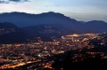
the shot is nice, but the development has to be redone.
I would say that you have joined 2-3 shots, sky, clouds and the central foreground ... or so it seems for differences in brightness
for me the sky looks very dark compared to the first floor and bright, low clouds have a magenta cast too heavy (I leave here the benefit of the doubt seen the montior that I observe)
The profile of the mountains is very sharp and you can see a clear halo above at some points.
So what I wanted to tell you that potentially is a beautiful shot but it gives the impression of too attached images for both the brightness and for different tones and color saturation. ;-)
Hello
Max lo scatto è bello, ma lo sviluppo è da rifare.
direi che hai unito 2-3 scatti, cielo, nuvole centrali e primo piano... o almeno così sembra per le differenze di luminosità
per me il cielo è troppo carico e scuro rispetto al primo piano luminoso, le nuvole basse hanno una dominante magenta troppo accentuata (qui lascio il beneficio del dubbio visto il montior che io lo osservo)
Il profilo dei monti è molto marcato e si nota un alone chiaro sopra in alcuni punti.
Insomma quello che volevo dirti che potenzialmente è un bellissimo scatto ma dà troppo l'impressione di immagini attaccate sia per la luminosità diversa che per i toni e saturazione colore.
Ciao
Max |
| sent on November 26, 2013 (13:29) | This comment has been automatically translated (show/hide original)
Thanks Nicholas and Max
@ Max: I really appreciate the advice given. I do not remember exactly the development of the file, but usually use for casting masks brightness which I think is one of the most effective methods. Probably, as you say, I gave him a bit of extra brightness on the first floor that is clearer. As for the color, I balanced the two files by referring to the gray stones in the foreground that should be a great neutral.
Thank you so much for constructive advice. Grazie Nicola e Max.
@max: apprezzo molto i consigli dati. Non ricordo esattamente lo sviluppo del file, ma solitamente uso per la fusione le maschere di luminosità che credo sia uno dei metodi più efficaci. Probabilmente, come dici tu, ho dato un po di luminosità ulteriore al primo piano che risulta più chiaro. Per quanto riguarda il colore, ho bilanciato i due file prendendo come riferimento il grigio dei sassi in primo piano che dovrebbero essere un ottimo neutro.
Grazie mille dei consigli costruttivi. |
| sent on February 21, 2015 (15:33) | This comment has been automatically translated (show/hide original)
Also this beautiful!
Good Bella anche questa!
Bravo |
|

Publish your advertisement on JuzaPhoto (info) |


 JuzaPhoto contains affiliate links from Amazon and Ebay and JuzaPhoto earn a commission in case of purchase through affiliate links.


 2.6 MEGAPIXEL
 Resize to fit window