What do you think about this photo?Do you have questions or curiosities about this image? Do you want to ask something to the author, give him suggestions for improvement, or congratulate for a photo that you really like?
You can do it by joining JuzaPhoto, it is easy and free!
There is more: by registering you can create your personal page, publish photos, receive comments and you can use all the features of JuzaPhoto. With more than 242000 members, there is space for everyone, from the beginner to the professional.
user1892 | sent on June 25, 2013 (14:01) | This comment has been automatically translated (show/hide original)
Hello Claudio.
I really like the treatment that you used in the picture. Several professional photographers use this style, can you tell me if it has a name, or the technique used for this effect?
Thank you very much and congratulations for the photos from the series Portrait
Andrea Ciao Claudio.
Mi piace tantissimo il trattamento che hai utilizzato nella foto. Diversi fotografi professionisti utilizzano questo stile, sai dirmi se ha un nome o la tecnica utilizzata per questo effetto??
Grazie mille e complimenti per le foto della serie Portrait
Andrea |
| sent on June 25, 2013 (15:53) | This comment has been automatically translated (show/hide original)
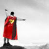
Given that I do not like this photo processing very large (as would have been, photo, with moderate processing pià?), I find the pose obviously unnatural (not a muscular person who is watching the landscape but a bodybuilder is pulling the muscles with the attempt to convey feeling of spontaneity).
Of two things: either hands in his pockets and a relaxed pose, or the "pull" of the muscles, but in the proper position.
Moreover, being the subject off to one side, I would not have seen so central but moved (at least slightly) on the right (it would have been different if it had been addressed with his face toward the sea).
In terms of composition, then, the piece was cut off at the bottom (you can see very little of the end of the pants)
or lower the inquadratura to include part of the thigh.
Greetings Premesso che su questa foto non mi piace molto l'elaborazione eccessiva (come sarebbe stata, la foto, con un'elaborazione pià moderata?), trovo la posa ovviamente innaturale (non è una persona muscolosa che sta guardando il paesaggio ma un culturista che sta tirando i muscoli con il tentativo di trasmettere sensazione di spontaneità).
Delle due, l'una: o le mani in tasca ed una posa rilassata, o il "tiro" dei muscoli ma in posizione adeguata.
Inoltre, essendo il soggetto rivolto da un lato, non lo avrei visto così centrale ma spostato (almeno leggermente) sulla destra (diverso sarebbe stato se fosse stato rivolto con il viso verso il mare).
A livello di composizione, poi, andava tagliato via il pezzettino in basso (si intravede di pochissimo la fine dei pantaloni)
o abbassare l'inquadratura per includere una parte di coscia.
Un saluto |
| sent on June 25, 2013 (16:28) | This comment has been automatically translated (show/hide original)
Hello richard. It is not a bodybuilder who wants to express spontaneity, but grandeur without having to resort to forcibly classic poses of bodybuilding. As for the cut in the lower part I is fine as well, under the buttock without having to get to the mid-thigh that I would slender figure which must instead stand for amplitude. Speech is rather different to the centrality of the subject, on the one hand I'm like you, I would naturally seek more air to the side which goes some eyes, on the other hand, however, the centrality of the spine gives a strong sense of symmetry which is essential in bodybuilding. I understand that it is natural to judge with the canons that belong to us, but the service was commissioned and if you have no idea what a bodybuilder circles you realize that the result is very pleasing to thesubject's eyes. I accept the criticism, however, particularly in light of the fact that the questions posed by you, me I was already placed too:-D
Andrea calmly answer you tonight ;-) Ciao richard. Non é un culturista che vuole esprimere spontaneità, ma imponenza senza per questo dover forzatamente ricorrere alle pose classiche del bodybuilding. Per quanto riguarda il taglio nella parte inferiore mi sta benissimo così, sotto il gluteo senza dover arrivare a metà coscia che mi avrebbe slanciato la figura che deve invece risaltare per ampiezza. Discorso diverso invece é per la centralità del soggetto, dove da una parte la penso come te, spontaneo mi verrebbe di cercare più aria dalla parte in cui va po sguardo; d'altra parte peró la centralità della colonna vertebrale dona un forte senso di simmetria che nel bodybuilding é fondamentale. Capisco che viene spontaneo giudicare con i canoni che ci appartengono, ma il servizio era commissionato e se hai idea di cosa cerchi un culturista ti rendi conto che il risultato é molto gradevole agli occhi del soggetto. Accetto comunque le critiche, soprattutto in virtù del fatto che le questioni da te poste, me le ero già poste anche io :-D
Andrea stasera con calma ti rispondo ;-) |
user1892 | sent on June 25, 2013 (17:46) | This comment has been automatically translated (show/hide original)
Thank you very much Claudio! :) Grazie mille Claudio!! :) |
| sent on June 25, 2013 (22:06) | This comment has been automatically translated (show/hide original)
“ Hello richard. It is not a bodybuilder who wants to express spontaneity, but grandeur without having to resort to forcibly classic poses of bodybuilding. „
So ... the grandeur I arrived.
Is diluted by the ease of hands in his pockets and ... the ease is diluted by the muscles visibly contracted, producing an intermediate result that does not hit.
Impressions.
“ As for the cut at the bottom of me is fine as well, under the buttock without having to get to mid-thigh that I would slender figure which needs to stand out for its breadth „ .
Really observation stems from two ways to eliminate the light present between horse and bottom of the image.
Like, therefore,that little dot of light?
“ Something different is instead for the centrality of the subject, on the one hand I'm like you, I would naturally seek more air to the side which goes some eyes, on the other hand, however, the centrality of the spine gives a strong sense of symmetry that is essential in bodybuilding. I understand that it is natural to judge with the canons that belong to us, but the service was commissioned and if you have no idea what a bodybuilder circles you realize that the result is very pleasing to the eyes of the subject. „
Here we go again ... as in many other post ... I find the same process (fortunately softer).
Observation. "I do not like this photo is blurry!"
Reply author: "Me l'Have asked for that. "
Observation: "So ... why do not you write it? Whoever sees the picture up here in the comments, the currency for what it is, without premises, without knowing the clients, what is behind, etc ..."
It would be very useful in these cases (as some do) write next to the picture "photos taken so ... commissioned to make the grandeur etc etc etc".
Do not see?
Otherwise ... those who leave comments go off topic (or, this is not the case, is located in front of justifications painful) and lose the will to comment ... but this is another issue that does not affect your shots.
;-)
Greetings " Ciao richard. Non é un culturista che vuole esprimere spontaneità, ma imponenza senza per questo dover forzatamente ricorrere alle pose classiche del bodybuilding. "
Allora... l'imponenza non mi è arrivata.
Viene diluita dalla disinvoltura delle mani in tasca e... la disinvoltura viene diluita dai muscoli visibilmente contratti, producendo un risultato intermedio che non colpisce.
Impressioni.
" Per quanto riguarda il taglio nella parte inferiore mi sta benissimo così, sotto il gluteo senza dover arrivare a metà coscia che mi avrebbe slanciato la figura che deve invece risaltare per ampiezza" .
Veramente l'osservazione nasceva dai due modi per eliminare la luce presente tra cavallo e bordo inferiore della foto.
Ti piace, dunque, quel puntino di luce?
" Discorso diverso invece é per la centralità del soggetto, dove da una parte la penso come te, spontaneo mi verrebbe di cercare più aria dalla parte in cui va po sguardo; d'altra parte peró la centralità della colonna vertebrale dona un forte senso di simmetria che nel bodybuilding é fondamentale. Capisco che viene spontaneo giudicare con i canoni che ci appartengono, ma il servizio era commissionato e se hai idea di cosa cerchi un culturista ti rendi conto che il risultato é molto gradevole agli occhi del soggetto."
Ci risiamo... come in tanti altri post... trovo lo stesso processo (fortunatamente più soft).
Osservazione. "Questa foto non mi piace, è sfocata!"
Risposta dell'autore: "Me l'hanno chiesta così".
Osservazione: "Allora... perchè non scriverlo? Chi vede la foto quassù nell'area commento, la valuta per quello che è, senza premesse, senza conoscere i committenti, cosa c'è dietro, etc..."
Sarebbe molto utile, in questi casi (come alcuni fanno) scrivere accanto alla foto "Foto commissionata... scattata così per rendere l'imponenza etc etc etc".
Non trovi?
Altrimenti... chi lascia commenti va fuori tema (o, non è questo il caso, si trova davanti a giustificazioni penose) e perde la voglia di commentare... ma questo è un altro problema che non riguarda i tuoi scatti.

Un saluto |
| sent on June 25, 2013 (22:26) | This comment has been automatically translated (show/hide original)
So Richard, is that point of light does not bother me to be honest and I find objectionable the lower cut. For goodness sake, 5 cm lower would be just as nice, but to my way of thinking is fine.
You're probably right, I'd better write where does the photo and what must inspire. I probably left out because I know enough about the world of gyms and I was sure this photo would have liked to the customer and to the world that revolves around, so luckily it was:-D and for cultural influences to me like a lot, although I recognize the distance from the canons fashion and beauty to which ALSO I usually am inspired for my shots. In fact, I had no doubt that here on Juza many would not like a little post-production for the massive and almost a little bit of a sense of outrage that manyhave in front of a physical kind (most of the comments I receive, even from friends, they say, but hell that crap is too big ... and from there I think, perfect what we wanted :-)).
I repeat: I thank you for the criticism, expressed by another in terms of construction and in some ways I understand the great (except for the fact that the lower cut I do not mind).
Greetings to you too ;-) Dunque Richard, si quel punto di luce non mi infastidisce se devo essere sincero e trovo consono il taglio inferiore. Per carità, 5 cm più in basso sarebbe stato altrettanto piacevole, ma per mio modo di vedere sta bene.
Probabilmente hai ragione, avrei fatto bene a scrivere da dove nasce la foto e cosa deve suscitare. Probabilmente l'ho omesso perchè conosco abbastanza il mondo delle palestre ed ero sicuro che questa foto sarebbe piaciuta al cliente ed al mondo che gli gravita attorno, così fortunatamente è stato  e proprio per influenze culturali anche a me piace molto, sebbene riconosco la lontananza dai canoni fashion e beauty ai quali ANCHE IO mi ispiro solitamente per i miei scatti. Difatti non avevo dubbi sul fatto che qui su Juza a molti non sarebbe piaciuta, un po per la post-produzione massiccia e un pò per un senso quasi di sdegno che moltissimi hanno di fronte a un fisico del genere (la maggior parte dei commenti che ricevo, anche da parte di amici, dicono: ma cavolo che schifo è troppo grosso...e da lì penso: perfetto quello che volevamo e proprio per influenze culturali anche a me piace molto, sebbene riconosco la lontananza dai canoni fashion e beauty ai quali ANCHE IO mi ispiro solitamente per i miei scatti. Difatti non avevo dubbi sul fatto che qui su Juza a molti non sarebbe piaciuta, un po per la post-produzione massiccia e un pò per un senso quasi di sdegno che moltissimi hanno di fronte a un fisico del genere (la maggior parte dei commenti che ricevo, anche da parte di amici, dicono: ma cavolo che schifo è troppo grosso...e da lì penso: perfetto quello che volevamo  ). ).
Ripeto: ti ringrazio per le critiche, espresse per altro in termini costruttivi e per certi versi le capisco alla grande (tranne il fatto del taglio inferiore che a me non dispiace).
Un saluto anche a te |
| sent on June 25, 2013 (22:39) | This comment has been automatically translated (show/hide original)
Now I say to Andrew instead: such a result starts with the shooting, where I used a pattern of three lights, two postero-lateral and one end panel, all three pretty tough (if you do not know tries Joel Grimes, true master in the use of this scheme and of this kind of pictures in general). The post is particularly elbaborata: To give an HDR-like effect and recover the wide dynamic range in LR I lowered all white and all the lights and turned up all the blacks and all the shadows. I then restored contrast with the curves without touching the extremes, +75 light colors, dark colors -75. Abbssato the vivdezza much (I think around -70) and upped the saturation a bit. Then I went in the HSL panel to lower the brightness of the blue and to bring up their saturation, together with the aquamarine. Then with the brush of LR I increased the clarity (+100) on the body of the ragGeez.
Then passed the photo in Photoshop first of all I cloned the two flashes that were present in the frame:-D and did some minor surgery on the color of the sea (but just a wire) and then I deleted all the skin defects.
At that point, the most beautiful part, by any method you normally use to dodge and burn (new level, "overlay" filled with 50% gray and touches of black and white) I have exalted a lot of the games of light and shadow created on the muscles.
Partly cloudy in the sand and get up a bit the blacks (except in the pants that I wanted them so dark).
It seems to me that you have not omitted anything, and I hope (but I think so) that it was clear ;-) Ora rispondo ad Andrea invece: un risultato del genere parte dalla fase di scatto, dove ho usato uno schema a tre luci, due postero-laterali e una frontale alta, tutte e tre piuttosto dure (se non lo conosci cerca Joel Grimes, vero maestro nell'uso di questo schema e di questo genere di foto in generale). La post è particolarmente elbaborata: Per dare un effetto simil-HDR e recuperare l'ampia gamma dinamica ho abbassato in LR tutti i bianchi e tutte le luci e alzato tutti i neri e tutte le ombre. Ho poi ridato contrasto con le curve, senza toccare gli estremi, colori chiari +75, colori scuri -75. Abbssato la vivdezza di molto (mi sembra intorno al -70) e alzato la saturazione un po. Dopodichè nel pannello HSL sono andato ad abbassare la luminosità del blu e ad alzarne la saturazione, insieme a quella dell'acquamarina. Dopodichè con il pennello di LR ho aumentato la chiarezza (a +100) sul corpo del ragazzo.
Passata quindi la foto in Photoshop ho inanzitutto clonato i due flash che erano presenti nell'inquadratura e fatto qualche piccolo intervento sul colore del mare (ma appena un filo) e poi, ho eliminato tutti i difetti della pelle.
A quel punto, la parte piu bella, con il metodo che uso di solito per fare dodge e burn (nuovo livello "sovrapposto" riempito di grigio al 50% e pennellate di bianco e di nero) ho esaltato parecchio i giochi di ombre e luci creati sui muscoli.
Qualche schiarita alla sabbia e alzati un po i neri (tranne nei pantaloni che li volevo così scuri).
Mi sembra di non aver omesso nulla e spero (ma credo di si) di essere stato chiaro |
| sent on June 26, 2013 (9:17) | This comment has been automatically translated (show/hide original)
@ Claudio: I would just point out one thing that I found also highlighted in your second response and clarity is good to explain: I did not write that it was necessary to cut necessarily lower, I wrote that to eliminate that point of light (which I opinion distracting without adding much, like all things that enter into the shots for a portion imperceptible and that they tend to avoid), A frame of the roads was lower but the other would cut a few pixels down, which I do not think distorts the photo.
So, to avoid misunderstandings, I not expect that the lower frame is the only solution: only argued that either that, or cut those few pixels down would make it more solid and without any distractions image.
So, understand that you do not like the shot lower,if you want you could try to eliminate a few pixels down to get the same result.
Implication: If you like it so then, that's okay.
:-) @Claudio: mi permetto solo di sottolineare una cosa che ho trovato evidenziata anche nella tua seconda risposta e per chiarezza è bene spiegare: non ho scritto che occorreva tagliare necessariamente più in basso; ho scritto che per eliminare quel punto di luce (che a mio parere distrae senza aggiungere molto, come tutte le cose che entrano nelle inquadrature per una porzione impercettibile e che si tende ad evitare), UNA delle strade era inquadrare più in basso ma l'altra sarebbe tagliare qualche pixel in basso, cosa che non credo stravolga la foto.
Dunque, per evitare equivoci, non pretendo assolutamente che inquadrare più in basso sia l'unica soluzione: sostenevo solo che o quello, o tagliare quei pochi pixel in basso avrebbero reso più solida e senza alcuna distrazione l'immagine.
Dunque, compreso che non ti piace l'inquadratura più bassa, se vorrai potrai provare ad eliminare qualche pixel in basso per ottenere lo stesso risultato.
Sottinteso: se poi ti piace così, va bene così.
|
| sent on June 26, 2013 (9:18) | This comment has been automatically translated (show/hide original)
Ps I can tell you from '? I (cloning aside), more like the original ... And 'one of the few photos that I like more choice without processing ...
:-)
But we realized that the destination (recipient) was one in particular, so ... that's okay.
P.s. te lo posso di'? A me (clonazioni a parte), piace più l'originale... E' una delle poche foto che mi piacciono più senza l'elaborazione scelta...
Ma abbiamo capito che la destinazione (ed il destinatario) era una in particolare, dunque... va bene così.
|
| sent on June 26, 2013 (9:50) | This comment has been automatically translated (show/hide original)
The post I'm sorry, I cut slightly longer at the top to eliminate that point of light La post non mi dispiace, avrei tagliato leggermente piu in alto per eliminare quel punto di luce |
| sent on June 26, 2013 (13:39) | This comment has been automatically translated (show/hide original)
Of course I can ':-D
Thanks for the contribution Francy Certo che lo puoi di'
Grazie Francy per il contributo |
user1892 | sent on June 27, 2013 (17:28) | This comment has been automatically translated (show/hide original)
Thank you very much for the explanation Claudio. Very interesting.
I will try the technique in some of my next shot.
Again congratulations for photos
BRAVO!
Andrea Grazie mille per la spiegazione Claudio. Molto interessante.
Proverò la tecnica in qualche mio prossimo scatto.
Ancora complimenti per le foto
BRAVO!
Andrea |
| sent on June 29, 2013 (11:13) | This comment has been automatically translated (show/hide original)
Thanks andrea! Grazie andrea! |
| sent on July 19, 2013 (11:34) | This comment has been automatically translated (show/hide original)
There you can do, really good!
Joel Grimes is superb in this kind of shots ;-) Ci sai fare, bravo davvero!
Joel Grimes è superlativo in questo genere di scatti |
| sent on July 19, 2013 (15:02) | This comment has been automatically translated (show/hide original)
Thank you very much ;-) cyber eh grimes is a great inspiration Grazie mille cyber ;-) eh si grimes é di grande ispirazione |
| sent on July 19, 2013 (16:15) | This comment has been automatically translated (show/hide original)
... Not to mention another planet! ;-) ...per non dire di un altro pianeta!!! |
| sent on July 19, 2013 (17:00) | This comment has been automatically translated (show/hide original)
I honestly do not disturb the symmetry caused by the light on the right side of the side ... if he had been illuminated uniformly in the two sides might have given even more sense of majesty, static!
the rest I like it! a me sinceramente disturba la non simmetria causata dalla luce sul lato destro del fianco... se fosse stato illuminato uniformente nei due fianchi forse avrebbe dato ancora di più senso di possenza, staticità!
il resto mi piace! |
| sent on July 19, 2013 (17:10) | This comment has been automatically translated (show/hide original)
Thanks for the critical Nth ;-) Grazie per la critica Nth |
|

Publish your advertisement on JuzaPhoto (info) |

 Portraits

 JuzaPhoto contains affiliate links from Amazon and Ebay and JuzaPhoto earn a commission in case of purchase through affiliate links.


 Resize to fit window