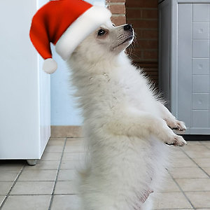
What do you think about this photo?Do you have questions or curiosities about this image? Do you want to ask something to the author, give him suggestions for improvement, or congratulate for a photo that you really like?
You can do it by joining JuzaPhoto, it is easy and free!
There is more: by registering you can create your personal page, publish photos, receive comments and you can use all the features of JuzaPhoto. With more than 243000 members, there is space for everyone, from the beginner to the professional.
| sent on June 22, 2020 (13:08) | This comment has been automatically translated (show/hide original)
You interpreted the photo as opposed to how I did it,
i I tried to hide the background as much as possible and you to enhance it.
The result I like, I'm not convinced just of the rotation of the photo in this verse. Hai interpretato la foto al contrario di come ho fatto io,
io ho provato a nascondere lo sfondo il più possibile e tu ad esaltarlo.
Il risultato mi piace, non sono convinto solo della rotazione della foto in questo verso. |
user92328 | sent on June 22, 2020 (14:38) | This comment has been automatically translated (show/hide original)
Overall it is not bad, but the composition convinces me very little, especially for those two elements too close to the top edge...
Romatically I like a little, also for light and general atmosphere, but even here I find it a little flat chromatically, maybe you could make better use of the color fan of nature... Complessivamente non è male, ma la composizione mi convince molto poco, sopratutto per quei due elementi troppo vicini al bordo in alto...
Cromaticamente un po mi piace, anche per luce ed atmosfera generale, però anche qui la trovo un pochino piatta cromaticamente, forse si poteva sfruttare meglio il ventaglio cromatico della natura... |
| sent on June 23, 2020 (23:23) | This comment has been automatically translated (show/hide original)
for the turn to me in cr I was already automatically horizontal, boh I do not know why
e beautiful bright and colorful and there is, maybe the plant and a little yellow but maybe just for my taste per il giramento a me in cr mi veniva già automaticamente in orizzontale, boh non so perche
e bella luminosa e colorata e ci sta, forse la pianta e un pochino giallo ma forse solo per il mio gusto |
| sent on June 24, 2020 (16:05) | This comment has been automatically translated (show/hide original)
It's not bad but I agree with Salvo, having the background stood out inevitably leads to look at those two helmets too close to the edge.
Ce I have them near the edge but I darkened them with respect to the central element Non è male ma concordo con Salvo, l'aver fatto risaltare lo sfondo porta inevitabilmente a guardare quei due elemti troppo vicini al bordo.
Ce li ho anch'io vicini al bordo ma li ho scuriti rispetto all'elemento centrale |
user171441 | sent on June 24, 2020 (21:16) | This comment has been automatically translated (show/hide original)
I like the colors but I find the cut dispersive I colori mi piacciono ma il taglio lo trovo dispersivo |
user30556 | sent on June 27, 2020 (17:41) | This comment has been automatically translated (show/hide original)
I don't like from the raw the duality of subjects (to put it mildly, the ones in focus. the thorny flower and the other behind that almost looks like a grasshopper) I do not see them harmonious together.
I would choose, to value only one and exclude the other.
Non mi piace gia' dal raw la dualita' di soggetti (per intenderci, quelli a fuoco. il fiore spinoso e l'altro dietro che pare quasi una cavalletta) Non li vedo armoniosi insieme.
Preferirei, a scelta, valorizzarne solo uno ed escludere l'altro.
|
|

Publish your advertisement on JuzaPhoto (info) |


 JuzaPhoto contains affiliate links from Amazon and Ebay and JuzaPhoto earn a commission in case of purchase through affiliate links.


 2.5 MEGAPIXEL
 Resize to fit window