What do you think about this photo?Do you have questions or curiosities about this image? Do you want to ask something to the author, give him suggestions for improvement, or congratulate for a photo that you really like?
You can do it by joining JuzaPhoto, it is easy and free!
There is more: by registering you can create your personal page, publish photos, receive comments and you can use all the features of JuzaPhoto. With more than 242000 members, there is space for everyone, from the beginner to the professional.
| sent on December 23, 2012 (11:47) | This comment has been automatically translated (show/hide original)
Definitely better ... bravo. Hello Ivan Decisamente meglio...bravo. Ciao Ivan |
| sent on December 23, 2012 (12:14) | This comment has been automatically translated (show/hide original)
Thanks for the ride Ivan, actually the screen calibrated evil is a big problem ... Now I will try some solution, at worst you change it ....: fconfuso: Grazie per il passaggio Ivan, effettivamente lo schermo calibrato male è un bel problema... Ora cercherò qualche soluzione, alla peggio lo si cambia.... |
| sent on December 23, 2012 (12:25) | This comment has been automatically translated (show/hide original)
To me that just lower the contrast of the screen ... ;-) Secondo me basta che abbassi il contrasto dello schermo... |
user5266 | sent on December 23, 2012 (12:26) | This comment has been automatically translated (show/hide original)
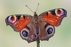
Personally, I am attracted to blacks wallpapers, here with the yellow that dominates, the result is spectacular, in my humble opinion.
I can not compliment you, hello Alessandro Personalmente sono attratto dagli sfondi neri,qua con il giallo che domina,il risultato è spettacolare,a mio modesto parere.
Non posso che farti i complimenti,ciao Alessandro |
| sent on December 23, 2012 (13:21) | This comment has been automatically translated (show/hide original)
“ I think that just lower the contrast of the screen ... „
I tried to change the brightness, contrast, gamma, backlight .... nothing .... it is as if the PC does not recognize those green areas and unify them in black. :-(
“ Personally, I am attracted to blacks wallpapers, here with the yellow that dominates, the result is spectacular, in my humble opinion.
I can not compliment you „
Thank you for the transition and appreciation! Pleased that the message is past! :-P " Secondo me basta che abbassi il contrasto dello schermo..."
Ho provato a modificare la luminosità, il contrasto, la gamma, la retroilluminazione.... nulla.... è come se il PC non riconoscesse quelle zone di verde e li unificasse a nero. 
" Personalmente sono attratto dagli sfondi neri,qua con il giallo che domina,il risultato è spettacolare,a mio modesto parere.
Non posso che farti i complimenti"
Ti ringrazio per il passaggio e l'apprezzamento!! Lieto che il messaggio sia passato! |
| sent on December 23, 2012 (14:04) | This comment has been automatically translated (show/hide original)
Personally I find it more appealing, just remember the next time you leave a little 'margin between subject and edges, thus avoiding a sense of claustrophobia.
Important, however, when you read the suggestions that are made by our users, you cernirli in a manner consistent with your ideas, because only you are the author of it and only you can possibly choose the one that is best suited to your work, unless are purely technical things like focus. Personalmente la trovo più accattivante, ricordati solo la prossima volta di lasciare un po' di margine tra soggetto e bordi, evitando così un senso di claustrofobia.
Importante comunque quando leggi i suggerimenti che vengono fatti da noi utenti, è cernirli in maniera coerente con le tue idee, perchè solo tu ne sei l'autore e solo tu puoi eventualmente scegliere quello che risulta più consono al tuo operato, a meno che non siano cose puramente tecniche come la messa a fuoco. |
| sent on December 23, 2012 (14:10) | This comment has been automatically translated (show/hide original)
“ Just remember the next time you leave a little 'margin between subject and edges, thus avoiding a sense of claustrophobia „
Surely I will cure this better, I had done too much to take from the subject to "cure me" of the rest!
“ Important, however, when you read the suggestions that are made by our users, you cernirli in a manner consistent with your ideas, because only you are the author of it and only you can possibly choose the one that is best suited to your work „
Very true, but a healthy debate can only stem growth and new ideas!
Thank you again for the ride! " ricordati solo la prossima volta di lasciare un po' di margine tra soggetto e bordi, evitando così un senso di claustrofobia"
Sicuramente curerò meglio questo aspetto, mi ero fatto troppo prendere dal soggetto per "curarmi" del resto!!
" Importante comunque quando leggi i suggerimenti che vengono fatti da noi utenti, è cernirli in maniera coerente con le tue idee, perchè solo tu ne sei l'autore e solo tu puoi eventualmente scegliere quello che risulta più consono al tuo operato"
Verissimo, ma da un sano confronto può solo scaturire crescita e nuovi spunti!!
Grazie di nuovo per il passaggio!! |
| sent on December 24, 2012 (15:51) | This comment has been automatically translated (show/hide original)
the color contrast is very strong and successful ... I agree with the need to leave more space at the edges ... hello il contrasto di colori è molto deciso e ben riuscito...concordo con la necessità di lasciare più spazio ai bordi...ciao |
| sent on January 09, 2013 (17:31) | This comment has been automatically translated (show/hide original)
Great nice shot! com, contrast, color and pdc are perfect. I would have liked to see a bit of stem ....
hello Gran bello scatto! compo, contrasto, colore e pdc sono perfetti. mi sarebbe piaciuto vedere un pò di gambo....
ciao |
| sent on January 10, 2013 (21:03) | This comment has been automatically translated (show/hide original)
Bokeh Thanks for the welcome step and comment!
Mastro thanks for passggio, the stem I could have left but in this shot I would have ruined the true subject of the picture: the flower and its yellow! ;-)
I am a bit 'of the school of Van Der Rohe "less is more." Grazie Bokeh per il gradito passaggio e commento!!
Mastro grazie per il passggio, il gambo avrei potuto lasciarlo ma in questo scatto avrei rovinato il vero soggetto della foto: il fiore ed il suo giallo!
Io sono un po' della scuola di Van Der Rohe "less is more!". |
| sent on March 07, 2013 (11:34) | This comment has been automatically translated (show/hide original)
I agree with Fabale, I like the backgrounds blacks and contrast .. spectacular explosion of light given off by the yellow flower on a black background!
I see it as a click artistic unrealistic .. and personally I like that you do not notice the green stem.
Then, each one has its own point of view! ;-) Concordo con Fabale, mi piacciono gli sfondi neri ed i contrasti.. spettacolare l'esplosione di luce data dal fiore giallo su sfondo nero!
Lo vedo come uno scatto artistico, non realistico.. e personalmente mi piace che non si noti il verde del gambo.
Poi, ogniuno ha il suo punto di vista! |
|

Publish your advertisement on JuzaPhoto (info) |


 JuzaPhoto contains affiliate links from Amazon and Ebay and JuzaPhoto earn a commission in case of purchase through affiliate links.


 Resize to fit window