What do you think about this photo?Do you have questions or curiosities about this image? Do you want to ask something to the author, give him suggestions for improvement, or congratulate for a photo that you really like?
You can do it by joining JuzaPhoto, it is easy and free!
There is more: by registering you can create your personal page, publish photos, receive comments and you can use all the features of JuzaPhoto. With more than 242000 members, there is space for everyone, from the beginner to the professional.
user612 | sent on November 17, 2012 (18:42) | This comment has been automatically translated (show/hide original)
Beautiful, excellent composition and colors, beautiful also the vertical cut. Hangs on the left. Hello Giorgio Bella, ottima composizione e colori, bello anche il taglio verticale. Pende a sinistra. Ciao Giorgio |
| sent on November 17, 2012 (19:11) | This comment has been automatically translated (show/hide original)
Thanks George and Pass comment ... and I have to say that it seemed to me, as I tried to "fix it" .... I think it's the way that deceives. In the end I left it like that, because ... as taken from the lines of the church you can see that it is straight (at least I think!:-D).
Greetings to you .... ciaooooooo:-P Grazie Giorgio del passaggio e del commento...e devo dirti che anche a me sembrava, mentre cercavo di "sistemarla"....secondo me è il terreno che inganna. Alla fine l'ho lasciata così, come scattata...perchè, dalle linee della chiesa si vede che è dritta (almeno penso!!! ). ).
Un saluto a te.... ciaooooooo  |
user612 | sent on November 17, 2012 (19:18) | This comment has been automatically translated (show/hide original)
The lines of the church but I do not see the above photo should please te.Ciao Le linee della chiesa non le vedo ma sopratutto la foto deve piacere a te.Ciao |
user612 | sent on November 17, 2012 (22:26) | This comment has been automatically translated (show/hide original)
The error is normally when shooting freehand, for landscape photos better to use the trepiede.Ciao L'errore viene normalmente quando si scatta a mano libera, per foto di paesaggio meglio usare il trepiede.Ciao |
user8602 | sent on November 17, 2012 (22:44) | This comment has been automatically translated (show/hide original)
A great shot, beautiful colors, contrast and glare.
Sanja good ;-)
PS it does not sag. The eye is deceived by intersecting lines that are not
parallel to the sensor. Trust Giorgio ;-) Un'ottima inquadratura, belli i colori, il contrasto e il riflesso.
Brava Sanja 
P.S. non pende. L'occhio viene ingannato dalle linee che si incrociano e che non sono
parallele al sensore. Fidati Giorgio |
user612 | sent on November 17, 2012 (22:55) | This comment has been automatically translated (show/hide original)
Do you know Momo for me Your words are verb:-D ;-) Seriously looking at the eye deceives a lot. Lo sai Momo che per me le tue parole sono verbo Scherzi a parte a guardarla l'occhio inganna parecchio. |
| sent on November 17, 2012 (23:09) | This comment has been automatically translated (show/hide original)
Good composition, the viewpoint and the colors. It 'a slight incline easily remedied if you apply a correction between 0.25% and 0.5% on the right. The sensation perceived by the eye is greater because it misled the avenue down in the background (pos.base bell and pos.atleta). The bell tower is perceived as vertical, but even here it is not a regular figure, since that ends up with a projecting structure, we have the second reference point that accentuates the feeling; bending.
Known for the quality of a loss of micro-excessive, it was preferable to close F.8 in favor of clarity even if this would have resulted in a bit to raise the ISO.
hello and good light, laurel
imm.corretta:
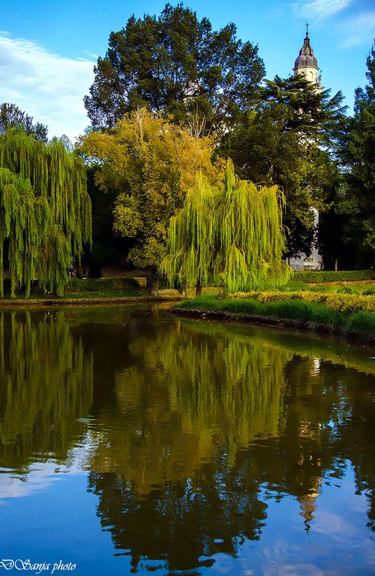
Buoni la composizione, il punto di ripresa e le cromie. E' una leggera pendenza facilmente rimediabile se applichi una correzione tra 0,25% e di 0,5% a dx. La sensazione percepita dal nostro occhio è maggiore perchè tratta in inganno dal viale in discesa sullo sfondo (pos.base campanile e pos.atleta). Il campanile è percepito come verticale ma anche qui non essendo di una figura regolare, dato che termina in alto con una struttura sporgente, abbiamo il secondo punto di riferimento che accentua la sensazione di inclinatura.
Per la qualità complessiva noto una perdita di microcontrasto eccessiva, era preferibile chiudere a f.8 a favore della nitidezza anche se ciò avrebbe comportato di alzare un pelino gli iso.
ciao e buona luce, lauro
imm.corretta:
|
| sent on November 18, 2012 (9:43) | This comment has been automatically translated (show/hide original)
Another salute to George and I sincerely thank Momo and ElleEmme for the attention and detailed analysis!! :-P
Ciaoooo to all Un'altro saluto a Giorgio e ringrazio di cuore Momo e Elleemme per l'attenzione e le analisi dettagliate !!!!
Ciaoooo a tutti |
| sent on November 19, 2012 (0:23) | This comment has been automatically translated (show/hide original)
Hello Sanja, beautiful composition, the reflection and the light caught are very interesting, on my monitor known just a little bit too much saturation, but I could be the problem.
Congratulations and good light! ;-) Ciao Sanja, bella composizione, il riflesso e la luce colta sono molto interessanti, sul mio monitor noto solo un pò troppa saturazione, ma potrei essere io il problema.
Complimenti e buona luce! |
| sent on November 22, 2012 (14:22) | This comment has been automatically translated (show/hide original)
Hello dear Sanja! The bold colors (those that you love so much! ;-)), A beautiful composition and reflections delicate although highly contrasted make your shot very pleasant. Congratulations! Ciaoo
Michela Ciao cara Sanja! Le cromie decise (quelle che tanto ami!!!), una bella composizione e dei riflessi delicati seppur molto contrastati rendono il tuo scatto molto piacevole. Complimenti!! Ciaoo
Michela |
| sent on November 22, 2012 (15:33) | This comment has been automatically translated (show/hide original)
Thank you so much dear Michela ... you're always so kind to me! I heartily thank you! :-P
Ciaooooooo Grazie mille cara Michela...sei sempre così gentile con me!!!! Ti ringrazio di cuore!!!
Ciaooooooo |
| sent on November 22, 2012 (18:44) | This comment has been automatically translated (show/hide original)
see the church the picture looks straight or maybe I'm wrong cmq very nice I like the cut and the composition and colors
my compliments
a free slauto
a vedere la chiesa l immagine sembra dritta o forse mi sbaglio cmq molto bella mi piace il taglio la composizione e i colori
i miei complimenti
un slauto franco
|
| sent on November 22, 2012 (22:19) | This comment has been automatically translated (show/hide original)
Hello Franco! :-P You're always very kind .... thanks for the passage and comment! Greetings to you too ... :-P
Ciaooooo Ciao Franco !!! Sei sempre gentilissimo....grazie del passaggio e del commento!!! Un saluto anche a te...
Ciaooooo |
| sent on November 22, 2012 (22:39) | This comment has been automatically translated (show/hide original)
Your photo seems to appear almost shyly total fluency and then gently assert its unequivocal beauty! Me gusta. by Gazebo! La tua foto sembra presentarsi quasi timidamente in totale scioltezza per poi affermarsi dolcemente nella sua inequivocabile bellezza!!!! Me gusta. da Gazebo! |
| sent on November 29, 2012 (19:21) | This comment has been automatically translated (show/hide original)
looks like a painting, colors and reflections relaxing .. hello :-) sembra un dipinto, colori e riflessi rilassanti.. ciao  |
| sent on November 29, 2012 (19:24) | This comment has been automatically translated (show/hide original)
Jarmila Thanks, you're very kind! I'm glad you like it! :-P
Ciaooooo Grazie Jarmila, sei molto gentile!!! Sono felice che ti piace!!!!
Ciaooooo |
| sent on April 21, 2013 (23:37) | This comment has been automatically translated (show/hide original)
Compo gorgeous as the colors ....
Talented! Compo splendida come i colori....
Bravissima!!! |
|

Publish your advertisement on JuzaPhoto (info) |


 JuzaPhoto contains affiliate links from Amazon and Ebay and JuzaPhoto earn a commission in case of purchase through affiliate links.


 Resize to fit window