What do you think about this photo?Do you have questions or curiosities about this image? Do you want to ask something to the author, give him suggestions for improvement, or congratulate for a photo that you really like?
You can do it by joining JuzaPhoto, it is easy and free!
There is more: by registering you can create your personal page, publish photos, receive comments and you can use all the features of JuzaPhoto. With more than 242000 members, there is space for everyone, from the beginner to the professional.
| sent on June 07, 2017 (14:12) | This comment has been automatically translated (show/hide original)
First, in the matter of beauty. In my opinion, the best of the two in the same situation depends solely on display conditions, on the monitor and on the web, preferably on the horizontal, large printed on the vertical has a deep depth. I insist, however, with too much saturation in the shadows. :-D Pari sono, in fatto di bellezza. Secondo me la migliore tra le due nella stessa situazione dipende unicamente dalle condizioni di visualizzazione, a monitor e sul web preferibile orizzontale, stampata in grande il verticale ha una bella profondità. Insisto però con la troppa saturazione nelle ombre. |
| sent on June 07, 2017 (14:16) | This comment has been automatically translated (show/hide original)
Thank you Max, the post is the same and I did not go to cheat by modifying it after the first comments. Grazie Max, la post è identica e non mi andava di barare modificandola dopo i commenti della prima. |
| sent on June 07, 2017 (17:13) | This comment has been automatically translated (show/hide original)
Mario and the other are in my opinion shot by PRO.
I can not see any corrections
In addition to fairytale locations, however, they have an extra march
"Handle" in the click and in the post
Congratulations Mario questa e le altre sono a mio avviso scatti da PRO .
Non c vedo correzioni da fare
Oltre le location da favola hanno comunque una marcia in più
"Manico " nello scatto e nella post
Veri complimenti |
| sent on June 07, 2017 (17:43) | This comment has been automatically translated (show/hide original)
Thank you Gio, my reflection wanted to deepen my personal tastes, but as Max said it depends on the "medium" used. To make the idea, the horizontal home monitor makes the best of the first, while on the mobile phone, due to the vertical orientation, this is more enjoyable. Grazie Gio, la mia riflessione voleva più approfondire i gusti personali, ma come ha detto Max tanto dipende dal "mezzo" utilizzato. Per rendere l'idea, sul monitor di casa orizzontale rende meglio la prima, mentre sul cellulare, per via dell'orientamento verticale, questa è più godibile. |
| sent on June 07, 2017 (17:51) | This comment has been automatically translated (show/hide original)
In the mountains a bit of Magenta to remove, in this best the first floor, less orange and with better depth ;-)
Hello
Claudio Sulle montagne un po' di Magenta da togliere, in questa meglio il primo piano, meno aranciato e con migliore profondità 
Ciao
Claudio |
| sent on June 07, 2017 (20:10) | This comment has been automatically translated (show/hide original)
Amazing
Image composed of perfection.
My compliments. ;-) Strepitosa
Immagine composta alla perfezione.
I miei complimenti. |
| sent on June 07, 2017 (20:36) | This comment has been automatically translated (show/hide original)
Bravo Rubino, magnificent place photographed to perfection.
Bravo Rubino, posto magnifico fotografato alla perfezione.
|
| sent on June 07, 2017 (22:15) | This comment has been automatically translated (show/hide original)
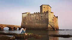
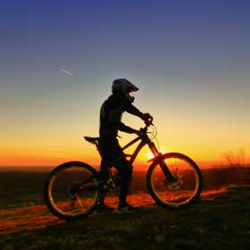
I prefer the horizontal one.
Too long on the first floor that becomes the only protagonist of the scene, and then why also put all that sky so little meaningful to us?
Much more balanced and effective, according to my eye, the horizontal one.
Hello
Simone preferisco di gran lunga quella orizzontale.
troppo lungo il primo piano che diventa il solo protagonista della scena,e allora perchè metterci anche tutto quel cielo così poco significativo?
molto più equilibrata ed efficace,secondo il mio occhio,quella orizzontale.
ciao
Simone |
| sent on June 07, 2017 (22:20) | This comment has been automatically translated (show/hide original)
The more I look at them and the more they are indecisive, the vertical from deeper depths, but my personal taste is horizontal and not for lEp because if I posted this first you most likely got it the same.
compliments
Claudio c Più le guardo e più sono indeciso , la verticale da più profondità , ma il mio gusto personale è per la orizzontale e non per lEp perche se avessi postato questa per prima molto probabilmente lo ottenevi uguale.
complimenti
claudio c |
| sent on June 07, 2017 (22:30) | This comment has been automatically translated (show/hide original)
Difficult to choose between the two shots. Personally I do not have much sympathy for vertical shots, but this is especially interesting and maybe you're right, it's better than the horizontal one. Very nice both. Difficile scegliere tra i due scatti. Personalmente non ho molta simpatia per gli scatti verticali, questo però è particolarmente interessante e forse hai ragione tu, è meglio di quello orizzontale. Molto belli entrambi. |
| sent on June 07, 2017 (22:38) | This comment has been automatically translated (show/hide original)
Beautiful both .. Congratulations ..
Hi G. Bellissime entrambe.. complimenti..
Ciao G. |
| sent on June 07, 2017 (23:15) | This comment has been automatically translated (show/hide original)
Docet Commissioner! ;-)
I also find the most balanced horizontal version ... but the place is so fascinating and engaging your job that I enjoy it, and not least, even in square shape!
Hello Simone Commissario docet!
Trovo anch'io la versione orizzontale maggiormente equilibrata ... ma è talmente affascinante il luogo e accattivante il tuo lavoro che me la gusterei, e non poco, persino in forma quadra!
Ciao, Simone |
| sent on June 08, 2017 (9:04) | This comment has been automatically translated (show/hide original)
Thank you for accepting my request, on composition I always have some doubts (basic rules separately). A greeting
Mario Grazie per aver accolto la mia richiesta, sulla composizione ho sempre qualche dubbio (regole base a parte). Un saluto
Mario |
| sent on June 08, 2017 (10:01)
Beautiful shot! Congrats
Brian |
| sent on June 08, 2017 (13:16) | This comment has been automatically translated (show/hide original)
This version I find it much more complicated to accomplish. All the lines lead vertiginously to the sun. There is a great sense of unbalance in the foreground that goes off the horizon thanks to the mountains and the sea, which balance the image, and they enjoy the fantastic sunset. As the Commissioner says, two thirds of the sky is too much, they add nothing to the general atmosphere, rather they dampen it.
In conclusion, I prefer the other one too but I find the vertical mooolto complicated for the landscapes especially in the format
2/3.
compliments
hi Luca Questa versione la trovo molto più complicata da realizzare. Tutte le linee portano vertiginosamente al sole. C'è un grande senso di squilibrio nel primo piano che si spegne all'orizzonte grazie alle montagne e al mare, che riportano in equilibrio l'immagine, e fanno godere del tramonto fantastico. Come dice il Commissario, 2/3 di cielo sono di troppo, non aggiungono niente all'atmosfera generale, anzi la smorzano.
in conclusione, preferisco l'altra anche io ma trovo il verticale mooolto complicato per i paesaggi soprattutto nel formato
2/3.
complimenti
ciao Luca |
| sent on June 13, 2017 (11:47) | This comment has been automatically translated (show/hide original)
Horizontally, for the reasons already mentioned by comm. Orizzontale, per i motivi già menzionati dal comm. |
|

Publish your advertisement on JuzaPhoto (info) |


 JuzaPhoto contains affiliate links from Amazon and Ebay and JuzaPhoto earn a commission in case of purchase through affiliate links.


 Resize to fit window