What do you think about this photo?Do you have questions or curiosities about this image? Do you want to ask something to the author, give him suggestions for improvement, or congratulate for a photo that you really like?
You can do it by joining JuzaPhoto, it is easy and free!
There is more: by registering you can create your personal page, publish photos, receive comments and you can use all the features of JuzaPhoto. With more than 242000 members, there is space for everyone, from the beginner to the professional.
| sent on April 13, 2016 (19:06) | This comment has been automatically translated (show/hide original)
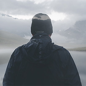
the place is beautiful, good light and the original composition, the post does not convince me at all the area light is also hot in the blue parts of the sky and the shaded area is so neutral as to be almost in bn slightly sepia, apart this is for me a pretty picture.
Congratulations, hello. il posto è splendido, la luce buona e la composizione originale, la post non mi convince del tutto la zona in luce è calda anche nelle parti azzurre del cielo e la zona in ombra è talmente neutra da sembrare quasi in bn leggermente seppiato, a parte questo per me una bella immagine.
Complimenti, ciao. |
| sent on April 13, 2016 (19:50) | This comment has been automatically translated (show/hide original)
Very nice! Molto bella. |
| sent on April 13, 2016 (22:39) | This comment has been automatically translated (show/hide original)
I do not know the place but I am in tune with what is written by Catherine on tonalità.Non even know what kind of give you directions: - | but the feeling of estrangement of those rocks on top of the whole scene is the first thing that jumped to my eyes.
As for the composition instead I'd moved me from that little (if they can) to hide the rock on the left background, because it creates a visual reminder that distracts from the only true point of arrival of the compositional line indicated so clearly by the same lines the black rocks in the foreground.
At least in my interpretation.
Hello
Simone non conosco il posto ma mi trovo in sintonia con quanto scritto da Caterina sulle tonalità.Non so neanche che tipo di indicazioni darti ma la sensazione di estraneità di quelle rocce in primo piano rispetto alla scena intera è la prima cosa che mi è balzata agli occhi. ma la sensazione di estraneità di quelle rocce in primo piano rispetto alla scena intera è la prima cosa che mi è balzata agli occhi.
Per quanto riguarda la composizione invece mi sarei spostato di quel poco (sempre se possibile) per nascondere lo scoglio sullo sfondo a sx,perchè crea un richiamo visivo che distoglie dall'unico e vero punto di arrivo della linea compositiva indicata così palesemente dalle stesse linee delle rocce nere in primo piano.
Almeno secondo la mia interpretazione.
ciao
Simone |
| sent on April 14, 2016 (0:35) | This comment has been automatically translated (show/hide original)
Catherine, Loris and Simone with the passage ..
@Caterina: This is an image that I had discarded .. ritornandoci up after a bit 'of time I did ... for the shadows now I try to keep them very neutral, and the skies tend to desaturarli and warm them ... I am aware that not is consistent with reality, it is a certain period of experimentation, the end is also the most fun part of landscape photography.
@Simone: True for the compo, usually I always try to not overlap elements .. but here even a few cm on the left made me lose the guideline and the impact another consideration is that if I look is picture projected on a screen 100 ": -o makes me come back with the memory at the time of capture and view to 1200 does not make it .. I think it's a bit 'like the cinema, saw a movie on TV is not the same thing: - /
A greeting,
Giuseppe Caterina, Loris e Simone grazie del passaggio..
@Caterina: questa è un'immagine che avevo scartato.. ritornandoci su dopo un po' di tempo mi piaceva... per le ombre ora cerco di tenerle molto neutre, e i cieli tendo a desaturarli e scaldarli... sono consapevole che non sia coerente con la realtà, è un perido di sperimentazioni, alla fine è anche la parte più divertente della fotografia di paesaggio.
@Simone: vero per la compo, di solito cerco sempre di non sovrappore elementi.. ma qui anche pochi cm a sinistra mi facevano perdere la linea guida e l'impatto un'altra considerazione è che se guardo sta foto proiettata su uno schermo da 100" mi fa tornare con la memoria al momento dello scatto e vista a 1200 non rende.. penso sia un po' come il cinema, un film rivisto in TV non è la stessa cosa mi fa tornare con la memoria al momento dello scatto e vista a 1200 non rende.. penso sia un po' come il cinema, un film rivisto in TV non è la stessa cosa
Un saluto,
Giuseppe |
| sent on April 14, 2016 (10:13) | This comment has been automatically translated (show/hide original)
Wonderful photography, composition fanstastica! Congratulations and very good Meravigliosa fotografia, composizione fanstastica! Complimenti e bravissimo |
| sent on April 14, 2016 (13:07) | This comment has been automatically translated (show/hide original)
I agree with the analysis of Simon and Catherine, the colors are not convincing even to me, cmq experience will not hurt ;-) Concordo con le analisi di Simone e Caterina, le cromie non convincono nemmeno a me, cmq sperimentare male non fa  |
| sent on April 14, 2016 (18:57) | This comment has been automatically translated (show/hide original)
Alpha, Franco and Fabio because of the passage to you.
@Franco: Hello Franco, above was covered by clouds, unfortunately the water colors are not that great as it reflects the colors of the underlying rocks (gray - green) .. chromatically I left the one that caught the sensor. . only on the sky I "experienced" ... l
Hello,
Giuseppe Alpha, Franco e Fabio grazie del passaggio anche a voi.
@Franco: Ciao Franco, sopra era coperto da nuvole, purtroppo i colori dell'acqua non sono il massimo in quanto si riflettono i colori delle rocce sottostanti (grigio - verde) .. a livello cromatico ho lasciato quello che ha catturato il sensore.. solo sul cielo ho "sperimentato"... l
Ciao,
Giuseppe |
| sent on April 14, 2016 (20:53) | This comment has been automatically translated (show/hide original)
excellent composition, the colors I think that Catherine's analysis is shared. The fact is that I admire her again !!
compliments,
Roberto. ottima la composizione, per i colori credo che l'analisi di Caterina sia condivisibile. Sta di fatto che la ammiro volentieri!!
complimenti,
Roberto. |
| sent on April 14, 2016 (21:03) | This comment has been automatically translated (show/hide original)
beppe beautiful, but I agree with catherine with the post ... I think you gave an output to the extreme shadows too high .. is good to have clarity in the shadows, but in this case seem clouded .. however, the picture deserves !! :-D bella beppe, ma concordo con caterina con la post... secondo me hai dato un output alle ombre estreme troppo alto.. è giusto avere leggibilità nelle ombre, ma in questo caso sembrano appannate.. comunque la foto merita!!  |
| sent on April 14, 2016 (21:03) | This comment has been automatically translated (show/hide original)
beppe beautiful, but I agree with catherine with the post ... I think you gave an output to the extreme shadows too high .. is good to have clarity in the shadows, but in this case seem clouded .. however, the picture deserves !! :-D bella beppe, ma concordo con caterina con la post... secondo me hai dato un output alle ombre estreme troppo alto.. è giusto avere leggibilità nelle ombre, ma in questo caso sembrano appannate.. comunque la foto merita!! |
| sent on April 15, 2016 (17:05) | This comment has been automatically translated (show/hide original)
Hello Faith, I wanted to give it clicks a "mood" to LOTR or GOT: -o I can not stop :-D
ciaooo Ciao Fede, si volevo dare allo scatto un "mood" alla LOTR o GOT e non riesco a fermarmi
Ciaooo |
| sent on April 18, 2016 (11:10) | This comment has been automatically translated (show/hide original)
Thanks also to you Roberto.
A greeting,
Giuseppe Grazie anche a te Roberto.
Un saluto,
Giuseppe |
| sent on May 06, 2016 (23:49) | This comment has been translated
Beautiful, congratulations! |
| sent on May 10, 2016 (18:37) | This comment has been automatically translated (show/hide original)
Thanks Diamante_P ;-) Grazie Diamante_P |
|

Publish your advertisement on JuzaPhoto (info) |


 JuzaPhoto contains affiliate links from Amazon and Ebay and JuzaPhoto earn a commission in case of purchase through affiliate links.


 1.5 MEGAPIXEL
 Resize to fit window