What do you think about this photo?Do you have questions or curiosities about this image? Do you want to ask something to the author, give him suggestions for improvement, or congratulate for a photo that you really like?
You can do it by joining JuzaPhoto, it is easy and free!
There is more: by registering you can create your personal page, publish photos, receive comments and you can use all the features of JuzaPhoto. With more than 242000 members, there is space for everyone, from the beginner to the professional.
| sent on June 11, 2012 (13:00) | This comment has been automatically translated (show/hide original)
tips! I'm not the right person because I also did a test and so the alas I also posted this :-( But I like:-P consigli! non sono la persona giusta visto che anch'io ho fatto una prova cosi e aimè l ho anche postata  però questa mi piace però questa mi piace  |
| sent on June 11, 2012 (13:07) | This comment has been automatically translated (show/hide original)
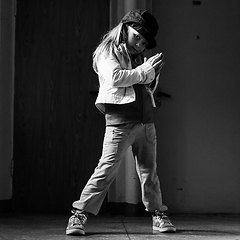
I like it. What in my personal opinion I would not be so much illuminate the face and hat, or at least I would have reduced post.
Just for comparison I tried a little to selectively darken these parts

A me piace. Quello che nella mia personalissima opinione non avrei fatto è illuminare così tanto il volto ed il cappello od almeno lo avrei ridotto in post.
Solo per confronto ho provato un poco a scurire selettivamente queste parti
|
| sent on June 11, 2012 (13:17) | This comment has been automatically translated (show/hide original)
6egrave, a bit tight at the top where the cap is veramnte too close to the edge, I would have paid attention to the folds del'abito just below the eye, creating a bulge in the belly in my opinion be avoided as contrasted with the curve of the breast .
I just listed some things that could be considered at the time of shooting, but I can not tell myself if I could take this into account :) I'm no expert in this kind of shots, and I think your photo is a good start.
Greetings
Baldassarre
Molto bella l'interpretazione in chiave alta, mi piace per gli occhi ben illuminati, il cappello ottimamente esposto, in parte anche la maf sul vestito che però porta l'attenzione più verso la peluria sulla schiena, un pochetto antiestetica a mio parere per questo genere di scatti, avrei preferito che concentrasse l'attenzione più sul fronte della modella.
Penso che l'uso di un obiettivo T/S avrebbe agevolato la selezione di un differente piano di fuoco, in modo da includere meglio entrambi gli occhi e probabilmente migliorare il dettaglio sulla mano e gli occhiali, magari riportando attenzione al profilo frontale del body facendo attenzione ad escludere dalla PDC la schiena. In questo modo, molto probabilmente il cappello avrebbe presentato più dettaglio sulla tesa e sulla parte frontale, sfumando verso il retro, un po al contrario di come si presenta adesso.
La composizione è un po stretta in alto dove il cappello è veramnte troppo vicino al bordo, avrei fatto attenzione alle pieghe del'abito subito sotto gli occhiali che creano un rigonfio nella zona ventre a mio parere da evitare in quanto contrasta con la curva armoniosa del seno.
Ho solo elencato alcuni accorgimenti che potevano essere considerati al momento dello scatto ma non so dirti se io stesso sarei riuscito a tenerne conto :) non sono esperto in questo genere di scatti e ritengo che la tua foto è già un buon inizio.
Un saluto
Baldassarre
|
| sent on June 11, 2012 (13:59) | This comment has been automatically translated (show/hide original)
Hello
As they have already commented on the other friends I find that the face is too overexposed, almost burnt (maybe a tad the e ')
I find the composition a little too central decentrandola perhaps a bit 'to the right eye would fall less on the back.
Another thing, I find that the light is too common, especially on the face, what kind of lighting did you use? and from where?
Anyway it's a nice start, good ;-)
Hello
Faith Ciao
Come hanno gia commentato gli altri amici trovo che il viso sia troppo sovraesposto, quasi bruciato (forse un tantino lo e')
Trovo la compo un tantino troppo centrale, forse decentrandola un po' verso destra l'occhio cadrebbe meno sulla schiena.
Altra cosa, trovo che la luce sia troppo diffusa, sopratutto sul viso, che tipo di illuminazione hai usato? e da dove?
Cmq sia un bel inizio, bravo
Ciao
Fede |
| sent on June 11, 2012 (14:18) | This comment has been automatically translated (show/hide original)
I do not know guys, it seems to me in the corner, which is bright nothing to say. Perhaps a second light on the back would have reduced a bit 'the contrast between the face and back. Ermanno good job! Non so ragazzi, a me pare in curva, che sia luminosa nulla da dire. Forse una seconda luce sulla schiena avrebbe ridotto un po' il contrasto fra viso e schiena. Buon lavoro Ermanno! |
| sent on June 11, 2012 (17:58) | This comment has been automatically translated (show/hide original)
you are all right ... actually, the light is perhaps a little too strong for the face and contrast on the back, stealing a lot of the picture in general.
Too much force on your back and so soft face ............. mmmhhmm could not you tell me before shooting? hahahahahahahaha
Vabbeh, I will keep this for next time ;-)
Grassssie avete tutti ragione... effettivamente, la luce è forse un filo forte per il volto e troppo contrasto sulla schiena, rubando molto alla foto in generale.
Troppa forza sulla schiena e tanto morbido il volto............. mmmhhmm non potevate dirmelo prima dello scatto? hahahahahahahaha
Vabbeh, terrò presente per la volta prossima ;-)
Grassssie |
| sent on June 11, 2012 (18:42) | This comment has been automatically translated (show/hide original)
Hello Herman, more than having the ability to give you advice, and I look shiny eyes ... congratulations.
David Morellini Ciao Ermanno, più che avere la capacità a darti consigli, osservo e mi lucido gli occhi...complimenti.
Davide Morellini |
| sent on June 11, 2012 (20:45) | This comment has been automatically translated (show/hide original)
Gtabbi support, or if you want to make a key high contrast areas burned more so that there is more light and less idea of ??feeling "soft".
A good start sprint that offers great workability, beautiful components and cabling, bravo! Appoggio Gtabbi, altrimenti se vuoi fare una chiave alta contrasta maggiormente le zone bruciate in modo che ci sia più idea di luminosità e meno sensazione "soft".
Un buono scatto di partenza che offre molta lavorabilità, bella la compo e la posa, bravo! |
user9538 | sent on June 12, 2012 (2:50) | This comment has been automatically translated (show/hide original)
Great start compliments, support too much light on the face and all the other little things mentioned but ... maybe to have started it! :-P Ottimo inizio complimenti, appoggio la troppa luce sul volto e tutte le altre piccole cose citate ma... magari ad aver iniziato così! |
| sent on January 03, 2021 (22:01) | This comment has been translated
Fantastic! |
| sent on January 03, 2021 (23:49) | This comment has been automatically translated (show/hide original)
Delicately wonderful
compliments Delicatamente meravigliosa
complimenti |
| sent on January 04, 2021 (0:52) | This comment has been automatically translated (show/hide original)
Great portrait........ definitely two gorgeous eyes.....
Cyo
Stefano Ottimo ritratto........sicuramente due occhi stupendi.....
Ciao
Stefano |
| sent on January 04, 2021 (7:34) | This comment has been translated
Congratulations! |
| sent on January 04, 2021 (11:01) | This comment has been automatically translated (show/hide original)
Beautiful portrait
My compliments.
Hi Max ;-) Bellissimo ritratto
I miei complimenti.
Ciao Max |
| sent on January 05, 2021 (0:03) | This comment has been translated
A big thanks to everyone! |
|

Publish your advertisement on JuzaPhoto (info) |


 JuzaPhoto contains affiliate links from Amazon and Ebay and JuzaPhoto earn a commission in case of purchase through affiliate links.


 Resize to fit window