What do you think about this photo?Do you have questions or curiosities about this image? Do you want to ask something to the author, give him suggestions for improvement, or congratulate for a photo that you really like?
You can do it by joining JuzaPhoto, it is easy and free!
There is more: by registering you can create your personal page, publish photos, receive comments and you can use all the features of JuzaPhoto. With more than 253000 members, there is space for everyone, from the beginner to the professional.
| sent on May 30, 2012 (21:02) | This comment has been automatically translated (show/hide original)
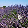
Very nice, in my opinion it is better than the previous version! Very nice, in my opinion it is better than the previous version! |
| sent on May 31, 2012 (19:55)
I agree, much better than the previous version. The whole matter of how much contrast/saturation is a matter of individual taste. For me, there is a very small difference between "just enough" and "no longer realistic". I think you did a fine job on this one, hauti! |
| sent on May 31, 2012 (20:14)
Wonderful |
| sent on May 31, 2012 (23:14) | This comment has been automatically translated (show/hide original)
Very very beautiful! :-) Very very beautiful!! |
| sent on June 01, 2012 (22:35)
potent stuff Adam (PS just finding my way on new forum) |
| sent on June 01, 2012 (23:08)
Thank you all for comments
Chris, John good to see you ... old crew is getting back ;] |
| sent on June 02, 2012 (0:31) | This comment has been automatically translated (show/hide original)
This second version is surely more December dramatic, but I go against the tide Because prefer the previous one .... of course, it's just my personal taste. ;-)
Bye,
Paul This second version is surely more dramatic,but I go against the tide because prefer the previous one....of course,it's just my personal taste.
Bye,
Paolo |
| sent on June 02, 2012 (8:45) | This comment has been automatically translated (show/hide original)
Very beautiful is better than the previous version, congrats. Very beautiful is better than the previous version, congrats. |
| sent on June 02, 2012 (9:32)
Very interesting color range, nice photo!!! :) |
| sent on June 02, 2012 (13:02) | This comment has been automatically translated (show/hide original)
very nice shot with wonderful color. bye very nice shot with wonderful color. bye |
| sent on June 02, 2012 (13:09) | This comment has been automatically translated (show/hide original)
Very beautiful Very beautiful |
| sent on June 02, 2012 (19:01)
thank you very much for kind words
I'm really glad you have pleasure watching it ;) |
| sent on June 02, 2012 (19:51) | This comment has been automatically translated (show/hide original)
Great colors! A very nice photo! Great colours ! A very nice photo ! |
| sent on June 03, 2012 (10:38) | This comment has been automatically translated (show/hide original)
I agree with the comments of previous photographers. Chromatic Great shot!
Compliments!
Hello!
. Gil. I agree with the comments of previous photographers. Great chromatic shot!
Compliments!
Ciao!
.gil. |
| sent on June 03, 2012 (20:50)
Maybe a too much saturated sky otherwise a wonderful colored nive picture |
| sent on June 04, 2012 (17:07)
Thank you once again it's a big pleasure to read those kind words !  |
| sent on June 04, 2012 (17:25) | This comment has been automatically translated (show/hide original)
Interesting but I prefer to cross processing:
first version of the sky and the foreground with saturated colors of this second version.
Interesting elaborations but I prefer a cross:
the sky of the first version and the first floor with saturated colors of this second version.
hello, laurel Interesting but I prefer a cross processing:
first version of the sky and the foreground with saturated colors of this second version.
Interessanti elaborazioni ma preferisco un incrocio:
il cielo della prima versione e la parte in primo piano con colori saturi di questa seconda versione.
ciao, lauro |
| sent on June 05, 2012 (18:03)
Then you are in minority Elleeemme but still thank you so much for visiting and leaving your thoughts ;)
cheers ! |
| sent on June 05, 2012 (18:55) | This comment has been automatically translated (show/hide original)
I did not see the previous version but I like the colors of this one .. I like the way the colors of the flowers 'refer' to the colors of the sky :-) Just a question: did you create two different layers to post process the picture? Because it's Seems That there are kind of white marks around the trees .. expecially the tree on the left side .. I didn't see the previous version but I like the colors of this one.. I like the way the colors of the flowers "refer" to the colors of the sky Just a question: did you create two different layers to post process the picture? Because it's seems that there are kind of white marks around the trees..expecially the tree on the left side.. |
| sent on June 05, 2012 (20:22)
Hi Filcontact!
This is a fault of a blend.
I was trying to reduce the effect of halo to minimum but it's still visible as you noticed :)
If anyone is interested i can post some small previews of raw files.
|
|

Publish your advertisement on JuzaPhoto (info) |


 JuzaPhoto contains affiliate links from Amazon and Ebay and JuzaPhoto earn a commission in case of purchase through affiliate links.


 Resize to fit window