What do you think about this photo?Do you have questions or curiosities about this image? Do you want to ask something to the author, give him suggestions for improvement, or congratulate for a photo that you really like?
You can do it by joining JuzaPhoto, it is easy and free!
There is more: by registering you can create your personal page, publish photos, receive comments and you can use all the features of JuzaPhoto. With more than 242000 members, there is space for everyone, from the beginner to the professional.
| sent on April 24, 2012 (21:04) | This comment has been automatically translated (show/hide original)
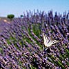
Beautiful, great light and delicate colors.
Congratulations, hello. Bella, ottima luce e colori delicati.
Complimenti, ciao. |
| sent on April 24, 2012 (21:24) | This comment has been automatically translated (show/hide original)
with the passage caterina - ask an advice to all the landscapers DOC!
In my opinion the composition would be slightly more balanced croppando the lower part (the image posted is the result of a single click and without crop), but I preferred to keep it as it is so that the texture of gravel can give greater depth to ' image. What do you think? :-) grazie del passaggio caterina - chiedo un consiglio a tutti i paesaggisti DOC!
A mio parere la composizione sarebbe più equilibrata croppando leggermente la parte inferiore (l'immagine postata è frutto di un unico scatto e senza crop); ho preferito però mantenerla tal quale in modo tale che la texture del fondo ghiaioso possa dare maggiore profondità all'immagine. Voi che ne pensate?  |
| sent on April 24, 2012 (22:03) | This comment has been automatically translated (show/hide original)
So I really like the composition, with the bottom in the foreground there is a lot of depth. Although purists landscape tend to isolate the elements and to simplify for a more minimalist and dreamy. At the end is a matter of personal taste.
Anyway congratulations ;-)
All the best,
Joseph A me così piace molto la compo, con il fondale in primo piano c'è molta profonditá. Anche se i puristi della paesaggistica tendono ad isolare gli elementi e a semplificare per ottenere un'immagine più minimalista e sognante. Alla fine è questione di gusti personali.
Comunque complimenti
Un saluto,
Giuseppe |
| sent on April 24, 2012 (22:11) | This comment has been automatically translated (show/hide original)
thanks for the ride kyagi ;-) grazie per il passaggio kyagi |
| sent on April 24, 2012 (22:21) | This comment has been automatically translated (show/hide original)
I would leave so why really deserves io la lascerei così perchè merita davvero |
| sent on April 24, 2012 (22:22) | This comment has been automatically translated (show/hide original)
Cropparla not just because you lose the texture of the backdrop, then you had to bring you during shooting, however, so it is nice eye that you see in the lower left box the Clone Stamp Cropparla no perchè perdi appunto la texture del fondale, allora di dovevi avvicinare tu in fase di scatto, comunque così è bella occhio solo che si vede in basso a sinitra il timbro clone |
| sent on April 24, 2012 (23:38) | This comment has been automatically translated (show/hide original)
beautiful pastel colors, I like it very much! bellissimi colori pastello, mi piace molto! |
| sent on April 25, 2012 (6:26) | This comment has been automatically translated (show/hide original)
through the steps:-P - gabriele do not see signs and they do not seem at all to have used the clone stamp ... grazie dei passaggi  - gabriele non vedo segni e sopratutto non mi sembra affatto di aver usato il timbro clone... - gabriele non vedo segni e sopratutto non mi sembra affatto di aver usato il timbro clone... |
| sent on April 25, 2012 (7:01) | This comment has been automatically translated (show/hide original)
Hello Stefano :-)
I think it is great, you gave depth to the scene and you captured the best light and the colors of the moment;
You made everything well ... or perhaps a bit more of the sky so that the mist rose was not on the edge of the frame ...
Best wishes and have a good day :-) Ciao Stefano
secondo me così è ottima, hai dato profondità alla scena e hai catturato al meglio la luce e le cromie di quel momento;
hai composto bene il tutto...anzi forse un tantino più di cielo di modo che la foschia rosa fosse meno al margine del fotogramma...
Un caro saluto e una buona giornata |
| sent on April 25, 2012 (9:09) | This comment has been automatically translated (show/hide original)
It is fine the first floor depth, but if they can pull off another version minimal, cut very pano with only the cloud and its reflection in the reeds, Gabriel has got a good look at the bottom left there is a small strip of double image ... it seems that the image is on two levels and is the upper layer straightened slightly and then letting the trim a little off ;-)
Hello :-) Va benissimo così il primo piano da profondità, ma se ne può tirare fuori un'altra versione minimal, taglio molto pano con solo la nuvola il suo riflesso ed il canneto, Gabriele ha visto bene in basso a sinistra c'è una minuscola striscia di doppia immagine...sembra quasi che l'immagine fosse su due livelli e sia strato raddrizzato leggermente quello superiore lasciando poi il rifilo un poco largo
Ciao |
| sent on April 25, 2012 (15:00) | This comment has been automatically translated (show/hide original)
Hello Stefano. Great shot, congratulations. Clean composition and delicate colors. With regard to your question about the first floor quoto Catherine. Okay.
Hello,
Diego. Ciao Stefano. Ottimo scatto, complimenti. Composizione pulita e colori delicati. Relativamente al tuo dubbio in merito al primo piano quoto Caterina. Va bene così.
Ciao,
Diego. |
| sent on April 25, 2012 (21:54) | This comment has been automatically translated (show/hide original)
Beautiful light and colors, congratulations!
Ciao.Omar Bellissima luce e colori,complimenti!
Ciao.Omar |
| sent on April 26, 2012 (18:11) | This comment has been automatically translated (show/hide original)
Diego, Omar thanks to you the passage :-) Diego, Omar grazie anche a voi del passaggio |
| sent on May 27, 2013 (16:44) | This comment has been automatically translated (show/hide original)
Congratulations very beautiful :) Complimenti molto Bella :) |
|

Publish your advertisement on JuzaPhoto (info) |


 JuzaPhoto contains affiliate links from Amazon and Ebay and JuzaPhoto earn a commission in case of purchase through affiliate links.


 Resize to fit window