What do you think about this photo?
Do you have questions or curiosities about this image? Do you want to ask something to the author, give him suggestions for improvement, or congratulate for a
photo that you really like?
You can do it by joining JuzaPhoto, it is easy and free!
There is more: by registering you can create your personal page, publish photos, receive comments and you can use all the features of JuzaPhoto.
With more than 260000members, there is space for everyone, from the beginner to the professional.
|
|
sent on 28 Gennaio 2014 (13:49) | This comment has been automatically translated (show/hide original)
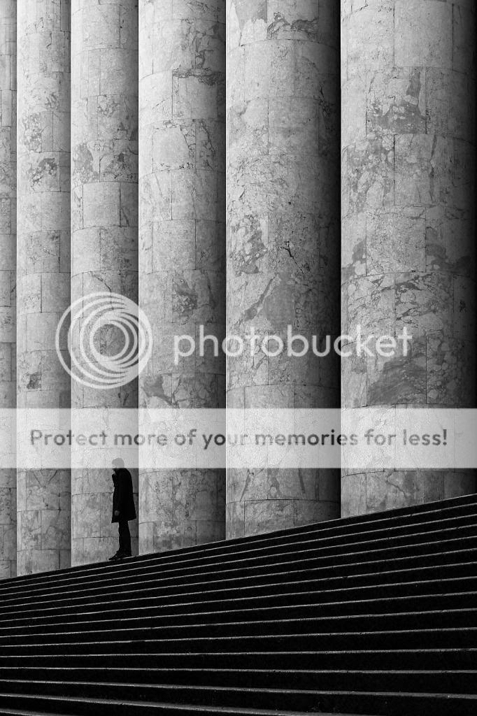
The geometry of this beautiful photo! and the human figure is the extra touch, I also really like the b & w.
congratulations! Bellissime le geometrie di questa foto! e la figura umana è il tocco in più, mi piace molto anche il b&n.
complimenti! |
|
|
sent on 28 Gennaio 2014 (13:55) | This comment has been automatically translated (show/hide original)
The human figure adds interest to an already beautiful shot of her
Hello
Valentino La figura umana aggiunge interesse ad uno scatto già bello di suo
Ciao
Valentino |
|
|
sent on 28 Gennaio 2014 (14:20) | This comment has been automatically translated (show/hide original)
Just a note: maybe, just maybe, it would have to be corrected a little bit, but only slightly, the slope of the vertical columns. But I say this wanting to find a nit.
For the rest of you I offer my congratulations, one of those shots that I'd like to get it done.
I like it for its simplicity and at the same time for the grandeur and magnificence of the columns that dominate the "little" man.
Bravo bravo!
Barbara Solo una nota: forse, e dico forse, sarebbe da correggere un pochino, ma di poco, la pendenza verticale delle colonne. Ma questo lo dico volendo trovare il pelo nell'uovo.
Per il resto ti faccio i miei complimenti, uno di quegli scatti che mi piacerebbe avere fatto.
Mi piace per la sua semplicità e nello stesso tempo per l'imponenza e magnificenza delle colonne che sovrastano il "piccolo" uomo.
Bravo bravo!
Barbara |
|
|
sent on 28 Gennaio 2014 (15:41) | This comment has been automatically translated (show/hide original)
thank you all. :-)
@ Barbara, those are skewed to the right, and seems to me a distortion phenomenon. The original was just a barrel (18-55 bottom of the bottle) only after several attempts at accommodation of distortion there was always something wrong, and I surrendered. at least the right part is straight! grazie a tutti. 
@Barbara si , sono storte quelle a destra,e me sembra un fenomeno di distorsione. L'originale era proprio un barilotto (18-55 fondo di bottiglia) solo che dopo vari tentativi di sistemazione della distorsione c'era sempre qualcosa che non andava, e mi sono arreso. almeno la parte destra è dritta! |
|
|
sent on 28 Gennaio 2014 (17:38) | This comment has been automatically translated (show/hide original)
Well done, really.
Just to say something, the human presence would have put it on the right to give more space to his gaze.
Congratulations, it's one of those photos that I regret not having done it myself.
Paris Ben fatta,veramente.
Giusto per dire qualcosa,la presenza umana l'avrei messa sulla dx per dare più spazio al suo sguardo.
Complimenti,è una di quelle foto che mi spiace non aver fatto io.
Paride |
|
|
sent on 28 Gennaio 2014 (18:28) | This comment has been automatically translated (show/hide original)
Giuseppe nice picture, I like it. Giuseppe bella foto, mi piace. |
user8319
|
sent on 28 Gennaio 2014 (20:19) | This comment has been automatically translated (show/hide original)
I am stepping stone to compliments, really nice pictures. Mi accodo ai complimenti, bella foto davvero. |
|
|
sent on 28 Gennaio 2014 (22:26) | This comment has been automatically translated (show/hide original)
wow, nice picture, nice perspective ... how small we are human beings.
congratulations and good, nothing to say.
hello wow, bella foto, bella prospettiva...come siamo piccoli noi esseri umani.
bravo e complimenti, niente da dire.
ciao |
|
|
sent on 28 Gennaio 2014 (23:06) | This comment has been automatically translated (show/hide original)
“ there was always something wrong, and I surrendered. „ :-( :-(
You only correcting lens or have even tried to pull a little 'photo?
The image is worth and I think it is also straight without too much effort, and placed on probation on the look straight version! :-P:-P
Hello,
Maurizio
“ c'era sempre qualcosa che non andava, e mi sono arreso. „ 
Hai effettuato solo la correzione lente o hai provato anche a tirare un po' la foto?
L'immagine merita e secondo me viene anche dritta senza troppi sforzi, su su prova e riposta aspetto la versione dritta!!
Ciao,
Maurizio
|
|
|
sent on 29 Gennaio 2014 (14:43) | This comment has been automatically translated (show/hide original)
I like it, but I'd like more if they were correct drooping lines.
Then I would not have anything to say ...
(Man I'm fine where he is ...:-D).
Great glance.
Bravo ...
Andrea. ;-) Mi piace, ma mi piacerebbe di più se venissero corrette le linee cadenti.
Allora non avrei niente da ridire...
(l'uomo mi sta bene dove sta... ). ).
Grande colpo d'occhio.
Bravo...
Andrea. |
|
|
sent on 29 Gennaio 2014 (17:22) | This comment has been automatically translated (show/hide original)
intriguing geometries and cutting, congratulations
Hello
max intriganti le geometrie e il taglio, complimenti
Ciao
max |
|
|
sent on 31 Gennaio 2014 (11:36) | This comment has been automatically translated (show/hide original)
Great composition, in fact, the lines are not perfectly vertical hurt a bit 'the geometry of the picture, but I have to tell you that I do not mind that much. I do not know how to advise you to remove the distortion because I for one do not particularly annoying, but if the place is what I believe (Post Office building in Palermo) from the location where you were either with or plasticotto with a lens would have gotten most noble of better ... it is the location, at the base of the stairs and aim toward the other, which does not help (among other things you renew the compliments because I tried to shoot in the same place and I have not gotten anything remotely comparable! :-D) Ottima composizione, in effetti la linee non perfettamente verticali danneggiano un po' la geometria della foto, ma devo dirti che non mi dispiace più di tanto. Non saprei come consigliarti di rimuovere la distorsione perché a me per primo non infastidisce particolarmente, ma se il posto è quello che credo io (palazzo delle poste di Palermo) dalla posizione in cui eri né col plasticotto né con una lente più blasonata avresti ottenuto di meglio ... è proprio la posizione, alla base delle scale e con l'obbiettivo rivolto verso l'altro, che non aiuta (tra l'altro ti rinnovo i complimenti perché ho provato a scattare in quello stesso luogo e non ho ottenuto nulla di lontanamente paragonabile! ) |
|
|
sent on 31 Gennaio 2014 (15:34) | This comment has been automatically translated (show/hide original)
Beautiful, but you probably forgot to apply an unsharp mask at least on the columns and stairs ... or if you did not as intense as that of the original image. It 'obvious if you put the two images side by side.
I like how the new geometry, much more strict, but you could push a little 'more with the overall contrast (you can also see the silhouette of the man who in this is more readable). This is a correction that takes a minute, and add so much, IMHO.
I renew to you my congratulations!
EDIT: just trying to give an increase in micro-contrast with unsharp mask set with:
amount: 40%
radius: 30 px
threshold15 levels
or something like that, and see if you're satisfied Bella, ma hai probabilmente dimenticato di applicare una maschera di contrasto almeno sulle colonne e sulle scale ... o se l'hai fatto non è così intensa come quella della foto originale. E' evidente se metti le due immagini fianco a fianco.
La nuova mi piace come geometria, decisamente più rigorosa, ma potresti spingere un po' più con il contrasto globale (si vede anche dalla sagoma dell'uomo che in questa è più leggibile). Si tratta di una correzione che prende un minuto di tempo, e aggiungerebbe tanto, IMHO.
Ti rinnovo i miei complimenti!
EDIT: prova a dare semplicemente un aumento del microcontrasto con maschera di contrasto settata con:
amount: 40%
radius: 30 px
threshold: 15 levels
o qualcosa di simile, e vedi se il risultato ti soddisfa |
|
|
sent on 31 Gennaio 2014 (17:25) | This comment has been automatically translated (show/hide original)
“ better? „
In my opinion, definitely yes:-D
I've now learned to have the settings more or less standard to give the effect I want, which then varied depending on the image. Having a starting point of reference helps in these cases. “ meglio? „
A mio avviso decisamente si
Io ormai ho imparato ad avere dei settaggi più o meno standard per dare l'effetto che voglio, che poi vario a seconda dell'immagine. Avere un punto di partenza di riferimento aiuta in questi casi. |
|
|
sent on 31 Gennaio 2014 (21:23) | This comment has been automatically translated (show/hide original)
Well :-). basically I can not appreciate the difference between visually very little amount and radius and vice versa.
Usually I put very low range and quantity of 140-180% Bene . fondamentalmente non riesco ad apprezzare visivamente la differenza tra molto amount e poco radius e viceversa.
Di solito metto raggio molto basso e quantità 140-180% |
|
|
sent on 31 Gennaio 2014 (22:51) | This comment has been automatically translated (show/hide original)
The Unsharp Mask works by detecting essentially the net change in tone on the three RGB channels and increasing the contrast locally, darkening around in a user-determined by brightening the darker and the lighter one, creating a small area in the highest contrast of all the contours of the image. The command Quantity simply gives the amount of darkening / lightening of the edges, while varying the radius around where the mask acts. Threshold instead affect the method by which the algorithm detects the edges, said in a nutshell, the higher the threshold value minus the effect of the unsharp mask is visible, since it goes to act only on the edges more marked and net.
I have permission to use your photo:
i218.photobucket.com/albums/cc228/Toschenko/IMG_6845final3_zps722c8d8c
(Not sure why the site does not load the photo directly, however the link double click on the magnifying glass to see it in original resolution)
Left: without changes
Center: quantia 40, Radius 30 Threshold 10. The result is that the contrast increases in a visible manner (the beam is high and the round in which increases the contrast is relatively large), but only the areas of the original image that have sharp edges are involved.
Right: Amount 150, Radius 0.7 Threshold 1. Here the shadows darkenand, for example, those between the columns, are less emphasized but the fact that the threshold is low makes the mask to act on all the details of the image, and the details of the columns appear more visible. Globally appears more defined and sharp, which is then the optical effect that is sought with the sharpening.
After I bored with things you may already know, I tell you:-D: Quantity between 100 and 160 (depending on the resolution of the image) to give clarity, not more than 40/50 to increase the contrast visible: Ray preferably 0.3 to 1 depending on the size of the details of the photo to increase sharpness, details more practical purposes there are smaller must be the radius: Radius to increase the contrast generally above 30.
Threshold to low values ??(1-5) to increase the nitidezza, high (around 10/15) for contrast.
In the case of images with a fair amount of noise and lots of fine detail is better to proceed more gradually applying unsharp masks with low radius and threshold around 7/8 to exclude from sharpening the noise (at least on paper:-D)
This is at least what I do La maschera di contrasto funziona essenzialmente rilevando le variazioni nette di toni sui tre canali RGB e aumentando il contrasto localmente, scurendo in un intorno determinato dall'utente la parte più scura e schiarendo quella più chiara, creando un piccola zona a contrasto più elevato su tutti i contorni dell'immagine. Il comando Quantità dà semplicemente l'ammontare di scurimento/schiarimento dei bordi, mentre Raggio varia l'intorno in cui la maschera agisce. Soglia invece influisce sul metodo con cui l'algoritmo rileva i bordi, detto in soldoni più è alto il valore di Soglia meno l'effetto della maschera di contrasto è visibile, poiché essa va ad agire solo sui bordi più marcati e netti.
Mi sono permesso di utilizzare la tua foto:
i218.photobucket.com/albums/cc228/Toschenko/IMG_6845final3_zps722c8d8c
(non so perché il sito non carica direttamente la foto, comunque dal link clicca due volte sulla lente d'ingrandimento per vederla a risoluzione originale)
Sinistra: senza modifiche
Centro: Quantià 40, Raggio 30 Soglia 10. Il risultato è che il contrasto aumenta in maniera visibile (il raggio è elevato e l'intorno in cui aumenta il contrasto è relativamente esteso), ma solo le zone dell'immagine originale che presentano dei bordi netti vengono interessate.
Destra: Quantità 150, Raggio 0.7 Soglia 1. Qui le ombre più scure, ad esempio quelle tra le colonne, sono meno enfatizzate ma il fatto che la Soglia sia bassa fa agire la maschera su tutti i dettagli dell'immagine, e i dettagli delle colonne appaiono più visibili. Globalmente appare più definita e nitida, che è poi l'effetto ottico che si ricerca con lo sharpening.
Dopo averti tediato con cose che forse già sapevi, ti dico : Quantità tra i 100 e i 160 (a seconda della risoluzione dell'immagine) per dare nitidezza, non più di 40/50 per aumentare il contrasto visibile: Raggio preferibilmente da 0.3 a 1 in funzione della grandezza dei dettagli della foto per aumentare la nitidezza, pratica più dettagli fini ci sono più piccolo deve essere il raggio: per aumentare il contrasto Raggio generalmente superiore ai 30.
Soglia a valori bassi (1-5) per aumentare la nitidezza, alta (intorno a 10/15) per il contrasto.
In caso di immagini con una discreta quantità di rumore e tanti dettagli fini è meglio procedere gradualmente applicando più maschere di contrasto con raggio basso e soglia intorno a 7/8 per escludere dallo sharpening il rumore (almeno sulla carta )
Questo è almeno ciò che faccio io |
|
|
sent on 01 Febbraio 2014 (2:07) | This comment has been automatically translated (show/hide original)
Great explanation, even with sample images!
In fact, the difference can be appreciated now that you point out to me.
So I applied well to bring out the small veins.
For photos uploaded instantly you have to put the link to "direct" between the tags [IMG][/IMG] Ottima spiegazione, anche con le immagini di esempio!
In effetti la differenza si apprezza ora che me la fai notare.
Allora l'ho applicata bene per far risaltare le piccole venature.
Per le foto caricate all'istante devi mettere il link "direct" tra i tag [IMG][/IMG] |
|
|
sent on 01 Febbraio 2014 (2:25) | This comment has been automatically translated (show/hide original)
Superb. Stupenda. |
|

Publish your advertisement on JuzaPhoto (info) |

 street
 JuzaPhoto contains affiliate links from Amazon and Ebay and JuzaPhoto earn a commission in case of purchase through affiliate links.


 Resize to fit window
 1.5 MEGAPIXEL