What do you think about this photo?
Do you have questions or curiosities about this image? Do you want to ask something to the author, give him suggestions for improvement, or congratulate for a
photo that you really like?
You can do it by joining JuzaPhoto, it is easy and free!
There is more: by registering you can create your personal page, publish photos, receive comments and you can use all the features of JuzaPhoto.
With more than 260000members, there is space for everyone, from the beginner to the professional.
|
|
sent on 18 Gennaio 2014 (23:04) | This comment has been automatically translated (show/hide original)
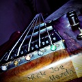
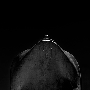
Hello, you cast the comment, instinctively ...
The photo should be a matrix graphics.
The idea is good.
But the messages that I get to the brain instantly are two:
1) More contrast and detail on white beams at the top.
2) Human figure too far away.
Let me explain ...
1) the party is too high "Feather". The horizontal beams tend to merge losing the "geometric connotation."
Maybe a slight underexposure would stand out better lines of separation. Otherwise it's just a matter of light, insurmountable unless different illuminations.
2) The man is too far away. So it becomes a nuisance lost in the sdinner and creates disorder ...
I tried to approach keeping it in the lower left, but making him take a more generous frame.
Again, the idea was good.
Has not been developed to better ...
Hello.
Andrea. ;-)
Ciao, te la commento di getto, istintivamente...
La foto dovrebbe essere a matrice grafica.
L'idea è buona.
Però i messaggi che mi arrivano al cervello istantaneamente sono due:
1) Più contrasto e dettaglio sulle travi bianche in alto.
2) Figura umana troppo distante.
Mi spiego meglio...
1) la parte alta è troppo "Sfumata". Le travi orizzontali tendono a confondersi perdendo la "Connotazione geometrica".
Forse una leggera sottoesposizione avrebbe fatto risaltare meglio le linee di distacco. Altrimenti è solo un problema di luce, insormontabile a meno di illuminazioni diverse.
2) L'uomo è troppo distante. Così diventa un elemento di disturbo perso nella scena e crea disordine...
Avrei cercato di avvicinarmi mantenendolo in basso a sx, ma facendogli occupare una parte più abbondante nell'inquadratura.
Ripeto, l'idea di partenza era buona.
Non è stata sviluppata al meglio...
Ciao.
Andrea.
|
|
|
sent on 18 Gennaio 2014 (23:16) | This comment has been automatically translated (show/hide original)
I really like the geometry as well as the development in high key. the man sees a little bit because superimposed on the chair in front of him and has a very similar gray.
It is perfect for me for that reason alone, however, do well to be proud of, it's a good job.
Hello
Max Mi piacciono molto le geometrie cosi come lo sviluppo in high key. l'uomo si vede un pò poco perchè sovrapposto alla poltrona che ha di fronte e ha un grigio molto simile.
Non è perfetto per me solo per questo motivo, comunque fai bene ad esserne orgoglioso, è un buon lavoro.
Ciao
Max |
|
|
sent on 18 Gennaio 2014 (23:46) | This comment has been automatically translated (show/hide original)
Thanks to the interventions!
Indeed, the human figure is lost within this space!
And to think that I really liked this presence while my companion said ... nice, too bad there's that guy in the middle! :-)
She was right but I do not need to know! :-D
By contrast, actually I have to try, even if they are very capable, the whole series is based, however, with this type of development. However let's say that the place is very white and very bright.
Now I'm off to work, slowly continue to charge it.
More than proud of this shot, I'm proud of the approach that I've had for the period of that vacation, documenting, going with clear ideas, limiting the shots allowed me tohave better pictures than I did before.
Now from here to take a good shot there runs, but it has given me that added stimulus to this new environment you are creating hope I do embark on this new interesting long way.
In a nutshell you just take the dog or c ... all the things that "go".
It takes research and message!
At least for my new way of seeing this hobby. ;-)
Thank you. Grazie degli interventi!
Effettivamente la figura umana si perde all'interno di questo spazio!
E pensare che a me piaceva molto questa presenza mentre la mia compagna ha detto... bella, peccato che c'è quello lì nel mezzo!
Aveva ragione lei ma non lo deve sapere!
Per il contrasto effettivamente devo provare, anche se non ne sono molto capace, tutta la serie comunque è basata con questo tipo di sviluppo. Comunque diciamo che anche il posto è molto bianco e molto luminoso.
Adesso sono fuori per lavoro, piano piano continuerò a caricarla.
Più che orgoglioso di questo scatto, sono orgoglioso dell'approccio che ho avuto per il periodo di quella vacanza che, documentandomi, andando con idee chiare, limitando gli scatti mi ha permesso di avere foto migliori di quelle che facevo prima.
Ora da qui a fare delle buone foto ce ne corre, però la cosa mi ha ridato stimolo che sommato a questo nuovo ambiente che si sta creando spero mi faccia intraprendere questa nuova interessante lunga strada.
In poche parole basta scattare alla c...o di cane a tutte le cose che "passano".
Ci vuole ricerca e messaggio!
Almeno per il mio nuovo modo di vedere questo hobby.
Grazie. |
|
|
sent on 18 Gennaio 2014 (23:52) | This comment has been automatically translated (show/hide original)
But I see it differently and focus on the message of the shot, assuming you wanted to give a message.
As soon as I saw it I exclaimed, "Ah-ah". The exclamation came to me when I saw that one of the bags "beanbag" was not a lot but a man.
The position he assumed and the neutral color of the jacket, it does confuse with the elements that surround it, as if it were drained, tired and fed up of his condition, and that they're waiting for something with his friends sacks.
He is already luckier than Renzo Tramaglino *, which was a crock pot in the middle iron pots ... this man is an empty lot in the middle of empty bags.
The fact that he has gray hair adds further emphasis to this my vision / delirium evening.
Maybe I've watched too many photos oggthe. ;-)
For the technical part, I can not understand if the column on the left hangs or not, maybe you had to revise a few degrees vertically.
Bravo, I love it!
Barbara
Edit: I had not read your last speech. I read between the lines you did not want to give any message, but I have found the same. What do we do now? :-D
:-D
* Edit2: What a blunder! It must have been sleeping, combined with my memory that misfires every now and then ... the crock pot in the middle of the iron pots Don Abbondio is not Renzo! What fighiuradimelma! Prof.Chaos Thanks for letting me know! :-D Io invece la vedo diversamente e mi concentro sul messaggio dello scatto, ammesso che tu abbia voluto dare un messaggio.
Appena l'ho vista ho esclamato "Ah-ah". L'esclamazione mi è venuta nel momento in cui ho visto che uno dei sacchi "beanbag" non era un sacco ma un uomo.
La posizione che ha assunto e il colore neutro della giacca, lo fa confondere con gli elementi che lo circondano, come se fosse svuotato, stanco e stufo della sua condizione, e che stia li in attesa di qualcosa insieme ai suoi amici sacchi.
Lui è già più fortunato di Renzo Tramaglino*, che era un vaso di coccio in mezzo a vasi di ferro... questo uomo è un sacco vuoto in mezzo a sacchi vuoti.
Il fatto che abbia i capelli grigi aggiunge ulteriore enfasi a questo mia visione/vaneggiamento serale.
Forse ho guardato troppe fotografie oggi.
Per la parte tecnica, non riesco a capire se la colonna a sinistra pende o meno, forse la dovevi rivedere di qualche grado in verticale.
Bravo, mi piace!
Barbara
Edit: non avevo letto il tuo ultimo intervento. Leggo tra le righe che non volevi dare alcun messaggio, ma io l'ho trovato lo stesso. Come la mettiamo adesso?
*edit2: Che gaffe! Sarà stato il sonno, unito alla mia memoria che fa cilecca ogni tanto... il vaso di coccio in mezzo ai vasi di ferro è Don Abbondio, non Renzo! Che fighiuradimelma! Grazie Prof.Chaos per avermelo fatto notare! |
|
|
sent on 19 Gennaio 2014 (0:01) | This comment has been automatically translated (show/hide original)
... good, I've taken the words out of my mouth! But how did you know my intent even before me? :-D
Complimentissimi for fantasy and the ability to search a meaning within a photo.
To the left column to tablet I can not notice it but I trust!
Thank you for your wonderful performance! ... brava, mi hai tolto le parole di bocca! Ma come hai fatto a capire il mio intento addirittura prima di me?
Complimentissimi per la fantasia e la capacità di cercare un significato all'interno di una foto.
Per la colonna sinistra da tablet non riesco a notarlo ma mi fido!
Grazie della tua magnifica interpretazione! |
|
|
sent on 19 Gennaio 2014 (9:43) | This comment has been automatically translated (show/hide original)
I do not know if it's a shot of architecture or street where you want to give importance to human presence ...
If it were a click of architecture I like very much, also for the development of high key, if you could choose where to place the person I l 'I put on the bottom, which is useful to make the' idea of ??the proportions but not invasive ....
If you want to give space to the person, rather than "just" the 'I would have called "boredom".
The person standing on its own two feet makes me think more to those who do not get bored solitude, I think the classic person that went to the museum to take a pleasure is now resting while waiting for his teammates to come back visit ...
Andrea Io non capisco se è uno scatto di architettura o di street dove si vuole dare importanza alla presenza umana...
Se fosse uno scatto di architettura mi piace molto, anche per lo sviluppo in high key, se proprio potessi scegliere dove collocare la persona io l' avrei messa in fondo, utile per rendere l' idea delle proporzioni ma non invasiva....
Se vuoi dare spazio alla persona, più che "solo" l' avrei intitolata "noia".
La persona appoggiata sulle proprie gambe mi fa pensare più a chi si annoia che non alla solitudine, mi sembra la classica persona che è andata al museo per fare un piacere è adesso si riposa in attesa che tornino i suoi compagni di visita...
Andrea |
|
|
sent on 19 Gennaio 2014 (21:27) | This comment has been automatically translated (show/hide original)
The idea is good, have you tried to see it in b / w? I'm not an expert in b / w, but I think it would make it, you say?
MN L'idea è buona, hai provato a vederla in b/n? Non sono un esperto del b/n, ma penso che renderebbe, che dici?
MN |
|
|
sent on 20 Gennaio 2014 (11:07) | This comment has been automatically translated (show/hide original)
A great opportunity not fully exploited.
I agree with Prof Chaos, the human part is too small and gets lost in the pillows.
It would have been better to approach so as to increase the human presence, keeping a pdr from below, so as to include also a cmq posrione ceiling.
I would rate even conversion to B / N.
;-) Una bella occasione non sfruttata appieno.
Concordo con Prof Chaos, la parte umana è troppo piccola e si perde nei cuscini.
Sarebbe stato meglio avvicinarsi in modo da aumentare la presenza umana, mantenendo una pdr dal basso, in modo da includere cmq anche una posrione di soffitto.
Valuterei anche la conversione in B/N.
|
|
|
sent on 20 Gennaio 2014 (14:16) | This comment has been automatically translated (show/hide original)
I agree with those who preceded me, the idea is great but the man is far away and there is a portion of the floor that has no interest on the bottom border, it would be better to get closer in order to have a pdr closer to person, cut the floor and open up towards the ceiling with a pdr lower.
The human presence in my view connotes more shooting toward the street that the pure architecture and I agree with Barbara that has taken on a meaning of fatigue and loneliness caused by the posture of man to which I add a feeling of approval, the inability to distinguish , says Barbara, a lot in the midst of other bags all the same. In this sense, I get the message loud and clear photos, so shooting is effective.
Finally I would have preferred a BN but well contrasted this with the pliers to take itbecause it is a matter of personal taste, although I think that in general, the picture would have made more.
Greetings :-)
Federico
Concordo con chi mi ha preceduto, l'idea è ottima ma l'uomo è distante e c'è una porzione di pavimento che non ha alcun interesse sul bordo basso, sarebbe stato meglio avvicinarsi di più in modo da avere un pdr più vicino alla persona, tagliare il pavimento ed aprire verso il soffitto con un pdr più basso.
La presenza umana a mio avviso connota più lo scatto verso la street che l'architettura pura e concordo con Barbara che ha colto un significato di stanchezza e solitudine indotto dalla postura dell'uomo a cui aggiungo una sensazione di omologazione, l'incapacità di distinguersi, come dice Barbara, un sacco in mezzo ad altri sacchi tutti uguali. In questo senso il messaggio della foto mi arriva forte e chiaro, quindi lo scatto è efficace.
In ultimo avrei preferito un BN ben contrastato ma questa prendila con le pinze perché è una questione di gusti personali, anche se credo che in generale la foto avrebbe reso di più.
Un saluto
Federico
|
|
|
sent on 20 Gennaio 2014 (22:42) | This comment has been automatically translated (show/hide original)
Thank you very much interventions.
The image is part of a series of shots of archittura where I always inserted the human figure. Perhaps as you say it is more street ... in short, I came out a hybrid that is neither fish flesh it! :-)
I will continue to post photos of the series to see if maybe the whole work can make sense. However, I agree that it was a wasted opportunity, the increased presence of the human figure would surely have given more strength, I was too concentrated in the non-converging lines. I have yet to learn how to "drive"!
As for the BN I'm sorry but, or am I not do it (very likely), or is the image that you do not pay. I like this development cm ² light almost mono tone that I gave to the whole series.
I really like this new way of confronting, you fail to understand that things do not go and open your mind to new visions!
Thank you all!
Hello
Grazie mille degli interventi.
L'immagine fa parte di una serie di scatti di archittura dove ho inserito sempre la figura umana. Forse come dite voi è più street... insomma mi è venuto fuori un ibrido che non è ne carne ne pesce!
Continuerò a postare le foto della serie per vedere magari se nel complesso il lavoro possa avere un senso. Comunque condivido che è stata un'occasione sprecata, la maggiore presenza della figura umana avrebbe sicuramente dato più forza, ero troppo concentrato nel non far convergere le linee. Devo ancora imparare a "guidare"!
Per quanto riguarda il BN mi dispiace ma, o sono io che non ne sono capace (molto probabile) o è l'immagine che non si presta. A me cmq piaceva questo sviluppo leggero quasi mono tono che ho dato a tutta la serie.
Mi piace molto questo nuovo modo di confrontarsi, si riescono a capire cose che non vanno e si apre la mente a nuove visioni!
Grazie a tutti!
Ciao
|
|
|
sent on 20 Gennaio 2014 (23:36) | This comment has been automatically translated (show/hide original)
if it is a fit of architecture careful, the column on the left closes as high as you pointed out barbaric and beams of the ceiling and the upper part of the back wall are horizontal nn tend to lean to the right.
hello,
maurizio se è uno scatto di architettura attento,la colonna a sx chiude in alto come ti ha fatto notare barbara e le travi del soffitto e la parte alta della parete di fondo nn sono orizzontali tendono a pendere a dx.
ciao,
maurizio |
|
|
sent on 24 Gennaio 2014 (21:24)
sicuramente una buona idea, ottima location ma non sfruttate al meglio.
a mio avviso l'inquadratura è abbastanza dispersiva, eccessivamente generosa in alto. Per come l'hai composta, sebbene sia perfettamente a piombo, da la sensazione di pendere a destra.
Troppo marginale la dimensione della figura umana che si sovrappone ai sacchi eche avrebbe dovuto essere meglio posizionata.
Hai un buon occhio, non ti mancheranno le occasioni per stupire. sicuramente una buona idea, ottima location ma non sfruttate al meglio.
a mio avviso l'inquadratura è abbastanza dispersiva, eccessivamente generosa in alto. Per come l'hai composta, sebbene sia perfettamente a piombo, da la sensazione di pendere a destra.
Troppo marginale la dimensione della figura umana che si sovrappone ai sacchi eche avrebbe dovuto essere meglio posizionata.
Hai un buon occhio, non ti mancheranno le occasioni per stupire. |
|
|
sent on 27 Gennaio 2014 (3:33) | This comment has been automatically translated (show/hide original)
In my opinion not only by the impression of hanging a bit 'on the right, but hangs in a bit actually.
To me the character camouflaged between the bags do not mind, one of those cases to find the intruder in my view make the image less trivial than it would be without the human element. Obviously my approach to photography is quite rough, so I would not give too much credit to comment. :-D
Hello and see you soon! Secondo me non da solo l'impressione di pendere un po' a destra, ma un pelino pende effettivamente.
A me il personaggio mimetizzato tra i sacchi non dispiace, uno di quei casi da trova l'intruso che a mio modo di vedere rendono l'immagine meno banale di quanto non sarebbe senza l'elemento umano. Ovviamente il mio approccio alla fotografia è del tutto approssimativo, quindi non darei troppo credito a sto commento.
Ciao e alla prossima! |
|
|
sent on 28 Luglio 2014 (12:59) | This comment has been automatically translated (show/hide original)
I find this shot very well composed, for the rest I agree with what was said by prof. in the 1st comment. hello Pier io trovo questo scatto molto ben composto, per il resto condivido quanto detto dal prof. nel 1° commento. ciao Pier |
|
|
sent on 28 Luglio 2014 (14:04) | This comment has been automatically translated (show/hide original)
Ame love while sharing the first comment took only a bit of contrast only man to make it detached from the rest Ame piace pur condividendo il primo commento bastava solo un po di contrasto solo all'uomo da renderlo distaccato dal resto |
|

Publish your advertisement on JuzaPhoto (info) |

 Luoghi
 JuzaPhoto contains affiliate links from Amazon and Ebay and JuzaPhoto earn a commission in case of purchase through affiliate links.


 Resize to fit window


![[en]](shared_files/layout/country_flags/flag_196.jpg)