What do you think about this photo?Do you have questions or curiosities about this image? Do you want to ask something to the author, give him suggestions for improvement, or congratulate for a photo that you really like?
You can do it by joining JuzaPhoto, it is easy and free!
There is more: by registering you can create your personal page, publish photos, receive comments and you can use all the features of JuzaPhoto. With more than 255000 members, there is space for everyone, from the beginner to the professional.
| sent on October 20, 2025 (14:25) | This comment has been automatically translated (show/hide original)
|
| sent on October 21, 2025 (20:52) | This comment has been automatically translated (show/hide original)
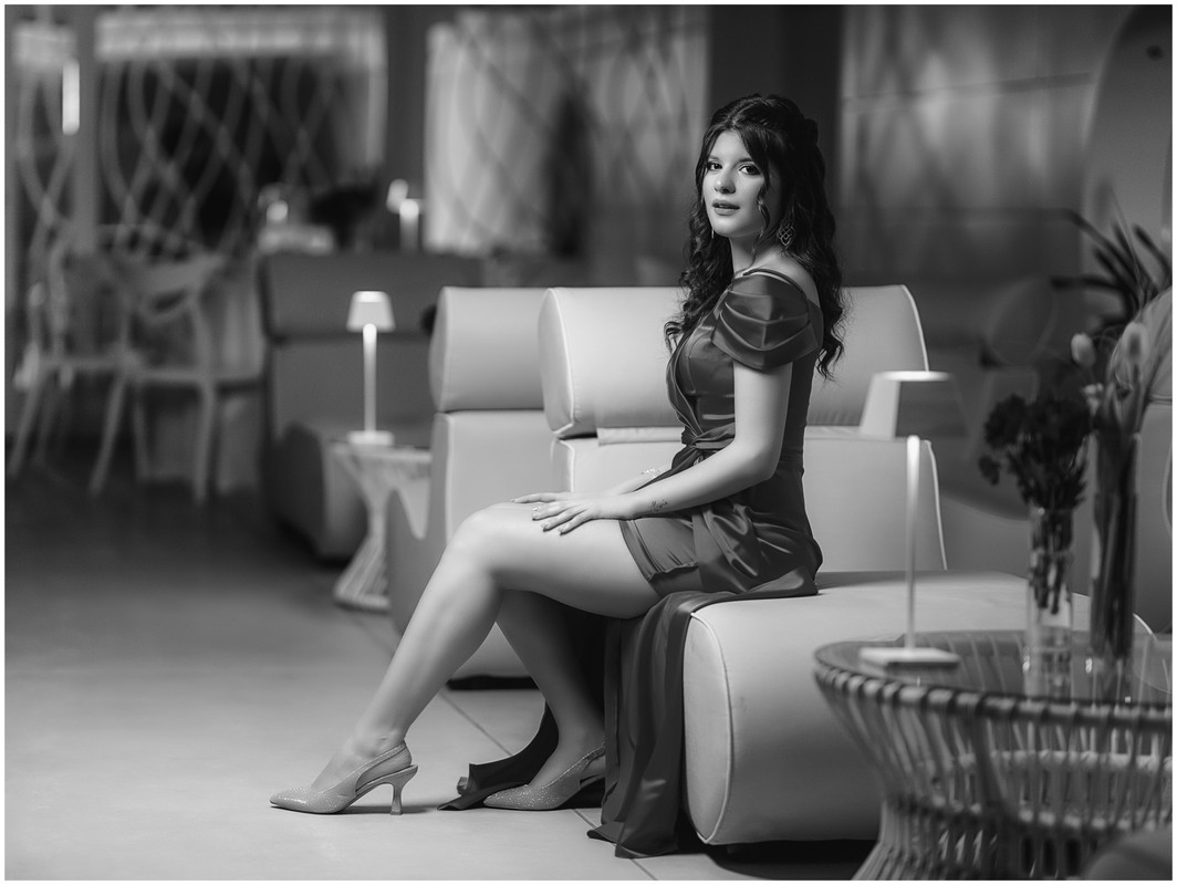
Very good, warm atmosphere in a credible and effective way, too bad the corner at the bottom right ... slightly bright background, maybe I would have vignetted a bit 8 :-) Anyway good 8-) Molto bene, atmosfera calda in modo credibile ed efficace, peccato l'angolino in basso a dx...sfondo leggermente luminoso, magari avrei vignettato un po' Comunque bravo Comunque bravo |
| sent on October 22, 2025 (13:47) | This comment has been automatically translated (show/hide original)
Hi Marcello, thanks for the passage. On the vignette or not I thought about it for a while and in the end I liked a nice, clean and uniform frame more. A bit of a cover in short. I noticed the corner at the bottom right too late but I think/hope that the attention goes to the model Ciao Marcello,grazie per il passaggio. Sulla vignettatura o no ci ho riflettuto per un po' e alla fine mi è piaciuto di più un fotogramma bello pulito e uniforme. Un po' da copertina insomma.L'angolino in basso a destra l'ho notato troppo tardi ma penso/spero che l'attenzione vada sulla modella |
| sent on October 22, 2025 (16:30)
Fra tutte anche se dici che il tuo genere è la street,
credo che la tua interpretazione per il compitino è fra le più riuscite.
Però trovo che la carnagione è un poco troppo imbottita portandola all'effetto bambola, non per il tono della pelle, ma per come arrotonda le forme. I capelli come tutti sono troppo chiusi e non vaporosi.
Il vestito è reso bene, forse schiarito un filo troppo dietro la schiena che deve restare in penombra e le scarpe che perdono un po dei brillantini.
Cosa poi per il compitino la copertina di una rivista di moda ill taglio orizzontale non è che ci vada bene, ti avrebbe anche risparmiato il dover cercare di far vivere meglio quei fiori che messi li in ombra non hanno senso in primo piano.
Sono stato pesante con te nel commento, ma perchè fra tutti hai fatto un buon lavoro se non il meglio.
Fra tutte anche se dici che il tuo genere è la street,
credo che la tua interpretazione per il compitino è fra le più riuscite.
Però trovo che la carnagione è un poco troppo imbottita portandola all'effetto bambola, non per il tono della pelle, ma per come arrotonda le forme. I capelli come tutti sono troppo chiusi e non vaporosi.
Il vestito è reso bene, forse schiarito un filo troppo dietro la schiena che deve restare in penombra e le scarpe che perdono un po dei brillantini.
Cosa poi per il compitino la copertina di una rivista di moda ill taglio orizzontale non è che ci vada bene, ti avrebbe anche risparmiato il dover cercare di far vivere meglio quei fiori che messi li in ombra non hanno senso in primo piano.
Sono stato pesante con te nel commento, ma perchè fra tutti hai fatto un buon lavoro se non il meglio. |
| sent on October 22, 2025 (17:35) | This comment has been automatically translated (show/hide original)
I find only slightly loaded the smoothing of the skin and for the hair I would have opened the blacks a little.
for the background I would have dimmed the lights a little Trovo solo leggermete caricata la lisciatura della pelle e per i capelli avrei aperto un pò i neri.
per lo sfondo avrei abbassato un pò le luci |
| sent on October 22, 2025 (19:30) | This comment has been automatically translated (show/hide original)
I like it, I find it one of the most successful. Maybe not on the cover, but you managed to embellish the model even more and highlight the dress in a natural way. a me piace, la trovo una delle più riuscite. Forse non da copertina, ma sei riuscito ad abbellire ancora di più la modella e a mettere in risalto l'abito in modo naturale. |
| sent on October 22, 2025 (21:33)
Non sono per nulla esperto in postproduzione di ritratti,quindi ogni considerazione è ben gradita
Sulla pelle sicuramente ci sono margini di miglioramento,d'altronde sistemare una pelle piuttosto irregolare senza farla apparire troppo finta non è una cosa semplice e il confine è alquanto sottile
Per quanto riguarda la questione sfondo e luci volevo valorizzare la location e non volevo la solita foto con modella illuminata da uno spot di luce. Anche perchè la location è bella ed elegante e penso che valorizzi lo scatto,i fiori in primo piano danno quel qualcosa in più. Ho provato poi vari tagli ma quelli troppo stretti non mi hanno convinto
Sui capelli è vero,avrei potuto fare più attenzione ma onestamente non ci ho pensato ma non penso che infici particolarmente sulla resa complessiva
Non sono per nulla esperto in postproduzione di ritratti,quindi ogni considerazione è ben gradita
Sulla pelle sicuramente ci sono margini di miglioramento,d'altronde sistemare una pelle piuttosto irregolare senza farla apparire troppo finta non è una cosa semplice e il confine è alquanto sottile
Per quanto riguarda la questione sfondo e luci volevo valorizzare la location e non volevo la solita foto con modella illuminata da uno spot di luce. Anche perchè la location è bella ed elegante e penso che valorizzi lo scatto,i fiori in primo piano danno quel qualcosa in più. Ho provato poi vari tagli ma quelli troppo stretti non mi hanno convinto
Sui capelli è vero,avrei potuto fare più attenzione ma onestamente non ci ho pensato ma non penso che infici particolarmente sulla resa complessiva |
| sent on October 22, 2025 (22:09)
Stylo come interpretazione è ben fatta,
sono stato un po severo, la pelle quasi evanescente è una questione che rischia di andare nelle bruciature, il sistema di imbottire la carnagione ha preso piede per via di certi plug-in e poi azioni di PS che rendevano però la pelle di plastica, non come tinta ma come rotondità troppo gommosa. Invece ci deve essere luce che smorza i contrasti ma non brucia le alte luci, le lascia nei punti che servono.
Secondo me tu hai usato più sensibilità rispetto altri e non essendo il tuo genere è un ottimo risultato.
La location nelle copertine più neutre sono meglio è il soggetto deve staccare ma quello che conta è la definizione sul soggetto che deve essere incisa e disegnata senza troppi contrasti sul vestito e gli accessori. I contrasti qui non sono energici ma devono solo disegnare le forme in modo delicato.
Stylo come interpretazione è ben fatta,
sono stato un po severo, la pelle quasi evanescente è una questione che rischia di andare nelle bruciature, il sistema di imbottire la carnagione ha preso piede per via di certi plug-in e poi azioni di PS che rendevano però la pelle di plastica, non come tinta ma come rotondità troppo gommosa. Invece ci deve essere luce che smorza i contrasti ma non brucia le alte luci, le lascia nei punti che servono.
Secondo me tu hai usato più sensibilità rispetto altri e non essendo il tuo genere è un ottimo risultato.
La location nelle copertine più neutre sono meglio è il soggetto deve staccare ma quello che conta è la definizione sul soggetto che deve essere incisa e disegnata senza troppi contrasti sul vestito e gli accessori. I contrasti qui non sono energici ma devono solo disegnare le forme in modo delicato. |
| sent on October 22, 2025 (23:06) | This comment has been automatically translated (show/hide original)
I underlined those details that for me could be improved, overall I still consider it a good post. Ho sottolineato quei particolari che per me potevano essere migliorati, nel complesso la ritengo comunque una buona post |
| sent on October 23, 2025 (11:33) | This comment has been automatically translated (show/hide original)
For me everything is fine (almost)
I would have darkened the background a little on the left to mask the disorder of the stacked chairs Per me va bene tutto (quasi)
Avrei scurito un tantino lo sfondo a SX per mascherare il disordine delle sedie accatastate |
| sent on October 23, 2025 (19:05) | This comment has been automatically translated (show/hide original)
For me excellent, apart from the corner on the right I wouldn't know what to report. Yes, maybe the hair can be perfected and there could have been a darkening of the background on the left, but still good! Per me ottima, a parte l'angolino a destra non saprei cosa segnalare. Si, forse i capelli sono perfettibili e ci poteva stare una scurita dello sfondo a sinistra, ma comunque bravo! |
| sent on October 24, 2025 (15:14) | This comment has been automatically translated (show/hide original)
I agree with the comments, I would have removed the magenta spot on the background on the left, I don't know why but the eye eventually ends up on that spot. Condivido i commenti avrei tolto la macchia magenta sullo sfondo a sinistra, a me non so perchè ma l'occhio alla fine finisce su quella macchia. |
| sent on October 24, 2025 (15:56) | This comment has been automatically translated (show/hide original)
As far as lights, contrast, colors are concerned, I find it one of the most successful, but the skin is excessively smooth, not so much on the legs, but on the face. The arm is perfect. Per quanto riguarda, luci, contrasto, colori, la trovo una delle più riuscite, ma la pelle è eccessivamente liscia, non tanto sulle gambe, quanto sul viso. Il braccio è perfetto. |
| sent on October 24, 2025 (20:05) | This comment has been automatically translated (show/hide original)
In general I like it, it is impactful but if you stop to analyze it I notice with this increase in temperature the dress with a change of color
I would have given a thread of light on the face, I would have cloned both the lower right corner and the upper right light strip which in my opinion is useless in generale mi piace, e d'impatto pero se ti fermi ad analizzarla noto con questo aumenti di temperatura il vestito a virato di colore
avrei dato un filo di luce sul viso, avrei clonato sia l'angolo in basso a dx che la striscia di luce in alto a dx che a mio avviso non serve a nulla |
| sent on October 25, 2025 (10:36)
Grazie a tutti per il passaggio
" a noto con questo aumenti di temperatura il vestito a virato di colore "
vero ma è una cosa voluta ed è coerente con l'aver scelto una tonalità globale più calda
" avrei dato un filo di luce sul viso"
Grazie per l'opinione ma non sono d'accordo. ho trovato molte post con il viso della modella quasi sovraesposto o troppo luminoso,soprattutto zona fronte,dove riflette maggiormente la luce. Io penso di aver trovato un buon equilibrio
Grazie a tutti per il passaggio
" a noto con questo aumenti di temperatura il vestito a virato di colore "
vero ma è una cosa voluta ed è coerente con l'aver scelto una tonalità globale più calda
" avrei dato un filo di luce sul viso"
Grazie per l'opinione ma non sono d'accordo. ho trovato molte post con il viso della modella quasi sovraesposto o troppo luminoso,soprattutto zona fronte,dove riflette maggiormente la luce. Io penso di aver trovato un buon equilibrio |
|

Publish your advertisement on JuzaPhoto (info) |

 GPP Elaborazioni in Gara

 JuzaPhoto contains affiliate links from Amazon and Ebay and JuzaPhoto earn a commission in case of purchase through affiliate links.


 2.8 MEGAPIXEL
 Resize to fit window


![[en]](shared_files/layout/country_flags/flag_196.jpg)