What do you think about this photo?Do you have questions or curiosities about this image? Do you want to ask something to the author, give him suggestions for improvement, or congratulate for a photo that you really like?
You can do it by joining JuzaPhoto, it is easy and free!
There is more: by registering you can create your personal page, publish photos, receive comments and you can use all the features of JuzaPhoto. With more than 255000 members, there is space for everyone, from the beginner to the professional.
| sent on October 20, 2025 (13:33) | This comment has been automatically translated (show/hide original)
FG
FG |
| sent on October 20, 2025 (13:33) | This comment has been automatically translated (show/hide original)
|
| sent on October 21, 2025 (20:50) | This comment has been automatically translated (show/hide original)
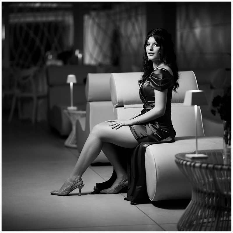
A bit like the colors that I adopted, but your performance on the model is better :-( Bravo Giuseppe, I don't rule out the podium... Un po' le cromie che ho adottato io, ma la tua resa sulla modella è migliore Bravo Giuseppe, non escludo il podio... Bravo Giuseppe, non escludo il podio... |
| sent on October 22, 2025 (16:17) | This comment has been automatically translated (show/hide original)
For the homework, the dress and shoes are good, a little less the complexion and the hair too closed black and shadow, The nose is always important, then the background that goes towards the greenish is not patina, and those flowers in the foreground cut in half make no sense, in the end they dirty, better the elegance of the lamp. Per il compitino bene il vestito e le scarpe, un po meno la carnagione e i capelli troppo chiusi neri e ombra, Il naso è sempre importante, poi il fondo che va verso il verdognolo non è da patinata, e quei fiori in primo piano tagliati a metà non hanno senso, alla fine sporcano, meglio l'eleganza della lampada. |
| sent on October 22, 2025 (19:28) | This comment has been automatically translated (show/hide original)
I like how you treated the skin and the color of the dress. The shoes are not very prominent and even the hair is a little confused with the background Mi piace come hai trattato la pelle e il colore del vestito. Le scarpe sono poco in evidenza e anche i capelli si confondono un po' con lo sfondo |
| sent on October 23, 2025 (11:30) | This comment has been automatically translated (show/hide original)
A choice, I think, the greenish background, does it fit? are tastes Una scelta, credo, lo sfondo verdognolo, ci sta ? son gusti |
| sent on October 23, 2025 (13:04) | This comment has been automatically translated (show/hide original)
Thanks to everyone for the comments, I know it's not glossy, on the other hand I wouldn't be able to make it glossy to be published in a fashion magazine. Grzie a tutti per i commenti, lo so che no è patinata, d'altronde non sarei capace a farla patinata per essere pubblicata su una rivista di moda. |
| sent on October 23, 2025 (19:00) | This comment has been automatically translated (show/hide original)
I really like the figure, the skin treatment seems right to me without excesses. I don't like the dominant green of the background. La figura mi piace molto, il trattamento della pelle mi pare giusto senza eccessi. La dominante verde dello sfondo invece non mi piace. |
| sent on October 24, 2025 (15:52) | This comment has been automatically translated (show/hide original)
I don't know if it is suitable for a magazine, but I tell you that it is one of my favorites. The model is treated very well, light, skin, dress, perhaps only the hair turns out to have black a little too closed. The green background is beautiful, complementary to the color of the dress, it balances everything well. Non so se adatta per una rivista, ma ti dico che è una delle mie preferite. La modella è trattata benissimo, luce, pelle, abito, forse solo i capelli risultano avere neri un pò troppo chiusi. Lo sfondo verde è bellissimo, complementare al colore del vestito, bilancia bene tutto. |
| sent on October 24, 2025 (19:59) | This comment has been automatically translated (show/hide original)
I find it a nice pp both in terms of cut and colors, I would have slightly opened the shadows on the hats and cloned that strip of light on the left la trovo una bella pp sia come taglio che colori, avrei aperto leggermente le ombre sui cappelli e clonato quella striscia di luce sulla sx |
| sent on October 25, 2025 (10:23) | This comment has been automatically translated (show/hide original)
I don't like the green cast and my skin tone is also affected a bit. I would also have opted for a little less contrast La dominante verde non mi piace e ne risente un po' anche la tonalità della pelle. Avrei anche optato per un po' meno contrasto |
|

Publish your advertisement on JuzaPhoto (info) |


 JuzaPhoto contains affiliate links from Amazon and Ebay and JuzaPhoto earn a commission in case of purchase through affiliate links.


 3.7 MEGAPIXEL
 Resize to fit window