What do you think about this photo?Do you have questions or curiosities about this image? Do you want to ask something to the author, give him suggestions for improvement, or congratulate for a photo that you really like?
You can do it by joining JuzaPhoto, it is easy and free!
There is more: by registering you can create your personal page, publish photos, receive comments and you can use all the features of JuzaPhoto. With more than 255000 members, there is space for everyone, from the beginner to the professional.
| sent on October 21, 2025 (19:44) | This comment has been automatically translated (show/hide original)
Welcome back Silvia, you indulged yourself with the holidays, huh??
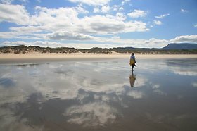
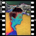
A bit desaturated, good WB, too bad corner at the bottom right... a bit leaning to the right?
Bentornata Silvia, ti sei sbizzarrita con le vacanze, eh??
Un po' desaturata, buono il WB, peccato angolino in basso a dx...un po' pendente a dx?
|
| sent on October 22, 2025 (14:32) | This comment has been automatically translated (show/hide original)
Acc I had missed the corner. :-or
I'm considering getting a monitor, because I'm struggling a lot with saturation and colors.
Acc mi era sfuggito l'angolino.
Sto valutando di prendere un monitor, perché sono molto in difficoltà con la saturazione e i colori.
|
| sent on October 22, 2025 (16:04) | This comment has been automatically translated (show/hide original)
For the homework you are on the right track apart from the hair and the color of the dress that goes towards red,
for the nose also here a little too important dark eyes and horizontal cut.
More than for the corner, those flowers in the foreground that are in the shade and look dead don't help for a fashion magazine cover. But many have left them. Per il compitino sei sulla strada giusta a parte i capelli e il colore del vestito che va verso il rosso,
per il naso anche qui un po troppo importante occhi scuri e taglio orizzontale.
Più che per l'angolino, quei fiori in primo piano che sono in ombra e sembrano morti non aiutano per una copertina di rivista di moda. Ma in tanti li hanno lasciati. |
| sent on October 22, 2025 (18:00) | This comment has been automatically translated (show/hide original)
Thank you Ivo, but I didn't understand how my nose and eyes were corrected. Grazie Ivo, ma non ho capito come andavano corretti naso e occhi. |
| sent on October 22, 2025 (22:29) | This comment has been automatically translated (show/hide original)
The nose is an important nose and the shadows should be lightened, you see nostrils that are not black holes and a little the part in shadow but without flattening. In short, shadows hinted at. For the eyes, the shadows and blacks of the pupils and also the eye contour should be opened, In practice it seems too heavy a make-up and should therefore be lightened to have more design.
Look at the eyes of the Stylo post which are also done well as she took up the model's makeup on the eye contour. Il naso è un naso importante e andrebbero schiarite le ombre vedi narici che non sono dei buchi neri e un po la parte in ombra ma senza appiattire. Insomma ombre accennate. Per gli occhi vanno aperte le ombre e i neri delle pupille e anche il contorno occhi, In pratica sembra un trucco troppo pesante e va quindi schiarito per avere più disegno.
Guarda gli occhi della post di Stylo che sono fatti bene anche come ha ripreso il trucco della modella sul contorno occhi. |
| sent on October 23, 2025 (7:40) | This comment has been automatically translated (show/hide original)
Thank you, I'll try. :-) Grazie ci provo. |
| sent on October 23, 2025 (11:26) | This comment has been automatically translated (show/hide original)
You are on the right path, the advice they gave you can only help you Sei sulla retta via, i consigli che ti hanno dato può solo che aiutarti |
| sent on October 23, 2025 (18:47) | This comment has been automatically translated (show/hide original)
I like it, I would say skin a little too lightened but I find that the figure has a nice prominence and the environment is not intrusive. At most I'll point out the corner on the right. Then, going into fine detail, Ivo's comments are certainly centered. A me piace, direi pelle un po' troppo schiarita ma trovo che la figura ha un bel risalto e l'ambiente non è invadente. Al massimo ti segnalo anch'io l'angolo a destra. Poi entrando nel dettaglio fine senz'altro i commenti di Ivo sono centrati. |
| sent on October 24, 2025 (15:05) | This comment has been automatically translated (show/hide original)
A little cold and very desaturated, at least the background. Un pò freddina e molto desatura almeno lo sfondo. |
| sent on October 24, 2025 (15:40) | This comment has been automatically translated (show/hide original)
In my opinion also too blurry and too bright dress compared to the rest. Secondo me anche troppo sfocata e vestito troppo acceso rispetto al resto. |
| sent on October 24, 2025 (19:52) | This comment has been automatically translated (show/hide original)
Hi Silvia, I find it too wide as
an image I find very white all the complexion and also the color of the dress turned a bit the colors. and corner this time Leo has cloned it too :-) ciao silvia , la trovo troppo ampio come immagine
trovo molto bianca tutto l'incarnato e anche il colore del vestito a girato un po i colori. e angolino sta volta lo ha clonato anche Leo |
| sent on October 25, 2025 (10:21) | This comment has been automatically translated (show/hide original)
I find it globally too gray and the skin is too bright, especially that of the face. Even the tone of this one does not convince me but it goes hand in hand with the white balance La trovo globalmente troppo grigia e la pelle è troppo luminosa,soprattutto quella del viso. Anche la tonalità di questa non mi convince ma va di pari passo con il bilanciamento del bianco |
| sent on October 25, 2025 (10:39) | This comment has been automatically translated (show/hide original)
Thank you all for the valuable comments. The idea was to make the girl stand out from the background and to enhance the dress above all. I changed the shade of the dress a little, because I hate plum dresses. ;-)
I also tried to highlight the brightness of the skin after correcting the flaws a bit, so I used a bit of diffuse glow which undoubtedly decreases the sharpness. Grazie a tutti dei preziosi commenti. L'idea era di far risaltare la ragazza rispetto allo sfondo e di valorizzare soprattutto il vestito. Ho cambiato un pochino la tonalità del vestito, perché detesto i vestiti color prugna.
Ho cercato anche di mettere in risalto la luminosità della pelle dopo averne un po' corretto i difetti quindi ho usato un po' di bagliore diffuso che indubbiamente diminuisce la nitidezza. |
| sent on October 25, 2025 (11:31) | This comment has been automatically translated (show/hide original)
The problem, according to my opinion, is that so the model is a bit "flashed", pass me the term. As a result, it also increases the contrast, leaving the face a little angular Il problema,secondo la mia opionione, è che così la modella risulta un po' "sparaflashata",passami il termine. Di conseguenza ne aumenta anche il contrasto,lasciando il viso un po' spigoloso |
|

Publish your advertisement on JuzaPhoto (info) |


 JuzaPhoto contains affiliate links from Amazon and Ebay and JuzaPhoto earn a commission in case of purchase through affiliate links.


 2.5 MEGAPIXEL
 Resize to fit window