What do you think about this photo?Do you have questions or curiosities about this image? Do you want to ask something to the author, give him suggestions for improvement, or congratulate for a photo that you really like?
You can do it by joining JuzaPhoto, it is easy and free!
There is more: by registering you can create your personal page, publish photos, receive comments and you can use all the features of JuzaPhoto. With more than 255000 members, there is space for everyone, from the beginner to the professional.
| sent on October 19, 2025 (20:00) | This comment has been automatically translated (show/hide original)
FG = Carlo tell your friends to stop...

FG = Carlo dì ai tuoi amici di smetterla...
|
| sent on October 20, 2025 (16:41) | This comment has been automatically translated (show/hide original)
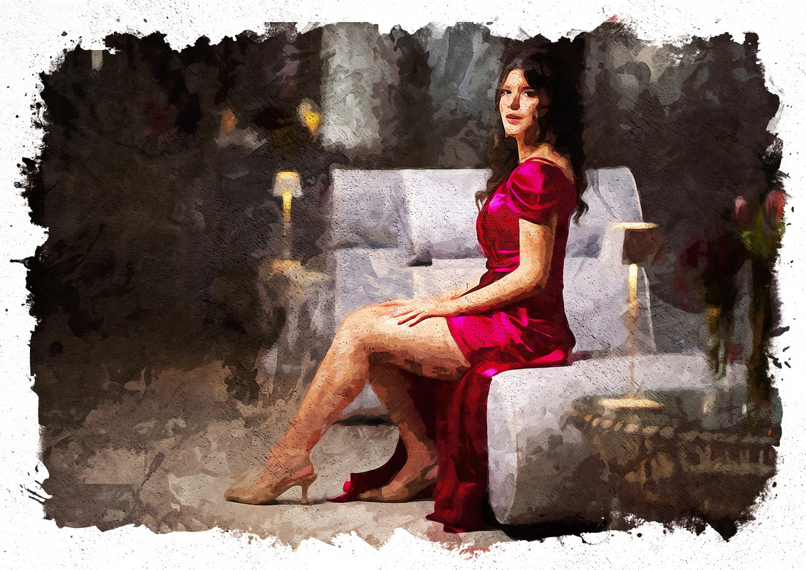
Good, perhaps a little too saturated and contrasted. I would have left more air over my head Buona,forse un pelino troppo satura e contrastata. Avrei lasciato più aria sopra la testa |
| sent on October 20, 2025 (17:24) | This comment has been automatically translated (show/hide original)
Thank you Stylo, for the saturation I adjusted to the starting one and I contained it, I think they opted for an intrusive complexion already of them.
For the air I agree, I remember giving more importance to thirds, placing my eyes at the intersection, if it does not coincide I will have filed something perhaps to eliminate some jagged edges...
I had confirmation when I developed watercolor, I had to reduce the size so as not to invade priority portions such as hair. Grazie Stylo, per la saturazione mi sono regolato su quella di partenza e l'ho contenuta, credo che abbiano optato per un colorito invadente già di loro.
Per l'aria ne convengo, ricordo di aver dato maggior importanza ai terzi, collocando gli occhi all'incrocio, se non collima avrò limato qualcosa magari per eliminare qualche bordo frastagliato...
La conferma l'ho avuta quando ho sviluppato l'acquerello, ho dovuto ridurre la grandezza per non far invadere porzioni prioritarie tipo i capelli.
Purtroppo la proposta era già inserita, ma va bene lo stesso, è un gioco  |
| sent on October 21, 2025 (19:38) | This comment has been automatically translated (show/hide original)
Good for me too, too bad for that edge at the bottom right... Carlo will not forgive you :-D Buona anche per me, peccato per quello spigolo in basso a dx...Carlo non te lo perdonerà |
| sent on October 21, 2025 (20:02) | This comment has been automatically translated (show/hide original)
Thank you Marcello, and who tells you that this reported by you is a misfortune? :-D Grazie Marcello, e chi ti dice che questa segnalata da te è una disgrazia? |
| sent on October 22, 2025 (14:49) | This comment has been automatically translated (show/hide original)
Agree with Stylo D'accordo con Stylo |
| sent on October 22, 2025 (15:18)
Grazie Silvia, per la saturazione mi sono regolato su quella di partenza e l'ho contenuta, credo che abbiano optato per un colorito invadente già di loro.
Per l'aria ne convengo, ricordo di aver dato maggior importanza ai terzi, collocando gli occhi all'incrocio, se non collima avrò limato qualcosa magari per eliminare qualche bordo frastagliato...
La conferma l'ho avuta quando ho sviluppato l'acquerello, ho dovuto ridurre la grandezza per non far invadere porzioni prioritarie tipo i capelli.
Purtroppo la proposta era già inserita, ma va bene lo stesso, è un gioco
Grazie Silvia, per la saturazione mi sono regolato su quella di partenza e l'ho contenuta, credo che abbiano optato per un colorito invadente già di loro.
Per l'aria ne convengo, ricordo di aver dato maggior importanza ai terzi, collocando gli occhi all'incrocio, se non collima avrò limato qualcosa magari per eliminare qualche bordo frastagliato...
La conferma l'ho avuta quando ho sviluppato l'acquerello, ho dovuto ridurre la grandezza per non far invadere porzioni prioritarie tipo i capelli.
Purtroppo la proposta era già inserita, ma va bene lo stesso, è un gioco |
| sent on October 22, 2025 (15:54) | This comment has been automatically translated (show/hide original)
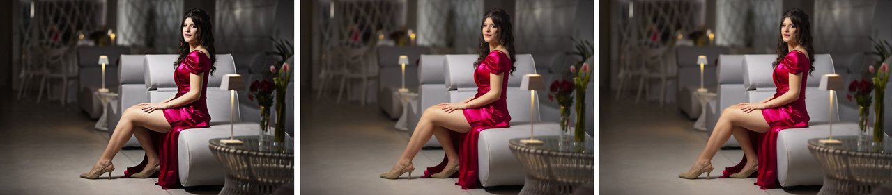
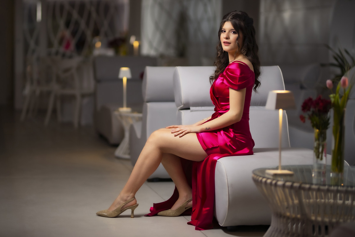
As a post itself it is well done, but not very glossy.
The padding of the skin has a doll effect, but the dye is well cared for and the nose does not become important in the face.
The color of the dress perhaps goes too much into red to want to draw it more.
Then the horizontal cut is not like the cover of a fashion magazine. Come post in se è fatta bene, ma poco patinata.
L'imbottitura della pelle fa effetto bambola, però la tinta è ben curata e il naso non diventa importante nel viso.
Il colore del vestito forse va troppo nel rosso per volerlo disegnare di più.
Poi il taglio orizzontale non è da copertina di rivista di moda. |
| sent on October 22, 2025 (16:22)
Grazie del passaggio Ivo, avrò frainteso il compitino quando dice: desidero, anzi ESIGO un'elaborazione stile "VOGUE".
L'ho interpretato come risultato della figura principale, non come immagine tipo "visto, approvato, si stampa" poi ho scaricato una copertina per ispirarmi... ci sono riuscito?
Ah, saperlo!
Da quanto mi dici mi sono solo avvicinato un po'...
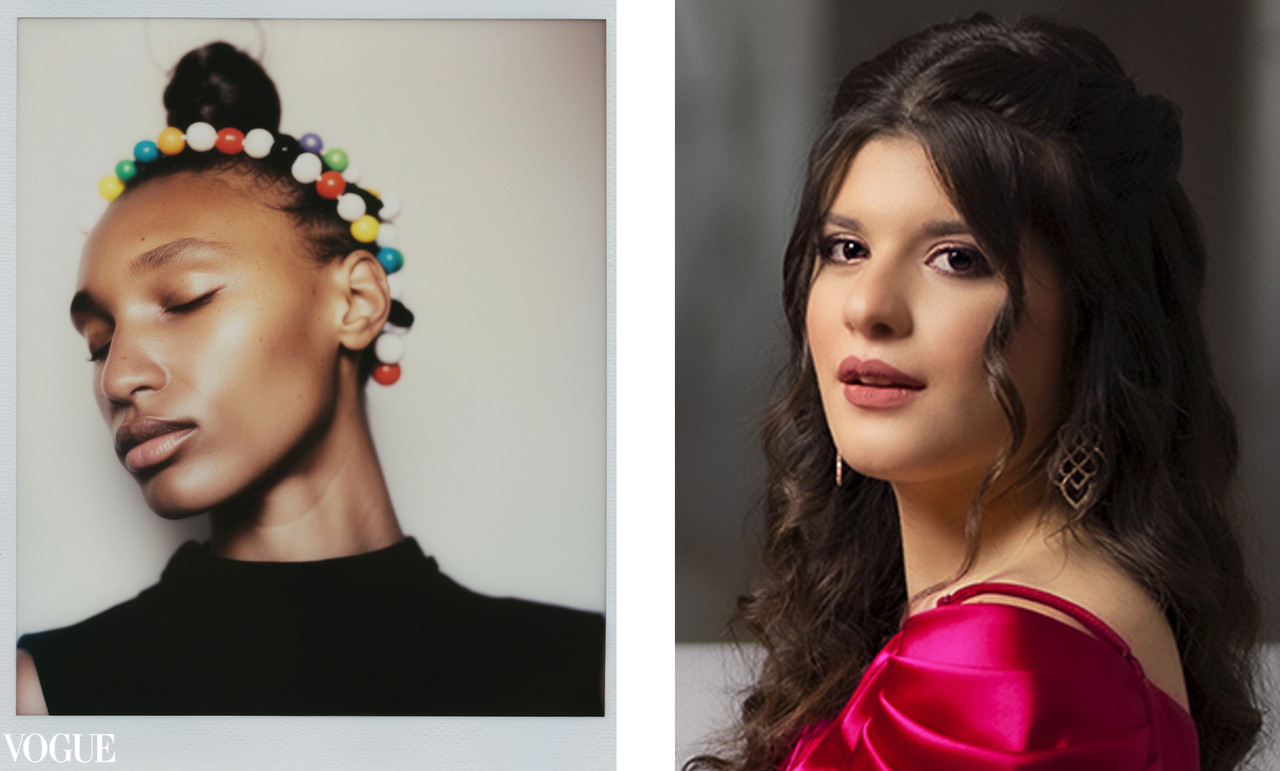
PS Comunque vada, è un successo!
Grazie del passaggio Ivo, avrò frainteso il compitino quando dice: desidero, anzi ESIGO un'elaborazione stile "VOGUE".
L'ho interpretato come risultato della figura principale, non come immagine tipo "visto, approvato, si stampa" poi ho scaricato una copertina per ispirarmi... ci sono riuscito?
Ah, saperlo!
Da quanto mi dici mi sono solo avvicinato un po'...
PS Comunque vada, è un successo! |
| sent on October 22, 2025 (17:20) | This comment has been automatically translated (show/hide original)
Lookdido,
The cover of Vogue has always been the maximum glossy as an effect.
The photos, on the other hand, of the interior are a bit different and give room for very creative interpretations.
In fact, I like your post, you interpreted that nose well but in practice you took away the light and everything flattened out, not lightened. In short, ethereal understood as light that almost dazzles. Lookdido,
La copertina di Vogue è sempre stata il massimo della patinata come effetto.
Le foto invece di interno sono un po diverse e danno spazio ad interpretazioni molto creative.
Difatti mi piace la tua post quel naso lo hai interpretato bene ma in pratica hai tolto la luce e tutto si è appiattito non schiarito. Insomma patinato, etereo inteso come luce che quasi abbaglia. |
| sent on October 22, 2025 (19:04) | This comment has been automatically translated (show/hide original)
Here, now it is clearer to me. Thank you Ecco, ora mi è più chiaro. Grazie |
| sent on October 22, 2025 (21:37) | This comment has been automatically translated (show/hide original)
Well, for me a "Vogue" effect does not get along with an excessive contrast, on the contrary. It is a fairly soft and delicate rendering Boh,per me un effetto "Vogue" non va d'accordo con un contrasto eccessivo,anzi. E' una resa abbastanza morbida e delicata |
| sent on October 22, 2025 (21:42) | This comment has been automatically translated (show/hide original)
After the doubt generated by Ivo I did some research and followed the relative procedure for a glossy rendering...
I've never been a consumer of glossy magazines, but now I'm curious... 8-) Dopo il dubbio ingenerato da Ivo ho fatto qualche ricerca e seguito la relativa procedura per una resa patinata...
Non sono mai stato un consumatore di riviste patinate, ma adesso mi sono incuriosito... |
| sent on October 22, 2025 (21:58) | This comment has been automatically translated (show/hide original)
I agree with Stylo,
the light must dazzle, and also on the fact that it is a delicate rendering because you don't have to burn the highlights, but you have to keep them especially in the skin.
Sono d'accordo con Stylo,
la luce deve abbagliare, ed anche sul fatto che che è una resa delicata perchè non devi bruciare le alte luci, ma le devi mantenere soprattutto nella pelle.
|
| sent on October 22, 2025 (23:17) | This comment has been automatically translated (show/hide original)
So the concept of glossy that I said I don't know, has various applications/nuances, I hope to be able to get to the bottom of it at the end of this GPP session... Quindi il concetto di patinato che ho dichiarato di non conoscere, ha varie applicazioni/sfumature, spero di poterne venire a capo al termine di questa sessione di GPP...
Perlomeno sarà nota l'interpretazione autentica del togato |
| sent on October 23, 2025 (11:22) | This comment has been automatically translated (show/hide original)
For me, who am not as competent as those who preceded me, it is difficult to find the hair in the egg
One thing, however, that I appreciate, not that you do not try your hand at additions, not that they do not fit, but I prefer you as now Per me che non sono competente come chi mi ha preceduto difficile trovare il pelo nell'uovo
Una cosa però che apprezzo, il non cimentarti in aggiunte, non che non ci stiano, ma ti preferisco come adesso |
|

Publish your advertisement on JuzaPhoto (info) |


 JuzaPhoto contains affiliate links from Amazon and Ebay and JuzaPhoto earn a commission in case of purchase through affiliate links.


 2.5 MEGAPIXEL
 Resize to fit window


![[en]](shared_files/layout/country_flags/flag_196.jpg)
![[en]](https://translate.google.com/?sl=it&tl=en&text=Grazie%20del%20passaggio%20Ivo%2C%20avr%26ograve%3B%20frainteso%20il%20compitino%20quando%20dice%3A%20desidero%2C%20anzi%20ESIGO%20un%26%2339%3Belaborazione%20stile%20%26quot%3BVOGUE%26quot%3B.%20%0A%20%0A%20L%26%2339%3Bho%20interpretato%20come%20risultato%20della%20figura%20principale%2C%20non%20come%20immagine%20tipo%20%26quot%3Bvisto%2C%20approvato%2C%20si%20stampa%26quot%3B%20poi%20ho%20scaricato%20una%20copertina%20per%20ispirarmi...%20ci%20sono%20riuscito%3F%20%0A%20Ah%2C%20saperlo%21%20%0A%20Da%20quanto%20mi%20dici%20mi%20sono%20solo%20avvicinato%20un%20po%26%2339%3B...%20%3A-D%20%20%0A%20%0A%20%3Ca%20target%3D%22_blank%22%20rel%3D%22nofollow%22%20href%3D%22https%3A%2F%2Fpostimg.cc%2Fv15ZKjbC%22%3E%20%0A%3Ca%20target%3D%22_blank%22%20href%3D%22https%3A%2F%2Fi.postimg.cc%2FyNb3D456%2Fduo.jpg%22%3E%3Cimg%20style%3D%22max-width%3A%20100%25%3B%20max-height%3A800px%22%20src%3D%22https%3A%2F%2Fi.postimg.cc%2FyNb3D456%2Fduo.jpg%22%3E%3C%2Fa%3E%0A%20%3C%2Fa%3E%20%0A%20%0A%20%0A%20PS%20Comunque%20vada%2C%20%26egrave%3B%20un%20successo%21%20&op=translate)