What do you think about this photo?Do you have questions or curiosities about this image? Do you want to ask something to the author, give him suggestions for improvement, or congratulate for a photo that you really like?
You can do it by joining JuzaPhoto, it is easy and free!
There is more: by registering you can create your personal page, publish photos, receive comments and you can use all the features of JuzaPhoto. With more than 255000 members, there is space for everyone, from the beginner to the professional.
| sent on October 19, 2025 (20:04) | This comment has been automatically translated (show/hide original)

|
| sent on October 20, 2025 (16:40) | This comment has been automatically translated (show/hide original)
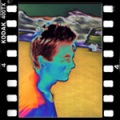
I find it too bright and the color of the skin (especially the face one) has been affected. I also think that this could have been improved better, on the face you can still see imperfections. I also find its color unpleasant La trovo troppo luminosa e ne ha risentito il colore della pelle (soprattutto quella del viso).Penso anche che questa potesse essere migliorata meglio,sul viso si notano ancora imperfezioni. Anche il suo colore lo trovo poco gradevole |
| sent on October 21, 2025 (11:05) | This comment has been automatically translated (show/hide original)
Also Stylo I made a shed with the ACR color card, you can see it in the biceps area. Among other things, I used the frequency separation technique to plane the skin a bit but during the course I was not convinced. The good thing is that I can try again to post producing it again to see if I can improve myself ... Sometimes here in GPP I received congratulations, even if I didn't get to the podium, on the management of the person in charge and making a big mistake in the rest :-) , so this time I started convinced that I would succeed and while I was producing I realized that it was not the result I wanted to achieve.
Stylo and others, if you like, you can tell me your opinion on B/W, thanks 8-)
Inoltre Stylo ho fatto un casotto col la scheda colore di ACR, lo si vede in zona bicipite. Fra l'altro ho usato la tecnica della separazione delle frequenze per piallare un po' la pelle ma durante lo svolgimento non ero convinto. La cosa positiva è che posso riprovare a post produrla ancora per capire se riesco a migliorarmi ... A volte qui in GPP ho ricevuto delle congratulazioni, pur non arrivando al podio, sulla gestione dell'incaricato e sbagliando clamorosamente il resto  , quindi questa volta ero partito convinto che ci sarei riuscito e intanto che post producevo mi sono reso conto che non era il risultato che volevo ottenere. , quindi questa volta ero partito convinto che ci sarei riuscito e intanto che post producevo mi sono reso conto che non era il risultato che volevo ottenere.
Stylo e altri, se vi va, potete dirmi il vostro parere sul B/N, grazie 
|
| sent on October 21, 2025 (14:32) | This comment has been automatically translated (show/hide original)
Thank you very much Look, then I'll try to get my hands on it to my editors to understand Grazie mille Look, dopo provo a metterci mano ai miei editor per capire |
| sent on October 21, 2025 (14:41) | This comment has been automatically translated (show/hide original)
Keep in mind that the comments are addressed to everyone, even me, then it's up to you to see where you've left :-) Tieni presente che i commenti sono rivolti a tutti, anche a me, poi sta a te vedere dove ti sei allontanato |
| sent on October 21, 2025 (14:42) | This comment has been translated
|
| sent on October 21, 2025 (19:34) | This comment has been automatically translated (show/hide original)
Bright and a little pink, I would have at least darkened the background to better isolate the girl. BN better 8-) Luminosa e un po' rosacea, avrei quantomeno scurito lo sfondo per isolare meglio la ragazza. BN meglio |
| sent on October 21, 2025 (21:17) | This comment has been automatically translated (show/hide original)
Thank you Marcello 8 :-) Grazie Marcello |
| sent on October 22, 2025 (13:07)
effettivamente la foto è molto sbiancata e lo si può notare guardando il tatuaggio sul braccio (Alessia), si è persa totalmente l'ambientazione originale e quindi i contrasti e i colori delle luci soffuse che creavano una ambientazione molto ricercata.
L'effetto HDR appiattisce totalmente l'immagine e in conseguenza di questa eccessiva ripresa delle luci si è abbassata anche la qualità dell'immagine con l'aumento di rumore.
Il taglio andrebbe rivisto inquanto c'è veramente troppo poco spazio tra la scarpa e il bordo a sx
Le gambe, che sono cosi in primo piano, necessitavano di un lisciamento adeguato
|
| sent on October 22, 2025 (14:45) | This comment has been automatically translated (show/hide original)
I don't mind the bright aspect but associated with the cut it highlights the legs too much especially the thigh which is not exactly slender! ;-)
Female poisonous comment. L'aspetto luminoso non mi dispiace ma associato al taglio mette troppo in risalto le gambe soprattutto la coscia che non è proprio esilissima!
Commento velenoso femminile. |
| sent on October 22, 2025 (15:46)
Secondo me per il compitino è una buona strada,
per una rivista di moda il taglio quadrato non è l'ideale,
schiarito una zona in ombra delle gambe e non schiarito i capelli che sono come tutti del resto troppo chiusi.
Anche la parte della schiena è schiarita e diventa una zona in penombra che non ha ragione di essere anche se aiuta a far diventare il vestito più in evidenza, più per la tinta che per la luminosità e contrasti che comunque devono essere contenuti.
La schiarita della carnagione invece per me va bene non gonfia nell'effetto bambola.
Secondo me per il compitino è una buona strada,
per una rivista di moda il taglio quadrato non è l'ideale,
schiarito una zona in ombra delle gambe e non schiarito i capelli che sono come tutti del resto troppo chiusi.
Anche la parte della schiena è schiarita e diventa una zona in penombra che non ha ragione di essere anche se aiuta a far diventare il vestito più in evidenza, più per la tinta che per la luminosità e contrasti che comunque devono essere contenuti.
La schiarita della carnagione invece per me va bene non gonfia nell'effetto bambola. |
| sent on October 22, 2025 (16:03) | This comment has been automatically translated (show/hide original)
Thank you for your valuable comments, I'll try again maybe inspired by your editing 8-) Vi ringrazio per i vostri preziosi commenti, ci riprovo magari ispirandovi ai vostri editing |
| sent on October 22, 2025 (19:51) | This comment has been automatically translated (show/hide original)
I agree with Ottiero, too bright and too pink, even the shadows in my opinion are too recovered. The cut does not convince me at all. ;-) Concordo con Ottiero, troppo luminosa e troppo rosacea, anche le ombre secondo me sono troppo recuperate. Il taglio non mi convince per niente. |
| sent on October 23, 2025 (0:30) | This comment has been automatically translated (show/hide original)
The tones were too flat due to an excessive brightness of the same (even if I like the complexion, to be honest), the volumes unfortunately went to be blessed.
As already reiterated I find the presence of the lamp in the foreground cumbersome and unpleasant, I would also have reduced the peripheral brightness to focus more attention on the daughter.
Troppo spianati i toni a causa di un'eccessiva luminosità degli stessi (anche se l'incarnato mi piace, ad esser sincero) , i volumi purtroppo sono andati a farsi benedire.
Come già ribadito trovo ingombrante e poco piacevole la presenza della lampada in primo piano , avrei inoltre ridotto la luminosità periferica per concentrare maggiormente l'attenzione sulla figliola.
|
| sent on October 23, 2025 (9:55) | This comment has been automatically translated (show/hide original)
I find it too bright and flat, with a cut that is too narrow that makes you lose the context. The complexion and skin care look good to me. I will not go further in the technical examination! La trovo troppo luminosa e piatta, con un taglio troppo stretto che fa perdere il contesto. L'incarnato e il trattamento della pelle mi sembrano buoni. Non mi spingo oltre nella disamina tecnica! |
| sent on October 23, 2025 (11:18) | This comment has been automatically translated (show/hide original)
I like bright PPs, but here I agree with those who preceded me in pointing out that it is a bit too much Mi piacciono le PP luminose, ma qui concordo con chi mi ha preceduto nell'evidenziare che è un po troppo |
| sent on October 23, 2025 (14:16) | This comment has been automatically translated (show/hide original)
My gait, during the PP, was decidedly sunny :-D Il mio andazzo, durante la PP, era decisamente solare  |
| sent on October 24, 2025 (14:54) | This comment has been automatically translated (show/hide original)
How nice to be last in the comments, I agree. Che bello arrivare ultimo nei commenti , condivido. |
|

Publish your advertisement on JuzaPhoto (info) |


 JuzaPhoto contains affiliate links from Amazon and Ebay and JuzaPhoto earn a commission in case of purchase through affiliate links.


 2.9 MEGAPIXEL
 Resize to fit window


![[en]](shared_files/layout/country_flags/flag_196.jpg)