What do you think about this photo?Do you have questions or curiosities about this image? Do you want to ask something to the author, give him suggestions for improvement, or congratulate for a photo that you really like?
You can do it by joining JuzaPhoto, it is easy and free!
There is more: by registering you can create your personal page, publish photos, receive comments and you can use all the features of JuzaPhoto. With more than 255000 members, there is space for everyone, from the beginner to the professional.
| sent on October 19, 2025 (19:39) | This comment has been automatically translated (show/hide original)
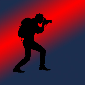
I add the B/W:
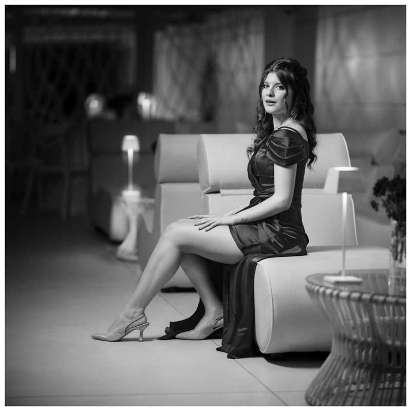
Aggiungo il B/N:
|
| sent on October 20, 2025 (1:00) | This comment has been automatically translated (show/hide original)
@Ale Z
the problem with making the color of photos on Davinci is that it is set for videos and also the definition is a function of the video, so you have always soft results that are good for video.
If you want a Davinci-like engine you have to get DxO PL9 but it has another setting on color and noise correction, as well as definition and micro-contrast.
Then there is an artifact in the background. @Ale Z
il problema di fare la color di foto su Davinci è che è impostato per i video e anche la definizione è in funzione del video, quindi hai in uscita dei risultati sempre flou che vanno bene per il video.
Se vuoi un motore simile a Davinci devi prendere DxO PL9 ma ha un'altra impostazione sulla correzione del colore e del rumore, oltre alla definizione e il micro-contrasto.
Poi c'è un artefatto sullo sfondo. |
| sent on October 20, 2025 (7:42) | This comment has been automatically translated (show/hide original)
Sorry Ivo but what does the resolution of the video have to do with it?
Da Vinci simply produces a LUT in .cube format that you apply in Photoshop as a layer on top of the image, which then remains the same with all its characteristics: format, resolution, color space, bit depth...
The artifact is due to my haste. It's a FG...
Scusa Ivo, ma che c'entra la risoluzione del video?
Da Vinci semplicemente produce una LUT in formato .cube che applichi in Photoshop come layer sopra all'immagine, che quindi rimane la stessa con tutte le sue caratteristiche: formato, risoluzione, spazio colore, profondità in bit…
L'artefatto è dovuto alla mia fretta. È una FG…
DxO ha gli stessi strumenti di intervento sul colore di Da Vinci? Verificherò. Sarebbe una buona notizia. |
| sent on October 20, 2025 (9:03) | This comment has been automatically translated (show/hide original)
Alex said a similar graphics engine, but it doesn't have the same functions exactly as Davinci, but it can do the same things just differently. I'm not talking about resolution, but definition, it doesn't use camera/optical algorithms, video frames don't need to be defined, but slightly soft.
The post photo and the post video are two different things, if it's okay with you ok. Alex ho detto un motore grafico simile, ma non ha le stesse funzioni esattamente come Davinci, ma può fare le stesse cose solo in modo diverso. Non parlo poi di risoluzione, ma di definizione, non usa algoritmi da fotocamera/ottica i frame dei video non servono definiti, ma leggermente flou.
Nella LUT dovresti inserire anche i contrasti e la definizione ma ripeto Davinci ragiona per i video anzi a dirla tutta per i film, anche tutta la color è impostata per un aspetto più da cinema.
Se vuoi fare lut esistono applicazioni dedicate (3D LUT Creator) per fotografia e poi le puoi gestire con Lutme.
Nei video e quindi Davinci e tutti i programmi video si basano su uno spazio colore Rec. 709 e Rec. 709A per i social media tipo YouTube Instagram FB ma per i video. Per la fotografia gli spazi colore sono diversi sRGB / Adobe RGB / ProPhoto RGB ed altro, si usano a seconda di cosa si deve fare. Non entro poi nel discorso della gamma usata nei due modi e di altre cose che sono più complesse come il tipo di Ottiche usate per il cinema e i sensori.
La post fotografica e la post video sono due cose diverse, se poi a te va bene ok.
|
| sent on October 20, 2025 (9:25) | This comment has been automatically translated (show/hide original)
“ The post photo and the post video are two different things, if it's okay with you ok. „
Excuse me Ivo if I insist.
A LUT in .cube format is simply a color remapping. It has nothing to do with resolution, definition... The fact that it is produced by software dedicated to video has no consequence on the photograph to which you apply it. You're off the mark... :-)
You can produce a LUT with many software. The advantage of Da Vinci Resolve is... which is free...
I took a look at the DxO website. PL9 does many things but not exactly the same things. " La post fotografica e la post video sono due cose diverse, se poi a te va bene ok."
Scusami Ivo se insisto.
Una LUT in formato .cube è semplicemente una rimappatura del colore. Non ha nulla a che vedere con risoluzione, definizione… Il fatto che sia prodotta da un software dedicato al video non ha alcuna conseguenza sulla fotografia a cui la applichi. Sei fuori strada… 
Una LUT la puoi produrre con tanti software. Il vantaggio di Da Vinci Resolve è… che è gratis…
Ho dato un'occhiata al sito di DxO. PL9 fa tante cose ma non esattamente le stesse cose. |
| sent on October 20, 2025 (9:46) | This comment has been automatically translated (show/hide original)
Ale z I modified the post so it's more complete,
.cube Luts are not universal and it also depends on where they are generated, and the color spaces used.
Since in Davinci it is based on a more cinematic vision the final effect if seen on video works, seen as an image it does not work as it would with 3D LUT Creator for example. Ale z ho modificato il post così è più completo,
Le Lut .cube non sono universali e dipende anche da dove son generate, e dagli spazi colore usati.
Visto che in Davinci si basa su una visione più da cinema l'effetto finale se visto in video funziona, visto come immagine non funziona come lo farebbe con 3D LUT Creator ad esempio. |
| sent on October 20, 2025 (13:13)
Hai cambiato il contenuto del tuo post…
Prima parli di definizione "soft" a causa del video, ora cambi e parli di colore…. 
Da Vinci accetta in input immagini in svariati spazi colore, compresi tutti quelli che noi usiamo in fotografia. E visualizza correttamente il colore delle foto. Nessuno slittamento.
Cosa fa in output è un altro discorso e non ci interessa perchè non chiedo a Da Vinci di salvarmi la foto, ma solo di produrre una LUT. L'importante è che lo spazio colore in cui produci la LUT sia lo stesso in cui lavori in PS.
L'esperienza che ho fin qui accumulato prevede l'importazione in Da Vinci della foto, l'elaborazione del colore e infine la produzione di un file LUT in formato .cube.
Questo file si applica in Photoshop come layer sopra la foto originale e mi mostra un risultato identico a quello che vedevo in Da Vinci. Quindi ho il controllo dei processo.
Ho cominciato con 3D LUT Creator ma non l'ho acquistato anche perché l'ideatore mi ha detto che hanno allo studio una versione nuova. E poi costicchia….
Esiste anche un altro plugin per PS di cui non ricordo il nome ma anche quello non economico.
Questi tre software hanno strumenti del tutto analoghi. In tutti i tre casi non sono proprio intuitivi…
Per questo ti consiglio di provare Da Vinci, se ti interessa l'argomento, perché è un software gratuito.
Io sono all'inizio della mia esperienza ma parlo di cose che uso concretamente.
Anzi mi piacerebbe scambiare opinioni con altri user.
Hai cambiato il contenuto del tuo post…
Prima parli di definizione "soft" a causa del video, ora cambi e parli di colore….
Da Vinci accetta in input immagini in svariati spazi colore, compresi tutti quelli che noi usiamo in fotografia. E visualizza correttamente il colore delle foto. Nessuno slittamento.
Cosa fa in output è un altro discorso e non ci interessa perchè non chiedo a Da Vinci di salvarmi la foto, ma solo di produrre una LUT. L'importante è che lo spazio colore in cui produci la LUT sia lo stesso in cui lavori in PS.
L'esperienza che ho fin qui accumulato prevede l'importazione in Da Vinci della foto, l'elaborazione del colore e infine la produzione di un file LUT in formato .cube.
Questo file si applica in Photoshop come layer sopra la foto originale e mi mostra un risultato identico a quello che vedevo in Da Vinci. Quindi ho il controllo dei processo.
Ho cominciato con 3D LUT Creator ma non l'ho acquistato anche perché l'ideatore mi ha detto che hanno allo studio una versione nuova. E poi costicchia….
Esiste anche un altro plugin per PS di cui non ricordo il nome ma anche quello non economico.
Questi tre software hanno strumenti del tutto analoghi. In tutti i tre casi non sono proprio intuitivi…
Per questo ti consiglio di provare Da Vinci, se ti interessa l'argomento, perché è un software gratuito.
Io sono all'inizio della mia esperienza ma parlo di cose che uso concretamente.
Anzi mi piacerebbe scambiare opinioni con altri user. |
| sent on October 20, 2025 (14:02)
Ale Z usare Davinci per fare color sulle foto ho smesso di farlo da più di un anno (e sempre fatto più per esperimento che per uso continuo sul campo) e devo dire che alla fine non sono mai riuscito ad avere risultati più precisi che con un SW di sviluppo raw. Usavo anche io LR e PS.
Son passato poi a DxO PL e Affinity Photo per quel poco che uso un programma pixel based.
Per quanto riguarda le LUT alla fine van bene se voglio avere un look tipo cinematografico, oppure simulazione di pellicole, o simulare la Lomo, ma non mi da risultati quando devo sviluppare i miei scatti con la fotocamera, in quel caso preferisco usare i preset, che anche loro faccio solo per avere una base su cui poi lavorare ogni singolo scatto.
Per la color correction e per la color grading non uso Lut.
Il discorso della definizione, del flou è dato dal contrasto che altera in RGB sia la percezione di definizione che di saturazione. Preferisco avere un controllo cromatico indipendente dalla luminosità, poi agire sulla luminosità solo per rendere più o meno accentuato il contrasto facendo restare ferma la tinta.
Non è il discutere sul cosa sono le Lut ma sul cosa si possono applicare e come, ed ho esperienza diversa dalla tua. Avendo dovuto seguire sia la produzione di foto che di video cine Tv i concetti di base della post produzione sono diversi tra foto e video, sia come definizione che come cromia. Tutto qui, solo ultimamente si cerca di usare nei video e nelle foto delle Lut per dare uno stile personale, ma puoi chiedere a chi fa video e corti che le Lut vengono fatte per simulare uno stile cinematografico, ma non sono usate per fare color grading, anche perchè alla fine sarebbero tutti simili i video e/o i corti se si usano le Lut, in un video (non quelli degli youtober) la color grading è fatta scena per scena e ha un suo sviluppo che non è costante, (solo in casi tipo serial TV in cui si doveva distinguere una particolare atmosfera che poteva avere come differenza ad esempio la città dove si svolgevano le varie storie del serial tv)
Poi si può sperimentare quello che si vuole, ma la color sia in foto che in cine hanno un loro ben preciso compito anche a livello di percezione.
Ale Z usare Davinci per fare color sulle foto ho smesso di farlo da più di un anno (e sempre fatto più per esperimento che per uso continuo sul campo) e devo dire che alla fine non sono mai riuscito ad avere risultati più precisi che con un SW di sviluppo raw. Usavo anche io LR e PS.
Son passato poi a DxO PL e Affinity Photo per quel poco che uso un programma pixel based.
Per quanto riguarda le LUT alla fine van bene se voglio avere un look tipo cinematografico, oppure simulazione di pellicole, o simulare la Lomo, ma non mi da risultati quando devo sviluppare i miei scatti con la fotocamera, in quel caso preferisco usare i preset, che anche loro faccio solo per avere una base su cui poi lavorare ogni singolo scatto.
Per la color correction e per la color grading non uso Lut.
Il discorso della definizione, del flou è dato dal contrasto che altera in RGB sia la percezione di definizione che di saturazione. Preferisco avere un controllo cromatico indipendente dalla luminosità, poi agire sulla luminosità solo per rendere più o meno accentuato il contrasto facendo restare ferma la tinta.
Non è il discutere sul cosa sono le Lut ma sul cosa si possono applicare e come, ed ho esperienza diversa dalla tua. Avendo dovuto seguire sia la produzione di foto che di video cine Tv i concetti di base della post produzione sono diversi tra foto e video, sia come definizione che come cromia. Tutto qui, solo ultimamente si cerca di usare nei video e nelle foto delle Lut per dare uno stile personale, ma puoi chiedere a chi fa video e corti che le Lut vengono fatte per simulare uno stile cinematografico, ma non sono usate per fare color grading, anche perchè alla fine sarebbero tutti simili i video e/o i corti se si usano le Lut, in un video (non quelli degli youtober) la color grading è fatta scena per scena e ha un suo sviluppo che non è costante, (solo in casi tipo serial TV in cui si doveva distinguere una particolare atmosfera che poteva avere come differenza ad esempio la città dove si svolgevano le varie storie del serial tv)
Poi si può sperimentare quello che si vuole, ma la color sia in foto che in cine hanno un loro ben preciso compito anche a livello di percezione. |
| sent on October 20, 2025 (14:20) | This comment has been automatically translated (show/hide original)
I also use LUTs in limited cases. Normally I don't need it.
In addition, today the major converters have refined tools for color control which, being integrated, are evidently much more convenient (and also simple).
I don't like presets and don't use them.
That said, LUTs are very convenient in some cases such as:
- recover the color of a disastrous complexion (taken under a disastrous light source)
- move the WB of the image while keeping some colors fixed (or almost...) fixed. This is the example I posted.
- Group the colors by bringing them closer to two complementary ones. I don't really explain...
In these things, for example, the tools we have talked about work better and more intuitively than the software we are more used to.
But the study continues... :-) Anch'io uso le LUT in casi limitati. Normalmente non ne ho esigenza.
In più oggi i maggiori convertitori hanno strumenti raffinati per il controllo del colore che, essendo integrati, sono evidentemente molto più comodi (e anche semplici).
Non mi piacciono i preset e non li uso.
Detto ciò le LUT sono molto comode in alcuni casi tipo:
- recuperare il colore di un incarnato disastroso (ripreso sotto una fonte luminosa disastrosa)
- spostare il WB dell'immagine mantenendo però fissi (o quasi…) alcuni colori. È l'esempio che ho postato.
- raggruppare i colori avvicinandoli a due complementari. Non mi spiego bene…
In queste cose ad esempio i software di cui abbiamo parlato lavorano meglio e più intuitivamente dei convertitori a cui siamo più abituati.
Ma lo studio prosegue… |
| sent on October 20, 2025 (14:48) | This comment has been automatically translated (show/hide original)
“ But the study continues... „
Well woe betide if it wasn't ;-)
By now I have reduced the SW to the bone for what I need, for photos and videos I have reduced to three, DxO PL, Affinity PHOTO and Davinci Resolve. Both for the camera and for the iPhone. " Ma lo studio prosegue…"
Beh guai se non lo fosse 
Io ormai ho ridotto all'osso i SW per quello che mi servono, per foto e video ho ridotto a tre, DxO PL, Affinity PHOTO e Davinci Resolve. Sia per la fotocamera che per l'iPhone. |
| sent on October 20, 2025 (16:32) | This comment has been automatically translated (show/hide original)
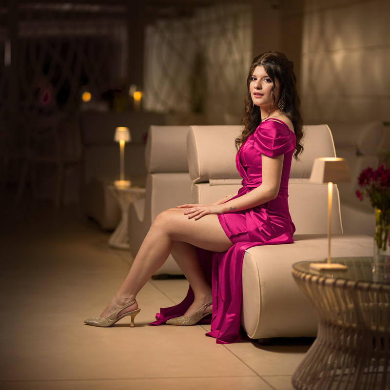
I like it, very natural. I am not entirely convinced by the additional blur, which has created artifacts a bit unpleasant to the lamp after all Mi piace,molto naturale. Non mi convince del tutto invece lo sfocato aggiuntivo,che ha creato artefatti un po' sgradevoli alla lampada in fondo |
| sent on October 20, 2025 (17:18) | This comment has been automatically translated (show/hide original)
Thank you Stylo. But I didn't add blurry. I just darkened the background.
But I added a bit of sparkle to the lamps :-) Grazie Stylo. Ma non ho aggiunto sfocato. Ho solo scurito lo sfondo.
Però ho aggiunto un po' di bagliore alle lampade |
| sent on October 21, 2025 (21:03) | This comment has been automatically translated (show/hide original)
Here then is the halo below. Very beautiful, correct cut, warm atmosphere preserved in a balanced and natural way. High probability podium. 8-) Ecco allora spiegato l'alone sotto. Molto bella, taglio corretto, atmosfera calda preservata in modo equilibrato e naturale. Podio ad alta probabilità. |
| sent on October 22, 2025 (11:33) | This comment has been automatically translated (show/hide original)
Thanks, Marcello :-) Grazie, Marcello |
| sent on October 22, 2025 (14:38) | This comment has been automatically translated (show/hide original)
For me it is very good, it responds to the judge's requests. I do not pronounce on the discussion because I have difficulty following it due to my lack of technical skills Per me è molto buona, risponde alle richieste del giudice.sulla discussione non mi pronuncio perché ho difficoltà a seguirla per le mie scarse competenze tecniche |
| sent on October 22, 2025 (15:35) | This comment has been automatically translated (show/hide original)
In the intent of the homework, the dress appears, the shoes a little less, but it is the whole background that then leads the model to be too strong in contrasts. The model, if you stuff her complexion, the first thing you see is the nose and then you lose all the rest of the face. Nell'intento del compitino il vestito appare, le scarpe un poco meno, ma è tutto lo sfondo che porta poi anche la modella ad essere troppo forte come contrasti. La modella se gli si imbottisce la carnagione la prima cosa che si vede è il naso e si perde poi tutto il resto del viso. |
| sent on October 22, 2025 (18:14) | This comment has been translated
Thank you all! |
| sent on October 22, 2025 (19:44) | This comment has been automatically translated (show/hide original)
The light is very beautiful and the complexion although dark it is very natural. The definition is very calibrated. I'm not convinced by the face a little too shady and the dress of a strange purple. Molto bella la luce e l'incarnato sebbene scuro è molto naturale. Molto calibrata la definizione. Non mi convince il viso un pò troppo ombroso e il vestito di un viola strano. |
| sent on October 23, 2025 (0:19) | This comment has been automatically translated (show/hide original)
Modern mood, lukewarm, soft, I appreciate the fact that you have contained well the "blows" of light on your face; The volumes are well represented and the cut fits well.
I don't like the tone of the dress (I think it has taken the powder toning) and the presence in my opinion bulky of the luminaria-vase of flowers in the foreground. Mood moderno , tiepido , morbido , apprezzo il fatto che hai contenuto bene le "botte" di luce sul viso ; i volumi sono ben rappresentati ed il taglio calza bene.
Non mi piace il tono del vestito (penso abbia preso il viraggio color cipria) e la presenza a mio avviso ingombrante della luminaria-vaso di fiori in primo piano. |
|

Publish your advertisement on JuzaPhoto (info) |

 GPP Elaborazioni in Gara

 JuzaPhoto contains affiliate links from Amazon and Ebay and JuzaPhoto earn a commission in case of purchase through affiliate links.


 3.7 MEGAPIXEL
 Resize to fit window

![[en]](shared_files/layout/country_flags/flag_196.jpg)