What do you think about this photo?Do you have questions or curiosities about this image? Do you want to ask something to the author, give him suggestions for improvement, or congratulate for a photo that you really like?
You can do it by joining JuzaPhoto, it is easy and free!
There is more: by registering you can create your personal page, publish photos, receive comments and you can use all the features of JuzaPhoto. With more than 255000 members, there is space for everyone, from the beginner to the professional.
| sent on October 20, 2025 (16:29) | This comment has been automatically translated (show/hide original)
I find it a little too contrasty and with too little space above the head, but the white balance and the color that follows are good La trovo un po' troppo contrastata e con troppo poco spazio sopra la testa,buono invece il bilanciamento del bianco e il colore che ne consegue |
| sent on October 21, 2025 (20:16) | This comment has been automatically translated (show/hide original)
I developed it as it is without moving any slider apart from the wb that I set to daylight and then I applied an action with ps to smooth the skin, L'ho sviluppata tale e quale senza spostare nessun cursore a parte la wb che ho impostato su daylight e poi ho applicato un'azione con ps per lisciare la pelle, |
| sent on October 21, 2025 (20:59) | This comment has been automatically translated (show/hide original)
I agree with Stylo's comment, although overall it's a good post. Mi associo al commento di Stylo, benchè nel complesso sia una buona post. |
| sent on October 22, 2025 (12:41) | This comment has been automatically translated (show/hide original)
for me it is a reportage photo that ended badly :-D . per me é una foto di reportage che ha finito male . . |
| sent on October 22, 2025 (14:33) | This comment has been automatically translated (show/hide original)
I agree on the cut that suffocates a little, for the rest I find it a great post Sono d'accordo sul taglio che soffoca un pochino, per il resto la trovo un'ottima post |
| sent on October 22, 2025 (15:30) | This comment has been automatically translated (show/hide original)
If I have to stay with the intent of the task, I would say that it is too dark both in contrast and in cut, it gives me a sense of drama and not of fashion magazine gloss. Especially in the hair that until now I see in all solutions very closed. Se devo stare all'intento del compitino, direi che è troppo cupa sia come contrasto che come taglio, mi da un senso di drammaticità e non di patinata da rivista di moda. Soprattutto nei capelli che fino ad ora vedo in tutte le soluzioni molto chiusi. |
| sent on October 22, 2025 (16:45) | This comment has been automatically translated (show/hide original)
Ok that I didn't take into account the "Glamour" theme and I treated it as a "normal" photo there I don't see these blacks so closed and neither does the light/shadow warning sure that I had the monitor well calibrated?
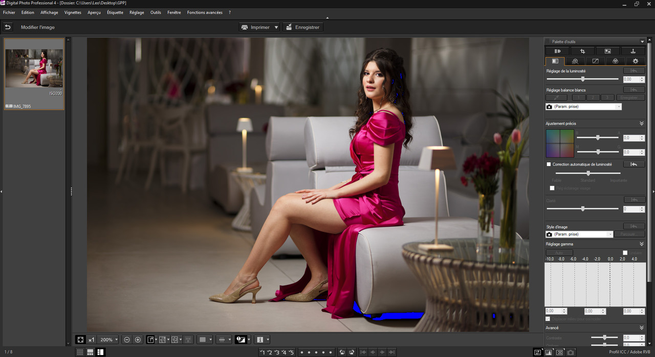
Ok che non ho tenuto conto del tema "Glamour" e l'ho trattata come una foto "normale" ma io sti neri cosi chiusi non li vedo e neanche l'avvertitore luci/ombre, sicuro che avete il monitor ben calibrato?
|
| sent on October 22, 2025 (17:08)
Leo i capelli con valori 5,4,2 misurate non sul pixel ma su zone più estese non è questione di Monitor.
Nel grigio scuro sul fondo vicino al rosso dove ci sono i disegni di 5,1,2
I fiori rossi 45,2,10 nella parte in colore rosso
Sono tutti valori RGB che non hanno bisogno di un monitor calibrato per dire che mi da l'impressione del cupo e non del patinato di una rivista di moda, sono scuri anche per una foto da locale tipo bar di lusso, poi gli occhi guarda gli altri come hanno risolto, Guarda Stylo per esempio che se fa street avrebbe dovuto avere lui un'immagine più cupa.
Poi i fiori in primo piano in ombra almeno tagliarli. Insomma è tutto l'insieme che è cupo.
|
| sent on October 22, 2025 (17:30)
giustamente quella di Stylo, si ha schiarito un po gli occhi e i capelli anche si nota appena, ma la trovo un po piatta con le luci e soprattutto la pelle troppo attenuate e uniformizzate che al limite mi da una senzazione sul soggetto più cupa che la mia.
lo sfondo é normale che sia scuro l'illuminazione é un cono di luce tipo spot ma diffuso solo sulla modella, si vedono al suolo i limiti circolari dell'illuminazione e anzi fà un bell'effetto di lasciare lo sfondo scuro senza schiarire le ombre, io ho persino lasciato (l'enorme) vignettatura dell'obbiettivo perché ci sta meglio cosi, attira più l'attenzioine al centro nella zona illuminata. non l'ho trattata come una foto di moda ma cupa non direi anzi ha un bel rilievo e rispetta la luce della scena.
giustamente quella di Stylo, si ha schiarito un po gli occhi e i capelli anche si nota appena, ma la trovo un po piatta con le luci e soprattutto la pelle troppo attenuate e uniformizzate che al limite mi da una senzazione sul soggetto più cupa che la mia.
lo sfondo é normale che sia scuro l'illuminazione é un cono di luce tipo spot ma diffuso solo sulla modella, si vedono al suolo i limiti circolari dell'illuminazione e anzi fà un bell'effetto di lasciare lo sfondo scuro senza schiarire le ombre, io ho persino lasciato (l'enorme) vignettatura dell'obbiettivo perché ci sta meglio cosi, attira più l'attenzioine al centro nella zona illuminata. non l'ho trattata come una foto di moda ma cupa non direi anzi ha un bel rilievo e rispetta la luce della scena. |
| sent on October 22, 2025 (17:42)
Leo per intenderci la copertina di Vogue è il massimo della luce patinata, eterea intesa come luce che quasi abbaglia.
Se il compitino è fare una copetina di Vogue, io intendo questo come obiettivo, poi se devo considerare una post come è fatta a livello personale allora è altra cosa.
Lookdido nei suoi commenti ha fatto giustamente una sua osservazione, che ci sta in questo contesto, ma qui è stato chiesto di fare una interpretazione con un obiettivo, quindi il come è scattata ha una valenza relativa è il mondo patinato che si deve vedere il più possibile.
Non è una questione di numeri e monitor ma di mondo diverso e diverso nel vedere le cose.
Leo per intenderci la copertina di Vogue è il massimo della luce patinata, eterea intesa come luce che quasi abbaglia.
Se il compitino è fare una copetina di Vogue, io intendo questo come obiettivo, poi se devo considerare una post come è fatta a livello personale allora è altra cosa.
Lookdido nei suoi commenti ha fatto giustamente una sua osservazione, che ci sta in questo contesto, ma qui è stato chiesto di fare una interpretazione con un obiettivo, quindi il come è scattata ha una valenza relativa è il mondo patinato che si deve vedere il più possibile.
Non è una questione di numeri e monitor ma di mondo diverso e diverso nel vedere le cose. |
| sent on October 22, 2025 (17:46) | This comment has been automatically translated (show/hide original)
In fact, I don't give a damn about Vogue, I've already said it for me it's a reportage photo that ended badly :-D, then yes, maybe I like them nice dense if I wanted to make it perfectly precise it had to be overexposed by + 0.30 ev infatti, a me non frega niente di vogue, l'ho già detto per me é una foto di reportage finita male, poi si, magari mi piacchiono belle dense (le dipositive de sottoesponevo spesso di 1/2 di ev) se avessi voluto farla precisa perfettamente giusta andava sovraesposta di + 0,30 ev, ma cosi com'é é precisa una diapositiva |
| sent on October 22, 2025 (18:20) | This comment has been automatically translated (show/hide original)
just for example, the perfect exposure would be like this, i.e. + 1/3 of EV. but I like it denser, a little underexposed to give more prominence
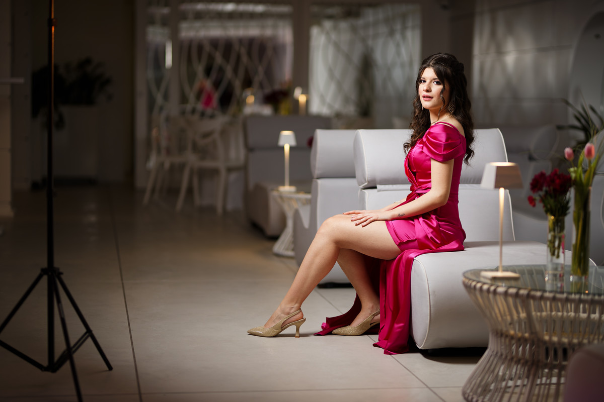
giusto per per esempio, l'esposizione perfetta sarebbe cosi, cioé + 1/3 di EV. ma a me piace più densa, un po sottoesposta per dare più rilievo e minimizzare lo sfondo inutile
|
| sent on October 22, 2025 (19:39) | This comment has been automatically translated (show/hide original)
In my opinion, the one in the competition is quite far from the Vogue/glamour style required. Too dark, too saturated, skin too yellow/red. Better the latter you posted for example. Secondo me quella in gara è abbastanza lontana dallo stile Vogue/glamour richiesto. Troppo scura, troppo satura, pelle troppo sul giallo/rosso. Meglio quest'ultima che hai postato per esempio. |
| sent on October 23, 2025 (0:14) | This comment has been automatically translated (show/hide original)
A cicinin high contrast, good complexion (even if I would have pulled off an ounce of yellow-green), natural, cut that in my opinion pulls unnecessarily on the horizontal.
It will not be a "supercombed" workmanship but I find it well executed. Un cicinin alto il contrasto , incarnato buono (anche se avrei tirato via un grammo di giallo-verde) , naturale ,taglio che a mio parere tira inutilmente sull'orizzontale.
Non sarà una lavorazione "superpettinata" ma la trovo ben eseguita . |
| sent on October 23, 2025 (9:10) | This comment has been automatically translated (show/hide original)
You're right, it has nothing to do with vogue, in fact I wanted to leave the tripod to really do reportage. Hai ragione non c'entra niente con vogue anzi volevo lasciare anche il treppiedi per fare veramente reportage. |
| sent on October 23, 2025 (9:23) | This comment has been automatically translated (show/hide original)
I agree with Stylo, and I would also say a little dark. Concordo con Stylo, e direi anche un filo scura. |
| sent on October 23, 2025 (11:11) | This comment has been automatically translated (show/hide original)
“ I find it a bit too contrasty and with too little space above the head, but the white balance and the color that follows are good „
I report it because I
share it " La trovo un po' troppo contrastata e con troppo poco spazio sopra la testa,buono invece il bilanciamento del bianco e il colore che ne consegue"
Lo riporto perchè lo condivido
|
| sent on October 23, 2025 (13:28) | This comment has been automatically translated (show/hide original)
thanks for the feedback guys grazie per i riscontri ragazzi.
Giuseppe tanto per curiosità se la mia la vedi scura la tua no?...perché io la vedo ancora più scura della mia, troppo anche per simulare l'effetto diaposita esposta a - 1/3 di ev (come si faceva allepoca analogica per aumentare il constrato e la saturazione e dare più rilievo all'immagine) che ra la mia intenzione, la tua la vedo proprio molto scura, troppo, é la più scura di tutte le PP in gioco...perché l'hai fatta cosi scura? |
| sent on October 23, 2025 (14:37) | This comment has been automatically translated (show/hide original)
@ Leo, I don't think I said "dark" where did you read them? For mine I did what you said now: I underexposed by 1/3 then masked the subject to highlight it a little compared to the whole scene, with a few more spooks around @ Leo, non mi pare di aver detto “scura” dove lo hai letto ? Per la mia ho fatto quello che hai detto tu adesso : ho sottoesposto di 1/3 poi mascherato il soggetto per evidenziarlo un po rispetto a tutta la scena, con qualche altra spippolata in giro, non ho contrastato per evidenziare contorni, poi se scura è per sottoesposizione voluta in quanto non mi piace lo sfondo
Per me contrastata intendo con bordi molto definiti |
|

Publish your advertisement on JuzaPhoto (info) |

 GPP Elaborazioni in Gara

 JuzaPhoto contains affiliate links from Amazon and Ebay and JuzaPhoto earn a commission in case of purchase through affiliate links.


 2.4 MEGAPIXEL
 Resize to fit window


![[en]](shared_files/layout/country_flags/flag_196.jpg)