What do you think about this photo?Do you have questions or curiosities about this image? Do you want to ask something to the author, give him suggestions for improvement, or congratulate for a photo that you really like?
You can do it by joining JuzaPhoto, it is easy and free!
There is more: by registering you can create your personal page, publish photos, receive comments and you can use all the features of JuzaPhoto. With more than 254000 members, there is space for everyone, from the beginner to the professional.
| sent on September 10, 2025 (21:12) | This comment has been automatically translated (show/hide original)
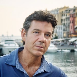
I see Silvia not very legible, I see blacks a little closed
I think it is intentional silvia la vedo poco leggibile , vedo dei neri un po chiusi
penso sia voluto |
| sent on September 11, 2025 (6:32) | This comment has been automatically translated (show/hide original)
I don't mind the accentuated contrast.
On the other hand, the square cut does not seem to me to further enhance the subject.
On the contrary, it makes me look (personal optical illusion) that I widen it a bit, shoulders like a swimming champion :-)
Another detail that I noticed in many pp and not only in yours, are the white flowers in the foreground that are too sharp that take attention away from my face.
In my opinion, the maf did not fall perfectly on the face. For this reason, in my pp, I tried to mitigate by accentuating the sharpness on the face and slightly blurring the flowers. A me, il contrasto accentuato non dispiace.
Invece il taglio quadrato non mi pare valorizzare ulteriormente il soggetto.
Anzi, mi fa sembrare (illusione ottica personale) che lo allarghi un po', spalle da campionessa di nuoto
Un'altro particolare che ho notato in molte pp e non solo nella tua, sono i fiori bianchi in primo piano troppo nitidi che mi tolgono attenzione dal viso.
Probabilmente la maf non e' perfettamente sugli occhi. Per questo, nella mia pp, ho cercato di mitigare accentuando la nitidezza sul volto e sfocando leggermente i fiori. |
| sent on September 11, 2025 (15:45) | This comment has been automatically translated (show/hide original)
I agree with the words of Ardian and kaveri
Impactful but a little too contrasted Condivido le parole di Ardian e kaveri
D'impatto ma un pó troppo contrastata |
| sent on September 11, 2025 (18:37) | This comment has been automatically translated (show/hide original)
Silvia, for me your version is very original. The first thing I notice is that you have deformed the photo, resizing the head relative to the body, which I like. A little too wide? Maybe. Excessive contrast and saturation? Maybe. But everything comes together in a perfect balance between classic and modern. For me on the podium. Silvia, per me la tua versione è molto originale. Prima cosa che noto è che hai deformato la foto, ridimensionando la testa rispetto al corpo, il che mi piace. Un pò troppo allargata? Forse. Contrasto e saturazione eccessivi? Può essere. Ma il tutto si conbina in un perfetto equilibrio tra classico e moderno. Per me da podio. |
| sent on September 11, 2025 (21:28) | This comment has been automatically translated (show/hide original)
Welcome back Silvia 8-)
Bold interpretation, for many reasons: cut, colors, light. Impactful, it can be divisive, but sometimes "luck" favors the bold... Bentornata Silvia
Audace interpretazione, per tante ragioni: taglio, colori, luce. D'impatto, può essere divisiva, ma talvolta la "fortuna" aiuta gli audaci... |
| sent on September 12, 2025 (13:25) | This comment has been automatically translated (show/hide original)
Thank you all for the comments. I too had the impression of shoulders that were too wide, but I think it's due to the perspective correction, I tried to correct it by stretching a little but I ended up having too little air on it. The strong contrast was intentional because I tried to highlight the brightness of the skin by removing some small imperfections, such as the pimple under the nose and accentuating a little the lighter strands on the sides of the face. Grazie a tutti per i commenti. Anch'io ho avuto un po' l'impressione di spalle troppo larghe, ma credo che sia dovuto alla correzione prospettica, ho cercato di correggerla allungando un po' ma finivo per avere troppa poca aria sopra. Il contrasto forte era voluto perché ho cercato di mettere in risalto la luminosità della pelle togliendo qualche piccola imperfezione, tipo il brufolo sotto il naso e accentuando un po' le ciocche più chiare ai lati del viso. |
| sent on September 12, 2025 (15:29) | This comment has been automatically translated (show/hide original)
Maybe a little too contrasty but I like it a lot. On the cut, I agree with Kaveri's comments. Forse un po' troppo contrastata ma mi piace molto. Sul taglio condivido i commenti di Kaveri. |
|

Publish your advertisement on JuzaPhoto (info) |


 JuzaPhoto contains affiliate links from Amazon and Ebay and JuzaPhoto earn a commission in case of purchase through affiliate links.


 3.9 MEGAPIXEL
 Resize to fit window