What do you think about this photo?Do you have questions or curiosities about this image? Do you want to ask something to the author, give him suggestions for improvement, or congratulate for a photo that you really like?
You can do it by joining JuzaPhoto, it is easy and free!
There is more: by registering you can create your personal page, publish photos, receive comments and you can use all the features of JuzaPhoto. With more than 257000 members, there is space for everyone, from the beginner to the professional.
| sent on August 09, 2021 (12:15) | This comment has been automatically translated (show/hide original)
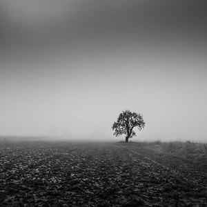
Well composed and with a great tonal range. Congratulations
Ignatius Ben composto e con un ottima gamma tonale. Complimenti
Ignazio |
| sent on August 09, 2021 (15:19) | This comment has been automatically translated (show/hide original)
Another b/w "author": well-kept compo, is an image that makes simplicity its trump card; excellent as always the post, never invasive and always suitable for the subject portrayed: excellent work!
Leonardo Un altro b/n "d'autore" : curatissima la compo , è un'immagine che fa della semplicità la sua carta vincente ; eccellente come sempre la post , mai invasiva e sempre adatta al soggetto ritratto : ottimo lavoro !
Leonardo |
| sent on August 09, 2021 (17:56) | This comment has been automatically translated (show/hide original)
Gorgeous monochrome!
Compliments Splendido monocromatico!
Complimenti |
| sent on August 09, 2021 (20:44) | This comment has been automatically translated (show/hide original)
Thank you Ignatius, Thank you Gionskj, your compliments are always very welcome. Grazie Ignazio, Grazie Gionskj, i vostri complimenti sono sempre graditissimi. |
| sent on August 09, 2021 (20:49) | This comment has been automatically translated (show/hide original)
Thank you so much Leonardo for your appreciation and generosity.
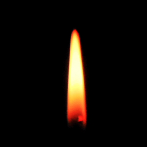
The color version was not at all interesting, the green imperava, the toning allowed me to play with shades of gray and the result does not seem bad, the bush in the background I did not get much but I could not do better :-/
Grazie mille Leonardo per l'apprezzamento e la generosità.
La versione a colori non era per niente interessante, il verde imperava, il viraggio mi ha permesso di giocare con le tonalità di grigio ed il risultato non mi sembra malaccio, la boscaglia sullo sfondo non mi è venuta un gran che ma non sono riuscito a fare di meglio 
|
| sent on August 31, 2021 (12:56) | This comment has been automatically translated (show/hide original)
The "bush at the bottom" could have a slightly higher contrast. But not too much (at least in my opinion) xchè would have made the composition too unifome and too "loaded", making the plant lose importance (which is then the main subject).
For me that's fine.
A greeting
Giacomo La "boscaglia sullo fondo" poteva avere un contrasto leggermente superiore. Ma non troppo (almeno secondo me) xchè avrebbe reso troppo unifome e troppo "carica " la composizione, facendo perdere di rilievo alla pianta (che poi è il soggetto princiapale).
Per me bene così.
Un saluto
Giacomo |
| sent on August 31, 2021 (13:08) | This comment has been automatically translated (show/hide original)
Thank you for the analysis and for the compliments Giacomo, I am pleased and I appreciate it. Ti ringrazio per l'analisi e per i complimenti Giacomo, mi fa piacere e lo apprezzo. |
|

Publish your advertisement on JuzaPhoto (info) |


 JuzaPhoto contains affiliate links from Amazon and Ebay and JuzaPhoto earn a commission in case of purchase through affiliate links.


 4.3 MEGAPIXEL
 Resize to fit window