What do you think about this photo?
Do you have questions or curiosities about this image? Do you want to ask something to the author, give him suggestions for improvement, or congratulate for a
photo that you really like?
You can do it by joining JuzaPhoto, it is easy and free!
There is more: by registering you can create your personal page, publish photos, receive comments and you can use all the features of JuzaPhoto.
With more than 260000members, there is space for everyone, from the beginner to the professional.
|
|
sent on 01 Ottobre 2019 (8:15) | This comment has been automatically translated (show/hide original)
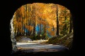
I really like these woods, very nice. Congratulations.
A greeting.
Mark.
P.S.: Is there a slight blue/cyan dominance? Mi piacciono molto questi scorci di bosco, molto bello. Complimenti.
Un saluto.
Marco.
P.S.: c'è forse una leggera dominante blu/cyan? |
|
|
sent on 01 Ottobre 2019 (8:31) | This comment has been automatically translated (show/hide original)
Is there a slight blue/cyan dominance?
Minkia, caught on first shot :-D :-D :-D
Evidently yes, even yellow is not real, the leaves and beech trees do not color like that.
It's my own interpretation, played on the colors and movement of the leaves moved by the wind... the latter, however, is real. ;-)
Thank you
Hello c'è forse una leggera dominante blu/cyan?
Minkia ,beccato al primo colpo
Evidentemente si ,anche il giallo non è reale, le foglie e dei faggi non si colorano in quel modo.
È una mia personale interpretazione, giocata sui colori e sul movimento delle foglie mosse dal vento...quest'ultimo però è reale.
Grazie
Ciao |
|
|
sent on 01 Ottobre 2019 (9:46) | This comment has been automatically translated (show/hide original)
Can I ask you why you decided to process it creatively and unnaturally? Just for the colors, or is there anything else? Posso chiederti perché hai deciso di elaborarla in modo creativo e non naturale? Solo per i colori, o c'è altro? |
|
|
sent on 01 Ottobre 2019 (11:28) | This comment has been automatically translated (show/hide original)
@Commissario: this experiment is going to have to do with a Guy in Burke?... know that I 12,000 euros for your photo I will not take them out... ;-)
Aside the jokes, not bad the result...
Simone @Commissario: questo esperimento avrà mica a che fare con un certo Burkett?...sappi che io 12.000 $ per la tua foto non li tiro fuori...
A parte gli scherzi, non male il risultato...
Simone |
|
|
sent on 01 Ottobre 2019 (11:39) | This comment has been automatically translated (show/hide original)
“ is there a slight blue/cyan dominance? „
a little... looks like the smurf woods :-D :-D
The chromatic interpretation I do not mind, isieme to the move on the leaves and the twisted shapes of the trunks creates a good pictorial effect, I find only too empty the lower part to the left
Congratulations, hello
“ c'è forse una leggera dominante blu/cyan? „
un po'...sembra il bosco dei puffi
L'interpretazione cromatica non mi dispiace, isieme al mosso sulle foglie e alle forme contorte dei tronchi crea un buon effetto pittorico, trovo solo troppo vuota la parte bassa a sinistra
Complimenti, ciao
|
user112477
|
sent on 01 Ottobre 2019 (11:56) | This comment has been automatically translated (show/hide original)
The Commissioner investigates an intrigued story set in a strangely coloured undergrowth.
But the Commissioner has a clear track and already has in mind not to use filters.
Congratulation Commissioner. Don't let false leads get swayed. Follow his path.
Fujifan80. Il Commissario indaga su una intrigata vicenda ambientata in un sottobosco dai colori strani.
Ma il Commissario ha chiara una traccia e ha già in mente di non usare filtri.
Complimenti Commissario. Non si lasci influenzare da false piste. Segua il suo sentiero.
Fujifan80. |
|
|
sent on 01 Ottobre 2019 (12:03) | This comment has been automatically translated (show/hide original)
“ I just find the lower left part too empty „
as far as I can understand I think it's to counteract the green/yellow of the leaves on the trees, as the title Changes says. Then if the undergrowth is so without interventions in photo montage (... or gardening) you couldn't bring items to those areas “ trovo solo troppo vuota la parte bassa a sinistra „
per quanto ne posso capire penso sia per contrastare con il verde/giallo delle foglie sugli alberi, come dice il titolo Changes. Poi se il sottobosco è così a meno di interventi in fotomontaggio (...o giardinaggio) non si potevano portare oggetti in quelli zona |
|
|
sent on 01 Ottobre 2019 (12:15)
Beautiful shot and composition Simone. Hello,.. Amir. |
|
|
sent on 01 Ottobre 2019 (12:18) | This comment has been automatically translated (show/hide original)
“ Then if the undergrowth is so without interventions in photo montage (... or gardening) you could not bring objects in those areas „
There is not a single way to compose, maybe there were alternatives, I know that Simone is very careful in this respect and I am interested to know the motive of his choice ;-) “ Poi se il sottobosco è così a meno di interventi in fotomontaggio (...o giardinaggio) non si potevano portare oggetti in quelli zona „
Non esiste un solo modo di comporre, magari c'erano alternative, so che Simone è molto attento sotto qusto aspetto e m'interessa conoscere il moivo della sua scelta |
|
|
sent on 01 Ottobre 2019 (12:37)
“ Commissario: questo esperimento avrà mica a che fare con un certo Burkett?...sappi che io 12.000 $ per la tua foto non li tiro fuori...;-) „
Minkia beccato pure al secondo colpo...gli juzzini sono dei veri cecchini.
Grazie innanzitutto per i feedback ne avevo bisogno su questa foto.
Non è il mio stile chiaro (sempre che ne abbia uno) però non ho mai disdegnato certi accostamenti cromatici,senza scomodare Burkett direi che anche su questo forum ci sono validi esempi,solo che mi sono sempre chiesto quando un colore o una dominante nella fotografia di paesaggio sia da considerarsi un errore o una personale interpretazione .il passaggio è sempre incerto e spesso ci si nasconde dietro la seconda per giustificare la prima.Non è il mio caso.qui è chiaro ,almeno credo il mio intento ,puramente grafico,giocato sulla contrapposizione dei colori complementari,e lo stacco tra di loro...per evidenziare le foglie mosse ,quelle poche ingiallite le ho saturate e virate verso il giallo paglierino per staccarle dal verde ,il blu o cyano l'ho introdotto per contrastare il giallo.forse dovevo toglierlo ancora un po' dalle ombre.
Devo dire che ,presa per quello che è,quindi non certo la rappresentazione reale di un sottobosco,la resa finale mi piace molto,devo solo capire quando è se mi stancherò di tali rappresentazioni.
Sulla compo Caterina sono d'accordo in parte,nel senso che è vero quello che dici infatti con lo strumento distorci per correggere le linee cadenti,un po' l'ho ridotta quella zona,ma essendo in diagonale e meno della metà del fotogramma non la vedo così vuota.certo un po' meno non avrebbe guastato.
Le ho.provate tutte le composizioni,ero praticamente su un dirupo e quello spicchio di terreno meno di così non sono riuscito.
Grazie ancora
Simone “ Commissario: questo esperimento avrà mica a che fare con un certo Burkett?...sappi che io 12.000 $ per la tua foto non li tiro fuori...;-) „
Minkia beccato pure al secondo colpo...gli juzzini sono dei veri cecchini.
Grazie innanzitutto per i feedback ne avevo bisogno su questa foto.
Non è il mio stile chiaro (sempre che ne abbia uno) però non ho mai disdegnato certi accostamenti cromatici,senza scomodare Burkett direi che anche su questo forum ci sono validi esempi,solo che mi sono sempre chiesto quando un colore o una dominante nella fotografia di paesaggio sia da considerarsi un errore o una personale interpretazione .il passaggio è sempre incerto e spesso ci si nasconde dietro la seconda per giustificare la prima.Non è il mio caso.qui è chiaro ,almeno credo il mio intento ,puramente grafico,giocato sulla contrapposizione dei colori complementari,e lo stacco tra di loro...per evidenziare le foglie mosse ,quelle poche ingiallite le ho saturate e virate verso il giallo paglierino per staccarle dal verde ,il blu o cyano l'ho introdotto per contrastare il giallo.forse dovevo toglierlo ancora un po' dalle ombre.
Devo dire che ,presa per quello che è,quindi non certo la rappresentazione reale di un sottobosco,la resa finale mi piace molto,devo solo capire quando è se mi stancherò di tali rappresentazioni.
Sulla compo Caterina sono d'accordo in parte,nel senso che è vero quello che dici infatti con lo strumento distorci per correggere le linee cadenti,un po' l'ho ridotta quella zona,ma essendo in diagonale e meno della metà del fotogramma non la vedo così vuota.certo un po' meno non avrebbe guastato.
Le ho.provate tutte le composizioni,ero praticamente su un dirupo e quello spicchio di terreno meno di così non sono riuscito.
Grazie ancora
Simone |
|
|
sent on 01 Ottobre 2019 (12:58) | This comment has been automatically translated (show/hide original)
From my point of view, experimentation is good, although, of course, it would work better in a context of multiple photos.
In this case the result is quite disconcerting because we are used to seeing warm colors, in these situations. Unsettling, in a planned and discerning way, is already a very good goal in a world of images all the same or almost equal.
Hello, Paul Dal mio punto di vista ben venga la sperimentazione, anche se, ovviamente, funzionerebbe meglio in un contesto di più foto.
In questo caso il risultato è abbastanza spiazzante perché siamo abituati a vedere colori caldi, in queste situazioni. Spiazzare, in modo programmato e con discernimento, è già un ottimo traguardo in un mondo di immagini tutte uguali o quasi.
Ciao, Paolo |
|
|
sent on 01 Ottobre 2019 (13:08) | This comment has been automatically translated (show/hide original)
“ I have always wondered when a color or a dominant in landscape photography is to be considered a mistake or a personal interpretation „
It was exactly the purpose of my question.
So it was more of a graphic experiment.
You usually offer sober images with very natural shades that, to be honest, I prefer.
Thank you for your explanation.
Hello Simone! purple
“ mi sono sempre chiesto quando un colore o una dominante nella fotografia di paesaggio sia da considerarsi un errore o una personale interpretazione „
Era esattamente lo scopo della mia domanda.
Quindi è stata più che altro una sperimentazione grafica.
Solitamente proponi immagini sobrie con tonalità molto naturali che, se devo essere sincera, preferisco.
Ecco, su quelle riconosco la tua grande competenza; su questa, invece, potrei fare confusione e, se non sapessi che è tua, probabilmente la giudicherei come una foto elaborata in modo un po' troppo forzato
Ti ringrazio per la spiegazione.
Ciao Simone!
Viola |
|
|
sent on 01 Ottobre 2019 (17:57)
L'ho guardata diverse volte nel corso della giornata, perché questa tua libera interpretazione cromatica ha un po' spiazzato anche me! Il risultato alla fine non è male, anche perché hai utilizzato coscienziosamente colori complementari (magari era meglio una tonalità più sul blu che sul ciano?), non una semplice dominante cromatica, tuttavia il mio occhio cerca sempre un "appiglio" alla realtà cui è abituato e forse per questo non mi convince fino in fondo. Hai fatto bene a sperimentare per cercare nuove vie espressive, ma probabilmente questo genere è meno "digeribile" di altri. Prendiamo ad esempio il bianco e nero o il mosso creativo: l'immagine stessa è già distaccata dalla realtà (una non ha colori, l'altra non ha contorni) per cui si può osare di più senza tutto sommato provocare una reazione di perplessità nell'osservatore, anzi forse è proprio il contrario. Qui invece è diverso: un'immagine estremamente reale (un bosco di faggi) con i colori "alterati".
Circa la composizione, concordo con Caterina su quella "zona vuota" a sinistra; devo dire che il mio sguardo si sofferma principalmente sul bel faggio di destra, tanto che avrei tentato uno scatto in verticale concentrandomi solo su di esso... L'hai provato questo?
Ciao, Alberto. L'ho guardata diverse volte nel corso della giornata, perché questa tua libera interpretazione cromatica ha un po' spiazzato anche me! Il risultato alla fine non è male, anche perché hai utilizzato coscienziosamente colori complementari (magari era meglio una tonalità più sul blu che sul ciano?), non una semplice dominante cromatica, tuttavia il mio occhio cerca sempre un "appiglio" alla realtà cui è abituato e forse per questo non mi convince fino in fondo. Hai fatto bene a sperimentare per cercare nuove vie espressive, ma probabilmente questo genere è meno "digeribile" di altri. Prendiamo ad esempio il bianco e nero o il mosso creativo: l'immagine stessa è già distaccata dalla realtà (una non ha colori, l'altra non ha contorni) per cui si può osare di più senza tutto sommato provocare una reazione di perplessità nell'osservatore, anzi forse è proprio il contrario. Qui invece è diverso: un'immagine estremamente reale (un bosco di faggi) con i colori "alterati".
Circa la composizione, concordo con Caterina su quella "zona vuota" a sinistra; devo dire che il mio sguardo si sofferma principalmente sul bel faggio di destra, tanto che avrei tentato uno scatto in verticale concentrandomi solo su di esso... L'hai provato questo?
Ciao, Alberto. |
|
|
sent on 01 Ottobre 2019 (18:06) | This comment has been automatically translated (show/hide original)
“ Did you feel that? „
I'm offended... of course it :-D
But it was a picture for its own sake, here the forest is better perceived.
On the rest... What about... I agree, maybe the next one I correct the shot a little, I have fun ;-)
Hello “ L'hai provato questo? „
Mi.offendi...ovvio che si
Ma era una foto fine a se stessa ,qui il bosco si percepisce meglio.
Sul resto...che dire...sono d'accordo, magari la prossima correggo un po' il tiro, io mi diverto
Ciao |
|
|
sent on 01 Ottobre 2019 (19:06) | This comment has been automatically translated (show/hide original)
Beautiful this intricate tangle of branches
Also the colors
Hello Bellissimo questo intricato groviglio di rami
Ottimi anche i colori
Ciao |
|
|
sent on 01 Ottobre 2019 (21:08) | This comment has been automatically translated (show/hide original)
I like it for the courage you have shown in daring to get out of the traditional patterns and enter an unreal, imaginative world. I like it because you did it on purpose to experiment with new roads and, I think, for a landscaper like you it wasn't easy. I like for the joy that those colors transmit to the forest, deepening a message of hope and solarity. I like it because I think that if we all occasionally let ourselves be carried away by imagination to experience the "capricci" of our mind we could live more "light". I like it because this photo for me goes "beyond" the technical rigors and at the same time because I find it enveloping and engaging.
Just congratulations to me, good Simone.
Ric.
p.s. my monitor thanks you :-D :-D, with this you saved his life. A me piace per il coraggio che hai dimostrato nell'osare ad uscire dagli schemi tradizionali ed entrare in un mondo irreale, fantasioso. Mi piace perché lo hai fatto di proposito per sperimentare nuove strade e penso che per un paesaggista come te non sia stato facile. Mi piace per la gioia che quei colori trasmettono al bosco, profondendo un messaggio di speranza e di solarità. Mi piace perché penso che se tutti ogni tanto ci lasciassimo trasportare dalla fantasia per sperimentare i "capricci" della nostra mente potremmo vivere più "leggeri". Mi piace perché questa foto per me va "oltre" i rigori tecnici e nello stesso tempo perché la trovo avvolgente e coinvolgente.
Per me solo complimenti, bravo Simone.
Ric.
p.s. il mio monitor ti ringrazia , con questa gli hai salvato la vita. |
|
|
sent on 01 Ottobre 2019 (21:58) | This comment has been automatically translated (show/hide original)
Thank you again.
Ric ... always the best. :-D Grazie ancora.
Ric ...sempre il migliore. |
|
|
sent on 01 Ottobre 2019 (22:15) | This comment has been automatically translated (show/hide original)
Hello Simo, I'm of few words.
What to say, dismayed but at the same time fascinated by this new challenge of yours.
Fabrizio Ciao Simo, io sono di poche parole.
Che dire, spiazzato ma allo stesso tempo affascinato da questa tua nuova sfida.
Fabrizio |
|
|
sent on 01 Ottobre 2019 (22:19)
“ probabilmente questo genere è meno "digeribile" di altri. Prendiamo ad esempio il bianco e nero o il mosso creativo: l'immagine stessa è già distaccata dalla realtà (una non ha colori, l'altra non ha contorni) per cui si può osare di più senza tutto sommato provocare una reazione di perplessità nell'osservatore, anzi forse è proprio il contrario. „
Alberto, mi dispiace ma su questa riflessione non mi trovi d'accordo: sinceramente, tante volte, rimango perplessa anche davanti a certi b/n dove la ricercatezza estetica sembra quasi voler superare il contenuto, e anche per quanto riguarda il mosso creativo, lasciami dire, c'è modo e modo di farlo...
La tecnica dev'essere funzionale al messaggio che si vuole comunicare, ma in questo caso, come sostenuto anche dallo stesso Simone, sembra esserci semplicemente uno scopo "grafico", ed è il motivo per cui questa volta la foto non mi cattura emotivamente.
“ il mio intento, puramente grafico, giocato sulla contrapposizione dei colori complementari „
Forse, rimanendo sul piano tecnico,se le foglie fossero state arancioni, il risultato sarebbe stato più efficace.
La composizione in effetti appare sbilanciata, tuttavia il punto di fuga decentrato può contribuire a suscitare senso di disorientamento misto a curiosità: sensazioni abbastanza normali per coloro che si addentrano in un bosco inesplorato.
Simone, tu ci hai abituati a fotografie intime, sobrie, intense... fotografie in cui tecnica e contenuto viaggiano insieme, in sintonia... ecco perché, ripeto, le preferisco: in quelle ci sei, in questa no.
Ho deciso di tornare su questa proposta perché il tema mi appassiona e la discussione mi stimola.
Continuo a seguirti sempre con grande interesse.
Ciao,
Viola “ probabilmente questo genere è meno "digeribile" di altri. Prendiamo ad esempio il bianco e nero o il mosso creativo: l'immagine stessa è già distaccata dalla realtà (una non ha colori, l'altra non ha contorni) per cui si può osare di più senza tutto sommato provocare una reazione di perplessità nell'osservatore, anzi forse è proprio il contrario. „
Alberto, mi dispiace ma su questa riflessione non mi trovi d'accordo: sinceramente, tante volte, rimango perplessa anche davanti a certi b/n dove la ricercatezza estetica sembra quasi voler superare il contenuto, e anche per quanto riguarda il mosso creativo, lasciami dire, c'è modo e modo di farlo...
La tecnica dev'essere funzionale al messaggio che si vuole comunicare, ma in questo caso, come sostenuto anche dallo stesso Simone, sembra esserci semplicemente uno scopo "grafico", ed è il motivo per cui questa volta la foto non mi cattura emotivamente.
“ il mio intento, puramente grafico, giocato sulla contrapposizione dei colori complementari „
Forse, rimanendo sul piano tecnico,se le foglie fossero state arancioni, il risultato sarebbe stato più efficace.
La composizione in effetti appare sbilanciata, tuttavia il punto di fuga decentrato può contribuire a suscitare senso di disorientamento misto a curiosità: sensazioni abbastanza normali per coloro che si addentrano in un bosco inesplorato.
Simone, tu ci hai abituati a fotografie intime, sobrie, intense... fotografie in cui tecnica e contenuto viaggiano insieme, in sintonia... ecco perché, ripeto, le preferisco: in quelle ci sei, in questa no.
Ho deciso di tornare su questa proposta perché il tema mi appassiona e la discussione mi stimola.
Continuo a seguirti sempre con grande interesse.
Ciao,
Viola |
|

Publish your advertisement on JuzaPhoto (info) |

 paesaggi 3
 JuzaPhoto contains affiliate links from Amazon and Ebay and JuzaPhoto earn a commission in case of purchase through affiliate links.


 Resize to fit window


![[en]](shared_files/layout/country_flags/flag_196.jpg)