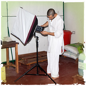
What do you think about this photo?
Do you have questions or curiosities about this image? Do you want to ask something to the author, give him suggestions for improvement, or congratulate for a
photo that you really like?
You can do it by joining JuzaPhoto, it is easy and free!
There is more: by registering you can create your personal page, publish photos, receive comments and you can use all the features of JuzaPhoto.
With more than 260000members, there is space for everyone, from the beginner to the professional.
user137840
|
sent on 14 Aprile 2018 (15:05) | This comment has been automatically translated (show/hide original)
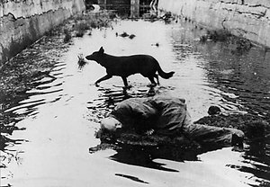
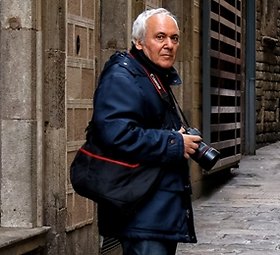
you will recognize that there is no trace of his work nor in New York ... everything is based on trust and not on the readability of the shot.
It remains a little portrait was a quiet man who expresses sleeps ...:-/but I like the light that is spread on her face.
Hello riconoscerai che non vi è traccia né del suo lavoro né di New York... tutto si basa sulla fiducia e non sulla leggibilità dello scatto.
rimane un ritratto poco espressivo di un uomo qualunque che dorme... però mi piace la luce che si spalma sul suo viso. però mi piace la luce che si spalma sul suo viso.
Ciao |
|
|
sent on 14 Aprile 2018 (15:26) | This comment has been automatically translated (show/hide original)
I think a title contains a photograph in an enclosure for anyone in that title tries to find the photograph is its foundation.
I put the title on each photo but the title is only one identity for its author, A finding the plates that moment, a vision that caught his eye.
In this picture I see a weary man who has a place to rest.
I see the hard work of those who have little time to restaurant its forces and is content with what he finds.
I see humanity and a photographer that view at all.
The drastic cut to the right stride and cries, look at that face, wherever in the world you are.
*
Have a nice day
Patrick
Credo che un titolo racchiuda una fotografia in un recinto per chi in quel titolo cerca di trovare la fotografia e il suo fondamento.
Ma le parole non sono mai una prigione del pensiero.
Io metto il titolo su ogni fotografia, ma il titolo penso sia solo un'identità per il suo Autore. Un ritrovare la targa di quel momento, una visione che ha attirato il suo sguardo.
In questa fotografia vedo un uomo stanco che ha trovato un posto qualunque per riposare.
Vedo il duro lavoro di chi ha poco tempo per riposare le sue forze e si accontenta di quello che trova.
Vedo l'umanità e un fotografo che la mostra a tutti.
Il taglio drastico a destra stride e grida, guardate quel viso, in qualunque parte del mondo si trovi.
*
Buona giornata
Patrizio
|
|
|
sent on 14 Aprile 2018 (15:44) | This comment has been automatically translated (show/hide original)
I agree with the comment by Philip, a man sleeping on a bench as we see every day.
Hello Luca Sono d'accordo con il commento di Filippo, un uomo che dorme su una panchina come da noi se ne vedono tutti i giorni.
Un saluto Luca |
|
|
sent on 14 Aprile 2018 (15:51) | This comment has been automatically translated (show/hide original)
@Filippo Datta
“ you will recognize that there is no trace of his work nor in New York ... everything is based on trust and not on the readability of the shot. „
I agree. I kept the title of a series, of which this photo is dedicated to this topic. Perhaps I will publish more. It probably would have been better to call it "sleeping man" but changing now would be disrespectful of your comment.
“ remains a little portrait expressive of an ordinary man who sleeps „ I disagree. The face has very sweet and is caught in a moment of great neglect.
Anyway, thanks for the comment and jumping.
A greeting
Franco @Filippo Dinatale
“ riconoscerai che non vi è traccia né del suo lavoro né di New York... tutto si basa sulla fiducia e non sulla leggibilità dello scatto. „
Concordo. Ho mantenuto il titolo di una serie, di cui questa foto fa parte, dedicata a questo tema. Forse ne pubblicherò altre. Probabilmente sarebbe stato meglio intitolarla “uomo che dorme” ma cambiare ora sarebbe poco rispettoso del tuo commento.
“ rimane un ritratto poco espressivo di un uomo qualunque che dorme „ su questo non sono d'accordo. Il volto ha tratti molto dolci ed è colto in un momento di grande abbandono.
In ogni caso, grazie del commento e del passaggio.
Un saluto
Franco
P.S. Luca, vale anche per quello che hai scritto tu. Un saluto anche a te. |
|
|
sent on 14 Aprile 2018 (15:56) | This comment has been automatically translated (show/hide original)
@Patrizio Raghavan
Thanks for the passage and welcome comment.
A greeting
Franco @Patrizio Rigobello
Grazie per il passaggio ed il gradito commento.
Un saluto
Franco |
|
|
sent on 14 Aprile 2018 (18:17) | This comment has been automatically translated (show/hide original)
Beautiful and expressive portrait
I find the title almost superfluous
a greeting
Marco Bello ed espressivo ritratto
trovo il titolo quasi superfluo
un saluto
Marco |
user137840
|
sent on 14 Aprile 2018 (19:25) | This comment has been automatically translated (show/hide original)
“ I agree. I kept the title of a series, of which this photo is dedicated to this topic. Perhaps I will publish more. It probably would have been better to call it "sleeping man" but changing now would be disrespectful of your comment. „
in fact my comment, albeit critical, resulted from the fact that it is a photo as an end in itself. I found that was not forming part of an ongoing issue, an issue for New York and the health of New Yorkers. :-/
Anyway thank you for the courteous response as evidence of your intellectual honesty. ;-)
See you soon. :-) “ Concordo. Ho mantenuto il titolo di una serie, di cui questa foto fa parte, dedicata a questo tema. Forse ne pubblicherò altre. Probabilmente sarebbe stato meglio intitolarla “uomo che dorme” ma cambiare ora sarebbe poco rispettoso del tuo commento. „
infatti il mio commento, seppur critico, è scaturito dal fatto che è una foto fine a se stessa. mi sono accertato che non fosse facente parte di una tematica già in corso, una tematica su New York e le condizioni dei Newyorchesi.
ad ogni modo ti ringrazio per il cortese riscontro come prova della tua onestà intellettuale. 
a presto. |
|
|
sent on 14 Aprile 2018 (19:39) | This comment has been automatically translated (show/hide original)
I quote the comment by Philip. I can't see neither NY (there are no identification of the city) or the job. I see only one person probably difficult.
Also I don't like the cut limbs.
It is often debated on putting or not the title (and I am in favour of the title) to the pictures should according to many instead talk to sole...in this case it was necessary to put it.
Hello Angel Quoto il commento di Filippo. Anch'io non ci vedo ne' NY (non ci sono elementi identificativi della città) né il lavoro. Vedo solo una persona probabilmente disagiata.
Inoltre non mi piace il taglio degli arti inferiori.
Si è spesso dibattuto sul mettere o no il titolo (e io sono favorevole al titolo) alle foto che dovrebbero secondo molti invece parlare da sole...in questo caso invece è stato necessario metterlo.
Ciao Angelo |
|
|
sent on 14 Aprile 2018 (19:44) | This comment has been automatically translated (show/hide original)
quoto Philip quoto Filippo |
|
|
sent on 14 Aprile 2018 (19:52) | This comment has been automatically translated (show/hide original)
A portrait of considerable thickness, and considering the author is hardly a surprise. In addition to what was said by Patrick, I really like where you place the accent using a ' selective focus is placed on the face and arms that in my humble opinion hit perfectly in the imagination. I used the term ' imaginary ' because they actually thought by Philip is also a match with mine.
A greeting.
Stefano Un ritratto di notevole spessore, e considerando l'autore non è certo una sorpresa. Oltre a quanto detto da Patrizio, mi piace molto dove hai posto l'accento usando un 'fuoco selettivo' posto sul viso e sulle braccia che a mio modesto parere centrano perfettamente nell'immaginario. Ho usato il temine 'immaginario' perché effettivamente il pensiero da Filippo trova anche un riscontro con il mio.
Un saluto.
stefano |
|
|
sent on 14 Aprile 2018 (20:06) | This comment has been automatically translated (show/hide original)
Dear Franco I don't find a photo in your usual ropes and as mentioned is not recognizable location as per title.
Hi, more affectionately, Stephen Caro Franco non la trovo una foto nelle tue solite corde e come già detto non è riconoscibile la location come da titolo.
ciao, sempre con affetto, stefano |
|
|
sent on 15 Aprile 2018 (10:40) | This comment has been automatically translated (show/hide original)
In fact a shot that leaves me a bit indifferent, with all due respect to the author.
In effetti uno scatto che mi lascia un po' indifferente, con tutto il rispetto per l'autore.
|
|
|
sent on 15 Aprile 2018 (15:49)
Ohhh bene, molto, molto bene!
Premesso che ho apprezzato tutti gli intervenuti, che ringrazio sinceramente, questa foto mi è utile per condividere alcuni pensieri:
Diversi di voi hanno commentato senza alcun riguardo per chicchessia (bene!) ed hanno criticato qualche aspetto giudicato “debole” dell'immagine. Benissimo!
Sono stati criticati il titolo, ritenuto non coerente e lontano dal rappresentato, la composizione per il taglio delle gambe ed il soggetto, apparso banale.
Mi fa veramente piacere (davvero!) che l'incongruenza del titolo sia stata notata da molti. Tanto più che, già nel mio primo intervento, mi sono dichiarato d'accordo con la critica di Filippo Dinatale spiegando il retroscena che mi ha portato a quella frettolosa scelta. Non l'ho cambiata solo per rispetto verso coloro che avevano già scritto.
Qualche altro ha poi dissimulato una certa acredine accumulata qui negli ultimi giorni insistendo su un argomento già dibattuto. Ma va bene così, visto che mi ha offerto l'occasione per dire che schierarsi pregiudizialmente pro o contro i titoli non ha senso. L'unica risposta che reputo possibile sul tema è: DIPENDE.
E non è affatto vero, a mio modesto giudizio, che una foto (o una serie) che richiede un titolo sia, in assoluto, meno “buona” di una che “parla da sola”. Così come è falso anche il contrario.
Sta all'autore confezionare un “pacchetto completo” in cui titolo, PP, composizione e quant'altro risultino funzionali e coerenti con i suoi scopi espressivi. Può usare un titolo oppure no, esattamente come sceglie di usare o meno un filtro in PP.
Non da oggi però noto che le critiche sulla coerenza, necessità o efficacia dei titoli sono rarissime in area commento (al massimo positive, con qualche critica per l'uso dell'inglese). Mi chiedo perché.
Eppure vedo tutti i giorni casi eclatanti di titoli che stridono sostanzialmente (molto più del mio!) con quanto rappresentato nell'immagine.
Potrei fare degli esempi concreti ma preferisco evitare di accendere le solite, prevedibili, polemiche.
Dico solo che, qualche giorno fa, in un tripudio entusiasta di oltre 40 commenti (messi tutti insieme credo non raggiungessero nemmeno le 70 parole!) per la foto di un autore molto amato, nessuno l'ha fatto notare. E si trattava di un errore palese ed incontestabile, anche sul piano logico-lessicale.
Dunque, qui è forse necessario risultare antipatici, spingere la gente a cercare la soddisfazione di coglierti in fallo, dipingersi come diavoli (mi viene da ridere!), per avere una lettura un po' più attenta e meno “social” delle foto a commento?
La lettura della singola foto, il commento, dovrebbero, di volta in volta, solo essere il punto di partenza, lo stimolo per chiacchierare “intorno” alla visione dell'autore e ai più vasti temi della fotografia.
Sono d'accordo con chi sostiene che la “critica costruttiva” sia solo una figura retorica, priva di ogni utilità una volta superati i livelli di apprendimento “basici”.
Credo però, come scrivo sempre, nella condivisione schietta delle idee e nel valore del dialogo.
Dialogo difficile da sostenere quando si legge, come qui sopra, “Inoltre non mi piace il taglio degli arti inferiori” seguito dal punto.
Capisco che un ortopedico abbia una particolare sensibilità per l'argomento ma, scusa Angelo, equivale a scrivere “non mi piace il pistacchio”. E allora? Dovrei rispondere che “invece a me sì!”?
Bisognerebbe sempre articolare un minimo di spiegazione per le proprie idee. Soprattutto quando si critica. E non certo con il solo scopo di difenderle ma bensì per cercare di aprire quel dialogo di cui parlavo poc'anzi.
E' per questo che mi sono sempre battuto contro la qui tanto richiamata locuzione latina “de gustibus non disputandum est”.
E', per me, la tomba di ogni dialogo.
Quanto alla foto in sé ed alla critica sulla banalità del soggetto ripreso, ora non ho tempo ma magari, se a qualcuno interessasse, potrei approfondire in seguito.
Per ora dico solo che si tratta di un'immagine non certo tra le mie migliori (quelle che considero migliori, per accordi con alcune gallerie, non posso pubblicarle più qui).
Forse farà parte del progetto in via di costruzione al quale ho accennato in un mio precedente intervento.
Non vi è comunque ritratta una persona disagiata (non lo faccio mai) e nel complesso, scusate l'immodestia, credo si tratti di una foto dignitosa con una buona qualità compositiva e, soprattutto, formale-fotografica.
Ovviamente, accetto e rispetto chi la pensa diversamente.
Un saluto cordiale a tutti e ancora grazie!
Franco
|
|
|
sent on 15 Aprile 2018 (16:41) | This comment has been automatically translated (show/hide original)
Many will ask:
"But this" Devil "so polite, unapologetic and precise in answering considerations could not be shut to sleep for another century?".
I rather think that circumstantial arguments are life forum, the antidote for those who want to leave a staggered world where you do not recognize, made by a galaxy of "friends" who will argue every day.
We support the reason
We support the reasoned analysis and not pretextual.
We support independent thinking.
Welcome back Flogger.
***
Have a good evening
Patrick Molti si chiederanno:
" Ma questo Diavolo, così educato , antipatico e preciso nel rispondere alle considerazioni fatte, non poteva restarsene a dormire per qualche altro secolo?".
Io invece penso che le circostanziate argomentazioni, una visione autonoma e libera, siano la vita del forum, l'antidoto per chi vuole lasciare un mondo sfalsato in cui non si riconosce più, fatto da una galassia di "amici " che si sostengono ogni giorno in ogni loro fotografia.
Sosteniamo la Ragione.
Sosteniamo l'analisi motivata e non pretestuosa di ogni fotografia.
Sosteniamo il Pensiero Franco e Indipendente.
Bentornato fustigatore.
***
Buona serata
Patrizio |
|
|
sent on 15 Aprile 2018 (18:03) | This comment has been automatically translated (show/hide original)
Of the many criticisms I feel compelled to share, at most, which is less in your wheelhouse than usual.
But I think this cannot be considered a criticism.
If it is part of a series, it would definitely be interesting it also in the overall context.
But seen by itself I find it to be very incisive pel composition and cutting, which are in good balance keeping a certain dynamism thanks to horizontal lines well exploited.
Very accurate also in terms of management of the tones, I find a photograph certainly well made.
Greetings
F
Delle varie critiche mi sento di condividere, al più, che è meno nelle tue corde del solito.
Ma credo questo non possa considerarsi una critica.
Se fa parte di una serie, certamente sarebbe interessante coglierla anche nel contesto complessivo.
Ma vista da sé trovo che sia molto incisiva per composizione e taglio, che sono in buon equlibrio mantenendo un certo dinamismo grazie alle linee orizzontali ben sfruttate.
Molto curata anche sul piano della gestione dei toni, la trovo una fotografia indubbiamente ben fatta.
Saluti
F
|
|
|
sent on 15 Aprile 2018 (18:18)
Bene Franco...da avvocato senza causa mi hai fatto tornare nei panni di Ortopedico ed allora approfondisco il concetto degli arti inferiori...
A mio parere la foto è stata troppo croppata. Avrei preferto leggermente più "aria" a sx cosicché l'ombra della testa sarebbe stata completa e non tagliata.
Per quanto riguarda gli arti inferiori penso che il taglio sia troppo deciso e non rilevo una motivazione precisa e giustificata. Secondo me valutare anche l'atteggiamento delle gambe e non solo quello delle braccia, avrebbe reso sicuramente più interessante e compiuta l'immagine.
Inoltre penso che vedere le scarpe magari da lavoratore o al contrario dei piedi nudi avrebbe sicuramente indirizzato il fruitore ad una lettura più approfondita della foto che come l'hai postata ,a mio parere, non fornisce degli elementi fondamentali.
Concordo con te che non si tratta di una delle tue migliori foto per i motivi che ti ho illustrato, consapevole però che nel contesto di un possibile portfolio, come hai annunciato, potrebbe avere un significato diverso e più completo
Questa è la mia opinione senza acredine.
Ciao e buona serata
Angelo
|
|
|
sent on 16 Aprile 2018 (10:40) | This comment has been automatically translated (show/hide original)
@Francesco Snack
Yes, this time we agree)!
Thanks for the ride and best wishes
Franco @Francesco Merenda
Ebbene sì, questa volta siamo d'accordo!
Grazie del passaggio ed un caro saluto
Franco |
|
|
sent on 16 Aprile 2018 (12:12)
Dunque Angelo,
premesso che la foto non è affatto croppata, almeno sul lato più corto, quello che scrivi, in sintesi, si traduce in "io piuttosto l'avrei fatta così!".
Credo sia il modo sbagliato di procedere in una qualsiasi lettura critica. Bisognerebbe invece chiedersi "perchè l'autore ha fatto certe scelte, cosa ha voluto dire/mostrarci?".
In questo caso gli indizi sulle mie intenzioni sono molteplici e mi sembrano palesi. Vedi il fuoco selettivo ed il taglio stretto quasi ad avvolgere ed isolare il momento intimo e di abbandono del soggetto.
L'osservatore scorre il frame attraverso piani di profondità diversi: la sfocatura delle gambe è solo il primo di questi piani ed è solo un espediente compositivo (potevo tagliare anche di più!) che porta l'occhio a cercare il fuoco del secondo piano (la bella postura dell'incrocio di braccia) ed infine alla parte più significativa della fotografia (il bellissimo viso sereno del soggetto). Con un percorso visivo contrario la sfocatura è la via d'uscita.
La buona luce, una definizione fotografica che ritengo eccellente (qui è postata in bassa definizione), uno sfondo omogeneo ma spezzato ritmicamente ed un armonico gioco di ombre (quella della testa non mi sembra significativa nella realizzazione fotografico/compositiva del mio pensiero) fanno la foto.
Ho altri scatti con inquadrature più larghe, con le gambe riprese per intero e a fuoco ma, a mio giudizio, nessuna funziona come questa e, soprattutto, nessuna "traduce" così bene il motivo che mi ha portato a scattare.
Tu l'avresti fatta diversa e magari sarebbe anche migliore ma sarebbe stata un'altra cosa, il tuo pensiero , un'altra foto.
Scusa se mi ripeto ma sei incorso in uno dei più diffusi errori che compiono qui quasi tutti i commentatori.
Non ha senso stigmatizzare gli orizzonti storti, il troppo chiara/troppo scura e....il taglio delle gambe. E' solo una stupidaggine se prima non si dà credito espressivo all'autore e a quelle scelte che al primo sguardo appaiono sbagliate. Specie nel caso di foto di autori non proprio principianti.
Sarebbe stato quindi meglio porsi prima delle domande e poi, eventualmente, chiedere "Franco, perchè hai tagliato le gambe?"
Questo è anche il modo per far partire quel dialogo di cui parlavo in un intervento precedente e di cui questa risposta può considerarsi un esempio.
Certo è difficile, un po' più impegnativo e poi....toglie spazio e tempo al "divertimento" e alla baldoria social!
So già che mi dirai che qui si può fare questo e quello ma, perdona, in questa occasione non ne dai certo dimostrazione.
Ti saluto.
Franco Dunque Angelo,
premesso che la foto non è affatto croppata, almeno sul lato più corto, quello che scrivi, in sintesi, si traduce in "io piuttosto l'avrei fatta così!".
Credo sia il modo sbagliato di procedere in una qualsiasi lettura critica. Bisognerebbe invece chiedersi "perchè l'autore ha fatto certe scelte, cosa ha voluto dire/mostrarci?".
In questo caso gli indizi sulle mie intenzioni sono molteplici e mi sembrano palesi. Vedi il fuoco selettivo ed il taglio stretto quasi ad avvolgere ed isolare il momento intimo e di abbandono del soggetto.
L'osservatore scorre il frame attraverso piani di profondità diversi: la sfocatura delle gambe è solo il primo di questi piani ed è solo un espediente compositivo (potevo tagliare anche di più!) che porta l'occhio a cercare il fuoco del secondo piano (la bella postura dell'incrocio di braccia) ed infine alla parte più significativa della fotografia (il bellissimo viso sereno del soggetto). Con un percorso visivo contrario la sfocatura è la via d'uscita.
La buona luce, una definizione fotografica che ritengo eccellente (qui è postata in bassa definizione), uno sfondo omogeneo ma spezzato ritmicamente ed un armonico gioco di ombre (quella della testa non mi sembra significativa nella realizzazione fotografico/compositiva del mio pensiero) fanno la foto.
Ho altri scatti con inquadrature più larghe, con le gambe riprese per intero e a fuoco ma, a mio giudizio, nessuna funziona come questa e, soprattutto, nessuna "traduce" così bene il motivo che mi ha portato a scattare.
Tu l'avresti fatta diversa e magari sarebbe anche migliore ma sarebbe stata un'altra cosa, il tuo pensiero , un'altra foto.
Scusa se mi ripeto ma sei incorso in uno dei più diffusi errori che compiono qui quasi tutti i commentatori.
Non ha senso stigmatizzare gli orizzonti storti, il troppo chiara/troppo scura e....il taglio delle gambe. E' solo una stupidaggine se prima non si dà credito espressivo all'autore e a quelle scelte che al primo sguardo appaiono sbagliate. Specie nel caso di foto di autori non proprio principianti.
Sarebbe stato quindi meglio porsi prima delle domande e poi, eventualmente, chiedere "Franco, perchè hai tagliato le gambe?"
Questo è anche il modo per far partire quel dialogo di cui parlavo in un intervento precedente e di cui questa risposta può considerarsi un esempio.
Certo è difficile, un po' più impegnativo e poi....toglie spazio e tempo al "divertimento" e alla baldoria social!
So già che mi dirai che qui si può fare questo e quello ma, perdona, in questa occasione non ne dai certo dimostrazione.
Ti saluto.
Franco |
|
|
sent on 16 Aprile 2018 (12:58) | This comment has been automatically translated (show/hide original)
@ Patrick Rafutho
I can't think about my undeserved role of "Flogger" without doing the self-irony.
Anyway, thanks for the vote of confidence.
Hello
Franco
@ Patrizio Rigobello
Non riesco a pensare al mio ruolo immeritato di "fustigatore" senza fare dell'autoironia.
In ogni caso, grazie per la fiducia.
Ciao
Franco
|
|
|
sent on 16 Aprile 2018 (13:07) | This comment has been automatically translated (show/hide original)
I think self-mockery and frankness, as the courage to expose rationally their ideas and their Foundation, in reality often inappropriate for a serene and constructive, respectful dialogue, as is done today, the world of the web, are rare qualities like the competence and deserve getting recognition and appreciation, whoever the person who carries out.
Hello and good day
Patrick Credo che autoironia e franchezza, come il coraggio per esporre razionalmente le proprie idee e il loro fondamento, in delle realtà spesso inadeguate ad un dialogo rispettoso, sereno e costruttivo, come è di fatto oggi il mondo del web fotografico, siano delle qualità rare al pari della competenza e meritino sempre riconoscimento e apprezzamento, chiunque sia la persona che le porta avanti.
Ciao e buona giornata
Patrizio |
|

Publish your advertisement on JuzaPhoto (info) |

 Street 4
 JuzaPhoto contains affiliate links from Amazon and Ebay and JuzaPhoto earn a commission in case of purchase through affiliate links.


 Resize to fit window


![[en]](shared_files/layout/country_flags/flag_196.jpg)