What do you think about this photo?Do you have questions or curiosities about this image? Do you want to ask something to the author, give him suggestions for improvement, or congratulate for a photo that you really like?
You can do it by joining JuzaPhoto, it is easy and free!
There is more: by registering you can create your personal page, publish photos, receive comments and you can use all the features of JuzaPhoto. With more than 242000 members, there is space for everyone, from the beginner to the professional.
| sent on May 19, 2015 (12:51) | This comment has been automatically translated (show/hide original)
Alessandro Beautiful!
Congratulations for the shot
Andrew
PS: I would try only to turn a little 'shadow since you've chosen bn (excellent choice for more in this scene) Bella Alessandro!
Complimenti per l'inquadratura
Andrew
PS: Proverei solo a chiudere un po' le ombre visto che hai scelto il bn (ottima scelta per altro in questa scena) |
| sent on October 06, 2015 (15:05) | This comment has been automatically translated (show/hide original)
Very beautiful. :-) Molto bella.:-) |
| sent on October 06, 2015 (16:05) | This comment has been automatically translated (show/hide original)
Gorgeous!
Federico Bellissima!
Federico |
| sent on October 06, 2015 (16:30) | This comment has been automatically translated (show/hide original)
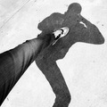
Picture a bit "overused" that the road that crosses the frame but still well done.
The compo is not bad but the B / N is a bit too "flat", a little weak.
He would need a different contrast, while preserving the narrow road which already alludes to shoot.
In my opinion, it would gain a lot.
A greeting
Momo Immagine un po "inflazionata" quella della stradina che attraversa il fotogramma ma comunque ben realizzata.
La compo non è male ma il B/N è un po troppo "flat", un po fiacco.
Avrebbe bisogno di un contrasto diverso, preservando però la stradina che già accenna a sparare.
A mio parere, ne guadagnerebbe molto.
Un saluto
Momo |
| sent on October 07, 2015 (11:09) | This comment has been automatically translated (show/hide original)
".... But the B / N is a bit too" flat ", a little weak."
Thanking everyone for the appreciation, respect the B & N in your judgment "a bit 'too weak', thank you peer First, because to know the opinion of others is always good, you learn.
But as for me, I consider the tone intemredi the most important image, are those that "make" the photograph, and then I do not like very high contrast images, however, much easier to be realized, and therefore, I prefer to stay on a not too dark gray, which makes it more readable part of the image, plus very extensive, where there is grass.
Qushe very wide gray area of ??the image is very dominant on the lighter: darkening, not only lost the readability of gray, but above all it "weighed down" the image as a light tone to the environment, the atmosphere of the day was lost extremely bright that a medium gray make it to communicate, and that is, in the end, the true message of the image, high contrast with a dark gray misinterpreted the image.
"....ma il B/N è un po troppo "flat", un po fiacco."
Ringraziando tutti per l'apprezzamento, per quanto riguarda il B&N a giudizio tuo "un po' troppo fiacco" , ti ringrazio peer prima cosa, dato che conoscere il parere altrui fa sempre bene, ci si impara.
Ma per quanto mi riguarda, considero i toni intemredi i più importanti dell'immagine, sono quelli che "fanno" la fotografia, e dunque non mi piacciono assolutamente le immagini molto contrastate, peraltro molto più facili da realizzarsi, e dunque, ho preferito stare su di un grigio non troppo scuro, che rende più leggibile la parte dell'immagine, oltretutto molto estesa, dove c'è dell'erba.
Quella zona grigia molto vasta dell'immagine è preponderante molto sulla parte più chiara: scurendola, non solo si perdeva la leggibilità del grigio, ma soprattutto si "appesantiva" l'immagine come tonalià di ambiente, si perdeva quell'atmosfera di giornata estremamente luminosa, che un grigio medio ce la fa a comunicare, e che è, alla fine, il messaggio vero di quella immagine, un contrasto elevato con un grigio scuro travisava l'immagine.
|
| sent on October 07, 2015 (11:34) | This comment has been automatically translated (show/hide original)
My apologies, Alessandro wow!
As I shall point out, as I have expressed is my personal opinion, nothing more.
If the photo you like it, all OK! You do not even need to post it on a forum to check the appreciation of others.
I have not spoken to "darken" something, but the picture as it looks like an old print black and white or rather gray-gray botched and without conflict.
Add, in reference to the composition, that the darker line that passes through the frame to the height of the bridge would have to be "straight".
I repeat, if you like it, then do not take account of my opinion. <br />
I would ask, however, out of respect for other people's time, specify in your post that accepts only positive comments and opinions.
good light
Momo Le mie scuse, Alessandro 
Come ho tenuto a precisare, quanto da me espresso è il mio parere personale, nulla più.
Se la foto a te piace così, tutto OK! Non hai nemmeno bisogno di postarla su un forum per verificare l'apprezzamento degli altri.
Io non ho parlato di "scurire" qualcosa, bensì che la foto così com'è assomiglia ad una vecchia stampa bianco-nero o, meglio, grigio-grigio mal riuscita e senza contrasti.
Aggiungo, in riferimento alla composizione, che la linea più scura che attraversa il fotogramma all'altezza del ponticello avrebbe dovuto essere "dritta".
Ripeto, se a te piace così, allora non tenere conto della mia opinione.
Ti chiederei però, per rispetto del tempo altrui, di specificare nei tuoi post che accetti solo commenti e pareri positivi.
buona luce
Momo |
| sent on October 07, 2015 (13:41) | This comment has been automatically translated (show/hide original)
"I'd ask you, however, to respect the time of others, specify in your post that accepts only positive comments and opinions."
Maybe we have not understood: I have thanked you because you made me a negative comment, for what, because the only way to improve is to receive COMMENTS NEGATVI to their actions, as well as to your photos: one of those we meditate and decide whether apply or not.
In your case, I have decided not to apply it (explain why), but other times, a negative comment I considered positively, was right who had done it and I have given into other images.
If the negative comment is accurate, detailed, and not as your general, you always learn something, while fromone that tells you that the photo is beautiful does not learn anything, although an appreciation always glad to receive it.
So they welcome the negative comments if done competently and thanks again. "Ti chiederei però, per rispetto del tempo altrui, di specificare nei tuoi post che accetti solo commenti e pareri positivi. "
Forse non ci siamo capiti: io ti ho ringraziato perchè mi hai fatto un commento negativo, per quello, perchè l'unica maniera di migliorarsi è ricevere COMMENTI NEGATVI alle proprie azioni, oltre che alle proprie fotografie: su quelli uno ci medita e decide se applicarli o meno.
Nel caso tuo, ho deciso di non applicarlo (spiegando il perchè),ma altre volte, un commento negativo l'ho considerato positivamente, aveva ragione chi lo aveva fatto e ne ho tenuto conto in altre immagini.
Se il commento negativo è puntuale, circostanziato, come il tuo e non generico, ci si impara sempre qualcosa, mentre da uno che ti dice che la foto è bella non ci impari nulla, anche se un apprezzamento fa sempre fa piacere riceverlo.
Dunque ben vengano i commenti negativi se fatti con competenza e grazie di nuovo. |
| sent on April 07, 2017 (10:17) | This comment has been translated
Excellent shot, congratulations! |
|

Publish your advertisement on JuzaPhoto (info) |


 JuzaPhoto contains affiliate links from Amazon and Ebay and JuzaPhoto earn a commission in case of purchase through affiliate links.


 Resize to fit window