What do you think about this photo?Do you have questions or curiosities about this image? Do you want to ask something to the author, give him suggestions for improvement, or congratulate for a photo that you really like?
You can do it by joining JuzaPhoto, it is easy and free!
There is more: by registering you can create your personal page, publish photos, receive comments and you can use all the features of JuzaPhoto. With more than 242000 members, there is space for everyone, from the beginner to the professional.
| sent on January 28, 2014 (13:39) | This comment has been automatically translated (show/hide original)
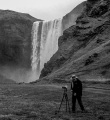
The version in HD is another thing, you can appreciate the full pp. That to me is undoubtedly the most pleasant shooting (to correct the dark part at the top of the branch, you're good then surely you can do it). The illusion of the gradient is too predominant, as is the predominant shrub with respect to the context. If (as I think) the subject was this shrub, I tried not to frame the lake because it distracts and there is nothing interesting (reflections, colors, etc.) above the water. I say because I do not know if in reality it would be possible ..
Now I expect bullshit, but I warn you that I live in Duckburg:-D:-D (but are not scrooge :-| :-|)
hello Massimo La versione in hd è altra cosa, si apprezza in pieno il pp. Che per me risulta indubbiamente la parte più gradevole dello scatto (da correggere la parte scura in alto del ramo, sei bravo quindi sicuramente ce la farai). L'illusione della pendenza è troppo predominante, così come risulta predominante l'arbusto rispetto al contesto. Se (come penso) il soggetto era questo arbusto, avrei cercato di non inquadrare il lago perchè distrae e non c'è nulla di interessante (riflessi, colori, ecc) sopra all'acqua. Dico avrei perchè non so se nella realtà sarebbe stato possibile..
Ora mi aspetto menate, ma ti avverto che abito a Paperopoli (ma non sono paperone (ma non sono paperone  ) )
ciao Massimo |
| sent on January 28, 2014 (17:41) | This comment has been automatically translated (show/hide original)
Sorry Max, but also to all those who have confirmed it, but I continued to compare the version in hd 1200px but with that much difference you speak of me I just can not see it, I'll be blinded, but a hair, pelino , pelinino, the darker it is the classic effect of reduction of resolution that also tends to compress the midtones and shadows close, but we really are in the field of the infinitesimal. tones brick then I note you do not own and if it was, in that time the green grass certainly is not, and in any case not differ between them in the two versions.
I almost like the picture very much:-D (another term that I absolutely patent) because it is exactly how I would have made it myself (of course I would have done better:-D:-D:-D). What I would not have done is cut off the feet to the branch that drops down tox, and I left a pile of extra space on the upper right above the tip of the branch incriminato.Ok you see the halo of the brush in an attempt to mask the two exposures, but in those cases I personally would not be able to do better if not also a little lightening of the sky on the left.
I think these are extreme situations that should be treated with luminosity.mask and control almost micrometer. (for me still to be tested).
I finally corrected the dominant bluish on the dry wood of juniper that is generally almost white.
for the rest to me a photo of a sunset or a beautiful sky broken anyway prepontentemente from a disordered form and severe as that of the plant life in the foreground, I like it a lot.
hello, simone
Scusa Max ,ma anche a tutti quelli che lo hanno confermato,ma ho continuato a confrontare la versione in hd con quella a 1200Px ma tutta questa differenza di cui parlate io non riesco proprio a vederla,Sarò cecato io ,ma si un pelo ,pelino,pelinino,più scura ma è il classico effetto di riduzione di risoluzione che tende a comprimere anche i mezzi toni e chiudere le ombre,ma siamo veramente nel campo dell'infinitesimale.I toni mattone poi non li rilevo proprio e se anche fosse ,in quel periodo l'erba certamente verde non la è,e comunque non discostano tra di loro nelle due versioni.
a me la foto piace quasi molto(un'altro termine che devo assolutamente brevettare) perchè è esattamente come l'avrei fatta io (io logicamente l'avrei fatta meglio).Quello che non avrei fatto è tagliare i piedi al ramo che scende verso il basso a dx,e avrei lasciato un pelo di spazio in più sull'angolo in alto a dx sopra la punta del ramo incriminato.Ok si vede l'alone del pennello nel tentativo di mascherare le due esposizioni,ma in quei casi io personalmente non sarei riuscito a fare di meglio se non schiarendo un pò anche la parte di cielo a sx.
queste sono situazioni limite che credo andrebbero trattate con le luminosity.mask e con un controllo quasi micrometrico.(per me ancora da sperimentare).
per ultimo avrei corretto la dominante azzurrina sulla legna secca del ginepro che è quasi bianca generalmente.
per il resto a me una foto di un tramonto o comunque un bel cielo rotto prepontentemente da una forma disordinata e severa come quella della pianta morta in primo piano,a me piace un sacco.
ciao,simone
|
| sent on January 28, 2014 (22:07) | This comment has been automatically translated (show/hide original)
Simone, this time they are not (fully) agree with you. The first floor of the version in HD is absolutely different from the "normal" (and I write to you after a good Lambrusco, so we make a pair with your barbera ..:-D), more bright, detailed, clear, different, in fact. After the PP are in agreement that does not change much. Then, understood, you are talking about a BEAUTIFUL photo, I would have been happy to have taken me, with the benefit of hindsight, sitting in front of a PC, you're just trying to (hopefully) make it even more beautiful. It remains in my opinion something "strange" in some places (water pendant, dark branch above) is perhaps due to the PP, maybe the optical illusion, I do not know because I do not so capable (of discernment, too) . I understood what I wanted with my previous posting was that the bush MUST and SHOULD be the 'single character, while this shot is mixed with other things (the lake) is not interesting enough for me having to include. As long as you could, of course.
I agree and I agree that the bush is very simply but very nice.
hello Massimo Simone, questa volta non sono (del tutto) d'accordo con te. Il primo piano della versione in hd è assolutamente diverso da quello "normale" (e ti scrivo dopo un buon lambrusco, così facciamo il paio con il tuo barbera..) , più luminoso, dettagliato, nitido, diverso, insomma. Dopo il pp sono d'accordo che non cambia molto. Poi, sottinteso, si sta parlando di una BELLA foto, che sarei stato felice di averla scattata io; con il senno di poi, seduti davanti un pc, si sta solo cercando di (eventualmente) farla ancora più bella. Rimane a mio avviso qualcosa di "strano" in alcuni punti (acqua pendente, ramo scuro in alto) che forse è dovuta alla pp, forse alla illusione ottica, non so in quanto non così io capace (di intendere e di volere, anche). Quello che volevo intendere io con il mio precedente intervento era che il cespuglio DEVE e DOVEVA essere l'unico protagonista , mentre con questa inquadratura si confonde con altre cose (lago) per me non così interessanti da doverle includere. Sempre che si potesse, naturalmente.
Convengo e concordo che il cespuglio è semplicemente molto ma molto bello.
ciao Massimo |
| sent on January 28, 2014 (22:50) | This comment has been automatically translated (show/hide original)
“ Simon, this time they are not (fully) agree with you „
but how dare you! :-D
are riandato to see me the HD version and I have for the umpteenth time compared with that in 1200 (now I consumed the mouse button to compare fury) and confirm everything I have written, I repeat you will also be brighter, but it really is not much, and it's not that we do affect even from the white background of the image in HD? however, I have not even been drinking tonight, you see that they are just blinded allora.tanto tomorrow Max when reading my comment, I already know who will send me to hell:-D
water pendant, the effect is obvious but I think you're all doing fooled by tilting the perspective of the dam, the little house on the right below the copperct, is a little distorted but is dritta.quella that is most noticeable is the inclination due to the falling lines to the left you see the reflections of the trees on the water
As for the fact of the protagonist sprig or not, are of the opinion that in photography and especially in that landscape does not necessarily have to always find a message, a key to understanding particular, a guideline that leads the eye in a certain point, or as I read more and more often lately some hidden philosophical meaning that enlighten us on the true meaning of our existence (but not your case is clear), but there are also the beautiful images that appagono the view of the lake and if that Giacopiane at sunset with beautiful light on the water, a wonderful sky, some trees that frame and a first floorthat breaks the poetry of the moment, for me it is still a beautiful image.
The sprig alone might have told a different story, here we wanted to tell in that beautiful place that Juniper was born, grew up, lived and now dead.
I think so then, as always, everyone has their own point of view that we must always, however, more than listening, listening.
hello " Simone, questa volta non sono (del tutto) d'accordo con te"
ma come ti permetti!
sono riandato a vedermi la versione in HD e l'ho confrontata per l'ennesima volta con quella a 1200(ormai ho consumato il tasto del mouse a furia di confrontarle) e confermo tutto quello che ho scritto,si ripeto sarà anche più luminosa ,ma è davvero poca roba,e poi non è che ci facciamo condizionare anche dallo sfondo bianco dell'immagine in Hd? comunque io stasera non ho neanche bevuto ,si vede che sono proprio cecato allora.tanto domani Max quando legge il mio commento,so già che mi manderà a quel paese
per l'acqua pendente ,l'effetto è evidente ma credo che vi state tutti facendo fregare dall'inclinazione prospettica della diga,la casetta sulla destra sotto il rametto,è un pò distorta ma è dritta.quella che è più evidente è l'inclinazione dovuta alle linee cadenti a sinistra vedi i riflessi degli alberi sull'acqua
Per quanto riguarda il fatto del rametto protagonista o meno,sono del parere che in fotografia e soprattutto in quella di paesaggio non bisogna per forza sempre trovare un messaggio,una chiave di lettura particolare,una linea guida che ci porta con l'occhio in un determinato punto,o come ultimamente leggo sempre più spesso un qualche significato filosofico recondito che ci illumini sul vero significato della nostra esistenza(ma non è il tuo caso sia chiaro) ,ma esistono anche le belle immagini che appagono la vista e se quella del lago di giacopiane al tramonto con una bella luce sull'acqua, un cielo meraviglioso,un pò di alberi che fanno da cornice ed un primo piano che spezza la poesia di quel momento,per me è comunque una bell'immagine.
Il rametto da solo avrebbe forse raccontato un'altra storia,qui ci ha voluto raccontare in che bel posto quel ginepro sia nato,cresciuto,vissuto e ora morto.
Io la penso così poi come sempre ognuno ha il suo punto di vista che bisogna sempre comunque più che ascoltare ,saper ascoltare.
ciao |
| sent on January 29, 2014 (12:28) | This comment has been automatically translated (show/hide original)
I'm on two different PCs continue to see a huge difference in color and brightness between the two versions, I'd like to figure out the mystery. Also because we are talking about the version that I see in hd (brighter and more readable with stick) or darker than the preview and brick color? However, my view is the correct version hd.
On the composition of my intent was to present the lake at sunset with an interesting foreground, so I chose that one branch (which continues to ds, it was not possible to place it entirely).
Thanks Massimo Duckburg:-D, Al-breaking Commissioner:-D and to Integra for their intervention. :-)
Hello
Max
Io su due pc diversi continuo a vede una enorme differenza di colori e luminosità tra le due versioni, mi piacerebbe capire il mistero. Anche perchè parliamo della versione che io vedo in hd (più luminosa e con il rametto leggibile) o quella dell'anteprima più scura e color mattone? Comunque dalla mia visuale quella corretta è la versione hd.
Sulla composizione il mio intento era presentare il lago al tramonto con un primo piano interessante, per questo ho scelto quell'unico rametto (che continua a ds, non era possibile inserirlo tutto).
Grazie Massimo di Paperopoli, Al rompi-commissario ed ad Integra per il loro intervento.
Ciao
Max
|
| sent on January 30, 2014 (8:17) | This comment has been automatically translated (show/hide original)
apart from the slope, I think your image was a bit 'too much dissected. The impact is extremely pleasant and compositionally interesting, when you start to analyze every pixel you do not save anything. For me a great photo that speaks to me in a calm and quiet. Claudio a parte la pendenza, credo che la tua immagine sia stata un po' troppo vivisezionata. L'impatto è estremamente piacevole e compositivamente interessante; quando si comincia a analizzare ogni pixel non si salva nulla. Per me un'ottima foto che mi parla di un'atmosfera calma e tranquilla. Claudio |
| sent on January 30, 2014 (8:34) | This comment has been automatically translated (show/hide original)
thanks to both of you.
Cla.san .. ago perte of the game, if the game is not that? :-D
Hello
Max grazie a tutti e due.
Cla.san.. fà perte del gioco, se no che gioco è?
Ciao
Max |
| sent on January 30, 2014 (10:47) | This comment has been automatically translated (show/hide original)
A beautiful landscape with a great shot. Un bel paesaggio con un ottimo punto di ripresa. |
| sent on January 31, 2014 (8:46)
Nice glance and relaxing atmosphere... however I am wondering if there isn't a bit too much magenta in the grass ?
... It is Personal anyway .
Congrats |
| sent on January 31, 2014 (9:10)
Wonderful shot and great composition. I like the foreground and the beautiful light. Hello |
| sent on February 07, 2014 (20:16) | This comment has been automatically translated (show/hide original)
I hit the building and the color rendition and I must say that I appreciate them both: personal taste! Congratulations Cecilia mi ha colpito la costruzione e la resa cromatica e devo dire che li apprezzo entrambi: gusto personale! Complimenti Cecilia |
| sent on February 18, 2014 (13:01) | This comment has been automatically translated (show/hide original)
Hello Max, well I do not know how simone abysmal differences between the photo and the photo of the preview in HD, in my opinion, the main problems are to be found in the lack of consistency between the various levels of brightness, and the sky that I find too elaborate and dark . Ok then you see the glow on the branch, but those are little things.
The composition is perhaps not to scream, but because it has its own ;-)
soon
hello
Fabio Ciao Max, pure io come simone non noto differenze abissali tra la foto dell'anteprima e la foto in HD, a mio parere i problemi principali vanno ricercati nella mancata coerenza di luminosità tra i vari piani, e il cielo che trovo troppo elaborato e scuro. Poi ok si vede l'alone sul rametto, ma quelle sono cose da poco.
La composizione forse non è da urlo, ma comunque ha il suo perchè 
a presto
ciao
Fabio |
| sent on February 20, 2014 (14:08) | This comment has been automatically translated (show/hide original)
This I'd lost .... really nice ... impressive sharpness ... Questa me l'ero persa....veramente bella...nitidezza impressionante... |
| sent on July 04, 2016 (22:38) | This comment has been automatically translated (show/hide original)
Excellent work, extraordinary beauty. Hello, Rodema. ;-) Eccellente lavoro, bellezza straordinaria. Ciao, Rodema. |
| sent on July 04, 2016 (22:58) | This comment has been automatically translated (show/hide original)
truly remarkable gallery, I chose this purely for reasons of composition due to the presence of an element of detachment in the foreground, in any case very pleasant in its entirety. Congratulations Stefano Galleria davvero notevole, ho scelto questa per ragioni prettamente compositive dovute alla presenza di un elemento di stacco in primo piano, in ogni caso gradevolissime in toto. Complimenti Stefano |
| sent on July 07, 2016 (8:07) | This comment has been translated
Thanks Stefano! |
|

Publish your advertisement on JuzaPhoto (info) |


 JuzaPhoto contains affiliate links from Amazon and Ebay and JuzaPhoto earn a commission in case of purchase through affiliate links.

...")
 1.7 MEGAPIXEL
 Resize to fit window