What do you think about this photo?Do you have questions or curiosities about this image? Do you want to ask something to the author, give him suggestions for improvement, or congratulate for a photo that you really like?
You can do it by joining JuzaPhoto, it is easy and free!
There is more: by registering you can create your personal page, publish photos, receive comments and you can use all the features of JuzaPhoto. With more than 242000 members, there is space for everyone, from the beginner to the professional.
| sent on December 12, 2013 (13:07) | This comment has been automatically translated (show/hide original)
nice photo: perfect light and balanced remarkable recovery of the shadows. Compliments.
Angell
bella foto: luce perfetta e notevole il recupero equilibrato delle ombre. Complimenti.
Angell
|
| sent on December 12, 2013 (13:47) | This comment has been automatically translated (show/hide original)
That light and colors!
Great shot!
Maximum Che luce e che colori!!!
Scatto bellissimo!
Massimo |
| sent on December 12, 2013 (19:10) | This comment has been automatically translated (show/hide original)
Congratulations! All I see is a beautiful photo.
Hello
Complimenti! Io vedo solo una bella foto.
Ciao
|
| sent on December 13, 2013 (0:42) | This comment has been automatically translated (show/hide original)
Simone ... I figured ... no problem for me ...
the important thing is to be constructive, your note has sparked a number of versions rather interesting that every one has interpreted in his own way ... I do not want to but I still prefer my ... :-D,
albeit to Felux is close enough and your most politically correct ... ;-)
Is that ... removing the cold, blue and cyan, in my opinion flattens the picture ...
see the version that actually fabius (as written by Felux) tends to green so that even the oak tree has changed color ... 8-)
The point, in my opinion, is not the dominant, more or less thrust or a color that is there and there should not be ... if we want an accurate representation of the real scene, or if we want a little more elabsea ??bream ...
I appreciate those who propose a landscape in b / w and just as those who draw heavily color image ..., just give me a thrill ... the vision, a visual delight, that hit me for the originality and beauty intrinsic to what is portrayed ... then every one sees it in his own way of course.
Thank you Simon for discussion, and also to Felux and Fabius for participation and proposals ...
and always good light at all ...
thanks also to all the other participants with the posts and with the like
Hello
Simone..., figurati..., per me nessun problema...,
l'importante è essere costruttivi, il tuo appunto ha scatenato una serie di versioni piuttosto interessanti che ogni uno ha interpretato a modo suo..., non me ne volere ma io continuo a preferire la mia...  , ,
seppure quella di felux sia abbastanza vicina e la tua più politicamente corretta... 
...è che togliendo i freddi, blu e ciano, secondo me si appiattisce il quadro...,
vedi la versione di fabius che effettivamente (come scritto da felux) tende al verde tanto che anche la quercia ha cambiato colore... 
Il punto, secondo me, non è tanto la dominante più o meno spinta o un colore che c'è e non dovrebbe esserci..., se vogliamo una rappresentazione esatta della scena reale o se la vogliamo un po più elaborata...,
io apprezzo chi propone un paesaggio in b/n e altrettanto chi elabora pesantemente un'immagine a colori..., basta che la visione mi dia un'emozione..., un piacere visivo, che mi colpisca per l'originalità e la bellezza intrinseca di quello che vi è rappresentato..., poi ogni uno la vede ovviamente a modo suo.
Grazie a te Simone per la discussione, e anche a Felux e Fabius per la partecipazione e le proposte...,
e sempre buona luce a tutti...,
grazie inoltre a tutti gli altri intervenuti con i post e con i mi piace
Ciao
|
| sent on December 13, 2013 (12:33) | This comment has been automatically translated (show/hide original)
“ The point, in my opinion, is not the dominant, more or less thrust or a color that is there and there should not be ... if we want an accurate representation of the real scene, or if we want a little more elaborate. ..,
I appreciate those who propose a landscape in b / w and just as those who draw heavily color image ..., just give me a thrill ... the vision, a visual delight, that hit me for the originality and beauty intrinsic to what is portrayed ... then every one sees it in his own way of course. „
but you know you're a nice guy!
It 'just what I did inca @ @ are Paul if you told me once that you did your preparation and you had emphasized the blue (to the point that it became purple), why you liked it, I had already & agravand, over the first intervento.Invece have continued to argue that the dominant purple just was not there. has nothing to do version “ politically correct ... „
I am going to post a picture of a tree on a snowy hill and sky with a rose, a rose which was actually just mentioned, but I wanted to emphasize why I liked it so and as you rightly say:
“ I appreciate those who propose a landscape in b / w and just as those who draw heavily color image ..., just give me a thrill ... the vision, a visual delight, that hit me for the originality and the intrinsic beauty of that which is represented ... then every one sees it in his own way of course. „
and that I subscribe to, but if someone comments on the photo and tells me that he does not like the dominantyou rose in the sky, I can not but take note I can say that the dominant is not there.
“ I do not want to but I still prefer my ... „
on this I did not have the slightest doubt ;-)
I am always open to confront and discuss photography with everyone, except with the walls ;-)
this time is the last time that I swear.
hello, and good photos for you too.
" Il punto, secondo me, non è tanto la dominante più o meno spinta o un colore che c'è e non dovrebbe esserci..., se vogliamo una rappresentazione esatta della scena reale o se la vogliamo un po più elaborata...,
io apprezzo chi propone un paesaggio in b/n e altrettanto chi elabora pesantemente un'immagine a colori..., basta che la visione mi dia un'emozione..., un piacere visivo, che mi colpisca per l'originalità e la bellezza intrinseca di quello che vi è rappresentato..., poi ogni uno la vede ovviamente a modo suo. "
ma sai che sei un bel tipo!
E' proprio quello che mi ha fatto inca@@are Paolo se tu mi dicevi subito che a te piaceva la tua elaborazione e che avevi enfatizzato il blu (a tal punto che è diventato viola),perchè ti piaceva così,io avevo già finito al primo intervento.Invece hai continuato a sostenere che la dominante viola proprio non c'era.non c'entra niente la versione " politicamente corretta..."
IO sto per postare una foto di un albero su una collina innevata e con un cielo rosa ,un rosa che in realtà era solo accennato,ma che io ho voluto enfatizzare perchè a me piaceva così e come dici giustamente tu:
" io apprezzo chi propone un paesaggio in b/n e altrettanto chi elabora pesantemente un'immagine a colori..., basta che la visione mi dia un'emozione..., un piacere visivo, che mi colpisca per l'originalità e la bellezza intrinseca di quello che vi è rappresentato..., poi ogni uno la vede ovviamente a modo suo. "
e che io sottoscrivo,ma se qualcuno mi commenta la foto e mi dice che non gli piace la dominante rosa del cielo,ne posso prendere atto ma non gli posso dire che la dominante ,non ci sia.
" non me ne volere ma io continuo a preferire la mia..."
su questo non ne avevo il minimo dubbio
Io sono sempre aperto a confrontarmi e a discutere di fotografia con tutti,tranne che con i muri
stavolta è proprio l'ultima volta che intervengo giuro.
ciao, e buone foto anche a te.
|
| sent on December 13, 2013 (17:26) | This comment has been automatically translated (show/hide original)
:-D
Perhaps I expressed myself badly ... but I have not said in the first response that the purple was not only for me but the colors were okay except for the top corner ...
“ ... from my monitor, in the upper left corner is the only place where I see a dominant perhaps a little too much on the cold , otherwise the whole image has been treated fairly homogeneous with respect to color and saturation that are pretty much in line with my other work ... „
then in the next reply I pointed out:
“ ... Purple , which you say you see in some places in the shade (perhaps on the trees, but not on the ground under the houses ..., at least on my monitor) [ B] is ... „
and anyway ... now I come to see your photo and you will say all the colors ... :-D:-D:-D
Hello ;-)
...forse mi sono espresso male io ma nella prima risposta non ho detto che il viola non c'era ma solo che per me i colori erano a posto tranne che per l'angolo in alto...
" ...dal mio monitor, l'angolo in alto a sinistra è l'unico punto in cui vedo una dominante forse un po eccessiva sui freddi , per il resto tutta l'immagine è stata trattata abbastanza omogeneamente per quanto riguarda colore e saturazione che sono piuttosto in linea con altri miei lavori..."
poi nella risposta successiva ti ho precisato:
" ... Il viola , che tu dici di vedere in alcuni punti in ombra (forse sugli alberi, ma non sul terreno sotto le case..., per lo meno dal mio monitor) c'è ..."
e comunque..., adesso vengo a vedere la tua foto e te ne dico di tutti i colori...
Ciao |
| sent on December 13, 2013 (19:40) | This comment has been automatically translated (show/hide original)
Marvellous! Meravigliosa!! |
| sent on December 13, 2013 (21:04) | This comment has been automatically translated (show/hide original)
I agree with all the compliments of those who preceded me. All your photos are really beautiful! Condivido tutti i complimenti di chi mi ha preceduto. Tutte le tue foto sono veramente splendide! |
| sent on December 13, 2013 (21:49) | This comment has been automatically translated (show/hide original)
Thanks again to John and Copernicus ... hello Grazie ancora a Gianni e Copernico..., ciao |
| sent on December 15, 2013 (14:11) | This comment has been automatically translated (show/hide original)
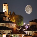
I just do not understand. Given that I know nothing about development and PP, and then the little that I do, just a few months, certainly in the eyes of many will be too wrong, we also discuss the composition, of which little I hear about?! I come from a photography club and the dia. The PP did not exist but we discussed a lot of composition that, in my opinion, is the soul of the photo. It 's true, times have changed and you have to adapt, but when you stand in front of a picture like this, which is a masterpiece of composition, watching silently from perceiving beauty, because the controversy end in itself? The colors are those, however beautiful, which the author considered it more appropriate according to its sensitivity, its taste, its culture. I'm on this site for less than two months, and I have to say that I discovered a world, for better or for worse. Great pics: I feel tiny little. Beautiful photos and pictures even considered ugly that exalted emotions that I definitely will, probably, are not able to perceive. Everyone has the right to think as much as the pare.Io photographer. I like looking at the pictures and learn. I like to photograph and when I get home I feel more peaceful, more oxygenated. Photographer not to compete. Photographer for me to be able to find the emotions that I gratifichino life. Then I compared the
others, hoping to transmit a few. No photographer for others. If you like my pictures I'm happy, if
do not like them, Amen!
Your photos excite me! A salutone.
Italo
Proprio non capisco. Premesso che non so niente di elaborazione e pp e quindi quel poco che faccio,solo da pochi mesi,sicuramente agli occhi di tanti risulterà anche sbagliato, vogliamo discutere anche di composizione, di cui poco sento parlare?! Vengo da un club fotografico e dalla dia. La pp non esisteva ma si discuteva tanto di composizione che,secondo me, è l'anima della foto. E' vero i tempi sono cambiati e bisogna adeguarsi ma quando ti trovi davanti ad una foto come questa,che è un capolavoro di composizione, da guardare in silenzio percependone la bellezza, perchè la polemica fine a se stessa? I colori sono quelli, comunque bellissimi, che l'autore ha ritenuto più opportuni secondo la propria sensibilità, il suo gusto, la sua cultura. Sono in questo sito da meno di due mesi e devo dire che ho scoperto un mondo, nel bene e nel male. Foto stupende: mi sento piccolo piccolo. Foto bellissime neanche considerate e foto brutte esaltate che sicuramente daranno delle emozioni che io,probabilmente, non sono in grado di percepire. Ognuno ha il diritto di pensarla come gli pare.Io fotografo da tanto. Mi piace guardare le foto e imparare. Mi piace fotografare e quando torno a casa mi sento più sereno,più ossigenato. Non fotografo per gareggiare. Fotografo per me, per riuscire a trovare delle emozioni che mi gratifichino la vita. Poi mi confronto con gli
altri, sperando di trasmetterne qualcuna. Non fotografo per gli altri. Se le mie foto piacciono sono contento, se
non piacciono, amen!
Le tue foto mi emozionano! Un salutone.
Italo
|
| sent on December 15, 2013 (18:43) | This comment has been automatically translated (show/hide original)
“ ... Your photos excite me! ... „
I like you ... photographer mainly for me and the contact with nature and the countryside ... and then also to share my emotions with others and be rewarded with a nice comment like yours ... ;-)
Thanks Italo.
Hello " ...Le tue foto mi emozionano!..."
...come te anch'io fotografo principalmente per me e per il contatto con la natura e la campagna..., e poi anche per condividere le mie emozioni con gli altri ed essere ripagato con un bel commento come il tuo...,
Grazie Italo.
Ciao |
user33394 | sent on December 15, 2013 (18:53) | This comment has been automatically translated (show/hide original)
Gorgeous!
Congratulations are amazing!
Louis Bellissime!!!
Complimenti sono strepitose!!!
Luigi |
| sent on December 15, 2013 (21:07) | This comment has been automatically translated (show/hide original)
Hello Luigi, thanks to you Ciao Luigi, grazie anche a te |
| sent on December 19, 2013 (21:41) | This comment has been automatically translated (show/hide original)
A marvel lights and colors .... stunning, congratulations. John. Una meraviglia luci e colori....mozzafiato, complimenti. Giovanni. |
| sent on December 20, 2013 (8:09) | This comment has been automatically translated (show/hide original)
Thank you for your appreciation ... John, hello. Grazie del tuo apprezzamento Giovanni..., ciao. |
| sent on December 20, 2013 (8:20) | This comment has been automatically translated (show/hide original)
Great beautiful picture in the spectacular light and colors!
All the best, Mark. Gran bella foto spettacolare nella luce e nei colori!
Un saluto, Marco. |
| sent on December 20, 2013 (11:47) | This comment has been automatically translated (show/hide original)
A beautiful shot that had escaped me ....... :-(
Of course the picture would be very nice to her but the tree in the foreground makes the difference!!!
I take off my hat because thou hast a little time to photograph and which operates in a rather restricted area, you still can get in some good shots!!!
Hello Paul ;-)
Un bellissimo scatto che mi era sfuggito.......
Certamente la foto sarebbe molto bella di suo ma l'albero in primo piano fa la differenza!!!!!!!!
Mi levo tanto di cappello perchè nonostante tu abbia poco tempo per fotografare e che operi in una zona piuttosto ristretta, riesci lo stesso a ricavare degli ottimi scatti!!!!!!!!
Ciao Paolo
|
| sent on December 20, 2013 (11:59) | This comment has been automatically translated (show/hide original)
Paul, did you manage to overtake wow wow. One note, you should not publish it:-D because, rightly accepting only those parts unpublished photos, candidabile was the first prize in the competition landscape of the Natural History Museum in London. By the way, participation is open for 2014, do not miss it (I do it :-)).
Paolo, sei riuscito a superarti  . Un solo appunto; non dovevi pubblicarla perché, accettando giustamente da quelle parti solo foto inedite, era candidabile al primo premio nella sezione paesaggio del concorso del Natural History Museum di Londra. A proposito, è aperta la partecipazione per il 2014; non puoi mancare (io si . Un solo appunto; non dovevi pubblicarla perché, accettando giustamente da quelle parti solo foto inedite, era candidabile al primo premio nella sezione paesaggio del concorso del Natural History Museum di Londra. A proposito, è aperta la partecipazione per il 2014; non puoi mancare (io si  ). ).
www.nhm.ac.uk/visit-us/wpy/?utm_source=wpy-new-site-redirects&utm_medi |
| sent on December 20, 2013 (12:15) | This comment has been automatically translated (show/hide original)
Thanks again to all for comments and like ...
Mauro , I repeat what is already written in a previous post: “ ... because lately I have not much time to devote to the photos on the field, I went to dredge up this shot last December that I had left to grow old like a good bottle of wine ... „ :-D
Francis , France ... Too good, from what I can see, the competition is dedicated to wildlife even more if there is a section Environments of the Earth ..., which could do the job ... too bad for the first prize now that I have played ... :-D I'll try to find some other shots with a fine bouquet like this ... ;-)
Again, thank you and Merry Christmas to all. Grazie ancora a tutti per commenti e mi piace ...,
Mauro , ti ripeto quanto già scritto in un post precedente: " ...visto che ultimamente non ho molto tempo da dedicare alle foto sul campo, sono andato a ripescare questo scatto del dicembre scorso che avevo lasciato a invecchiare come una buona bottiglia di vino..."
Francesco , Troppo buono Francé..., da quanto vedo, il concorso è dedicato più alla fauna anche se c'è una sezione Ambienti della Terra ..., che potrebbe fare al caso..., peccato per il primo premio che ormai mi sono giocato... , vedrò di trovare qualche altro scatto con un buon bouquet come questo...
Ancora grazie e Buon Natale a tutti. |
| sent on December 20, 2013 (12:20) | This comment has been automatically translated (show/hide original)
I just looked distracted to the previous discussion, I understand that just the most beautiful photos of interesting but I can turn it deems necessary to modify the tones and colors of the famous blue hour to get to what the eyes of the photographer did not see why not I was inexplicable. Ho appena dato un'occhiata distratta alla precedente discussione; capisco che proprio le foto più belle ne possano accendere di interessanti ma che si ritenga indispensabile modificare toni e colori della famosa ora blu per arrivare a quello che gli occhi del fotografo non hanno visto perché non c'era mi è inspiegabile. |
|

Publish your advertisement on JuzaPhoto (info) |


 JuzaPhoto contains affiliate links from Amazon and Ebay and JuzaPhoto earn a commission in case of purchase through affiliate links.


 Resize to fit window