What do you think about this photo?Do you have questions or curiosities about this image? Do you want to ask something to the author, give him suggestions for improvement, or congratulate for a photo that you really like?
You can do it by joining JuzaPhoto, it is easy and free!
There is more: by registering you can create your personal page, publish photos, receive comments and you can use all the features of JuzaPhoto. With more than 242000 members, there is space for everyone, from the beginner to the professional.
| sent on April 17, 2013 (17:25) | This comment has been automatically translated (show/hide original)
There is no mention of limits: before you get an idea on a photo I put in account
- I have not understood what the message (if any)
- That the photographer was not able to convey the message (if any).
I understand that there was a message to understand and, therefore, it simplifies everything.
:)
Greetings ...
Non si parla di limiti: prima di farmi un'idea su una foto metto in conto
- di non aver capito io quale sia il messaggio (se c'è)
- che il fotografo non sia riuscito a trasmettere il messaggio (se c'era).
Capisco che non c'era un messaggio da capire e, dunque, si semplifica tutto.
:)
Un saluto...
|
| sent on April 17, 2013 (17:52) | This comment has been automatically translated (show/hide original)
I'm sorry but I do not like the choice of means b / n the middle color
mi dispiace ma proprio non mi piace la scelta mezzo b/n mezzo colore
|
| sent on April 17, 2013 (19:51) | This comment has been automatically translated (show/hide original)
I respect your opinion emmemme75, thanks for the visit. Rispetto la tua opinione emmemme75, grazie per la visita. |
| sent on May 28, 2013 (15:50) | This comment has been automatically translated (show/hide original)
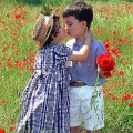
In this photo there are three types of colors, the bales on yellow, purple and sky on the bride and groom white / gray.
established that is to your taste (and at this point I also believe in the taste of the bride and groom)
wrong one contour (see the bride's arms on the sky)
I do not think you can define a "choice" is not able to do it perfectly.
This is my humble opinion.
Hello
Claudia In questa foto ci sono tre tipologie di colorazioni, le balle sul giallo, il cielo sul viola e gli sposi bn/grigio.
appurato che è di tuo gusto ( e a questo punto credo anche a gusto degli sposi)
sbagliare uno scontorno (vedi le braccia della sposa sul cielo)
secondo me non si può definire una "scelta", è il non saperlo fare perfettamente.
Questo il mio modesto parere.
Ciao
Claudia |
| sent on May 28, 2013 (22:30) | This comment has been automatically translated (show/hide original)
Thanks for the comment, Claudia. Grazie per il commento, Claudia. |
| sent on June 06, 2013 (18:27) | This comment has been automatically translated (show/hide original)
Very beautiful! :-P Molto bella!!! |
| sent on June 06, 2013 (20:59) | This comment has been automatically translated (show/hide original)
Thanks Doriana. Grazie Doriana. |
| sent on June 18, 2013 (12:39) | This comment has been automatically translated (show/hide original)
sometimes leave BN in the main subject is a winning choice and, in this case, would be a right choice.
However it does not reflect my taste, it is a beautiful image that valorizzerei with a PP classic enough or maybe vignetting but not with a PP so intrusive ...... obviously my taste.
Eye then down to personal taste, I would opt for the long term ... leave a mark if you like it even in 20 years, and not just today ... fashion passes the beauty remains :-) a volte lasciare in BN il soggetto principale è una scelta vincente e, in questo caso, sarebbe una scelta giusta.
Tuttavia non rispecchia il mio gusto; è una bellissima immagine che valorizzerei con una PP abbastanza classica o magari vignettata ma non con una PP così invadente...... ovviamente è il mio gusto.
Occhio poi al gusto personale; io opterei per il lungo periodo... lasciare un segno di se che piaccia anche fra 20 anni e non solo oggi ... la moda passa la bellezza rimane :-) |
| sent on June 18, 2013 (14:22) | This comment has been automatically translated (show/hide original)
@ Ermanno×la: can I ask you a photo example of where BN leave the main subject is a choice that considers winning?
Thanks anticipatmente, a greeting @Ermanno×la: posso chiederti un esempio di foto in cui lasciare in BN il soggetto principale è una scelta che reputi vincente?
Grazie anticipatmente, un saluto |
| sent on June 18, 2013 (15:11) | This comment has been automatically translated (show/hide original)
Even I do not like :-(
Perhaps the contrary would improve a little (although I do not really like the selective desaturation).
So the subject automatically becomes the hay ... Anche a me non piace 
Forse al contrario migliorerebbe un pò (anche se non mi piace molto la desaturazione selettiva).
Così il soggetto diventa automaticamente il fieno... |
| sent on June 18, 2013 (15:54) | This comment has been automatically translated (show/hide original)
Great Takayama ... I agree ... Grande Takayama... Condivido... |
| sent on June 18, 2013 (16:15) | This comment has been automatically translated (show/hide original)
I love it! a really good idea (maybe sfruttero 'since I'm just back from a wedding I) compliments ;-)
Antonio Mi piace! davvero una bella idea (che magari sfruttero' visto che sono reduce da un matrimonio anch'io) complimenti 
Antonio |
| sent on June 19, 2013 (8:47) | This comment has been automatically translated (show/hide original)
@ _richard
I have never had opportunities to do similar PP little because my tastes reflect the selective coloring but I've seen around the web some pictures well done in which subjects were in BN.
Keep in mind that it is also a type of machining that brings the true subject (married) and another object on the same level ..... give importance to two things, one would on the contrary an absolute predominance .....
I repeat, I never did it because it is not in my tastes but I have seen jobs well done .... if you find some examples I'll place
in this case I prefer the PP Takayama @ _richard
io non ho mai avuto occasioni di fare simili PP perchè rispecchiano poco i miei gusti le colorazioni selettive ma ho visto in giro nel web alcune immagini ben fatte in cui i soggetti erano in BN.
Tieni presente che è anche un tipo di lavorazione che porta il soggetto vero (sposi) ed un altro oggetto sullo stesso livello..... dare importanza a due cose di cui una avrebbe al contrario una predominanza assoluta.....
Ti ripeto; non l'ho mai fatto perchè non è nei miei gusti ma ho visto dei lavori ben fatti.... se ne ritrovo qualche esempio te lo posto
nel caso specifico anch'io preferisco la PP di Takayama |
| sent on June 19, 2013 (8:54) | This comment has been automatically translated (show/hide original)
@ Herman: I was not referring necessarily to your picture.
I'd like to see a link to any one or more photos in which it considers that leave the subject in BN was a winning choice. To better understand what you mean.
Greetings @Ermanno: non mi riferivo necessariamente ad una tua foto.
Mi piacerebbe vedere un link qualunque di una o più foto in cui reputi che lasciare il soggetto in BN è stata una scelta vincente. Per capire meglio cosa intendi.
Un saluto |
| sent on June 20, 2013 (0:13) | This comment has been automatically translated (show/hide original)
@ _richard
this is my file that I touched up quickly now to get an idea ... it is said that it is an effect that like always but has a why if well exploited.
No coincidence that the Chiambretti Night Show used it often / always in its advertising ... this is video is true but it has a reason to exist.
If environment and subject come together in the right way, a selective BN against the rules can give you a break with a difference.
Tell me if you like the idea or not share, do not necessarily like it but you can not say it's bad ... obviously are few scenes that lend themselves to this type of PP.
As noted above, in the specific case of our author above, do not like it either, but the concept is not wrong .... ifhad left everything in color and only the bride and groom in BN it would surely have worked more
dl.dropboxusercontent.com/u/51462595/_MG_9227.jpg @ _richard
questo è un mio file che ho ritoccato velocemente ora per farti un'idea... non è detto che sia un effetto che piaccia sempre ma ha un suo perchè se ben sfruttato.
Non a caso il Chiambretti Night Show lo usava spesso/sempre nelle sue pubblicità... si tratta di video è vero ma ha un suo motivo di esistere.
Se ambiente e soggetto si fondono nel modo giusto, un BN selettivo contro le regole può dare uno stacco diverso dal solito.
Dimmi se come idea la condividi oppure no; non è detto che piaccia ma non si può dire che sia brutto... ovviamente son poche le scene che si prestano a questo tipo di PP.
Come scritto sopra, nel caso specifico del nostro autore sopra, non piace nemmeno a me ma il concetto non è sbagliato.... se avesse lasciato tutto a colori e solo gli sposi in BN la cosa avrebbe sicuramente funzionato di più
dl.dropboxusercontent.com/u/51462595/_MG_9227.jpg |
| sent on June 20, 2013 (9:22) | This comment has been automatically translated (show/hide original)
@ Ermanno: always being said that I do not really like the drawing in which the subject is in B / W (unless you want to convey meanings as "The subject has lost the will to live than what surrounds it" or "the subject is insignificant compared to the context ", or similar) in your attempt there is one thing that makes the b / w less annoying: the fact that the other colors are so subtle that the subject in B / W will little note. Ma .. I continue to say that the same photo, with the subject as colorful as the context or the context in black / white as the subject, it would much more. At most, the colored subject and the context in B / W.
The photo of this topic is really over, not only in the sense that the subject is desaturated, but the color is only on the bales (the real subject of the photo? For what mot3Cbr />
Greetings @Ermanno: sempre premesso che a me non piace proprio l'elaborazione in cui il soggetto è in B/N (a meno di voler trasmettere significati come "Il soggetto ha perso voglia di vivere rispetto a ciò che lo circonda" oppure "il soggetto è insignificante rispetto al contesto", o similari), nel tuo tentativo c'è una cosa che rende il b/n meno fastidioso: il fatto che gli altri colori sono talmente tenui che il soggetto in B/N si nota poco. Ma... continuo a dire che la stessa foto, con il soggetto colorato come il contesto o con il contesto in bianco/nero come il soggetto, renderebbe molto di più. Al massimo, il soggetto colorato ed il contesto in B/N.
La foto di questo topic è davvero oltre, nel senso che non solo il soggetto è desaturato, ma il colore è solo sulle balle (il vero soggetto della foto? Per quale motivo si intende porre l'attenzione su una balla?) e... con pennellate che sembrano sporcarle di bianco/nero.
Prendo atto, comunque, che si tratta sempre di idee personali ma non posso non stupirmi del fatto che:
- la foto, in B/N, mi sembra davvero molto più appetibile
- molte persone l'hanno trovato uno scatto degno di complimenti marcati.
Se c'è un significato, per un'elaborazione del genere, allora non l'ho capito (e non è stato spiegato). Se, come è stato scritto, l'unica spiegazione è "Gusto personale" (senza un messaggio da comprendere che un'elaborazione del genere dovrebbe trasmettere), allora sono fortemente contrario a questa elaborazione che sembra davvero un test non riuscito (sempre ai miei occhi, lo sottolineo, ed a quelli di altre persone).
Un saluto |
| sent on September 29, 2013 (21:21) | This comment has been automatically translated (show/hide original)
Fulvio .. excellent cut and color abbinatmento-bn .. greetings ottima Fulvio..taglio e abbinatmento colore-bn..un saluto |
| sent on September 29, 2013 (22:24) | This comment has been automatically translated (show/hide original)
Very beautiful!
Congratulations! Molto bella!
Complimenti ! |
| sent on October 13, 2013 (10:25) | This comment has been automatically translated (show/hide original)
Fulvio
The photo is beautiful and just :-P
In retrospect, with the magnifying glass are all good.
Greetings Fulvio ,
La foto è bella e basta
A posteriori con la lente di ingrandimento sono tutti bravi.
Saluti |
|

Publish your advertisement on JuzaPhoto (info) |


 JuzaPhoto contains affiliate links from Amazon and Ebay and JuzaPhoto earn a commission in case of purchase through affiliate links.


 Resize to fit window