What do you think about this photo?Do you have questions or curiosities about this image? Do you want to ask something to the author, give him suggestions for improvement, or congratulate for a photo that you really like?
You can do it by joining JuzaPhoto, it is easy and free!
There is more: by registering you can create your personal page, publish photos, receive comments and you can use all the features of JuzaPhoto. With more than 255000 members, there is space for everyone, from the beginner to the professional.
| sent on October 29, 2025 (13:56) | This comment has been automatically translated (show/hide original)
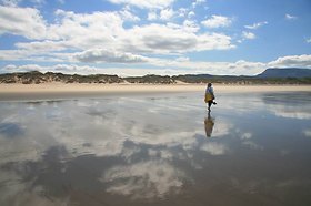
In my opinion colors a little dull, definitely PP delicate Secondo me colori un pò spenti, sicuramente PP delicata |
| sent on October 29, 2025 (16:12) | This comment has been automatically translated (show/hide original)
Hi Dante, I tried to give my interpretation of the light conditions with more natural colors - but the color is the aspect that interests me the least (it is part of the personal perception of each of us and then it is influenced by many personal factors and not least by the viewing device) the most important part of the landscape is the context and it is there that I focused my work... thanks for the
Kiss pass ciao Dante, ho provato a dare una mia interpretazione delle condizioni di luce con dei colori più naturali - ma il colore è l'aspetto che mi interessa meno (fa parte della percezione personale di ognuno di noi e poi è influenzata da tanti fattori personali e non ultimi dal dispositivo di visualizzazione) la parte più importante del paesaggio è il contesto (eliminato gli elementi di disturbo , vedi persone ecc) ed è li che ho concentrato il mio lavoro... grazie del passaggio
Kiss |
| sent on October 29, 2025 (17:04)
Ciao Franci, anche a parer mio è un po' "piatta", considerata la giornata estiva (alto contrasto) e il contesto che meritava un'esaltazione dei colori (specie acqua e cielo). Un po' eccessiva la definizione che amplifica il rumore digitale nelle ombre. Apprezzo, invece, la restituzione della trama delle rocce grazie a un ottimo recupero delle alte luci. Sulle persone: servono anche per dare le proporzioni della scena, in fondo non erano troppe. Ma bene come hai scelto tu. Rimasto un tenue alone sull'orizzonte a dx.
Distinti saluti
Ciao Franci, anche a parer mio è un po' "piatta", considerata la giornata estiva (alto contrasto) e il contesto che meritava un'esaltazione dei colori (specie acqua e cielo). Un po' eccessiva la definizione che amplifica il rumore digitale nelle ombre. Apprezzo, invece, la restituzione della trama delle rocce grazie a un ottimo recupero delle alte luci. Sulle persone: servono anche per dare le proporzioni della scena, in fondo non erano troppe. Ma bene come hai scelto tu. Rimasto un tenue alone sull'orizzonte a dx.
Distinti saluti |
| sent on October 29, 2025 (18:09) | This comment has been automatically translated (show/hide original)
Hi Ottiero, thank you for the passage and the comments. I will look at the file especially for the unsharp mask issue. Anyway the file was already in bad shape at the start...
Kiss Ciao Ottiero grazie per il passaggio e le osservazioni. Riguarderò il file soprattutto per la questione maschera di contrasto. Comunque il file era già messo male in partenza...
Kiss |
| sent on October 29, 2025 (23:30) | This comment has been automatically translated (show/hide original)
Hi Franci, I see a beautiful intersection of lines that converge almost in the center of the horizon line, and give depth to the image and a beautiful perspective, perhaps among the various elaborations this is the most realistic. Ciao Franci , io ci vedo un bel incrocio di linee che convergono quasi al centro della linea d'orizzonte, e danno profondità all'immagine e una bella prospettiva , forse tra le varie elaborazioni questa la più realistica . |
| sent on October 30, 2025 (9:35) | This comment has been automatically translated (show/hide original)
hi Diego, thank you - as already said I don't like hypersaturated photos (how boring, too easy...) I really like the post that goes beyond these clichés that tries to find beauty not so much in the color itself but in the harmony of the landscape for this reason I removed some people (too many) - realistic? I don't know
Thanks again for the
Kiss pass
ciao Diego, grazie - come già detto non mi piacciono le foto ipersature (che noia, fin troppo facile...) mi piace molto la post che va oltre questi cliché che cerca di trovare la bellezza non tanto nel colore stesso ma nell'armonia del paesaggio per questo motivo ho tolto alcune persone (troppe) - realistica? non saprei
Grazie ancora per il passaggio
Kiss
|
| sent on October 30, 2025 (11:43) | This comment has been automatically translated (show/hide original)
You can see a strange strip between sea and sky that looks like a defect in masks, I suppose that the desaturation is voluntary but I don't see its relevance, sharp slightly strong Si nota una strana striscia fra mare e cielo che sembra un difetto di maschere, suppongo che la desaturazione sia volontaria ma non ne vedo la pertinenza, sharp leggermente forte |
| sent on October 30, 2025 (11:55)
ciao Leo si sicuramente c'è un errore di maschera di contrasto quando ho ridotto il file (secondo me valutare i dettagli con un file con una risoluzione 1900 è discutibile ma fa parte di questo gioco) - ho applicato una maschera per eliminare alcuni artefatti sul cielo... il file era terribile)
Perchè non ne vedi la pertinenza? dove sta scritto che un paesaggio deve avere per forza i colori saturi o contrastata? perchè si tratta di mare? se poi non ti piace è un altro discorso ma ribadisco vedo troppo utilizzo di saturazione e vividezza.
Invece mi piaceva il fatto di creare un'atmosfera più sognante (per lo stesso motivo ho tolto delle persone). Se poi non piace degustibus...
Grazie per il passaggio
|
| sent on October 30, 2025 (15:11)
Anch'io vedo i colori un po' freddi e spenti per una calda giornata pugliese ( mi baso anche sull'abbigliamento delle persone), anche se hai ragione spesso si esagera in saturazione e contrasto.
L'alone sull'orizzonte, io lo vedo per tutta l'immagine, ma potrebbe starci con foschia.
Riguardo alle persone, secondo me hai scelto la giusta via di mezzo clonando quelle più fastidiose, avrei però tolto anche quella molto inclinata a sinistra.
|
| sent on October 30, 2025 (16:40)
ciao Silvia, può essere l'ho elaborata su un normalissimo monitor - chissà che Babbo Natale mi porti un monitor decente.. (magari un 4k)
Per quanto riguarda la ragazza sulla sinistra la stavo cancellando poi invece ho pensavo che era una delle poche figure in movimento che quindi dava "dinamicità" e in fondo racconta una storia... la ragazza che arriva tardi in spiaggia dopo una notte brava...
Diciamo che non mi sono concentrata tanto sul paesaggio ma su ciò che lo anima (a parte il mare ovviamente)... so bene che ci sono fotografi che fanno di tutto per eliminare la figura umana ma anche se ultimamente non possiamo di certo andarne fieri credo che un po' di umanità a questo mondo serva, anche solo per ricordarci quanto siamo piccoli rispetto al creato e quanto siamo fortunati a poter deliziare la nostra umanità con tanta bellezza. A volte penso che non ce lo meritiamo ma poi prevale il mio lato positivo.
Grazie per il passaggio e meno male che siamo in due in mezzo a questi maschiacci.
3 KISS
ciao Silvia, può essere l'ho elaborata su un normalissimo monitor - chissà che Babbo Natale mi porti un monitor decente.. (magari un 4k)
Per quanto riguarda la ragazza sulla sinistra la stavo cancellando poi invece ho pensavo che era una delle poche figure in movimento che quindi dava "dinamicità" e in fondo racconta una storia... la ragazza che arriva tardi in spiaggia dopo una notte brava...
Diciamo che non mi sono concentrata tanto sul paesaggio ma su ciò che lo anima (a parte il mare ovviamente)... so bene che ci sono fotografi che fanno di tutto per eliminare la figura umana ma anche se ultimamente non possiamo di certo andarne fieri credo che un po' di umanità a questo mondo serva, anche solo per ricordarci quanto siamo piccoli rispetto al creato e quanto siamo fortunati a poter deliziare la nostra umanità con tanta bellezza. A volte penso che non ce lo meritiamo ma poi prevale il mio lato positivo.
Grazie per il passaggio e meno male che siamo in due in mezzo a questi maschiacci.
3 KISS |
| sent on October 30, 2025 (22:48) | This comment has been automatically translated (show/hide original)
Also for me too much sharpness/contrast have pulled out all the flaws that were already present in the file. I don't mind the attenuated saturation at all; maybe you could turn the shade of the water in the pit, more towards green or blue to make it less "flat" Anche per me troppa nitidezza/contrasto hanno tirato esaltato tutti i difetti che erano già presenti nel file. La saturazione attenuata non mi dispiace affatto; magari potevi virare la tonalità dell'acqua della fossa, più verso il verde o il blu per renderla meno "piatta" |
| sent on October 31, 2025 (14:48) | This comment has been automatically translated (show/hide original)
hello Aigorino on sharpness I realized it too late - for the color I did it like this just to make it "flat" in the sense that I gave more importance to the human presence than to the landscape - the color distracts - saturating is all too easy. Then of course you may like it or not. Thanks for the passage ciao Aigorino sulla nitidezza me ne sono accorta troppo tardi - per il colore l'ho fatta così proprio per renderla "piatta" nel senso che ho dato più importanza alla presenza umana che non al paesaggio - il colore distrae - saturare è fin troppo facile. Poi ovviamente può piacere o meno. Grazie del passaggio |
| sent on October 31, 2025 (20:21) | This comment has been automatically translated (show/hide original)
The colors are not consistent with the sunny day, I think it is unrealistic and too low I colori non sono coerenti con la giornata di sole, la ritengo irrealistica e troppo scarica |
| sent on November 01, 2025 (13:45) | This comment has been automatically translated (show/hide original)
I find the management of the sand / rock excellent, but I don't like the water so off. You made it almost a day of thunderstorms :-D I also notice a strange line on the horizon (perhaps some mask not used properly) trovo ottima la gestione della sabbia/roccia, ma l'acqua così spenta non mi piace. L'hai fatta diventare quasi una giornata di temporale noto anche una linea strana all'orizzonte ( forse qualche maschera non usata come si deve) |
| sent on November 01, 2025 (17:23) | This comment has been automatically translated (show/hide original)
This desaturated choice is interesting, it is an interpretation that I like. Interessante questa scelta desaturata, è un'interpretazione che mi piace. |
| sent on November 01, 2025 (19:36)
ciao Carlo, si ho fatto un sacco di errori soprattutto sulla maschera all'orizzonte ma tra l'altro mi sono pure dimenticata di convertire in sRGB - per quanto riguarda il colore se guardi attentamente la luce non potrebbe essere di una giornata nuvolosa avrebbe una temperatura di luce diversa soprattutto sul terreno...
ma comunque può essere come la vedi tu anche perchè purtroppo lavoro su un monitor scarso e quindi spero che babbo natale mi porti un bel 4k almeno 27" se non 32"
grazie AleZ - saturare è la cosa più facile ma anche la più scontata e inflazionata...
Kiss
ciao Carlo, si ho fatto un sacco di errori soprattutto sulla maschera all'orizzonte ma tra l'altro mi sono pure dimenticata di convertire in sRGB - per quanto riguarda il colore se guardi attentamente la luce non potrebbe essere di una giornata nuvolosa avrebbe una temperatura di luce diversa soprattutto sul terreno...
ma comunque può essere come la vedi tu anche perchè purtroppo lavoro su un monitor scarso e quindi spero che babbo natale mi porti un bel 4k almeno 27" se non 32"
grazie AleZ - saturare è la cosa più facile ma anche la più scontata e inflazionata...
Kiss |
|

Publish your advertisement on JuzaPhoto (info) |

 gioco pp

 JuzaPhoto contains affiliate links from Amazon and Ebay and JuzaPhoto earn a commission in case of purchase through affiliate links.


 2.7 MEGAPIXEL
 Resize to fit window


![[en]](shared_files/layout/country_flags/flag_196.jpg)