|
|
sent on 05 Dicembre 2012 (21:52)
CAPTURE ONE VS. ADOBE PHOTOSHOP LIGHTROOM: WHITE BALANCE
This is an excerpt from my review that is published on my website www.nature-images.eu under Capture One vs. Adobe Photoshop Lightroom: White Balance
White Balance Set to Daylight
Since the colour temperature of daylight varies very much, it seems logical that Adobe Photoshop Lightroom (or more precisely Adobe Camera Raw that underlies it) and Capture One may have different default Kelvin settings in daylight mode than Canon. This happens indeed: While the "Daylight" preset in Lightroom has the colour temperature of 5500K, i.e. that of normal daylight, and tint set to +10, in Capture One, these are 5305K and +2.6.
The higher the Kelvin value, the "warmer" is the colour, i.e. the greater is the shift of it towards red, yellow, or magenta. Lower values result in dominance of "colder" tones - blue, green, or cyan. Since the temperature value in Capture One is lower, the image tones should be colder than in Lightroom, and they are indeed - as the images shown below demonstrate.
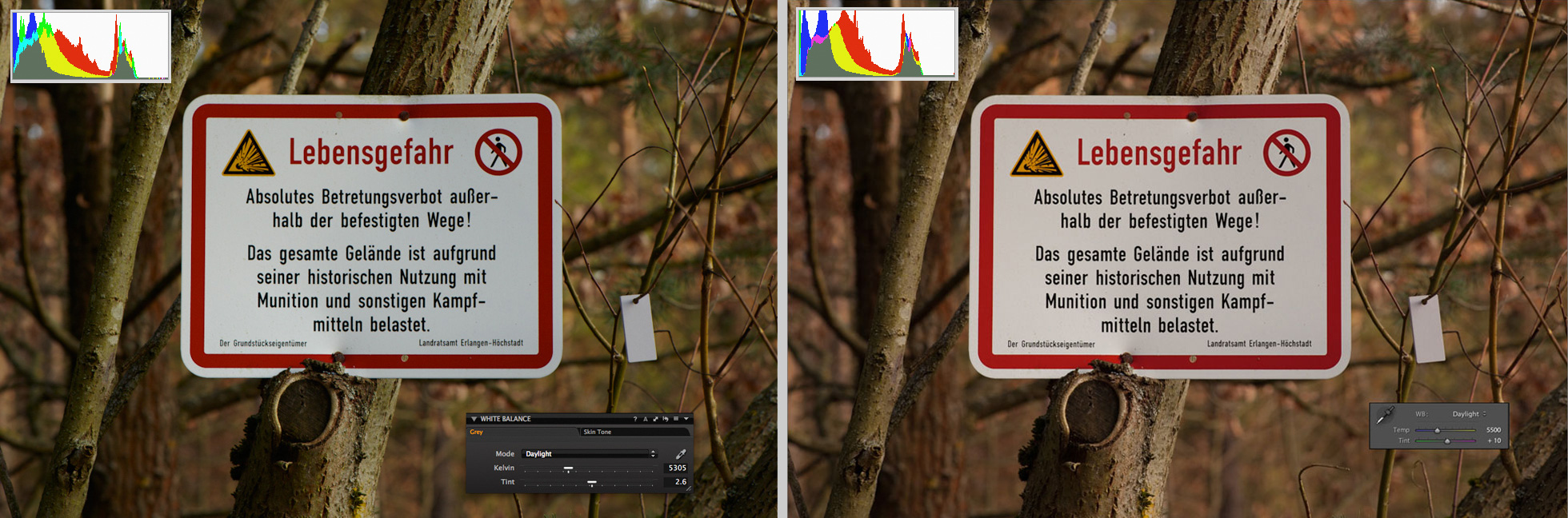
Daylight preset is selected: With 5305K and +2.6 tint, in Capture One the colour temperature is lower than in Lightroom that has normal values.
In the same image, the colour in Lightroom looks warmer than in Capture One. This is what actually has to be expected.
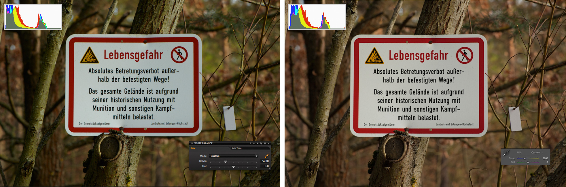
It becomes strange when the Kelvin and tint values in Capture One were set to the same as in Lightroom. Of course, the same colour temperature values should result in the same white balance, but in Capture One Pro and Lightroom they don't. If you look at comparison below, you would notice that the left image - the one that was produced in Capture One Pro 7 - has pretty strong magenta colour cast.

The white balance in both programmes is set to 5500K with +10 of tint.
One could think now that the white balance adjustment in Capture One is faulty, but this issue is not that simple. After I pushed the tilt slider to around +3, i.e. reduced magenta by 7 stops, the colour cast disappeared, and both images were looking similar. Hence, "daylight" has the same meaning in both programmes but the tilt slider has a different scale: For roughly the same colour appearance, the tilt value in Lightroom has to be triple as high as in Capture One. In Lightroom the tilt slider goes to 150 in both directions while in Capture One it is limited to -/+ 50 but allows decimal values. Therefore +3.3 in Capture One is close to +10 in Lightroom.
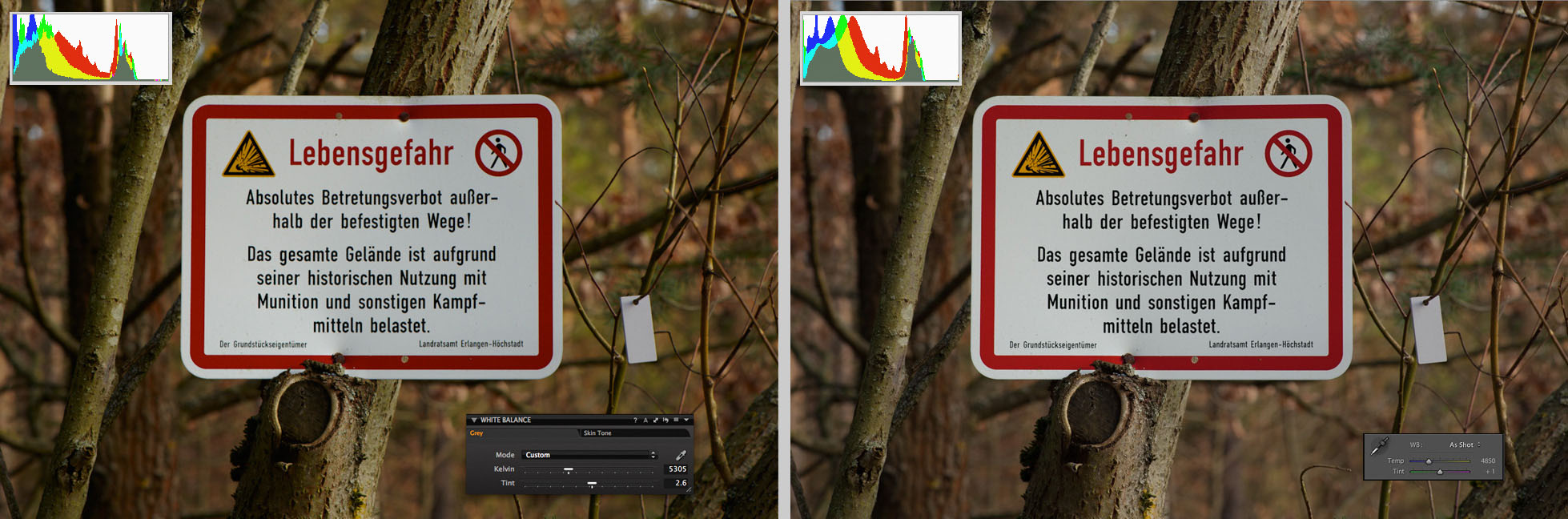
Having the colour temperature of 5200K the images that a Canon camera creates should have a bit colder colour than the standard daylight and even than the daylight preset in Capture One. Tint is another adjustable parameter that influences the look of an image. However, it is absent in cameras though available in raw converters and image editing software where it allows fine tuning of white balance through adjustment of the tones in a range between green and magenta.
Compare the image in Capture One Pro 7 and Adobe Photoshop Lightroom 4 after the colour temperature was set to the same value of 5200K as in daylight WB preset of a Canon camera
The colour temperature scale is universal and absolute, hence the same colour temperature always has the same Kelvin value. Obviously, zero is zero - in other words, zero is nothing. Therefore, if tint was set to "0", it should result in a balance between magenta and green, i.e. no bias towards either should be noticeable. As you see in the above example, it isn't the case: The image in Lightroom has a stronger presence of magenta while the one in Capture One looks a little greenish.
Since the experiment with the daylight setting that I described above has proved the correctness of Kelvin scale in both programmes, I assume that here again it is the tilt setting that causes the problem: Either in Lightroom or in Capture One, or in both, zero tilt in fact isn't zero. To me the image in Capture One looks not only more natural but also close to what I was photographing: The shield on it was hanging in bushes ? not in the sun; therefore the light was for sure not as warm as in the image rendered by Lightroom.
White Balance "As Shot"
The difference in white balance treatment in both programmes is even more evident when an image has just been converted from a raw file and no adjustments were made. Both, Capture One and Photoshop Lightroom always set own white balance values upon import of an image and ignore the camera white balance. The picture below shows the same image shot with 5200K and 0 tilt as it appears in Capture One and Lightroom upon import.
Both, Capture One and Lighroom ignore camera white balance and set their own temperature and tint for imported images.
For some reason that probably only developers of Lightroom know it sets the colour temperature to 4850K and tint to +1 in images that originally have 5200K and 0 tint and calls this white balance "As Shot". Surprisingly, the white in the image appears more neutral here compared to its look in the above example - when I set the colour temperature to 5200K. The overall contrast, saturation and colour balance in an image imported to Lightroom are also more neutral than in Capture One.
Although the white balance looks okay, the image in Capture One appears to have a little more contrast, and its colour is more vivid. In Capture One, the import WB parameters for images shot with daylight preset are closer to the original and identical to the daylight preset in this programme: 5305K and +2.6.
Unlike Lightroom where the import white balance is "As Shot", in Capture One Pro 7 it is called "Custom". However, if you select there "Shot" from the drop-down list, the values will remain the same - as you see in the following sample pictures:
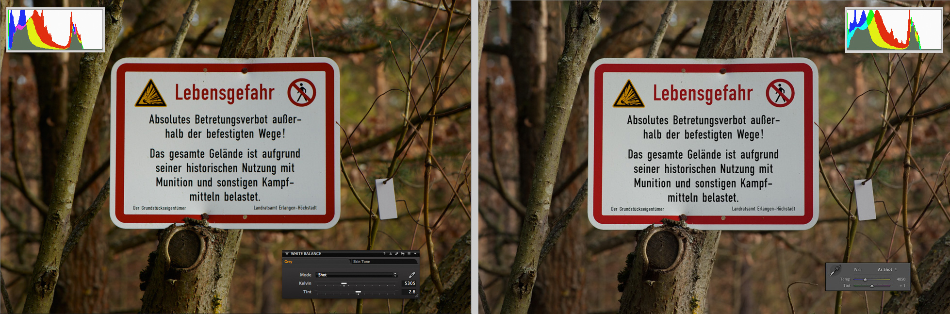
In Adobe Photoshop Lightroom the white balance set at import is called "As Shot". In Capture One it is initially labeled as "Custom", however, the values remain the same when you select "Shot" from the list.
Corrected White Balance
The discrepancy in Kelvin and tilt values between two programmes becomes even greater after the white balance was corrected. If in-software automatic WB correction was applied in Adobe Photoshop Lightroom, the colour temperature of the image is displayed as 4500K with +2 tint. In Capture One these values are much higher: 5031K and +4.6 tint. However, both programmes decreased the colour temperature of my test image by the same value of about 300K - from 5305K to 5031K and from 4850K to 4500K. (See pictures below.)
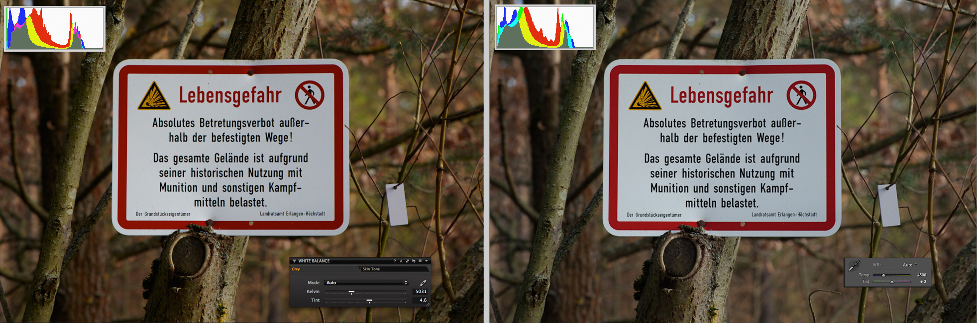
Automatically set white balance by software algorithm: The result looks in Capture One and Adobe Photoshop Lightroom similar but the values defer very much.
Visually, the result of correction in both programmes is satisfying though I like the image in Capture One more. The colour tones of the image created in Capture One are closer to the original while he image in Lightroom looks colder.
The most reliable and the easiest way to correct white balance is by using a neutral grey reference object. In landscape photography it can be a stone, but better results are achieved with a standard grey object - a grey card or cube. For testing the white balance the reference should, of course, have standard grey colour. In my tests I used a small grey card DGK-M Mini made by Digital Image Flow. In the test image used in this article you see it hanging on a twig near the warning shield.
Below you see the test image after correction via a grey card in Capture One Pro 7 and Adobe Photoshop Lightroom 4. The colour temperature and tint set according to grey card are higher in both programmes than the values set by built-in automatic adjustment.
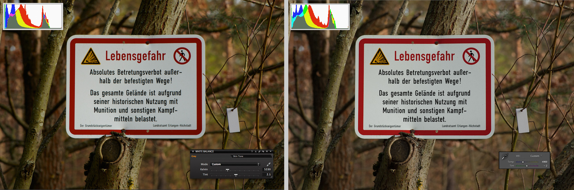
Compare colour temperature/tint values after white balance was automatically corrected via grey card: 5330K/+2.1 (Capture One) vs. 4900K/-2 (Lightroom)
For my eyes, the result in Capture One looks better again: The white of the shield is clearer. In Lightroom it has a slight greenish colour cast that is barely noticeable but the diagramme in the top left corner helps to determine it.
Conclusion
The fact that the colour of an image in Capture One shifts only slightly when WB presets are changed or when white balance is automatically adjusted from grey card lets me assume that this programme does it correctly. Also the appearance of the image in Capture One was quite close to that one that I was seeing through the viewfinder of my camera. In comparison to this, obviously, something is wrong with colour processing in ACR or in Lightroom. It may be a matter of taste, if the picture has more contrast and is more vivid, as it is in Capture One, or with less contrast and desaturated, as in Lightroom, but the colour temperature and tint values in these two programmes do not match at all, and the white balance in Lightroom doesn't even come close to the setting of the camera. The reason is for me a mystery. To me it looks like a flaw that undermines the reliability of Lightroom as of an image processing tool. This is very disappointing since this software is so great in many other aspects. I have a strong hope that Adobe would improve it some day. |
|
|
sent on 19 Agosto 2013 (15:02)
This is normal. The algorithms are different. The applications are designed for very specific users. Law business! |
What do you think about this topic?
Do you want to tell your opinion? You can join the discussion by joining JuzaPhoto, it is easy and free!
There is more: by registering you can create your personal page, publish photos, receive comments and you can use all the features of JuzaPhoto.
With more than 260000 members, there is space for everyone, from the beginner to the professional. |

Publish your advertisement on JuzaPhoto (info) |

 JuzaPhoto contains affiliate links from Amazon and Ebay and JuzaPhoto earn a commission in case of purchase through affiliate links.