What do you think about this photo?
Do you have questions or curiosities about this image? Do you want to ask something to the author, give him suggestions for improvement, or congratulate for a
photo that you really like?
You can do it by joining JuzaPhoto, it is easy and free!
There is more: by registering you can create your personal page, publish photos, receive comments and you can use all the features of JuzaPhoto.
With more than 260000members, there is space for everyone, from the beginner to the professional.
|
|
sent on 26 Agosto 2014 (22:59) | This comment has been automatically translated (show/hide original)
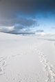
Excellent composition that exploits fine geometries and the lines converge towards the vanishing point, then enhanced by an excellent conversion to black and white, for one shot classic but very well done.
I am not, however, in the title, since I look pretty gloomy atmosphere;-) Ottima composizione che sfrutta benissimo le geometrie ed il convergere delle linee verso il punto di fuga, valorizzata poi da un'ottima conversione in bianco e nero, per uno scatto classico ma molto ben realizzato.
Non mi trovo però nel titolo, dato che vedo l'atmosfera abbastanza cupa |
|
|
sent on 26 Agosto 2014 (23:46) | This comment has been automatically translated (show/hide original)
Thanks to Andrea's comment! I could not resist not to take, although the image type is super inflated. This has something unusual, and what caught my attention ...
The conversion was made with Silver Efex, next to a small crop to improve the composition (unfortunately I tripped on the fly, I was with people who were waiting for me).
I agree that the title is little or nothing guessed, but it is the first thing that came to my mind. I'll try to find something more meaningful;-)
Grazie Andrea del commento! Non ho resistito a non scattare, sebbene la tipologia di immagine sia super inflazionata. Questa ha qualcosa di inusuale, e ciò ha attirato la mia attenzione...
La conversione è stata fatta con silver Efex, accanto ad un piccolo crop per migliorare la composizione (purtroppo ho scattato al volo, ero con delle persone che mi aspettavano).
Concordo sul fatto che il titolo sia poco o nulla azzeccato, ma è la prima cosa che mi è venuta in mente. Mi sforzerò a trovare qualcosa di più sensato
|
|
|
sent on 27 Agosto 2014 (0:06) | This comment has been automatically translated (show/hide original)
The fact that the type is overused does not mean that you can make great shots ... I would not have resisted even I-)
Anyway, what I find enhances the shot and distinguishes it from the classic is:
- Perfect shot, even in these shots a minimum error disturbs the balance
- Scale trending rectangular and not circular spiral \\
- Shot from below and not from above
- The sequence of the lights (which increases the movement towards the vanishing point)
- The vertical posts of the railings, which also increases the vanishing point, and also thanks to the light that enlightens them also create a break in shades of gray.
- The rails themselves, which also converge towards the vanishing point.
Basically you have joined three classic (scale, the lines of force to punto escape and recovery from the low building with sky) and obtaining a valid result that differs from all three.
It was worth it in short;-) Il fatto che la tipologia sia inflazionata non toglie che si possano fare ottimi scatti... non avrei resistito nemmeno io
Quello che comunque trovo valorizzi lo scatto e lo distingua dal classico è:
- inquadratura perfetta, in questi scatti anche un errore minimo rompe l'equilibrio
- scala ad andamento rettangolare e non circolare\a spirale
- ripresa dal basso e non dall'alto
- la sequenza delle luci (che aumenta il movimento verso il punto di fuga)
- i pali verticali delle ringhiere, che aumentano anch'essi la fuga prospettica ed inoltre grazie alla luce che li illumina creano anche uno stacco nei toni di grigio.
- le ringhiere stesse, che anch'esse convergono verso il punto di fuga.
In sostanza hai unito tre classici (scala, linee di forza verso punto di fuga e ripresa dal basso di edificio con cielo) ottenendo un risultato valido e che si discosta da tutti e tre.
Ne è valsa la pena insomma |
user4758
|
sent on 28 Agosto 2014 (7:33) | This comment has been automatically translated (show/hide original)
It seems taken from a scene in a movie, nice!
You know what ... because you want to point the way toward the light, maybe a BN was better and more contrasted with the shadows closed. The frame (according to me) had to be almost black Sembra tratta da una scena di un film, bella!
Sai cos'è... visto che vuoi indicare la via verso la luce, forse stava meglio un BN più contrastato e con le ombre più chiuse. La cornice (secondo me) doveva essere quasi nera |
|
|
sent on 28 Agosto 2014 (13:40) | This comment has been automatically translated (show/hide original)
Zeppo Hello, thanks for the ride. I try to change the conversion as you suggested to see the effect. The shot originally has a frame much clearer picture published, and I had to crop. I will try to darken again to see the effect !! Ciao Zeppo, grazie del passaggio. Provo a modificare la conversione come hai suggerito per vedere l'effetto. Lo scatto in origine ha una cornice molto più chiara dell'immagine pubblicata, ed ho dovuto croppare. Proverò a scurire ancora per vedere l'effetto!! |
|

Publish your advertisement on JuzaPhoto (info) |


 JuzaPhoto contains affiliate links from Amazon and Ebay and JuzaPhoto earn a commission in case of purchase through affiliate links.


 Resize to fit window
 4.2 MEGAPIXEL