What do you think about this photo?
Do you have questions or curiosities about this image? Do you want to ask something to the author, give him suggestions for improvement, or congratulate for a
photo that you really like?
You can do it by joining JuzaPhoto, it is easy and free!
There is more: by registering you can create your personal page, publish photos, receive comments and you can use all the features of JuzaPhoto.
With more than 260000members, there is space for everyone, from the beginner to the professional.
|
|
sent on 27 Giugno 2014 (12:23) | This comment has been automatically translated (show/hide original)
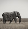
Very nice play of light and shadows, personally I would have given a slightly more scenic.
Hello.
Rinaldo Molto bello il gioco di luci e ombre, personalmente avrei dato un taglio leggermente più panoramico.
Ciao.
Rinaldo |
|
|
sent on 27 Giugno 2014 (18:01) | This comment has been automatically translated (show/hide original)
beautiful composition, excellent final result.
Spot on the idea of ??reducing the saturation, I'd work a little bit on the sky, very interesting, but low in contrast
hello hello Salvo bellissima composizione, ottimo il risultato finale.
Azzeccata l'idea di ridurre la saturazione, io lavorerei un pò sul cielo, molto interessante, ma poco contrastato
ciao ciao Salvo |
|
|
sent on 27 Giugno 2014 (18:34) | This comment has been automatically translated (show/hide original)
Beautiful panoramic :-) I do not think the desaturation has damaged the image. The light has created quite tough areas of light and shadow rather marked, all in all nice. I too would try to enhance the value of the sky, which probably would have been exalted (for lovers of the art) by a double exposure :-) Bellissima panoramica  Non credo che la desaturazione abbia danneggiato l'immagine. La luce piuttosto dura ha creato zone di luce ed ombra piuttosto marcate, tutto sommato gradevoli. Anch'io tenterei di valorizzare maggiormente il cielo, che probabilmente sarebbe stato esaltato (per gli amanti della tecnica) da una doppia esposizione Non credo che la desaturazione abbia danneggiato l'immagine. La luce piuttosto dura ha creato zone di luce ed ombra piuttosto marcate, tutto sommato gradevoli. Anch'io tenterei di valorizzare maggiormente il cielo, che probabilmente sarebbe stato esaltato (per gli amanti della tecnica) da una doppia esposizione |
|
|
sent on 27 Giugno 2014 (21:00) | This comment has been automatically translated (show/hide original)
Beautiful scenery, beautiful pdr. I too would have opted for the cut propane.
Hello Bellissimo panorama, bello il pdr. Anch'io avrei optato per il taglio pano.
Ciao |
|
|
sent on 27 Giugno 2014 (21:01) | This comment has been automatically translated (show/hide original)
Thank you George! Better to cut even a slice of heaven? I looked nice clouds but maybe you're right Ti ringrazio Giorgio! Meglio tagliare anche una fetta di cielo? Mi sembravano belle le nuvole ma forse avete ragione |
|
|
sent on 27 Giugno 2014 (21:30) | This comment has been automatically translated (show/hide original)
Thank you :-) Vittorio:-P
Have a nice evening! Grazie mille Vittorio 
Buona serata! |
|
|
sent on 27 Giugno 2014 (21:31) | This comment has been automatically translated (show/hide original)
[IMG]

[/IMG] What do you think so, if you do not like to take it off right away.
You can not make it bigger this is the format that you gave him, it's just to show the cut propane.
Hello [IMG]
[/IMG] Cosa te ne pare cosi, se non ti piace la tolgo subito.
Non è possibile farla più grande questo è il formato che gli hai dato, è solo per far vedere il taglio pano.
Ciao |
|
|
sent on 27 Giugno 2014 (21:31) | This comment has been automatically translated (show/hide original)
I think the cut would be to penalize pano interesting parts, first of all the sky. Working in the post actually sky can be better exploited. The function of light and shadows could be used to soften the sharp difference between the parties and the most enlightened 'ax.
The one proposed by George seems more 'pano that a trimmed version only Secondo me il taglio pano andrebbe a penalizzare parti interessanti, prima di tutto il cielo. Lavorando in post effettivamente il cielo può essere meglio valorizzato. La funzione luce ed ombre potrebbe essere utilizzata per addolcire la forte differenza tra parti illuminate e quelle più' scure.
Quella proposta da Giorgio mi sembra più' che pano una versione solo rifilata |
|
|
sent on 27 Giugno 2014 (21:48) | This comment has been automatically translated (show/hide original)
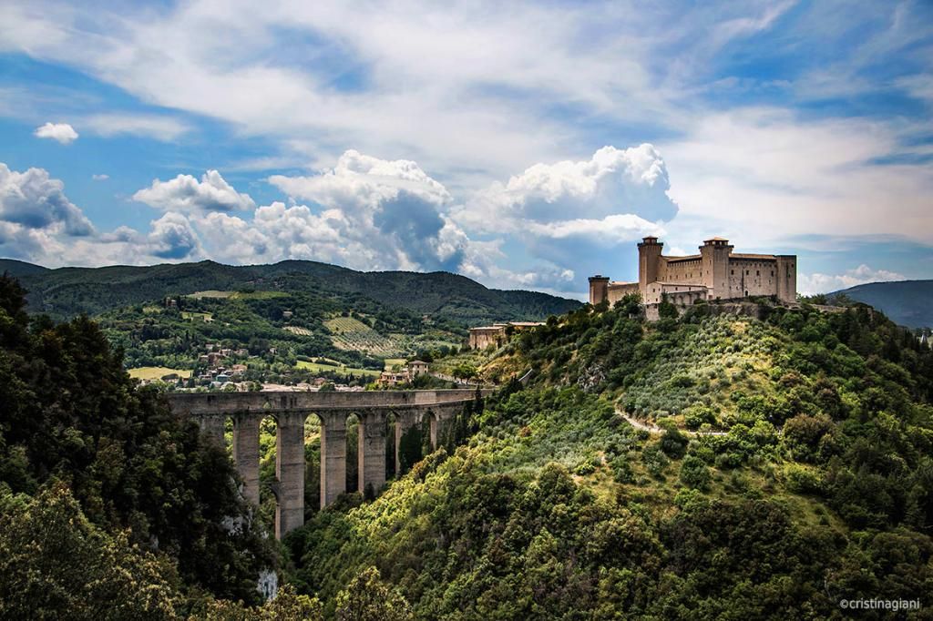
This is my version
Questa la mia versione |
|
|
sent on 27 Giugno 2014 (22:15) | This comment has been automatically translated (show/hide original)
very very nice! wow! ;-)
a greeting
francis molto molto bella!!! 
un saluto
francesco |
|
|
sent on 28 Giugno 2014 (0:10) | This comment has been automatically translated (show/hide original)
Fabulous Christine, you're really good ..
I really like the composition ... beautiful all the versions proposed ...
Very good to follow the advice.
A hug
Sonia ;-) Favolosa Cristina, sei veramente brava ..
Mi piace molto la composizione... splendide tutte le versioni proposte...
Bravissima nel seguire i consigli.
Un abbraccio
Sonia |
|
|
sent on 28 Giugno 2014 (0:37) | This comment has been automatically translated (show/hide original)
all the versions I find that the more pleasant is your own Cristina! congratulations for the work done!
a hug!
ciauzz mario di tutte le versioni trovo che quella più gradevole è proprio la tua Cristina! complimenti per il lavoro effettuato!
un abbraccio!
ciauzz mario |
|
|
sent on 28 Giugno 2014 (9:58) | This comment has been automatically translated (show/hide original)
You are all too kind, thanks for passing by here and leaving me your impression, good weekend :-) :-) Siete tutti troppo gentili, grazie per essere passati di qui e avermi lasciato la vostra impressione, buon fine settimana |
user18080
|
sent on 28 Giugno 2014 (13:52) | This comment has been automatically translated (show/hide original)
Very nice, one of the proposed versions, I prefer that of Alexander.
Hello, Massimiliano :-) Molto bella,tra le versioni proposte,preferisco quella di Alessandro.
Ciao,Massimiliano |
|
|
sent on 28 Giugno 2014 (14:44) | This comment has been automatically translated (show/hide original)
Beautiful location and good pdr, a hint of color in addition there is, I would see the lights a little lower, I agree with the cut pano, all leading up to the castle and the upper part of the sky has a relative importance in the composition, deleting the castle is to be higher and the image gains dynamism, as always, however, is a matter of taste ;-)
Congratulations, hello. Bella location e buon pdr, un pizzico di colore in più ci sta, vedrei anche le luci un poco più basse, concordo con il taglio pano, tutte le linee portano al castello e la parte alta del cielo ha un'importanza relativa nella composizione, eliminandola il castello viene a trovarsi più in alto e l'immagine guadagna dinamismo, come sempre comunque è questione di gusti
Complimenti, ciao. |
|

Publish your advertisement on JuzaPhoto (info) |


 JuzaPhoto contains affiliate links from Amazon and Ebay and JuzaPhoto earn a commission in case of purchase through affiliate links.


 Resize to fit window