What do you think about this photo?
Do you have questions or curiosities about this image? Do you want to ask something to the author, give him suggestions for improvement, or congratulate for a
photo that you really like?
You can do it by joining JuzaPhoto, it is easy and free!
There is more: by registering you can create your personal page, publish photos, receive comments and you can use all the features of JuzaPhoto.
With more than 260000members, there is space for everyone, from the beginner to the professional.
|
|
sent on 27 Marzo 2014 (13:54) | This comment has been automatically translated (show/hide original)
... You're a treasure trove!
've been working a lot lately and as far as I can count my judgment, very very good!
good, marco ... sei una fonte inesauribile!
hai lavorato molto ultimamente e, per quanto possa contare il mio giudizio, molto molto bene !
bravo, marco |
|
|
sent on 27 Marzo 2014 (14:06)
Also this fantastic! I really like your shots!!   |
|
|
sent on 27 Marzo 2014 (14:23) | This comment has been automatically translated (show/hide original)
Hello Jypka! Thank you for your prompt delivery and the nice comment! See you soon! :-P ;-) Ciao Jypka! Grazie della tua puntualità e del bel commento! A presto! |
|
|
sent on 27 Marzo 2014 (15:11)
Congratulations for this moment of wonder ! Excellent...like it ! |
|
|
sent on 27 Marzo 2014 (15:24) | This comment has been automatically translated (show/hide original)
Thank you very much dear Saroukai! :-D ;-) Grazie molte carissimo Saroukai! |
|
|
sent on 27 Marzo 2014 (17:30) | This comment has been automatically translated (show/hide original)
I really like the color rendition, hello ;-) mi piace molto la resa cromatica, ciao |
|
|
sent on 27 Marzo 2014 (21:03) | This comment has been automatically translated (show/hide original)
Hello Moth! Thanks for the comment, glad you like it! :-D ;-) Ciao Falena! Grazie del commento, felice che ti piaccia! |
|
|
sent on 27 Marzo 2014 (21:09)
Wonderful colours and great composition. My compliments. Hello |
|
|
sent on 27 Marzo 2014 (21:11) | This comment has been automatically translated (show/hide original)
Hello Zman! A hug for your constant presence! :-P ;-) Ciao Zman! Un abbraccio per la tua costante presenza! |
|
|
sent on 27 Marzo 2014 (22:35) | This comment has been automatically translated (show/hide original)
How do you, just tell me how you do and 'beautiful ;-) come fai, dimmi solo come, fai e' bellissima |
|
|
sent on 27 Marzo 2014 (23:15) | This comment has been automatically translated (show/hide original)
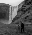
I covered the image over and over again, and with all the comments that precede me I am a bit ashamed 'you in this criticism:-P I think all that red softens a bit' too ... the image you've saturated the red and green? For the composition I agree with 66tasca! I also have to say that I really like and threatening sky that gives something of Fantasy:-D
Ian Ho riguardato l'immagine più e più volte, e con tutti i commenti che mi precedono mi vergogno un po' nel farti questa critica Secondo me tutto quel rosso ammorbidisce un po' troppo l'immagine... Hai saturato tu il rosso e il verde ? Per la composizione concordo con 66tasca ! Devo anche dire che il cielo minaccioso mi piace molto e regala quel non so che di Fantasy
Ian |
|
|
sent on 27 Marzo 2014 (23:24) | This comment has been automatically translated (show/hide original)
Hello fulvio! I'll give you my compliemti ultimantente because you're working during both shooting and post very well! And just for this reason I want to be picky!
The colors I like, even if the finding of Ian is correct I think that create a more effective color contrast. I also like the soft glow, although it is a bit 'too general. I suggest you clear the level of shadow and then apply it only to the lights and tones. Sometimes I lose to me, but with this device you can give a nice effect that is unnatural fluorescent no!
The thing I like least is the difference in brightness of the sky between the edges and the center of the outline of the church. It may well have been so in the raw but I would homogenized by darkening or lightening the whole sky uniformly!
<br />
Sorry if I pignolato but seeing as you're getting better I hope my advice can be of help!
Ciaooo Ciao fulvio!! Ti faccio i miei compliemti perché ultimantente stai lavorando sia in fase di scatto che in post molto bene ! E giusto per questo motivo voglio essere pignolo !
I colori mi piacciono , anche se la constatazione di Ian è corretta credo che creino in maniera più efficacie un contrasto cromatico . Mi piace anche il soft glow , anche se è un po' troppo generale . Ti consiglio di deselezionare il livello di ombre e poi applicarlo solo alle luci e ai mezzi toni. A volte mi scappa anche a me , ma con questo accorgimento riesci a dare un bell'effetto fluo senza che risulti innaturale !
La cosa che mi piace meno è la diversità di luminosita del cielo tra i bordi e il centro nel contorno della chiesa . Potrebbe anche essere stato cosi nel raw ma io lo avrei omogeneizzato scurendo o schiarendo tutto il cielo in maniera omogenea !
Scusa se ho pignolato ma vedendo come stai migliorando spero che i miei consigli possano esserti di aiuto !!
Ciaooo |
|
|
sent on 28 Marzo 2014 (0:41) | This comment has been automatically translated (show/hide original)
Very well done. Molto ben riuscita. |
|
|
sent on 28 Marzo 2014 (6:55) | This comment has been automatically translated (show/hide original)
beautiful .. congratulations
raffaele bella..complimenti
raffaele |
|
|
sent on 28 Marzo 2014 (7:48) | This comment has been automatically translated (show/hide original)
Beautiful contrast between the colors, beautiful!
Hello, Charles. Bellissimo il contrasto fra i colori, splendida!!
Ciao, Carlo. |
|
|
sent on 28 Marzo 2014 (8:00) | This comment has been automatically translated (show/hide original)
Simple, unique and excellent light.
HELLO Semplice, particolare e ottima luce.
CIAO |
|
|
sent on 28 Marzo 2014 (8:08) | This comment has been automatically translated (show/hide original)
Beautiful light and beautiful colors,
and excellent composition.
Congratulations Fulvio! Hello!
Sergio:-P ;-) Bella luce e splendidi colori,
nonché ottima composizione.
Complimenti Fulvio! Ciao!
Sergio |
|
|
sent on 28 Marzo 2014 (8:28) | This comment has been automatically translated (show/hide original)
1
But the brightness behind the chapel on the time it seemed good in the sense that emphasized the contours of the part already dark walls. If the whole were fairly homogeneous disappear contrast between the subject and the sky. But I must admit that there is little naturally between the two parts of the sky and that "it is not nice!": Fconfuso:
In the original (as you can see in the B & W version), things I was in a very different manner. This is just my personal interpretation with all its faults and virtues. I consider it a sort of task in class and all of you are teachers overtime because you have the sense of inciting people in a positive way!
Sometimes I wonder how many of you are not to be considered professional photographers the ability you possess! It 'apity, but a great satisfaction in the face of so many people in this profession and do not understand anything! :-D:-D
For now I embrace you all and I thank you from my heart! :-P ;-)
E sì, ragazzi miei! Vado proprio a cercarmele!
Ma d'altronde se si vuole fare passi in avanti, bisogno pur imparare in qualche modo.
Questo è un vecchio scatto di due anni fa, recuperato da questo viaggio in Normandia, solo perché sono testardo nel voler migliorare cose che bisogna rifare meglio e non recuperare. Il compo in sè è sbagliato perché troppo ravvicinato e quindi Marco ha ragionissimo su ogni fronte. Il voler tagliare fuori le persone che c'erano sulla sinistra ha portato ha questa composizione mal pensata.
I colori mezzi fantasy chiaramente li ho saturati io in PP, ma non direttamente ma con le plugin di PS mentra applicavo i vari filtri.
Il suggerimento di Gianluca sull'applicare il glow solo in aree selezionate mi sembra un incredibile e giusto suggerimento, manco ci avevo pensato!
Però la luminosità dietro la cappella sul momento mi sembrava buona, nel senso che enfatizzava i contorni già scuri della parte muraria. Se fosse tutto abbastanza omogeneo sparirebbe il contrasto tra il soggetto e il cielo. Però devo ammettere che c'è poca naturalezza tra le due zone del cielo e questo "non è bello"!
Nell'originale (come si può notare nella versione B&W), le cose stavo in maniera ben diversa. Questa è solo una mia personale interpretazione con tutti i suoi difetti e pregi. La ritengo una sorta di compito in classe e Voi tutti siete degli insegnanti straordinari perchè avete il buonsenso d'incitare le persone in maniera positiva!
A volte mi chiedo come fanno molti di Voi a non essere dei fotografi professionisti considerate le capacità che possedete! E' un vero peccato, però una bella soddisfazione alla faccia di tanta gente che esercita questa professione e non ne capisce nulla!
Per ora Vi abbraccio tutti e Vi ringrazio di cuore!
|
|

Publish your advertisement on JuzaPhoto (info) |


 JuzaPhoto contains affiliate links from Amazon and Ebay and JuzaPhoto earn a commission in case of purchase through affiliate links.


 Resize to fit window
 13.6 MEGAPIXEL