What do you think about this photo?
Do you have questions or curiosities about this image? Do you want to ask something to the author, give him suggestions for improvement, or congratulate for a
photo that you really like?
You can do it by joining JuzaPhoto, it is easy and free!
There is more: by registering you can create your personal page, publish photos, receive comments and you can use all the features of JuzaPhoto.
With more than 260000members, there is space for everyone, from the beginner to the professional.
|
|
sent on 02 Marzo 2014 (20:57) | This comment has been automatically translated (show/hide original)
Pretty good. Where are you? Bella bravo. Dove ti trovi? |
|
|
sent on 03 Marzo 2014 (11:39) | This comment has been automatically translated (show/hide original)
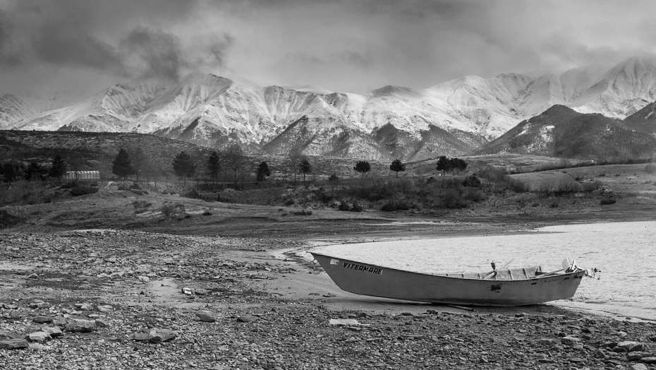
the composition works fairly, having the 3 subjects on different levels. Too heavy, in my opinion, the boulder in the foreground, and the light is bad and ruin a little of everything. :-)
Hello
Max la composizione funziona abbastanza, avendo i 3 soggetti su piani diversi. Troppo pesante, a parer mio, il masso in primo piano, e la luce è pessima e rovina un pò tutto.
Ciao
Max |
|
|
sent on 03 Marzo 2014 (12:10) | This comment has been automatically translated (show/hide original)
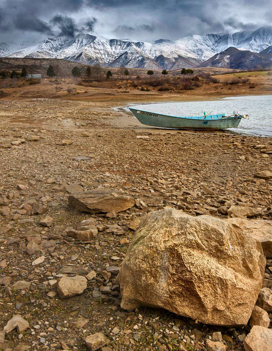
Quoto for the rock ... I cut with a panoramic and maybe a little 'more saturation or b & n (I can not decide) would be a very nice photo! Quoto per il masso...secondo me con un taglio panoramico e magari un po' più saturazione o in b&n (non so decidere) sarebbe una gran bella foto! |
|
|
sent on 03 Marzo 2014 (16:08) | This comment has been automatically translated (show/hide original)
quoto much for B & N quoto decisamente per il B&N |
|
|
sent on 03 Marzo 2014 (23:16) | This comment has been automatically translated (show/hide original)
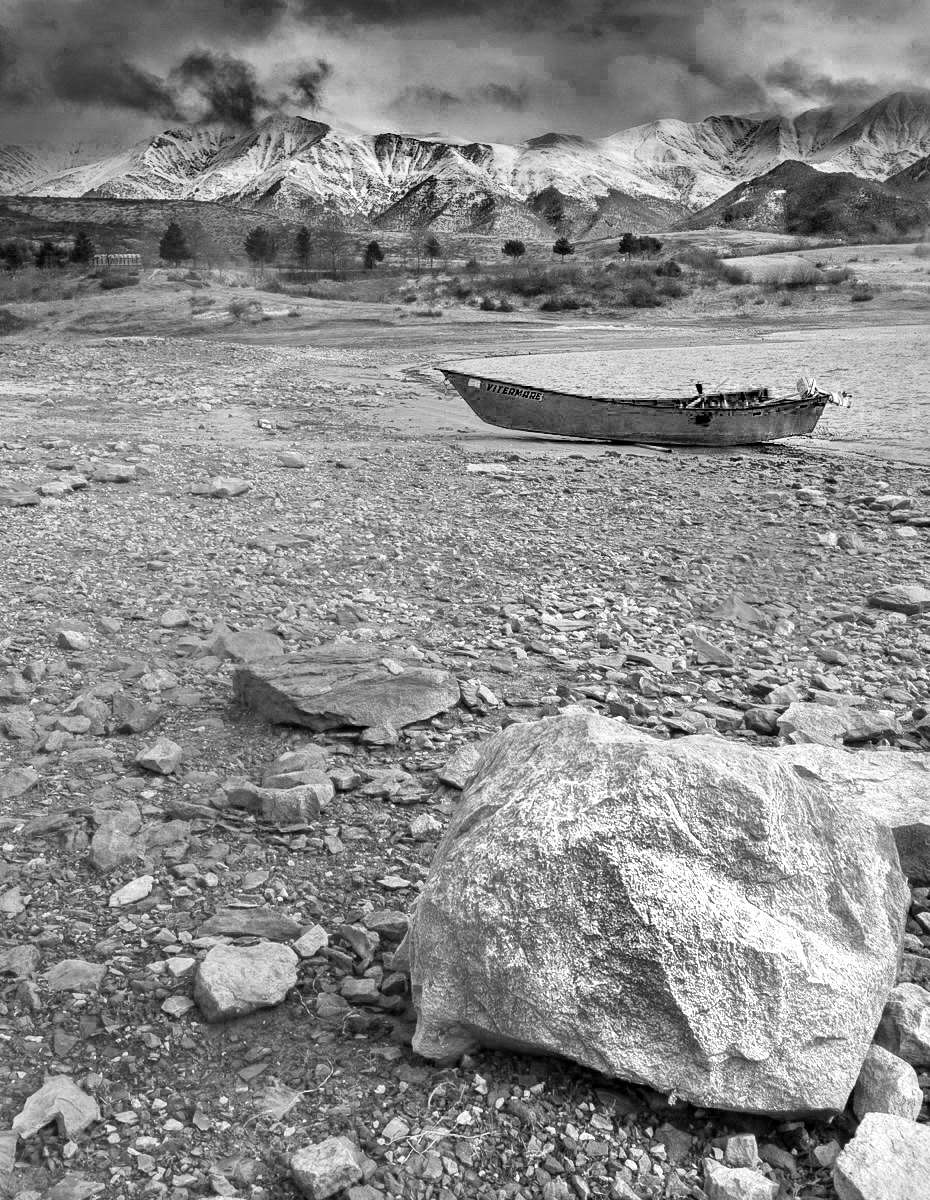
I also have a version pano, now the public
ho anche una versione pano, ora la pubblico
|
|
|
sent on 04 Marzo 2014 (0:30) | This comment has been automatically translated (show/hide original)
BN definitely better BN decisamente meglio |
|
|
sent on 04 Marzo 2014 (10:21) | This comment has been automatically translated (show/hide original)
Better in b / w, but the conversion is a bit 'too flat and uninteresting. You should work on it a bit '! ;-)
To me that rock in the foreground did not like it at all, but I do not sfango landscapes whatever! :-D
Hello
Barbara Meglio in b/n, ma la conversione è un po' troppo piatta e poco interessante. Dovresti lavorarci sopra un po'!
A me quel masso in primo piano non piace proprio per niente, ma io i paesaggi non li sfango a prescindere!
Ciao
Barbara |
|
|
sent on 04 Marzo 2014 (18:59) | This comment has been automatically translated (show/hide original)
Retrieving what I have not done before for reasons of time:
Thanks David (Campotosto, including Abruzzo, Lazio and brands)
Thanks Max,
Thanks Arconudo,
Thanks Mignolo.
all comments are very welcome. In general I think a little 'reflect a greater maturity mine, but for the most part, what works in this shot was suggested to me by my Nile, what is wrong, however, is all my own work! :-D
Let 's see what I can do to improve the picture. The cuts proposed by pinky (Please do not remove it), it seems to work pretty well. However, it seems to me that it is to lose a little 'magic of the wide-angle, with its distortions, does take a bit' of meaning to the photo. We say thatits a cutout 50mm. I have researched (obviously with the results considerably improvable), a triple focal plane. Sure, a stone is not a subject of such importance as to justify such a portion, but if the subject in the foreground was a cat, maybe the outcome would have been far more valuable. Or am I wrong?
I also made another version of the same scenario. Here, however, it seems to me that the stone is too insignificant to justify the framing that is cautious.
www.juzaphoto.com/galleria.php?t=781411&l=it
Recupero quello che non ho fatto in precedenza per ragioni di tempo:
Grazie Davide (Lago di Campotosto, tra abruzzo, lazio e marche),
Grazie Max,
Grazie Arconudo,
Grazie Mignolo.
tutti i commenti sono stati molto graditi. In generale credo che un po' riflettano una maggiore maturità mia, ma in massima parte, quello che funziona in questo scatto mi è stato suggerito dall'amico Nilo, quanto è sbagliato, invece, è tutta farina del mio sacco!
Vediamo un po' cosa posso fare per migliorare la foto. I tagli proposti da mignolo (che prego di non togliere), mi sembra funzionino abbastanza bene. Tuttavia mi sembra che venga a perdersi un po' la magia del grandangolo che, con le sue distorsioni, fa assumere un po' di significato alla foto. Diciamo che il suo è un ritaglio da 50mm. Io ho ricercato (evidentemente con risultati decisamente migliorabili), un triplo piano focale. Certo, una pietra non è un soggetto d'importanza tale da giustificare una tale porzione, ma se il soggetto in primo piano fosse stato un gatto, forse il risultato sarebbe stato decisamente più apprezzabile. Oppure sbaglio?
Ho fatto anche un'altra versione dello stesso scenario. Qui, però, mi sembra che il sasso sia troppo poco significativo da giustificarne l'inquadratura che si sbilancia.
www.juzaphoto.com/galleria.php?t=781411&l=it
|
|
|
sent on 04 Marzo 2014 (19:09) | This comment has been automatically translated (show/hide original)
@ Barbara. a special thank you for your welcome step. However do not even know where to begin to make the conversion to b / w more interesting. In the sense that not enough for me ... I need a tutorial just to better understand what you mean and then create my own taste of a genre that I always have a little 'snubbed because, all too often, I've seen used (or best abuse) to recover bad photo with lights preposterous (more or less as in this case). Let me explain, a good photo should already be imagined ... and not recovered. However, I realize now that, in some cases, the colors are completely unnecessary and if you can save a nice cut, removing the light feeling bad, may be an option to take into account. I mean, I when I imagined the pictures, I saw in the viewfinder, I was not impressed by the colors butonly by the combination water / boat / mountains, and (thanks to the Nile) stone. @Barbara. un grazie particolare per il tuo gradito passaggio. Tuttavia non so neppure da dove iniziare per rendere la conversione in b/n più interessante. Nel senso che non mi basta un tutorial... mi occorre proprio capire meglio quello che intendi e, successivamente, creare proprio un mio gusto su un genere che ho sempre un po' snobbato perchè, troppo spesso, l'ho visto usare (o meglio abusare) per recuperare brutte foto con luci improponibili (più o meno come in questo caso). Mi spiego meglio, una bella foto dovrebbe essere già immaginata... e non recuperata. Tuttavia, mi rendo conto solo ora che, in alcuni casi, i colori sono del tutto superflui e se si può salvare un bel taglio, togliendo la sensazione di luce cattiva, può essere una opzione da tener conto. Cioè, io quando ho immaginato la foto, l'ho vista nel mirino, non sono rimasto impressionato dai colori ma solo dall'accostamento acqua/barca/monti e, (grazie a nilo) sasso. |
|
|
sent on 05 Marzo 2014 (8:36) | This comment has been automatically translated (show/hide original)
Hello Fabrizio, the light was that it was more difficult to make. Probably with a 10-20 setback would have given you a greater harmony between the various elements. Use a supergrandangolo is not easy, you have to try a lot. I'm shooting in the vertical I lost the drops of water on the knob. Ciao Fabrizio, la luce era quella che era di più difficile fare. Probabilmente col 10-20 un passo indietro ti avrebbe dato una maggiore armonia fra i vari elementi. Usare un supergrandangolo non è semplicissimo, bisogna provare parecchio. Io lo scatto in verticale lo ho perso per le gocce d'acqua sul pola. |
|
|
sent on 05 Marzo 2014 (9:24) | This comment has been automatically translated (show/hide original)
To me, the conversion b / w you've done, is completely missing blacks. And 'gray, so it's a black and gray black and white. And 'as such in neutral as you have taken color: no color = no black and white.
With regard to the discourse on the abuse of the conversions, I do not deny that he had converted to b / w, at times, the shots that color did not convince me, but in the vast majority of cases improve slightly and continue to remain mediocre shots despite the conversion.
So when a shot is not convincing, the best way would always remain the trash or, if you do not want to just throw away, sharing with friends on FB! ;-)
According to me a good b / w must already have a good base already on the original color, but I think it all those who photograph, is the classicalphysics discovery of hot water!
If you want to learn how to reason directly in b / w, you buy a monochrome and you start to think only for b / w, as did billo1 ;-)
Or, since our cameras allow it, even if you shoot in RAW, you can see the result on the monitor in mono, so you start to become familiar with the b / w.
Hello
Barbara
Secondo me la conversione in b/n che hai fatto, manca completamente dei neri. E' grigia, quindi è più un bianco e grigio che un bianco e nero. E' neutra tale e quale a come l'hai scattata a colori: no colori = no bianco e nero.
Riguardo al discorso sull'abuso delle conversioni, non nego di aver convertito in b/n, a volte, degli scatti che a colori non mi convincevano, ma nella stragrande maggioranza dei casi migliorano di poco e continuano a rimanere scatti mediocri nonostante la conversione.
Quindi quando uno scatto non convince, la strada migliore rimarrebbe sempre il cestino o, se non la si vuole proprio buttare via, la condivisione con gli amici su FB!
Secondo me un buon b/n deve avere già una buona base già sull'originale a colori, ma credo lo pensino tutti coloro che fotografano, è la classica scoperta dell'acqua calda!
Se si vuole imparare a ragionare direttamente in b/n, ci si compra una monocrome e si inizia a ragionare solo per b/n, come ha fatto billo1
Oppure, visto che le nostre reflex lo consentono, anche se si scatta in raw, è possibile visualizzare sul monitor il risultato in monocromo, così si comincia a prendere confidenza con il b/n.
Ciao
Barbara
|
|
|
sent on 05 Marzo 2014 (11:10) | This comment has been automatically translated (show/hide original)
@ Nile. Yes, the light was not that great. However, with one eye a little 'more trained (like yours), I would have been able to take advantage of the few moments of open sky. Oh well, it will be the next one! In particular, they are a bit 'disappointed with the result of the photo pano format because, in my opinion, if I had put the two parties in the neighboring strong points, I would have gotten the result of bias that I had suggested. So, let's say that you were talking about, I can see now, as then I missed it completely! :-) @nilo. Si, la luce non era gran che. Tuttavia, con un occhio un po' più allenato (come il tuo), avrei saputo approfittare dei pochi momenti di cielo aperto. Vabbè, sarà alla prossima! In particolare, sono un po' dispiaciuto del risultato della foto in formato pano perchè, a mio parere, se avessi messo i due soggetti vicini nei punti forti, avrei ottenuto il risultato di diagonale che mi avevi suggerito. Insomma, diciamo che quello di cui parlavi, lo riesco a vedere ora, mentre allora mi è sfuggito completamente! |
|
|
sent on 05 Marzo 2014 (11:12) | This comment has been automatically translated (show/hide original)
@ Pinky. Both the photos you've proposed are much better than mine. I especially like how you have enhanced the sky. Let me think a little bit ...
@ Barbara. As soon as I get a minute I try to do a conversion following your directions. @mignolo. Entrambe le foto che hai proposto sono decisamente migliori della mia. In particolare mi piace come hai valorizzato il cielo. Lasciami riflettere un pochino...
@Barbara. Appena ho un minuto provo a fare una conversione seguendo le tue indicazioni. |
|
|
sent on 05 Marzo 2014 (13:27) | This comment has been automatically translated (show/hide original)
I found another shot without too many drops. I removed them and the result is not bad ... later there the place! :)
@ Barbara, I came back because I have a bit 'of days off! :-D Ho trovato un altro scatto senza troppe gocce. Le ho rimosse ed il risultato non è pessimo... più tardi ve la posto! :)
@Barbara, Sono tornato perchè ho un po' di giorni di ferie! |
|
|
sent on 05 Marzo 2014 (14:09) | This comment has been automatically translated (show/hide original)
Ok, but you can not completely abandon us when you work! Are you a government official, let us see that you, as they want to clichés, you're in the office only to fuck on Juza and to warm the chair! :-D:-D:-D
The evidence of Pinky I like. Even in my shooting, although I do not enthusiasms because ME does not excite the landscapes in general, it is not trash. Surely you have to enhance it more, because as you've posted is just flat / haggard, both color and b / w. Already better exploit the sky and the color of the rocks in the foreground, can be change the face of the shooting. ;-) Ok, ma non puoi abbandonarci completamente quando lavori! Sei un funzionario statale, facci vedere che anche tu, come vogliono i luoghi comuni, stai in ufficio solamente a cazzeggiare su Juza ed a scaldare la sedia!
Le prove di Mignolo mi piacciono. Anche secondo me lo scatto, nonostante non mi entusiasmi perchè A ME non entusiasmano in generale i paesaggi, non è da cestino. Sicuramente bisogna valorizzarlo di più, perchè come lo hai postato è proprio piatto/smunto, sia a colori che in b/n. Già valorizzare meglio il cielo e il colore delle rocce in primo piano, può far cambiare faccia allo scatto. |
|
|
sent on 05 Marzo 2014 (17:42) | This comment has been automatically translated (show/hide original)
Hmmm no fee service which I can use to edit photos? ImageStack vo 'them money! : P
@ Barbara: Of course skald the chair! Cabbages! Mica I autoriscaldata the chair in the office! You do not know that there is spendingreviù? But how do I go about Juza? Should I move the chair, turn on the pc, scratch my head, press the keys ... ue, I am out of breath just thinking about all this trouble! : P Hmmm quale servizio non a pagamento posso usare per pubblicare le foto? imagestack vo' li soldi! :P
@Barbara: Certo che scaldo la sedia! Cavoli! Mica ho la sedia autoriscaldata in ufficio!! Non sai che c'è la spendingreviù? Ma come faccio ad andare su juza? Dovrei spostare la sedia, accendere il pc, grattarmi la testa, premere i tasti... uè, mi viene il fiatone solo a pensare a tutta questa fatica!! :P |
|

Publish your advertisement on JuzaPhoto (info) |

 Paesaggi
 JuzaPhoto contains affiliate links from Amazon and Ebay and JuzaPhoto earn a commission in case of purchase through affiliate links.


 Resize to fit window