What do you think about this photo?
Do you have questions or curiosities about this image? Do you want to ask something to the author, give him suggestions for improvement, or congratulate for a
photo that you really like?
You can do it by joining JuzaPhoto, it is easy and free!
There is more: by registering you can create your personal page, publish photos, receive comments and you can use all the features of JuzaPhoto.
With more than 260000members, there is space for everyone, from the beginner to the professional.
user29778
|
sent on 11 Febbraio 2014 (13:17) | This comment has been automatically translated (show/hide original)
futuristic and brilliant! futuristica e geniale! |
|
|
sent on 11 Febbraio 2014 (13:18) | This comment has been automatically translated (show/hide original)
Great ...!! compliments. Hello. GM ...ottima!!!! complimenti. Ciao. GM |
|
|
sent on 11 Febbraio 2014 (13:40) | This comment has been automatically translated (show/hide original)
Big Mark, I really love this shot
Great definition, wonderful colors and super atmosphere
Greetings
Maximum Grande Marco, questo scatto mi piace veramente molto
Grande definizione, colori stupendi ed un'atmosfera super
Un saluto
Massimo |
|
|
sent on 11 Febbraio 2014 (15:21) | This comment has been automatically translated (show/hide original)
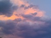
Considering the situation that we had to operate cameras
To take the picture, in the pouring rain ...
That limits the visual composition etc. ...
I tell you that at the level of components you've done miracles! :-P
The colors, however, does not convince me, I see it too intense blue and cold.
If you look carefully you will notice that the artificial lights white, they are actually greenish ....
Symptom that the WB is not 'correct.
This can be seen even more so on the rocks in the foreground, which seem to be a light colored wood to those used in the disco to understand
The contrast and 'a bit' too much, as it shadows are a bit 'too closed.
Good fusion and sharpness instead!
Ps rivedrei everything to gain naturalness investmentthere's visual impact.
Greetings Max Considerando la situazione fotografiche che abbiamo dovuto operare
Per fotografare, sotto la pioggia battente...
Che limita la visuale compositiva ecc...
Ti dico che a livello di compo hai fatto i miracoli !
I colori però non mi convincono, la vedo troppo blu intenso e fredda.
Se osservi bene noterai che le luci artificiali bianche, in realtà sono tendenti al verde....
Sintomo che il WB non e' corretto.
Lo si nota ancora di più sugli scogli in primo piano, che sembrano colorati da una lampada a wood quelle usate in discoteca per capirci
Anche il contrasto e' un po' eccessivo, come invece le ombre sono un po' troppo chiuse.
Buona invece la fusione e la nitidezza !
P.s rivedrei il tutto a guadagno della naturalezza invece del impatto visivo.
Un saluto Max |
|
|
sent on 11 Febbraio 2014 (15:37) | This comment has been automatically translated (show/hide original)
Excellent framing and the sky, the colors though perhaps a little starati create an atmosphere incredibile.Bravissimo Ottimi l'inquadratura e il cielo, i colori anche se forse un pò starati creano una atmosfera incredibile.Bravissimo |
|
|
sent on 11 Febbraio 2014 (16:10) | This comment has been automatically translated (show/hide original)
Thank you very much to all for your comments and for valuable suggestions.
The colors are not "Starati," I wanted to purposely cool white (2400 ° K), thus emphasizing the cool shades of blue, especially on the rocks, a little to recall the adverse weather conditions of that time (rain and heavy seas ), conseguendone a particular scene definitely, maybe a little bit surreal, but very charming and Pathos, well contrasted with the warm lights of the town that despite the strong water vapor, which completely covered the scene and ourselves, reflecting its colors equally paying back our efforts.
I'm so happy for the great quality of the file and for the sharpness obtained.
Thank you again.
Hello Marco
PS I will also try ari-edit this shot following the advice of Max Grazie Mille a tutti per i commenti e per i preziosi suggerimenti.
I colori non Sono "Starati", ho voluto di proposito raffreddare il bianco ( 2400°K), enfatizzando così le tonalità fredde del blu, soprattutto sulle rocce, un po per richiamare le avversità metereologiche di quel momento, (pioggia battente e mare grosso), conseguendone una scena sicuramente particolare, forse un pochino surreale, ma suggestiva e di grande Pathos, ben contrapposta alle luci calde della cittadina che nonostante il forte vapore acqueo, che ricopriva totalmente la scena e noi stessi, rifletteva ugualmente i suoi colori ripagando i nostri sforzi.
Sono soddisfatto perciò per la grande qualità del file e per la nitidezza ottenuta.
Grazie Ancora.
Ciao Marco
P.S. Proverò anche a ri-editare questo scatto seguendo i consigli di Max. |
|
|
sent on 11 Febbraio 2014 (16:12) | This comment has been automatically translated (show/hide original)
congratulations ... I like it very much! Hello ;-):-P francesco complimenti ...mi piace molto! un saluto francesco un saluto francesco |
|
|
sent on 11 Febbraio 2014 (16:35) | This comment has been automatically translated (show/hide original)
Beautiful picture ... Mark .... BRAVO ...Bella immagine Marco....BRAVO |
|
|
sent on 11 Febbraio 2014 (16:39) | This comment has been automatically translated (show/hide original)
Despite not being a lover of photos "cold", quoto Marco hundred percent, just for the reasons you pointed out. And the final result pleases the eye! ;-) Nonostante non sia amante delle foto "fredde", quoto Marco al cento per cento, proprio per i motivi che ha sottolineato. E l'effetto finale appaga lo sguardo! |
|
|
sent on 11 Febbraio 2014 (19:09) | This comment has been automatically translated (show/hide original)
I like it a lot, for me the cool shade is the strength of this shot. Beautiful. Hello A me piace un sacco, per me la tonalità fredda è la forza di questo scatto. Bellissima. Ciao |
|
|
sent on 11 Febbraio 2014 (20:26) | This comment has been automatically translated (show/hide original)
This debate ... I like it and I'm curious because when I saw it for the first time I made the same assessment on the lights ... then the shot I liked it and I did not want to point out .... but now I pull out the question that had arisen spontaneously, because the lights were left yellow (yellow and probably were)?? 've applied the cooling of white only in some places (ie isolating the block of houses that remained yellow?)?? if so, you might think to recover only the lights on right .... or not?? Thank you. Hello. GM ...questo dibattito mi piace e mi incuriosisce in quanto quando l'ho vista per la prima volta ho fatto la medesima valutazione sulle luci...poi lo scatto mi piaceva così e non ho voluto puntualizzare....invece ora tiro fuori la domanda che mi era sorta spontanea: perché le luci di sx sono rimaste gialle (e gialle probabilmente erano)???? hai applicato il raffreddamento del bianco solo in alcuni punti (isolando cioè il blocco delle case che è rimasto giallo?)??? se così fosse, potresti pensare di recuperare solo le luci di dx....o no??? grazie. Ciao. GM |
|
|
sent on 11 Febbraio 2014 (23:21) | This comment has been automatically translated (show/hide original)
Thank you for passing and for your comments, I am very happy to be able to compare.
Gian Mario, thanks to the suggestion of Max (Integra) I shot with a white balance of 3000 ° K directly in the machine, the 2 Raw departure already have a decidedly cold temperature, PP I cooled further by bringing the files to 2400 ° K to make the color stand out more from the white neon lights, splash of the waves and the clouds of the sky. While the yellow lights of the city, despite the temperature cooled down, they were yellow, then brightened with my editing process.
I made two screenshots of the two Raw, open in ACR, but I can not load them with Imageshak.
As soon as I can I show them to greater understanding.
Thank you again.
Hello Marco Ringrazio per il passaggio e per i vostri commenti, sono molto felice di potermi confrontare.
Gian Mario, Grazie al suggerimento di Max ( Integra ) ho scattato con un bilanciamento del bianco di 3000°K direttamente in macchina, i 2 Raw di partenza hanno già una temperatura decisamente fredda, in PP ho ulteriormente raffreddato i file portandoli a 2400°K per fare risaltare maggiormente il colore bianco dalle luci a neon, dagli spruzzi delle onde e dalle nuvole del cielo. Mentre le luci gialle della città, nonostante la temperatura raffreddata, sono rimaste della loro colore giallo, ravvivate successivamente con il mio processo di editing.
Ho preparato i due screenshot dei due Raw, aperti in ACR, ma non riesco a caricarli con Imageshak.
Non appena ci riesco ve li mostro per maggiore comprensione.
Grazie Ancora.
Ciao Marco |
|
|
sent on 12 Febbraio 2014 (0:13) | This comment has been automatically translated (show/hide original)
Great show from a "boy" that I know of the wonderful naturalistic images and now I compliment
so much for this excellent result.
LIKE
Mark Grande spettacolo da un "ragazzo" che io conosco per le splendide immagini naturalistiche ed ora mi complimento
tantissimo per quest'ottimo risultato.
MI PIACE
Marco |
|
|
sent on 12 Febbraio 2014 (0:39) | This comment has been automatically translated (show/hide original)
Great job Mark, I also like the choice of "cool" xchè the effect is definitely to my taste!
Hello, Henry Gran bel lavoro Marco, mi piace anche la scelta di "raffreddare" xchè l'effetto ottenuto è decisamente di mio gusto!
Ciao, Enrico |
|
|
sent on 12 Febbraio 2014 (0:47) | This comment has been automatically translated (show/hide original)
Hello Mark, congratulations on the composition, really nice! :) I see too cold, I would have turned up a bit 'grades K ;) of course is my point of view! :)
Hello
Umberto Ciao Marco, complimenti per la composizione, veramente belle! :) La vedo eccessivamente fredda, io avrei alzato un po' i gradi K ;) , ovviamente è un mio punto di vista! :)
Ciao
Umberto |
|
|
sent on 12 Febbraio 2014 (9:37) | This comment has been automatically translated (show/hide original)
I agree with Michela Concordo con Michela |
|

Publish your advertisement on JuzaPhoto (info) |


 JuzaPhoto contains affiliate links from Amazon and Ebay and JuzaPhoto earn a commission in case of purchase through affiliate links.


 Resize to fit window