What do you think about this photo?
Do you have questions or curiosities about this image? Do you want to ask something to the author, give him suggestions for improvement, or congratulate for a
photo that you really like?
You can do it by joining JuzaPhoto, it is easy and free!
There is more: by registering you can create your personal page, publish photos, receive comments and you can use all the features of JuzaPhoto.
With more than 260000members, there is space for everyone, from the beginner to the professional.
|
|
sent on 04 Febbraio 2014 (9:31) | This comment has been automatically translated (show/hide original)
nice idea ............
hello Jerry bella idea............
ciao Jerry |
|
|
sent on 04 Febbraio 2014 (10:04) | This comment has been automatically translated (show/hide original)
We are you in the shadows?! :-D
Bellissima!
Hello, clear Ci sei anche tu tra le ombre?!
Bellissima!
Ciao, chiara |
|
|
sent on 04 Febbraio 2014 (10:07) | This comment has been automatically translated (show/hide original)
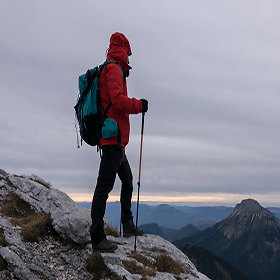
Very nice, good idea to have included the shadows of observers, however, I tried to include as little as possible to the wall at the bottom.
hello Molto bella, buona l'idea di aver incluso le ombre degli osservatori, avrei però cercato di includere il meno possibile il muretto in basso.
ciao |
|
|
sent on 04 Febbraio 2014 (10:32) | This comment has been automatically translated (show/hide original)
good idea, in my view if you cut a little below and to the best ds image readability. ;-)
Hello
max buona idea, a mio modo di vedere se tagli un pò sotto e a ds migliori la leggibilità dell'immagine.
Ciao
max |
|
|
sent on 04 Febbraio 2014 (10:34) | This comment has been automatically translated (show/hide original)
Thanks for the ride.
I fully agree with you Beppeverge, do not like to me that piece of wall ;-)
It Clare, are the first left arm bent in front of the face ;-) Grazie del passaggio.
Concordo pienamente con te Beppeverge, piace poco anche a me quel pezzo di muretto
Si Chiara, sono la prima a sinistra con il braccio piegato davanti alla faccia |
|
|
sent on 04 Febbraio 2014 (10:51) | This comment has been automatically translated (show/hide original)
Hello! Great idea! I agree with the cutting of the wall, the rest is very nice!
Ciaoooo Ciao !! Ottima idea!! Concordo con il taglio del muro, per il resto è molto bella !!!
Ciaoooo |
|
|
sent on 04 Febbraio 2014 (12:38) | This comment has been automatically translated (show/hide original)
The sky is beautiful!
cocordo with others to the wall ...
congratulations! Il cielo è bellissimo!!
cocordo con gli altri per il muretto...
complimenti! |
|
|
sent on 04 Febbraio 2014 (13:31) | This comment has been automatically translated (show/hide original)
As soon as I opened your photos without even thinking about it for a moment, I downloaded it, I opened it with pS, I cropped just below your shadow, I saved, I loaded on imageshak, I copied link ..... but when it came time to paste it on my comment, I have read the comments of others that I had not seen yet and I dropped the ............... ...... arms.
damn, I'm late.
patience
hello, simone Appena ho aperto la tua foto senza neanche pensarci su un attimo,l'ho scaricata,l'ho aperta con pS ,l'ho ritagliata appena sotto la tua ombra ,l'ho salvata ,l'ho caricata su imageshak,ho copiato in link ma .....quando è arrivato il momento di incollarlo sul mio commento,mi son letto i commenti degli altri che ancora non avevo visto e mi sono cadute le.....................braccia.
mannaggia,sono arrivato tardi.
pazienza
ciao,simone |
|
|
sent on 04 Febbraio 2014 (14:19) | This comment has been automatically translated (show/hide original)
Even for me, the bottom light must be eliminated.
down only in black high shadows and spectacular sky
Greetings
Valentino Anche per me la parte bassa luminosa va eliminata.
in basso solo nero in alto le ombre ed il cielo spettacolare
Un saluto
Valentino |
|
|
sent on 04 Febbraio 2014 (14:49) | This comment has been automatically translated (show/hide original)
Many thanks to all! Tonight place the revised and corrected version.
Unfortunately when I took too much I have not paid attention to the first floor, I focused on the shadows so that I do not run away (in fact I even tried a second shot but had already moved and you could see, from the silhouettes, which were no longer looking at the rainbow) .
But in fact I had to pay more attention in the post, mea culpa! :-|
Hello
Barbara Molte grazie a tutti! Stasera posto la versione rivista e corretta.
Purtroppo quando ho scattato non ho badato troppo al primo piano, mi sono concentrata sulle ombre affinchè non mi scappassero (infatti ho tentato anche un secondo scatto ma si erano già spostati e si vedeva, dalle sagome, che non stavano più osservando l'arcobaleno).
Però in effetti in post dovevo prestare più attenzione, mea culpa!
Ciao
Barbara |
|
|
sent on 04 Febbraio 2014 (16:04) | This comment has been automatically translated (show/hide original)
You have said it all, good idea, a little 'less than the realization, the image has two strong entities shadows and rainbow, everything else was limited to the indispensable ;-)
Hello. :-) Ti hanno già detto tutto, buona l'idea, un po' meno la realizzazione, l'immagine ha due soggetti forti le ombre e l'arcobaleno, tutto il resto andava limitato all'indispensabile
Ciao. |
|
|
sent on 04 Febbraio 2014 (19:15) | This comment has been automatically translated (show/hide original)
Ok, I've worked for 5 minutes and I did two versions, 2/3 and 16/9


According to you, what is better?
Of course, in the shadow, to homogenize everything, I had to resort to the clone stamp.
Hello
Barbara Ok, ci ho lavorato 5 minuti ed ho fatto due versioni, in 2/3 e in 16/9
Secondo voi, qual è meglio?
Ovviamente nella parte in ombra, per omogeneizzare il tutto, ho dovuto far ricorso al timbro clone.
Ciao
Barbara |
|
|
sent on 04 Febbraio 2014 (20:10) | This comment has been automatically translated (show/hide original)
2/3 .... you have to give a little vertical development seen that the shadows are watching a little upwards. Hello 2/3 ....devi dare un pò di sviluppo verticale visto che le ombre stanno guardando un pò verso l'alto.ciao |
|
|
sent on 04 Febbraio 2014 (21:37) | This comment has been automatically translated (show/hide original)
I'll be synthetic (because I do not have to see me Bandito that I write ... Today is irritable ...:-D).
Even for me on the first two thirds.
In the "Overview" I think there is too much space on the left of the shadow photographer ...
;-) Sarò sintetico (perché non devo farmi vedere da Bandito che ti scrivo...Oggi è irritabile...).
Anche per me la prima sui 2/3.
Nella "panoramica" ritengo ci sia troppo spazio a sx dell'ombra fotografa...
|
|
|
sent on 04 Febbraio 2014 (22:54) | This comment has been automatically translated (show/hide original)
“ 2/3 .... you have to give a bit of vertical saw that the shadows are looking a little upward „
I agree :-) and for the same reason, there was also a three quarters 8-):-D, jokes aside for me there is really ;-)
Hello. “ 2/3 ....devi dare un pò di sviluppo verticale visto che le ombre stanno guardando un pò verso l'alto „
Concordo e per lo stesso motivo ci stava pure il 3/4 , scherzi a parte per me ci sta davvero , scherzi a parte per me ci sta davvero
Ciao. |
|
|
sent on 05 Febbraio 2014 (14:03) | This comment has been automatically translated (show/hide original)
I really like the new version in 2/3, the blacks would close yet so as not to just see the wall and accentuate the shadows. Beautiful as a good idea and in having done on the fly.
hello Mi piace molto la versione nuova in 2/3; chiuderei ancora i neri per non far proprio vedere il muretto ed accentuare le ombre. Bella come idea e brava nell'averla fatta al volo.
ciao |
|

Publish your advertisement on JuzaPhoto (info) |


 JuzaPhoto contains affiliate links from Amazon and Ebay and JuzaPhoto earn a commission in case of purchase through affiliate links.


 Resize to fit window