What do you think about this photo?
Do you have questions or curiosities about this image? Do you want to ask something to the author, give him suggestions for improvement, or congratulate for a
photo that you really like?
You can do it by joining JuzaPhoto, it is easy and free!
There is more: by registering you can create your personal page, publish photos, receive comments and you can use all the features of JuzaPhoto.
With more than 261000members, there is space for everyone, from the beginner to the professional.
|
|
sent on 28 Gennaio 2014 (23:57) | This comment has been automatically translated (show/hide original)
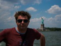
As soon as I opened the photo I thought the composition was wrong, even the base of the structure is cut to the left, then I read the caption that justifies the choice.
In my view, the effect of the vortex, which is actually better known away, does not make up the composition so unbalanced, does not attract the gaze so important so as not to draw attention to the cut of the building.
I like rather a lot of toning in BN.
Hello
Federico Appena ho aperto la foto ho pensato che la composizione fosse sbagliata, la base della struttura é addirittura tagliata a sinistra, poi ho letto la didascalia che giustifica la scelta.
A mio avviso l'effetto vortice, che effettivamente si nota meglio allontanandosi, non compensa la composizione cosí sbilanciata, non attira lo sguardo in modo cosí importante da non far notare il taglio dell'edificio.
Mi piace invece molto il viraggio in BN.
Ciao
Federico |
user8319
|
sent on 29 Gennaio 2014 (10:20) | This comment has been automatically translated (show/hide original)
Hello Andrea.
The trigger is nice but I do not particularly striking. The effect of "vortex" does not seem to emerge much. Ben made the conversion to B / W
Roberto Ciao Andrea.
Lo scatto è piacevole ma non mi colpisce particolarmente. L'effetto "vortice" non mi sembra emergere più di tanto. Ben realizzata la conversione in B/N.
Roberto |
|
|
sent on 29 Gennaio 2014 (12:44) | This comment has been automatically translated (show/hide original)
does not strike me what strikes you, I only see so much distrorsione, both optical and perspective with noise entering into the composition. ;-)
Hello
Max
non mi colpisce ciò che colpisce te, io vedo solo tanta distrorsione , sia ottica che prospettica con elementi di disturbo che entrano nella composizione. 
Ciao
Max
|
|
|
sent on 29 Gennaio 2014 (14:03) | This comment has been automatically translated (show/hide original)
“ does not strike me what strikes you, I only see so much distrorsione, both optical and perspective with disturbing elements that enter into the composition „
Wow, Max, I'm glad you liked it!
:-D “ non mi colpisce ciò che colpisce te, io vedo solo tanta distrorsione , sia ottica che prospettica con elementi di disturbo che entrano nella composizione „
Caspita, Max, sono contento che ti sia piaciuta!
 |
|
|
sent on 29 Gennaio 2014 (22:04) | This comment has been automatically translated (show/hide original)
Paco, to me the most striking distortion of the circle cloudy. At the center of the belly seems to have this property.
Handsome bn.
hello maximum Paco, anche a me la distorsione colpisce più del circolo nuvoloso. Al centro pare abbia la pancia questa struttura.
Bello il bn.
ciao massimo |
|
|
sent on 17 Febbraio 2014 (18:12) | This comment has been automatically translated (show/hide original)
hello Paco ...
This shot does not convince me. First, I hate falling lines (not always but often say), I find the composition unbalanced and badly cut with the tip of the skyscraper left inserted incorrectly, without penalty ..
perhaps (although it's hard to say) by moving a few feet to the right could find a composition more
pleasant and make better use of the curvature of the pool of water at the bottom trying to relate it with the curvature of the skyscraper and clouds (2.5 excuse for these lines, but sometimes I like to use fantasy :-|)
“ the clouds seem to follow the curvature of the skyscraper „
ok, this is true but I think you could not appreciate it and you're focused too much on the cloudand not on the rest.
-------------
Use this space to congratulate you for this shot www.juzaphoto.com/galleria.php?t=466485&l=it...l 'had posted in a topic where there was talk of benedusi looking at her and I thought, but look at you, Septimius finally did a decent shot, but it was tuowow! wow wow! (Ps. I settimio is nice, I follow it every so often because apart from everything always some points to ponder but his photos, exception made for 2 or 3 do not tell me nothing: fconfuso ... maybe it will be because it is not my favorite kind of photography .... bho)
Hello Paco, the next one! ;-) ciao Paco...
questo scatto non mi convince molto. innanzitutto io odio le linee cadenti (non sempre ma diciamo spesso), trovo la composizione sbilanciata e tagliata male con la punta del grattacielo di sinistra inserita male, senza rigore..
magari (anche se è difficile a dirsi) spostandoti di qualche metro verso destra riusciva a trovare una composizione più
gradevole e sfruttare meglio la curvatura della pozza d'acqua in basso cercando di rapportarla con la curvatura del grattacielo e delle nuvole (scusa per queste 2.5 righe, ma ogni tanto mi piace usare la fantasia ) )
“ le nuvole sembrano proseguire la curvatura del grattacielo „
ok, questo è vero ma secondo me non sei riuscito a valorizzarlo e ti sei concentrato troppo sulla nuvola e poco sul resto.
-------------
uso questo spazio per farti i complimenti per questo scatto www.juzaphoto.com/galleria.php?t=466485&l=it...l'avevi postato in un topic dove si parlava di benedusi e io guardandola pensai: ma guarda te, finalmente Settimio ha fatto uno scatto decente, invece era tuo (ps. a me è simpatico settimio, lo seguo ogni tanto perchè a parte tutto da sempre qualche spunto su cui meditare ma le sue foto, fatte eccezione per 2 o 3 non mi dicono niente (ps. a me è simpatico settimio, lo seguo ogni tanto perchè a parte tutto da sempre qualche spunto su cui meditare ma le sue foto, fatte eccezione per 2 o 3 non mi dicono niente ...forse sarà perchè non è il mio genere di fotografia preferito....bho) ...forse sarà perchè non è il mio genere di fotografia preferito....bho)
ciao Paco, alla prossima! |
|

Publish your advertisement on JuzaPhoto (info) |


 JuzaPhoto contains affiliate links from Amazon and Ebay and JuzaPhoto earn a commission in case of purchase through affiliate links.


 Resize to fit window