What do you think about this photo?
Do you have questions or curiosities about this image? Do you want to ask something to the author, give him suggestions for improvement, or congratulate for a
photo that you really like?
You can do it by joining JuzaPhoto, it is easy and free!
There is more: by registering you can create your personal page, publish photos, receive comments and you can use all the features of JuzaPhoto.
With more than 260000members, there is space for everyone, from the beginner to the professional.
|
|
sent on 09 Marzo 2014 (19:21) | This comment has been automatically translated (show/hide original)
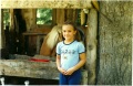
ok, in the spirit of # circolofotografico, I try to tell you my impressions. First of all, I see no major flaws. The colors are very dark, this choice that I see also another step in the same subject, probably represents your own personal taste, but I can not help but notice that the magnificent red trees do not have the right emphasis :)
The worst thing, however, seems to me to be the sky. Probably with a graduated filter, or a bit 'of pp, can you make it a little' more interesting. Maybe if you lower the light with a filter degrading and at the same time you change a bit 'temperature, you can get a better sky.
From a compositional point of view, maybe you wanted to include a little 'too. I mean, the Green River is a beautiful person but you have devoted a segment too small or too large :) if you wanted to make it stand out invresti had to give him the entire lower third, sacrificing a bit 'of heaven, and pass along a little'. otherwise it is a base ... a little 'slippery :-) Anyway not bad at all! ok, nello spirito del #circolofotografico, provo a dirti le mie impressioni. Innanzi tutto non vedo grossi difetti. I colori sono molto cupi, questa scelta, che rivedo anche nell'altro scatto dello stesso soggetto, probabilmente rappresenta un tuo gusto personale, tuttavia non posso far a meno di notare che i magnifici alberi rossi non abbiano il giusto risalto :)
La cosa peggiore, invece, mi sembra essere il cielo. Probabilmente con un filtro graduato, oppure un po' di pp, riuscirai a renderlo un po' più interessante. Magari se abbassi la luce con un filtro degradante e, nel contempo, modifichi un po' la temperatura, potrai ottenere un cielo migliore.
Da un punto di vista compositivo, hai forse voluto includere un po' troppo. Mi spiego, il fiume verde è un bellissimo soggetto ma gli hai dedicato uno spicchio troppo piccolo o troppo grande :) se volevi farlo risaltare, avresti dovuto dargli l'intero terzo inferiore, sacrificando un po' di cielo e, allontanandoti un po'. altrimenti così è una base... un po' scivolosa  Comunque non è affatto male! Comunque non è affatto male! |
|
|
sent on 11 Marzo 2014 (19:36) | This comment has been automatically translated (show/hide original)
thank you very much for passing and for the comments left, really very welcome!
I'm not a big fan of the post but it is not the only reason why I left the sky a "neutral": the true subject of the picture is the church, not the sky and the river, that I "served" only to contextualize!
In any case I'll be more careful next time not to include too much because I realize I can divert attention from the main subject! ti ringrazio moltissimo per il passaggio e per i commenti lasciati, davvero graditissimi!
non sono una grande amante della postproduzione ma non è solo questo il motivo per cui ho lasciato un cielo "neutro": il vero soggetto della foto è la chiesa, non il cielo e non il fiume, che mi "servivano" solo a contestualizzare!
in ogni caso starò più attenta la prossima volta a non includere troppo poiché mi rendo conto possa distogliere l'attenzione dal soggetto principale! |
|

Publish your advertisement on JuzaPhoto (info) |


 JuzaPhoto contains affiliate links from Amazon and Ebay and JuzaPhoto earn a commission in case of purchase through affiliate links.


 Resize to fit window
 17.9 MEGAPIXEL