What do you think about this photo?
Do you have questions or curiosities about this image? Do you want to ask something to the author, give him suggestions for improvement, or congratulate for a
photo that you really like?
You can do it by joining JuzaPhoto, it is easy and free!
There is more: by registering you can create your personal page, publish photos, receive comments and you can use all the features of JuzaPhoto.
With more than 260000members, there is space for everyone, from the beginner to the professional.
|
|
sent on 19 Gennaio 2014 (11:41) | This comment has been automatically translated (show/hide original)
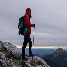
There are some things that do not convince me pretty much nothing in this shot.
The first is the light, it seems a bit 'too much colder than the time at which you took (or early morning or evening before sunset, the shadows are long enough).
The composition so tight chokes the mountains to the right, which is struggling to emerge from that frame the fog. You've probably taken at 70mm or something like that, for me it was better to take advantage of multiple focal lengths closer to wide angle, trying to insert multiple foreground and sacrifice a little 'the sky.
Moreover, also with regard to the composition, the horizon remains in an intermediate position, it is not about two-thirds and is not even in the middle of the shot, there was a cloud that particular cut I did not want to understand your choice, but with this weelo velatino do not see the need.
The first floor, as it has been inserted, it seems almost a nuisance, there had been more would have done most part of the landscape.
I'd like to know why your choices, if there was something that disturbed the composition in the foreground that you wanted to avoid or whatever. ;-)
At the next
Barbara Ci sono alcune cose che non mi convincono granchè in questo scatto.
La prima è la luce, mi sembra un po' troppo fredda rispetto all'orario in cui hai scattato (o mattina presto o sera prima del tramonto, le ombre sono abbastanza lunghe).
La composizione così stretta soffoca le montagne a destra, che faticano ad emergere sia dal frame che dalla nebbia. Probabilmente hai scattato a 70mm o qualcosa di simile, per me era meglio sfruttare di più le focali più vicine al grandangolo, cercando di inserire più primo piano e sacrificare un po' del cielo.
Inoltre, sempre riguardo alla composizione, l'orizzonte rimane in una posizione intermedia, non è sui due terzi e non è neppure a metà dello scatto, ci fosse stata una nuvola particolare che non volevi tagliare avrei capito la tua scelta, ma con questo cielo velatino non ne vedo la necessità.
Il primo piano, così com'è stato inserito, sembra quasi un elemento di disturbo, ce ne fosse stato di più avrebbe fatto più parte del panorama.
Mi piacerebbe sapere il perchè delle tue scelte, se ci fosse qualcosa che disturbava la composizione nel primo piano che hai voluto evitare o che altro.
Alla prossima
Barbara |
|
|
sent on 19 Gennaio 2014 (12:06) | This comment has been automatically translated (show/hide original)
thanks Barbara sincerity, this actually is not convincing even to me why I entered today in this "special area".
I confirm that was taken at 70 and at 15, in the evening, you advance to post it before I had even done a full crop of the lower part to bring out more the clouds and the summit but did not convince me also and above all to the fact that being was taken freehand sharpening, already not at the top, further losing quality.
In this case I just wanted to have more clouds with a peak because I liked the situation of the moment but between saying and doing ...
This is the antithesis of this:

that was actuallyone I wanted, more, for composition and visual.
other aspect blows ... :-D
hello
grazie Barbara della sincerità; questa effettivamente non convince nemmeno a me per questo l'ho inserita oggi in questa "area speciale".
Confermo che è stata scattata a 70 ed alle 15 , verso sera; ti anticipo che prima di postarla avevo anche fatto un ritaglio completo della parte bassa per far risaltare più le nuvole e la vetta ma non mi convinceva anche e sopratutto per il fatto che essendo stata scattata a mano libera la nitidezza, già non al top, perdeva ulteriormente di qualità.
Nella fattispecie volevo solamente avere più nuvole con solo una vetta perchè mi piaceva la situazione del momento ma tra il dire ed il fare...
Questa immagine è l'antitesi di questa:
che effettivamente era quella che mi garbava di più, per composizione e visuale.
aspetto altre legnate...
ciao
|
|
|
sent on 19 Gennaio 2014 (13:25) | This comment has been automatically translated (show/hide original)
Hello Max, I do not want to repeat myself but as I see it, this is the exact same case that I described in the photography of Eliana www.juzaphoto.com/galleria.php?t=711337&l=it
the second photo you posted definitely has more potential, you've created those guidelines that lead you toward that wonderful game of peaks and clouds on the horizon, the wide angle puts you immediately in the composition.
schiarirei contrasterei more personally and the whole area of ??grass bringing out the stains of rocks or ice (not clear on the size of fiel you posted) so as to attract attention and direct me towards the horizon.
hello, simone Ciao Massimo,non vorrei ripetermi ma per come la vedo io,questo è lo stesso identico caso che ho descritto nella fotografia di Eliana www.juzaphoto.com/galleria.php?t=711337&l=it
la seconda foto che hai postato ha sicuramente maggior potenziale,hai creato quelle linee guida che ti conducono verso quel meraviglioso gioco di nuvole e vette all'orizzonte,la visione grandangolare ti fa entrare da subito nella composizione.
personalmente schiarirei e contrasterei maggiormente tutta la zona dell'erba facendo risaltare le macchie di sassi o ghiaccio (non si capisce bene dalla dimensione del fiel che hai postato) in modo da attirare l'attenzione e indirizzarmi verso l'orizzonte.
ciao,simone |
|
|
sent on 19 Gennaio 2014 (13:54) | This comment has been automatically translated (show/hide original)
Thank you, Simone. I agree with what you wrote, but in my opinion the second one (which I posted just days ago because I was returning more) is much better. I would have loved to bring out more of the sea of ??clouds to this I had taken even one without a real crush pp but in landscaping plans will not work. At least that seems to me to have understood, for this one today, I purposely inserted in this section. For further confirmation and opinions (which finally happen this hashtag).
The PP is ice, I try to lighten it in the original, thanks for the tip.
hello grazie, Simone. concordo con quello che hai scritto, anche a mio avviso la seconda (che avevo già postato giorni fa perchè appunto mi tornava di più) è decisamente migliore. Mi sarebbe piaciuto far risaltare di più il mare di nuvole per questo avevo scattato anche l'altra senza un vero e proprio pp ma in paesaggistica schiacciare i piani non funziona. Almeno questo mi par di aver capito, per questo quella di oggi l'ho inserita appositamente in questa sezione. Per avere ulteriori conferme e pareri (cosa che finalmente in questo hastag capita).
Il pp è ghiaccio, provo a schiarirla nell'originale, grazie della dritta.
ciao |
|
|
sent on 19 Gennaio 2014 (14:56) | This comment has been automatically translated (show/hide original)
“ in landscaping plans to crush does not work „
not be drastic, I think it works when you have conditions of light, colors or shapes are truly captivating, otherwise the picture says a little poco.Questo at least as I see it.
hello “ in paesaggistica schiacciare i piani non funziona „
non essere drastico,secondo me funziona quando si hanno condizioni di luci,colori o forme davvero accattivanti,altrimenti la foto dice un pò poco.Questo almeno come la penso io.
ciao |
|
|
sent on 19 Gennaio 2014 (21:40) | This comment has been automatically translated (show/hide original)
For shooting proposed: the first plan would cut just below the dark mountain on the left, so as to have a panoramic cutting and lowering the horizon line to the third down, thus having available more sky as you said you were looking for.
For the second step: much, much better! Valorizzerei pp in the foreground, schiarendolo mainly, and cutting it out slightly to have more proportion / symmetry in height with the sky (in such a way as to have more symmetry with the strip in the middle of the clouds.
Hello
MN Per lo scatto proposto: taglierei il primo piano subito sotto la montagna scura a sx, in modo tale da avere una taglio panoramico ed abbassare la linea dell'orizzonte verso il terzo in basso, avendo così a disposizione più cielo come hai detto che cercavi.
Per il secondo scatto: molto ma molto migliore! Valorizzerei in pp il primo piano, schiarendolo principalmente, e ritagliandolo leggermente per avere più proporzione/simmetria in altezza con il cielo (in modo tale da aver più simmetria con in mezzo la striscia delle nubi.
Ciao
MN |
|
|
sent on 20 Gennaio 2014 (8:14) | This comment has been automatically translated (show/hide original)
Meanwhile, thanks to all the advice
@ Simone: You're right, pretend that he wrote "sometimes"
@ Mark: I'm answering the phone just now maybe I can do the changes that you and others have given me, and I propose a preview
Hello Intanto grazie a tutti dei consigli
@simone: hai ragione , fai finta che abbia scritto "a volte"
@marco : ora sto rispondendo dal tel appena posso magari faccio le modifiche che tu ed altri mi avete dato e propongo un'anteprima
Ciao |
|
|
sent on 20 Gennaio 2014 (12:10) | This comment has been automatically translated (show/hide original)
I will not go ... It has already been said abbastana ...
For me it is flat and probably not much improved.
The alternation clouds / mountains in layers is not enough to stimulate my desire to be there ... :-D
I also wanted us here n point of attraction, megli oanche with a light that would produce some
game of shadows appealing.
The second picture puzzles me ...
For me, you should have "Enter" in the landscape, raising the pdr and introducing an element that would give three-dimensionality and sense of proportion in the foreground. Even there, with a light that seems to me to still flat. Perhaps at 15.30?
All this to impress.
Hello.
Andrea. ;-) Non mi dilungo...Già è stato detto abbastana...
Per me è piatta e probabilmente non molto migliorabile.
L'alternanza nubi/montagne a strati non è sufficiente a stimolare la mia voglia di essere lì...
Mi ci voleva anche qui n punto d'attrazione, megli oanche con una luce che producesse qualche
gioco di ombre accattivante.
Anche la seconda immagine mi lascia perplesso...
Per me avresti dovuto "Entrare" nel paesaggio, alzando il pdr e introducendo un elemento che desse tridimensionalità e senso delle proporzioni in primo piano. Anche lì, con una luce che mi appare ancora piatta. Forse alle 15.30?
Tutto questo ad impressione.
Ciao.
Andrea. |
|
|
sent on 20 Gennaio 2014 (19:57) | This comment has been automatically translated (show/hide original)
Hello Massimo, in both the light is not at the top. In the first definitely the first floor so tight almost creates more nuisance than enrichment, the sky all in all, with those glazes has something artistic and the carpet of clouds is always a spectacle. In the second I am not convinced the provision of thirds: the top third of the sky and the bottom of the first floor tend to crush the middle floor. Even quell'angolino mountain on the right I take it almost as something cumbersome. Ciao Massimo, in entrambe la luce non è al top. Nella prima sicuramente il primo piano così risicato crea quasi più fastidio che arricchimento, il cielo tutto sommato, con quelle velature ha un qualcosa di artistico e il tappeto di nuvole è sempre uno spettacolo. Nella seconda non mi convince la disposizione dei terzi: il terzo superiore del cielo e quello inferiore del primo piano tendono a schiacciare il piano centrale. Anche quell'angolino di montagna a dx lo colgo quasi come un qualcosa di ingombrante. |
|
|
sent on 20 Gennaio 2014 (21:37) | This comment has been automatically translated (show/hide original)
I agree with both that the time was not the best but I was unable to stay at high altitude over (which can not become a justification since we are commenting on a click), perhaps for the first picture I shot with a tripod if I could do a cutout full-bodied to remove the entire lower section and leave only the clouds with a little less sky. I tried, it would be better, but definitely lose in quality. For the second you wonder if a less invasive pp would have been better rather than a still closer pp. (in height) knowing that I would have framed physically advancing even more what you see in the first picture (which is why I put so much pp, to exclude ).
I forgot: thanks to the passage, Eliana that piece on the right can get an idea for the future. Concordo con entrambi che l'orario non fosse dei migliori ma ero impossibilitato a stare in quota oltre ( che non può diventare un giustificativo visto che stiamo commentando uno scatto) ; per la prima foto forse se la scattavo con il treppiede potevo fare un ritaglio corposo per togliere tutta la parte bassa e lasciare solo le nuvole con un poco meno cielo. Ho provato , sarebbe migliore, ma decisamente perde in qualità . Per la seconda vi chiedo se un pp meno invasivo sarebbe stato migliore piuttosto che un pp ancora più ravvicinato ( in altezza) sapendo che avanzando fisicamente avrei inquadrato ancora di più ciò che si vede nella prima foto ( per questo ho messo tanto pp , per escluderlo).
Dimenticavo: grazie del passaggio, Eliana quel pezzo a dx può diventare un'idea per il futuro. |
|
|
sent on 21 Gennaio 2014 (18:36) | This comment has been automatically translated (show/hide original)
I'm watching a preview from the cell and it does not seem as bad as depth. When I can I want to revise the PC, but ... the beams of light, as you have done??
Meanwhile, thanks interpretation
Hello Sto guardando un'anteprima dal cell e non sembra male come profondità . Quando riesco la voglio rivedere al pc, ma...i fasci di luce, come hai fatto???
Intanto grazie dell'interpretazione
Ciao |
|
|
sent on 21 Gennaio 2014 (21:47) | This comment has been automatically translated (show/hide original)
:-D:-D:-D:-D I want to see when to see simone says:-D:-D
for beams, small trucchitti ps, obvious joke that I wanted, but I wanted you to see that especially in light of the landscape is one of the key things, though shots at times not too responsive, a good light you change the shot!
for the depth are contrento you enjoyed! voglio vedere quando al vede simone che dice
per i fasci, piccoli trucchitti di ps, ovvio che volevo scherzare, però volevo farti vedere che sopratutto nel paesaggio la luce è una delle cose fondamentali , anche se scatti ad orari non troppo consoni, una buona luce ti cambia lo scatto!!
per la profondità sono contrento che tu abbia apprezzato!!! |
|
|
sent on 21 Gennaio 2014 (22:07) | This comment has been automatically translated (show/hide original)
the square version is not bad but also a vertical, strictly in 4/3 there would see evil, are all solutions that we must try to see whether it can improve the readability of foto.Io I used the V-shaped lines that create stains ice
I also wanted to add that according to Massimo me in your latest version does not have dared enough to post the first floor, is still off, when there is no light if you want to save a picture that you are interested in, however, the light you need to create almost . Visit layers and mask the foreground, a coat contrasts those clouds Make them even more substantial, it creates some interest, but mostly fun doing it, if it is not in your style of processing is not to convince you that it is the only way to go. I do not know if I could explain.
Gianluca then when you have a moment of time I spiegherai how the hell did you get those rays of light, I know there are tutorials, even if it's not my style to use these tricks I have to admit that they are really beautiful.
sometimes when I see some beams of light that penetrate the windows or in the woods, which are often seen on this forum, I wonder how much is true, but if you feel the author already knows what will be his answer it? ;-) la versione quadrata non è male ma anche una verticale,rigorosamente in 4/3 non ce la vedrei male,sono tutte soluzioni che bisogna provare per vedere se possa migliorare la leggibilità della foto.Io avrei sfruttato le linee a V che creano le macchie di ghiaccio
volevo anche aggiungere a Massimo che secondo me nella tua ultima versione non hai osato abbastanza con la post del primo piano,è ancora spento,quando non c'è luce se vuoi salvare una foto che comunque ti interessa,la luce te la devi quasi creare.Vai di livelli e maschera il primo piano,contrasta un pelo anche quelle nuvole rendile più corpose ,crea un certo interesse,ma soprattutto divertiti a farlo,se non è nel tuo stile di elaborazione non convincerti che sia l'unica strada da percorrere.non so se sono riuscito a spiegarmi.
poi Gianluca quando hai un attimo di tempo mi spiegherai come cavolo hai fatto ad ottenere quei raggi di luce,so che ci sono dei tutorial,anche se non è nel mio stile usare questi stratagemmi devo ammettere che sono davvero belli.
a volte quando vedo certi fasci di luce che penetrano dalle finestre o nei boschi,che si vedono spesso anche su questo forum,mi chiedo quanto ci sia di vero,ma se senti l'autore si sa già quale sarà la sua risposta vero? |
|
|
sent on 22 Gennaio 2014 (18:17) | This comment has been automatically translated (show/hide original)
I start with the title 'sky islands' at this point is what you wanted to propose.
Well because you included the mainland? Let me explain, that strip at the bottom of the building where there is take it off even by cloning x respect the rule of thirds, and n having to cut again, as the islands are in the midst of the sea, so these "islands" have to be in the clouds .
I gave a reading very simple but I nn distorted picture of departure and its contents.
Hello,
Maurizio Io parto dal titolo 'isole in cielo', a questo punto è quello che volevi proporre.
Bene perché hai incluso la terra ferma? Mi spiego meglio,quella striscia in basso dove c'è l'edificio la toglierei anche clonandola x rispettare la regola dei terzi e nn dover tagliare ancora, come le isole stanno in mezzo al mare, così queste "isole" devono stare fra le nuvole.
Ho dato una lettura molto semplice ma nn ho stravolto la foto di partenza e il suo contenuto.
Ciao,
Maurizio |
|
|
sent on 22 Gennaio 2014 (22:02) | This comment has been automatically translated (show/hide original)
Sorry for the delay:-D ...
Gianluca: I now see the photo on the screen, the depth is fairly better than my very enhance the rays but the background looks a little pale, almost a backlight, maybe this is the effect you gave working on it.
Simon understood (perhaps:-D), do I understand it a little more difficult because the post is not just a thing I do so much and I generally limit myself to the minimum wage, not because I think it's wrong or what but just a little deepen I make messes.
That said, I tried to translate evidence into practice what I think I have been advised

Forgive the mistakes on the edges because the penin just can not digest it :-|
(BTW: I do not have lightroom but ps)
Tell me, if you like, your Scusate il ritardo...
Gianluca: ora vedo la foto a monitor; la profondità è discretamente migliore rispetto alla mia, i raggi la valorizzano molto ma lo sfondo sembra un poco smorto , quasi un controluce, forse questo è dato dall'effetto che hai dato lavorandoci.
Simone: capito (forse), farlo mi risulta un poco più difficile perchè la post non è proprio una cosa che faccio da tanto e generalmente mi limito al minimo sindacale; non perchè penso che sia sbagliata o cosa ma appena approfondisco un poco faccio casini.
Detto ciò, ho provato a tradurre in prova pratica ciò che penso mi sia stato consigliato
perdonatemi gli errori sui bordi perchè il pennello proprio non riesco a digerirlo
(a proposito: non ho ps ma lightroom)
ditemi, se ne avete voglia, la vostra |
|
|
sent on 22 Gennaio 2014 (22:11) | This comment has been automatically translated (show/hide original)
Maurice: You're right, the title came to me initially because I had made a cutout of the genus

Then I thought, looking lost too definition (note freehand:-D), although the cut and the
composition I liked the most. I re-edited but then I have not thought about the title.
Maybe it's better to go "feeling" rather than watching too much "quality".
But, and I emphasize, without these interventions would not have had a hand in these shots without your advice.
So, thank you all.
hello
Maurizio: hai ragione, il titolo mi era venuto perchè inizialmente avevo fatto un ritaglio del genere
poi guardandola ritenevo perdesse troppo in definizione (tieni presente mano libera) anche se il taglio e la
composizione mi piacevano di più. L'ho ri-modificata ma poi non ho più pensato al titolo.
Forse è meglio andare a "sentimento" piuttosto che guardare troppo la "qualità".
Però, e lo sottolineo, senza questi interventi non avrei messo mano a questi scatti senza i vostri consigli.
Quindi, grazie a tutti.
ciao
|
|
|
sent on 22 Gennaio 2014 (22:23) | This comment has been automatically translated (show/hide original)
tt those comments I read I was confused, then I saw a picture emerge that forgives, but i was very similar to the one posted recently and so on.Not longer knew whether to intervene or no.mi are concerned the photos, I read the title because I told them maybe there is a solution, if one tries to think of a title that will mean that shot sent and this is what I tried to represent, and I made my observation.
tt here the rest of you did it alone.
I like this version.
hello
maurizio
tt quei commenti che ho letto mi avevano confuso, poi mi sono visto sbucare una foto che perdona,i ma somigliava molto poco a quella postata e così via.Non sapevo più se intervenire o no.mi sono riguardato la foto,ho letto il titolo perché mi sono detto forse li c'e la soluzione, se uno si sforza di pensare un titolo vorrà dire che quello scatto ha trasmesso questo ed è quello che ha cercato di rappresentare, e ti ho fatto la mia osservazione.
tt qui il resto lo hai fatto da solo.
a me piace questa versione.
ciao
maurizio
|
|
|
sent on 27 Gennaio 2014 (3:40) | This comment has been automatically translated (show/hide original)
I also would remove a piece of heaven and I would make it even more scenic. :-D Io toglierei anche un pezzo di cielo e la renderei ancora più panoramica. |
|

Publish your advertisement on JuzaPhoto (info) |

 Inverno in appennino
 JuzaPhoto contains affiliate links from Amazon and Ebay and JuzaPhoto earn a commission in case of purchase through affiliate links.


 Resize to fit window